Okay, since I was talking about authors designing their own covers in reference to the Deposit Photos sale... maybe I should actually do a thread of advice for indie authors looking to make their own cover!
So, thread! https://twitter.com/coolcurrybooks/status/1330902131902193672">https://twitter.com/coolcurry...
So, thread! https://twitter.com/coolcurrybooks/status/1330902131902193672">https://twitter.com/coolcurry...
Okay, first off, yes I& #39;m a book cover designer and obviously all for authors hiring designers to make covers. But I also know that not everyone has the budget for that, so here& #39;s some advice for if you& #39;re tackling cover design yourself.
#1 A COVER IS A MARKETING TOOL
Seriously, I can& #39;t stress this enough. It& #39;s fine to want a pretty piece of art, but you should be approaching a cover as a marketing tool first, an art piece second.
Seriously, I can& #39;t stress this enough. It& #39;s fine to want a pretty piece of art, but you should be approaching a cover as a marketing tool first, an art piece second.
Indie authors don& #39;t have the same sort of marketing budgets (or connections) that trad publishers have. Your cover may very well be your primary marketing tool, so you need to make it count.
Real talk? It& #39;s not important if your cover doesn& #39;t 100% match the details of your book. Don& #39;t get hung up on representing a particular scene or finding the "perfect" stock photo model to fit your character.
Those don& #39;t matter when someone is browsing Amazon.
Those don& #39;t matter when someone is browsing Amazon.
Instead think about whether or not a cover works to attract readers. Specifically, your audience of readers! If you& #39;re writing female-led urban fantasy, you want readers looking for female-led urban fantasy.
And that leads us to another very important point...
And that leads us to another very important point...
#2 KNOW YOUR GENRE
I can& #39;t emphasize this enough. Genre-matching is CRUCIAL to creating a marketable cover. You need readers to be able to take one glance at a cover and get a feel for what genre it is and what& #39;s the tone of the story.
I can& #39;t emphasize this enough. Genre-matching is CRUCIAL to creating a marketable cover. You need readers to be able to take one glance at a cover and get a feel for what genre it is and what& #39;s the tone of the story.
This doesn& #39;t matter as much for trad pub, because they have marketing budgets and other tools in their arsenal. But for indie authors, it& #39;s vital.
Also, trad pub and indie sometimes have a different "look." Know both.
Also, trad pub and indie sometimes have a different "look." Know both.
Urban fantasy in particular, has a very defined look for its indies, and readers of indie urban fantasy go for this type of cover.
So how do you figure out what that "type" of cover is? Research and moodboards.
So how do you figure out what that "type" of cover is? Research and moodboards.
I create moodboards for every genre and subgenre I& #39;ve worked in. These range from historical romance to vampire books to contemporary cowboy romance.
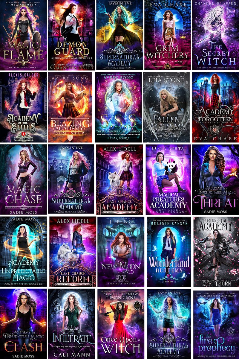
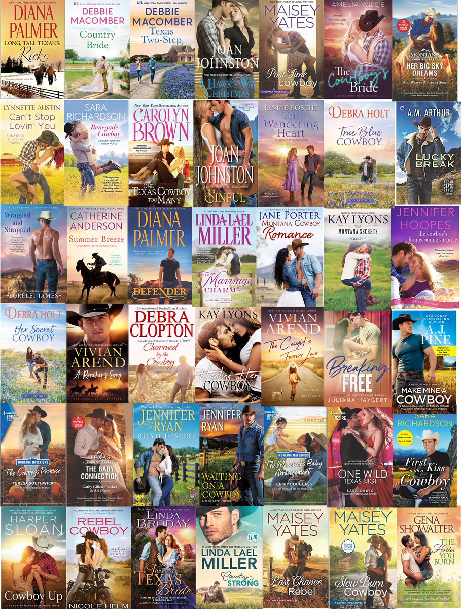
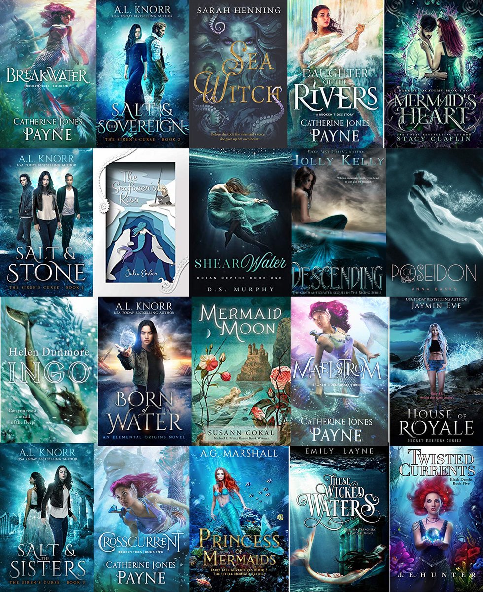
I& #39;m sharing a few here as samples. Hopefully you can tell genres or subgenres just by looking at them.
I& #39;m sharing a few here as samples. Hopefully you can tell genres or subgenres just by looking at them.
If not, they& #39;re historical romance, contemporary cowboy romance, mermaids, and academy urban fantasy.
I& #39;m also hoping that you can see the similarities between covers on the same board, and the overall differences between genres.
I& #39;m also hoping that you can see the similarities between covers on the same board, and the overall differences between genres.
Some of the obvious things to look at include color and contrast. Notice how the urban fantasy covers are super high saturation with very high contrast? That& #39;s practically a must for indie urban fantasy, especially academy.
But there& #39;s also some less obvious things to look for.
But there& #39;s also some less obvious things to look for.
How large is the figure? How much room does it take up on the cover?
Is the font a serif or sans serif? How much room does the title and author name take up on the cover?
Is the font a serif or sans serif? How much room does the title and author name take up on the cover?
And to get back to the obvious, what about the costuming, background and posing signals genre? AKA, castles and swords are a great way to signal epic fantasy. Long flowing gowns help a cover read "romance."
Think about how you can make your cover say, "yes, that& #39;s my genre!"
Think about how you can make your cover say, "yes, that& #39;s my genre!"
So do your own research for your particular subgenre (and please please please know what genre(s) you& #39;re marketing your book as).
The moodboards I shared are mostly drawn from Amazon Kindle bestsellers which is the best place to start your research.
The moodboards I shared are mostly drawn from Amazon Kindle bestsellers which is the best place to start your research.
I& #39;ve also sometimes rounded them out with covers pulled from Goodreads or (depending on the genre) publisher& #39;s websites.
I put my moodboards together in Photoshop, but you can also use Canva or Pinterest.
I put my moodboards together in Photoshop, but you can also use Canva or Pinterest.
Actually, speaking of Pinterest, there& #39;s another designer (Mariah Sinclair) who& #39;s been working on a project that includes creating a ton of different Pinterest boards for different genres, aimed at indie authors:
https://www.pinterest.com/coverdesignerdirectory/_created/">https://www.pinterest.com/coverdesi...
https://www.pinterest.com/coverdesignerdirectory/_created/">https://www.pinterest.com/coverdesi...
She& #39;s still adding subgenres, but she& #39;s got a ton of different ones even now so it& #39;s well worth checking out!
#3 TYPOGRAPHY MATTERS
I think a rookie mistake is to think mostly of the art and to assume that the text on top doesn& #39;t matter as much.
Typography matters a ton. And typography is it& #39;s own skill, so it may be new to you even if you have an arts background!
I think a rookie mistake is to think mostly of the art and to assume that the text on top doesn& #39;t matter as much.
Typography matters a ton. And typography is it& #39;s own skill, so it may be new to you even if you have an arts background!
The wonderful Courtney Milan has a blog post called "How to Suck at Typography" that I suggest anyone making their own covers read. https://www.courtneymilan.com/ramblings/2014/07/30/how-to-suck-at-typography/">https://www.courtneymilan.com/ramblings...
The first thing she addresses is font choice. Different genres have different expectations for their font.
Fantasy mostly uses serifs for titles. Thrillers go in for sans serifs. This is the sort of area where research helps a lot.
Fantasy mostly uses serifs for titles. Thrillers go in for sans serifs. This is the sort of area where research helps a lot.
One of the benefits to hiring a cover designer is that we likely have a lot of fonts. Like, so many fonts. My friend calls me a font dragon, sitting on my hoard.
I have 5,000 fonts on my computer and access to more through subscriptions.
I have 5,000 fonts on my computer and access to more through subscriptions.
If you& #39;re an indie author and not a designer, I& #39;m going to assume you don& #39;t have a giant font hoard, so I& #39;d suggest looking at things like Google fonts, which are all free for commercial use (please please pay attention to licensing!)
https://fonts.google.com/ ">https://fonts.google.com/">...
https://fonts.google.com/ ">https://fonts.google.com/">...
I& #39;m going to refer you back to Courtney Milan& #39;s post for the rest of font talk, but I am going to note that her section on "don& #39;t use font effects" is pretty specific to historical romance.
In other genres, you may want effects but this can be hard to do on your own without Photoshop or a similar program to get things like a metallic style effect.
But it is probably better to go with simple than to head into font effects without any idea what you& #39;re doing.
But it is probably better to go with simple than to head into font effects without any idea what you& #39;re doing.
#4 PAY ATTENTION TO LICENSING TERMS
I would hope that everyone& #39;s at least aware of the "don& #39;t use just any image you find on Google" rule. You want to use actual stock photos, preferably ones you paid for.
I would hope that everyone& #39;s at least aware of the "don& #39;t use just any image you find on Google" rule. You want to use actual stock photos, preferably ones you paid for.
Why paid stock photos? Sites like Unsplash and Pixabay don& #39;t vet their images the same way as paid stock sites, so they end up with a lot of stolen images on their sites, that you the author could be liable for using.
Also, the free sites don& #39;t require model consent forms. Consent is important, and you want anyone who appears on your book cover to have consented to having their image used for commercial purposes.
But even with paid stock sites, you& #39;ll want to check the licensing terms. Especially if you& #39;re a romance or erotica writer!
There& #39;s some that don& #39;t allow their images to be used in association with erotica, and they don& #39;t allows distinguish between romance and erotica
There& #39;s some that don& #39;t allow their images to be used in association with erotica, and they don& #39;t allows distinguish between romance and erotica
It& #39;s for this reason that designers usually recommend against Adobe Stock for book covers. They used to have a rule against their images being used for erotica and steamy romance. They& #39;ve since changed the wording some but... eh. You can usually get the same images elsewhere.
Oh, and stock photos need to be for both commercial and creative use. You need to avoid "Editorial only," which means they can only be used to accompany articles.
For example, the Gender Spectrum Collection (trans and nonbinary photos) is editorial only.
For example, the Gender Spectrum Collection (trans and nonbinary photos) is editorial only.
Licensing terms also usually have a limit on print copies. Usually between 250,000 and 500,000 copies. So way beyond the wildest dreams of most indie authors!
More relevant is that there are usually restrictions on merchandizing. AKA you can& #39;t sell t-shirts.
More relevant is that there are usually restrictions on merchandizing. AKA you can& #39;t sell t-shirts.
Licensing terms are not particularly sexy, but they are important. Just the other day there was an author in a Facebook indie group posting for feedback a cover he got from a designer on Fiverr.
The designer had used a stock illustration without telling him.
The designer had used a stock illustration without telling him.
This was horrible for a lot of reasons (and pretty in character for cheap Fiverr designers imo), not least because the author had no way of knowing what the licensing terms were and could have accidentally violated them.
And if it& #39;s not abundantly clear... if a designer ever does that to you, run away! That& #39;s the sign of someone who is either super inexperienced or super unethical.
And last point in what& #39;s becoming a very long thread...
#5 KEEP CONSISTENT BRANDING
You want to build up an audience and a "brand," both for your particular series and for yourself as an author.
#5 KEEP CONSISTENT BRANDING
You want to build up an audience and a "brand," both for your particular series and for yourself as an author.
There& #39;s a lot more that goes into this (such as different pen names, author websites, etc), but covers are an important part of it too.
If you& #39;re writing a series, you want readers to be able to see the sequel and immediately think "oh, is that the next book in my favorite series???" and then know that they want to buy your book.
Typography is super important here and is one of the ways you can create consistent branding across your series (or even across all your books).
You also likely want things like composition, figure size, etc to be similar across or series.
You also likely want things like composition, figure size, etc to be similar across or series.
I& #39;m ending here, but I& #39;m also happy to answer questions about any of it!
And I think a lot of this is important to know even if you& #39;re hiring a designer instead of making your own covers.
And I think a lot of this is important to know even if you& #39;re hiring a designer instead of making your own covers.
Knowing your genre will help you chose the right designer, and being aware of things like stock image licensing will hopefully help you recognize red flags like in the Fiverr situation I described above.

 Read on Twitter


