JUST ONE GRAPH IN THE DAILY MAIL - a thread.
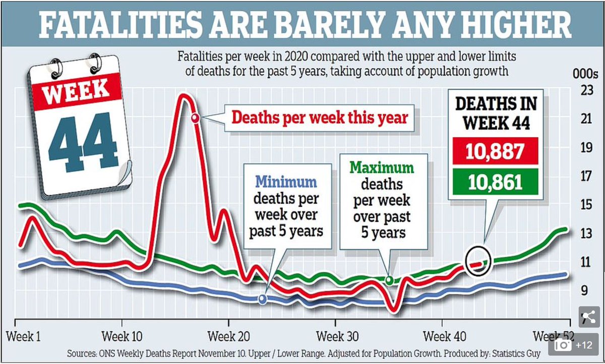
The Daily Mail published this chart. 2 things about it struck me. First, I’d seen the same data from the ONS, which sadly showed excess deaths in recent weeks – in fact higher than any time in the last 5 years. But this chart purported to show just the opposite. First, the Mail:
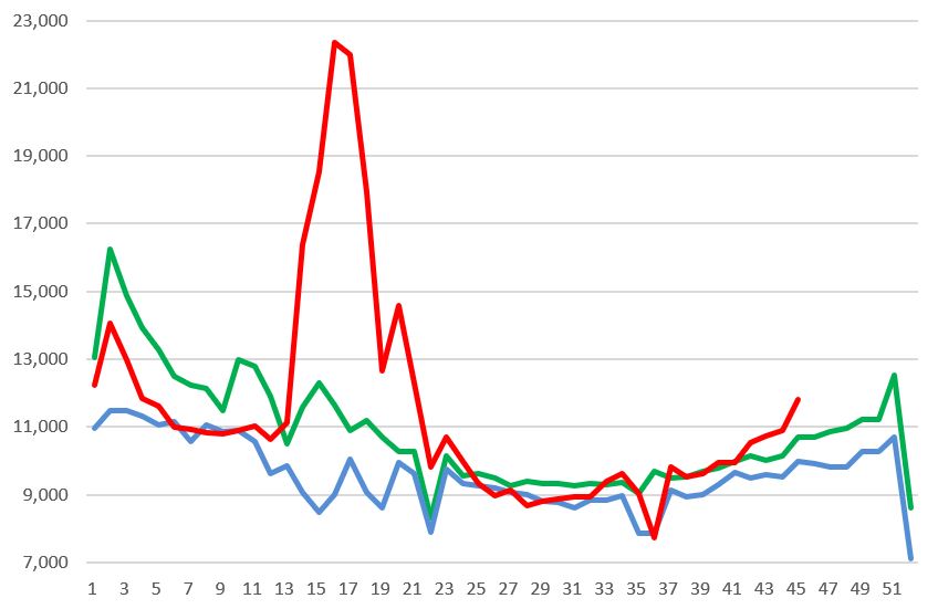
And now the ONS data. It is back above the highest levels we have seen in recent years. Given it is a lagging indicator, it may keep rising for a bit yet.
Second, the source looked very strange. Instead of just “Office for National Statistics", the source says “Statistics Guy”. Strange…
The first clue as to what is going on is that “The Statistics Guy” turns out to be a cranky Covid-denial twitter feed, run by a guy with a cartoon avatar. He advertises things like mass demonstrations against “The Great Reset” (a weird conspiracy theory, don’t ask).
The second clue is in the small print. “Adjusted for population growth”, says the Mail. Hmmm. Given that the last ONS data for UK population is for 2019, and the 2020 number isn’t out till June 2021, clearly these aren’t official stats. What are they assuming?
Cartoon avatar Statistics Guy pops up elsewhere challenging the official statistics and saying the statistics should be “Adjusted for 3.3% population growth????” (his question marks).
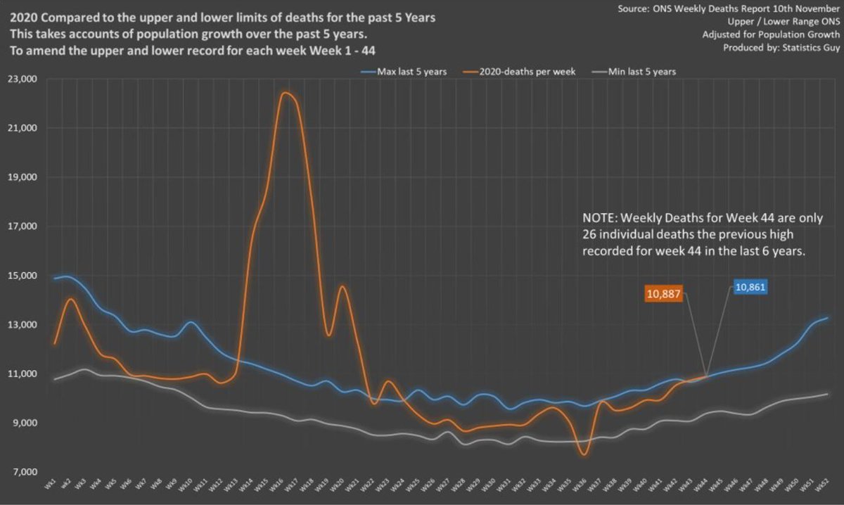
We can also see the original chart from Statistics Guy on his twitter (posted 13th November), which is what the Daily Mail have copied exactly. He says he has used “population growth over the past 5 years to amend the upper and lower record for each week”
If we look at week 44, which he & the Mail highlight, he shows 10,887 deaths in week 44, which is what ONS have. But the highest it& #39;s been anytime in the last 5 years was 10164 in 2019. Statistics guy shows a maximum of 10,861, which appears in the Mail. That& #39;s a 6.86% increase.
But of course, there is no way the population has increased by 6.8% in a year. Between 2018 and 2018 it increased 0.54%. If anything we’d expect growth over the last year to be slower because of a near halt to international migration, excess deaths and so on.
It is quite strange that the graph cuts off there. The next week of data had come out on the 17th, and the Mail published on the 20th. But oddly, they chose not to publish the next week of data, which showed excess deaths rising to over 200 a day above the 5 year average. Odd.
Why am I going on about one wrong graph? Because actually it& #39;s not just one graph: in fact the papers are filled with a torrent of this kind of thing: “Hey, there’s no real coronavirus problem, we can call just get back to normal”. Sadly, it& #39;s just not true.
While everything should be questioned (that& #39;s what science is), some of the papers need to apply the same standards to covid-denial content from random people with cartoon avatars that they do to the real scientists and clinicians on SAGE.
The vaccine is coming soon, life will get back to normal. But in the meantime, we need to protect people& #39;s lives and health through a difficult winter.
END
END

 Read on Twitter


