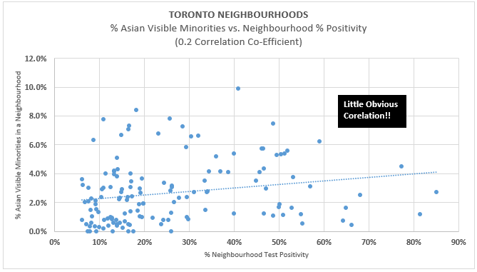
28/ But wow… separating all visible minorities into Asian and ‘other visible minorities’, and running the same regression vs. neighbourhood positivity, we see a MUCH WEAKER correlation to positivity in Asian communities (and conversely, higher for ‘other visible minorities’)
29/ This is perhaps suggestive, as many in the scientific community have hypothesized, that because of prior exposure to SARS coronaviruses, the Asian community may have relatively more pre-existing immunity (…again, I am only hypothesizing based on data and reason).
30/ Time to wrap up...
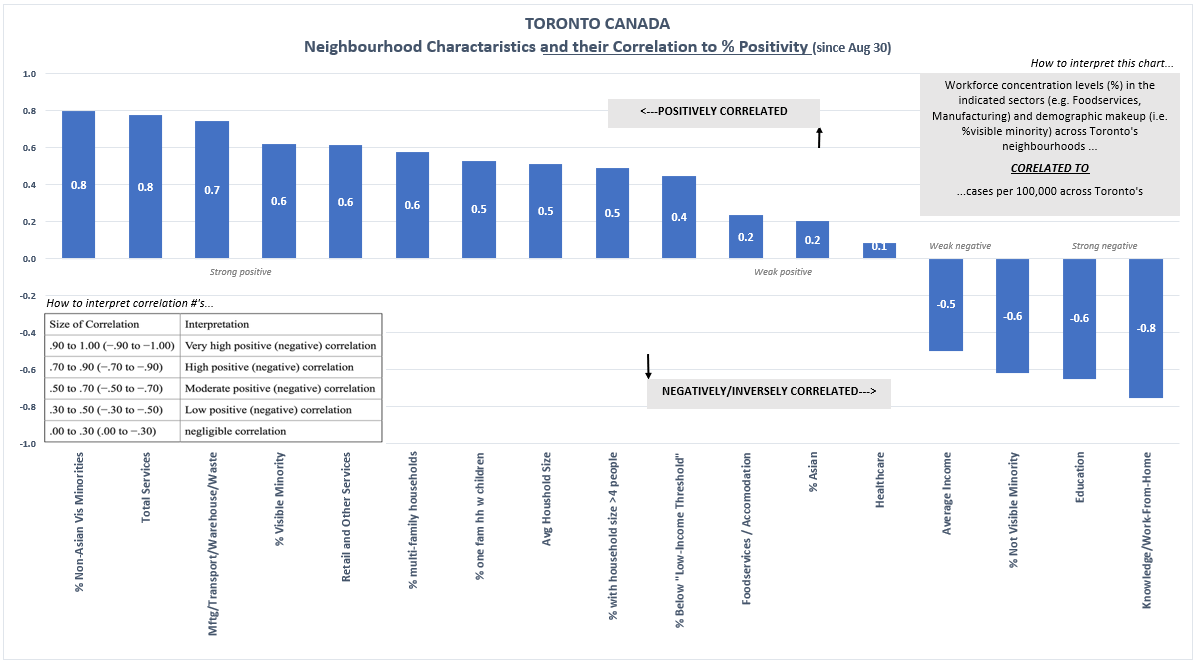
31a/ I will finish by quickly revisiting the Toronto data showing how neighbourhoods with a large % of their workforce in community facing services industries, as well as certain socioeconomic/demographic factors, strongly correlate with neighbourhood % positivity…
31b/ A collection of various socioeconomic/demographic factors, visually ranked by degree of correlation (left = more correlated, right = negatively correlated). The conclusions in the graph are self-evident. And note the much weaker correlation for foodservice/accommodation!
32/ Fascinating stuff all around. Its clear that:
1. There are vast differences in prevalence levels and growth across the city, with much of the city perhaps(?) already past its peak.
2. The burden of lockdown falls heaviest on those least able to bear it in our city.
1. There are vast differences in prevalence levels and growth across the city, with much of the city perhaps(?) already past its peak.
2. The burden of lockdown falls heaviest on those least able to bear it in our city.
33/ A personal note to our journalists:
Why are you not running this data? It is all publicly available. Why am I, a private citizen *with nothing to gain*, and my time to lose, having to do this analysis? (Although I am happy to do so).
The public deserves better from you.
Why are you not running this data? It is all publicly available. Why am I, a private citizen *with nothing to gain*, and my time to lose, having to do this analysis? (Although I am happy to do so).
The public deserves better from you.

 Read on Twitter


