The @DailyMailUK and @RossjournoClark have published another article downplaying the second wave, which got a government health warning from @DHSCgovuk, who said it was "misleading".
That& #39;s putting it mildly.
Here are a few of the issues I spotted... https://twitter.com/DailyMailUK/status/1330064507511730181">https://twitter.com/DailyMail...
That& #39;s putting it mildly.
Here are a few of the issues I spotted... https://twitter.com/DailyMailUK/status/1330064507511730181">https://twitter.com/DailyMail...
1) They claim half of all hospitals don& #39;t have any covid-19 patients.
That& #39;s because they counted mental health units, cosmetic surgeries, community health centres and specialist units like Moorfields Eye Hospital. These would NEVER treat covid patients. https://twitter.com/_johnbye/status/1323720226857455616?s=20">https://twitter.com/_johnbye/...
That& #39;s because they counted mental health units, cosmetic surgeries, community health centres and specialist units like Moorfields Eye Hospital. These would NEVER treat covid patients. https://twitter.com/_johnbye/status/1323720226857455616?s=20">https://twitter.com/_johnbye/...
2) They claim 1,293 less hospital beds are occupied than last November.
But they& #39;re comparing one day (November 5th) in 2020 to the average for a whole quarter (October to December) in 2019!
NOT the November average, as they say.
This clearly isn& #39;t a useful comparison.
But they& #39;re comparing one day (November 5th) in 2020 to the average for a whole quarter (October to December) in 2019!
NOT the November average, as they say.
This clearly isn& #39;t a useful comparison.
It also ignores the fact that hospitals in the hardest hit areas have been cancelling some non-urgent surgery to make space for the rising number of covid patients.
Just because hospitals aren& #39;t overflowing doesn& #39;t mean there isn& #39;t a problem. https://www.theguardian.com/society/2020/oct/23/mass-cancellations-of-nhs-operations-inevitable-this-winter-say-doctors">https://www.theguardian.com/society/2...
Just because hospitals aren& #39;t overflowing doesn& #39;t mean there isn& #39;t a problem. https://www.theguardian.com/society/2020/oct/23/mass-cancellations-of-nhs-operations-inevitable-this-winter-say-doctors">https://www.theguardian.com/society/2...
They& #39;ve also ignored the NHS& #39; note that "caution should be exercised in comparing overall occupancy rates between this year and previous years" because hospitals have had to be reorganised to keep covid and non-covid patients separate as far as possible.
https://www.england.nhs.uk/statistics/statistical-work-areas/bed-availability-and-occupancy/bed-data-overnight/">https://www.england.nhs.uk/statistic...
https://www.england.nhs.uk/statistics/statistical-work-areas/bed-availability-and-occupancy/bed-data-overnight/">https://www.england.nhs.uk/statistic...
The NHS says that this means "in general hospitals will experience capacity pressures at lower overall occupancy rates than would previously have been the case".
Which doesn& #39;t bode well if occupancy is already close to where it would normally be at this time of year.
Which doesn& #39;t bode well if occupancy is already close to where it would normally be at this time of year.
The Daily Mail does admit "some hospitals are under pressure".
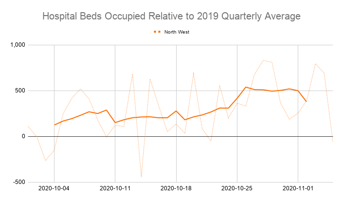
But the number of beds occupied in the *entire North West region* was already above last year& #39;s average for the quarter when the quarter began.
Just because some areas are quieter doesn& #39;t mean there isn& #39;t a problem.
But the number of beds occupied in the *entire North West region* was already above last year& #39;s average for the quarter when the quarter began.
Just because some areas are quieter doesn& #39;t mean there isn& #39;t a problem.
3) They claim less critical care beds are occupied than average.
But they compared the 5 year average of occupancy on the last Thursday of November to Sunday 8th November this year!
Occupancy can change by 5% from one day to the next, so this isn& #39;t a useful comparison either.
But they compared the 5 year average of occupancy on the last Thursday of November to Sunday 8th November this year!
Occupancy can change by 5% from one day to the next, so this isn& #39;t a useful comparison either.
And again, they& #39;re ignoring the impact of surgery being delayed to free up beds (including critical care beds) for covid patients. https://www.independent.co.uk/news/health/coronavirus-nhs-hospitals-second-wave-patients-intensive-case-b1231906.html">https://www.independent.co.uk/news/heal...
4) They claim there are no significant excess deaths.
This simply isn& #39;t true. In week 45 (which they left off their graph) deaths were 14% above average and 11% above the 5 year high.
No amount of "adjustments for population growth" will change this. https://twitter.com/_johnbye/status/1328708965149110272?s=20">https://twitter.com/_johnbye/...
This simply isn& #39;t true. In week 45 (which they left off their graph) deaths were 14% above average and 11% above the 5 year high.
No amount of "adjustments for population growth" will change this. https://twitter.com/_johnbye/status/1328708965149110272?s=20">https://twitter.com/_johnbye/...
In fact, the "population adjustments" in their graph don& #39;t make sense.
In week 44 it says the 5 year maximum was 10,861 deaths, when the actual figure quoted by the ONS is 10,146.
That& #39;s a 7% adjustment.
But England& #39;s population has only gone up by half that amount since 2015!
In week 44 it says the 5 year maximum was 10,861 deaths, when the actual figure quoted by the ONS is 10,146.
That& #39;s a 7% adjustment.
But England& #39;s population has only gone up by half that amount since 2015!
So while it& #39;s fair to say that things aren& #39;t as bad as some of the worst case scenarios modelled by the likes of PHE and Imperial College, the situation also isn& #39;t as rosy as the Daily Mail suggests.
A lot of their figures are misleading, misrepresented or simply wrong.
A lot of their figures are misleading, misrepresented or simply wrong.
Sources:
NHS hospital activity reports: https://www.england.nhs.uk/statistics/statistical-work-areas/covid-19-hospital-activity/
NHS">https://www.england.nhs.uk/statistic... Critical Care data for 2020:
https://www.england.nhs.uk/statistics/statistical-work-areas/uec-sitrep/urgent-and-emergency-care-daily-situation-reports-2020-21/
NHS">https://www.england.nhs.uk/statistic... Critical Care data for previous years:
https://www.england.nhs.uk/statistics/statistical-work-areas/critical-care-capacity/
NHS">https://www.england.nhs.uk/statistic... Bed Occupancy data:
https://www.england.nhs.uk/statistics/statistical-work-areas/bed-availability-and-occupancy/bed-data-overnight/">https://www.england.nhs.uk/statistic...
Latest ONS deaths data:
https://www.ons.gov.uk/peoplepopulationandcommunity/birthsdeathsandmarriages/deaths/bulletins/deathsregisteredweeklyinenglandandwalesprovisional/weekending6november2020
Historic">https://www.ons.gov.uk/peoplepop... ONS deaths data:
https://www.ons.gov.uk/peoplepopulationandcommunity/birthsdeathsandmarriages/deaths/datasets/weeklyprovisionalfiguresondeathsregisteredinenglandandwales
ONS">https://www.ons.gov.uk/peoplepop... population growth data:
#population-growth-in-england-wales-scotland-and-northern-ireland">https://www.ons.gov.uk/peoplepopulationandcommunity/populationandmigration/populationestimates/bulletins/annualmidyearpopulationestimates/mid2019estimates #population-growth-in-england-wales-scotland-and-northern-ireland">https://www.ons.gov.uk/peoplepop...

 Read on Twitter


