Coming soon: some thoughts on PA regions & voting trends (mumbled about this earlier with @4st8 but it& #39;s really happening now: New Regions https://abs.twimg.com/emoji/v2/... draggable="false" alt="👀" title="Augen" aria-label="Emoji: Augen">)
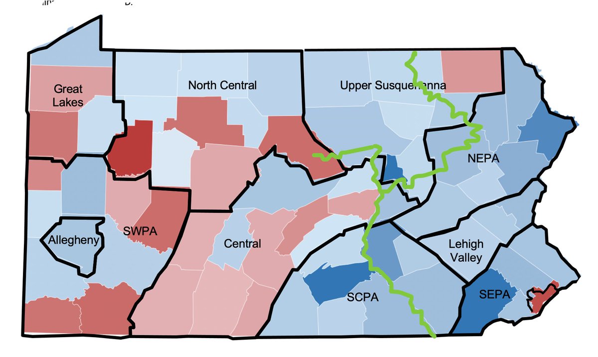
In part I wanted to capture the ways river towns along the Susquehanna River in central & northern PA—which tend to be home to colleges, medical ctrs, more young people, more professionals—have an evolving progressive ecosystem that shouldn& #39;t be split arbitrarily across regions
not unrelated https://twitter.com/lara_putnam/status/1327783255270100994">https://twitter.com/lara_putn...
Black Lives Matter protests outside of PA& #39;s largest cities clustered in river towns, along the Susquehanna, Lackawanna, Lackawaxen, Beaver River, & more. #EverythingHasAHistory
... which was not a story of kumbaya togetherness (but also not "outside radicals! riots!") but of local young people stepping forward & feeling their way towards new allies & new kinds of voice, as @fdwilkinson captured here https://www.bloomberg.com/opinion/articles/2020-08-30/black-lives-matter-in-small-town-pennsylvania">https://www.bloomberg.com/opinion/a...
The big picture: Yes the jump in Dem votes in SEPA would have flipped PA even if everything else stood still. But it didn& #39;t. Allegheny (=Pgh suburbs) saw Biden net 38,000 above Clinton. & Trump carried ~13,500 fewer net votes out of each of SCPA, NEPA & Lehigh Valley than in 2016
A different way of thinking about the trends is to group counties by @AmCommPro types instead. Biden gains over Clinton incl. 98,000 net votes in Urban Suburb counties, 46,000 in Exurbs, 24,000 in Middle Suburbs & 18,000 in "College Town" counties (really, greater Harrisburg)
Summing up countywide totals is on the one hand really useful & on the other consistently misleading, if it makes us imagne regions moving in internal unison. Often it& #39;s internal *divisions* that& #39;re powering political dynamics: driving opposing shifts that net out to small change
I love the fact that people are arguing about individual county placement in the replies: yes I am here for discussion of the Berks-Lancaster transit authority! Meanwhile here is the thread w/ @4st8 from like a year (=century) ago that started it all https://twitter.com/lara_putnam/status/1210654631426220033">https://twitter.com/lara_putn...
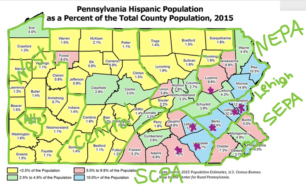
And yes there are lots of overlapping geographies you could point to within PA: like the Philly collar& #39;s collar (aka 222 corridor) where the populations of the cities of Lancaster, York, Lebanon, Allentown, Bethlehem are 1/3-1/2 Hispanic today: and Reading 2/3...
Never assume that county-level vote shifts reflect change driven by the demographic slice the county& #39;s most identified wth. This great article from @JuliaTerruso captures that well, even tho the title [not her fault!] misleads. NEPA/WPA=internally diverse #loaded">https://www.inquirer.com/news/white-working-class-biden-trump-pennsylvania-luzerne-westmoreland-20201111.html #loaded">https://www.inquirer.com/news/whit...
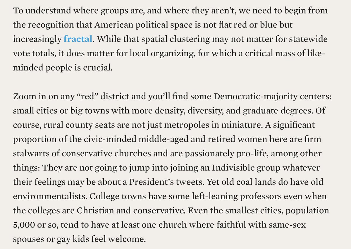
The internal spatial diversity of counties is esp important if you want to understand political engagement as a dynamic process, not treat as black box from which "preferences" emerge. Mental maps matter if we want to understand change over time—& even more if we want to shape it
Back to my regularly scheduled content: obsessive coverage of county/regional political change in Pennsylvania. New must read thread/linked blog https://abs.twimg.com/emoji/v2/... draggable="false" alt="👇" title="Rückhand Zeigefinger nach unten" aria-label="Emoji: Rückhand Zeigefinger nach unten"> https://twitter.com/sixtysixwards/status/1330155232265900035">https://twitter.com/sixtysixw...
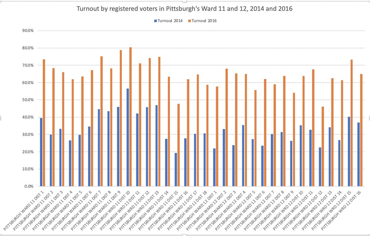
This graph from @sixtysixwards brought me up short: & shocked me into remembering just why Dems& #39; optimism going into Nov 2020, re what turnout in heavily African American districts of big cities was going to look like, was not just some self-deluding blindness to longterm trends
Below is 2014 & 2016 turnout in Pittsburgh& #39;s 12th ward (=Larimer & Lincoln-Lemington) & 11th ward (=East Liberty & Highland Park). Most of 12th ward is majority African American; 11th encompasses wider variation by race, education, SES, %homeowner, & baseline voting rates.
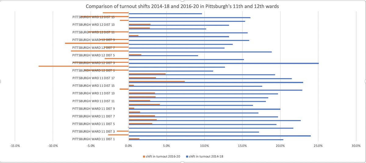
2018 saw a BIG increase in voting versus 2014, very widely shared across these wards. Yes midterm turnout rates had more room to grow than presidential, & yes there was some variation across space. But nothng re 2018 set you up to expect 2020 *declines* in half of these districts
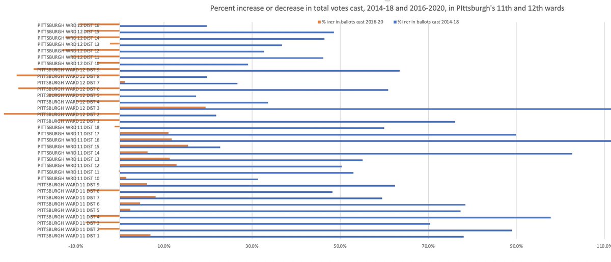
And it isn& #39;t just some artifact of cleaned-up rolls changing registration numbers: here& #39;s the % change in total ballots cast. The blue shows you change from 4 ys earlier as it looked in 2018. The orange shows you change from 4 ys earlier as it looked in 2020.
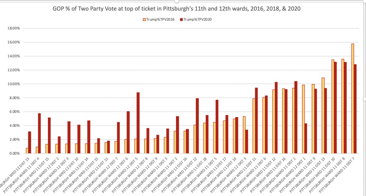
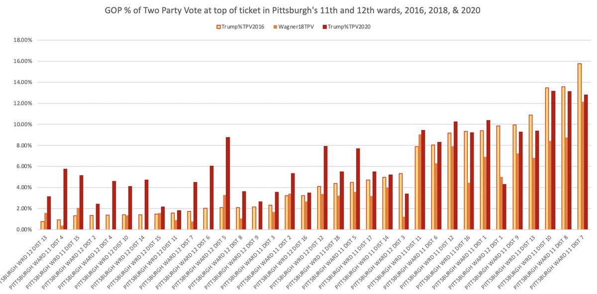
Meanwhile, trends in vote choice here echo those reported fr similar parts of Philly & elsewhere. OTOH: Trump& #39;s "best" 2016 precincts (=where he got 13-16% of the two-party vote) are the whitest precincts: & they remained Trump& #39;s strongest in 2020. OTOH...
...in all of Trump& #39;s 6 strongest (=whitest) precincts his 2020 %TPV was down slightly fr 2016, while in his 22 weakest 2016 precincts, his 2020 vote share increased, sometimes by a factor of 2 or more. While still remaining merely in the 5-8% range, importantly, !
Again with vote choice, as with turnout, adding in 2018 results complicates any notion of a continuous trend away from Dem voting here. 2018 GOP gov candidate Wagner did worse than 2016 Trump across the board. Which takes some doing, when Trump& #39;16 got ~2-15% in these precincts!
Ok because you should have asked for it, even if you didn& #39;t: here& #39;s 2019 increase in votes cast vs 2015. That is, 2019 was totally in line with 2018& #39;s positive trend of increased voting throughout both wards
As this map shows, those 11th & 12th ward precincts where turnout fell in 2020—a sudden reversal, we now see—were part of a broad pattern in demographically similar parts of the city of Pittsburgh. For maps & breakdown see excellent piece from @ORMorrison https://www.publicsource.org/biden-trump-allegheny-county-pittsburgh-vote-breakdown/">https://www.publicsource.org/biden-tru...
Sometimes when we see demographic groups shift similarly nationwide we assume the drivers must be deep-seated trends. But in this case, voting data from 2018 & 2019 should cause us to be skeptical of such explanations. It really looks like there is a very specific 2020 story here
Askng what changed in 2020 is not about denying the deep ongoing disparities that shape Pgh, whch @brentinmock & do crucial work to show. It& #39;s about asking what shifted in 2020 (pandemic? infodemic?) to make those disparities interact w/elections a new way https://www.bloomberg.com/news/articles/2020-01-30/in-pittsburgh-racism-is-a-health-crisis">https://www.bloomberg.com/news/arti...
Meanwhile across the state—continuing our theme of In Order to Understand Pennsylvania 2020 You Have To Look at Geographic Shifts Below the County Level—this thread on Bucks is must-read https://twitter.com/swarhola/status/1330315320259731458">https://twitter.com/swarhola/...
Really the amazing thing about the 2020 election is how much it looked like... the 2016 election. Worsening polarization? Actually, the opposite. Trump did a tiny bit better in his worst county category, & a tiny bit worse in all the rest. PA as seen through @AmCommPro categories
That stasis itself is pretty amazing, because *both* 2016 and 2018 had seen counties of similar demographic/geographic type shift massively & systematically versus elections 4 ys earlier, with suburban vs rural clusters running in opposite directions
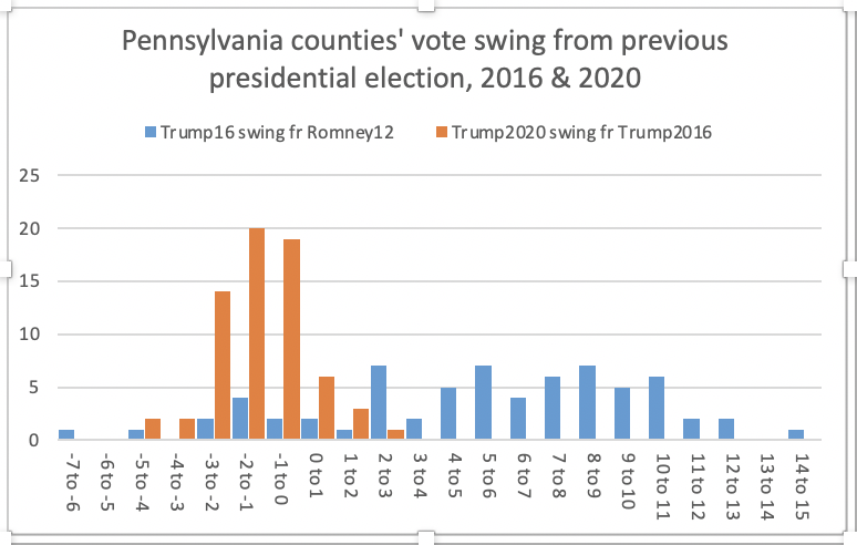
Compare that w the yellow https://abs.twimg.com/emoji/v2/... draggable="false" alt="👇" title="Rückhand Zeigefinger nach unten" aria-label="Emoji: Rückhand Zeigefinger nach unten">, showing vote swing btwn 2016 & & #39;20. Everywhere except Philly it favored Biden. Middle Suburbs & Exurbs, which had moved towards Trump& #39;16 fr Romney& #39;12, now swung towards Biden compared w Trump& #39;16. No category saw a median county swing greater than 3pts
And it& #39;s not just that taking the median of counties somehow hides more diversity of movement. In eg Western PA counties, partisan trends that had been underway for decades were accelerated by Trump in 2016: & then screeched to a halt (or very slightly reversed) in 2020
You could say well Trump maxed out his electorate in 2016 & then thngs stood still: but that& #39;s not the case. The median PA county in 2020 saw a 15% increase in total votes cast for Trump vs 2016. & a 20% increase in votes for Biden over Clinton. That& #39;s alot of change w/no change!
Wait, here& #39;s another way of showing you how crazy little county-level topline change 2020 saw. In 2016, *49* (of 67) PA counties swung more than 3 pts from the previous presidential election. In 2020, only 4 of 67 did.
Again, these are county top-lines. So if rural-suburban-urban polarization was *increasing* in PA in 2020, it was no longer happening at the level of Philly collar & Allegheny vs the rest. It was happening at the level of Greensburg surrounds vs Westmoreland& #39;s outer townships
Divergent trends by density at the sub-county level were on display in municipal elections in PA in 2019, so it& #39;s plausible they would have continued into 2020 https://twitter.com/lara_putnam/status/1202588589407768576">https://twitter.com/lara_putn...
The cultural/political divides *within* rural PA counties were also on display this June, when young people in big town after town stepped forward to organize racial justice protests: bringing both unexpected support & few-but-loud&armed counterprotestors https://twitter.com/lara_putnam/status/1277812737410772992">https://twitter.com/lara_putn...
IANAM (I Am Not A Mapper) so we& #39;ll have to wait for @4st8 & @MikeJohnsonPA& #39;s 2016-20 precinct-level change maps to know. But it& #39;s what we saw in 2018 vs 2014 in some of PA& #39;s Northern Tier: county seats got bluer, outskirts redder, & county totals shifted 1-2 pts D https://abs.twimg.com/emoji/v2/... draggable="false" alt="👇" title="Rückhand Zeigefinger nach unten" aria-label="Emoji: Rückhand Zeigefinger nach unten"> @JMilesColeman
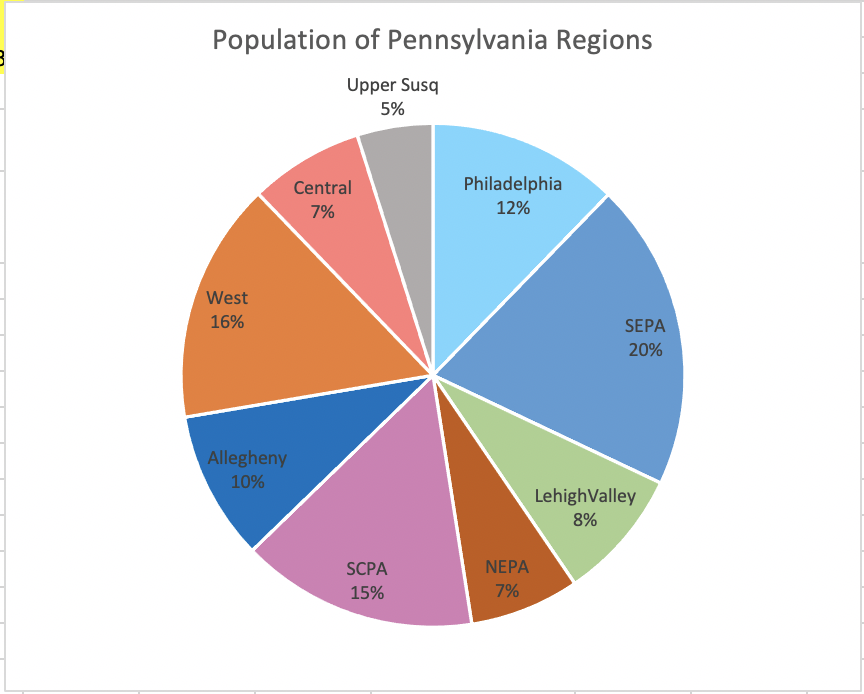
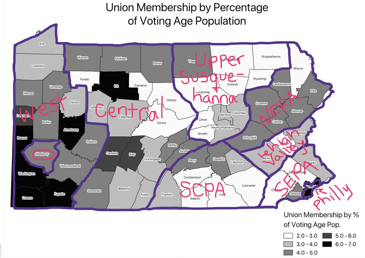
Speaking of that chunk of the norther tier, you may recall that this thread started (what, years ago?) by introducing this  https://abs.twimg.com/emoji/v2/... draggable="false" alt="👇" title="Rückhand Zeigefinger nach unten" aria-label="Emoji: Rückhand Zeigefinger nach unten">proposed breakdown of PA regions, & a discussion of why I think aggregating in this way to track political processes, & political change, makes sense
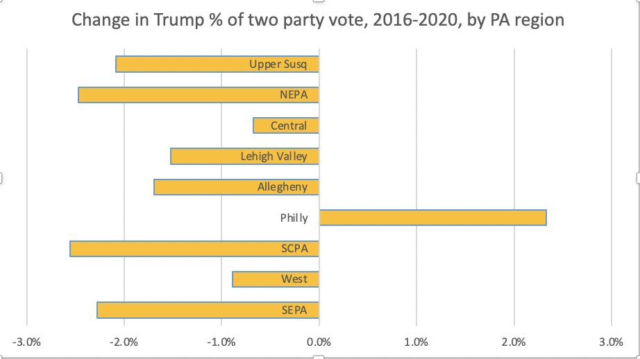
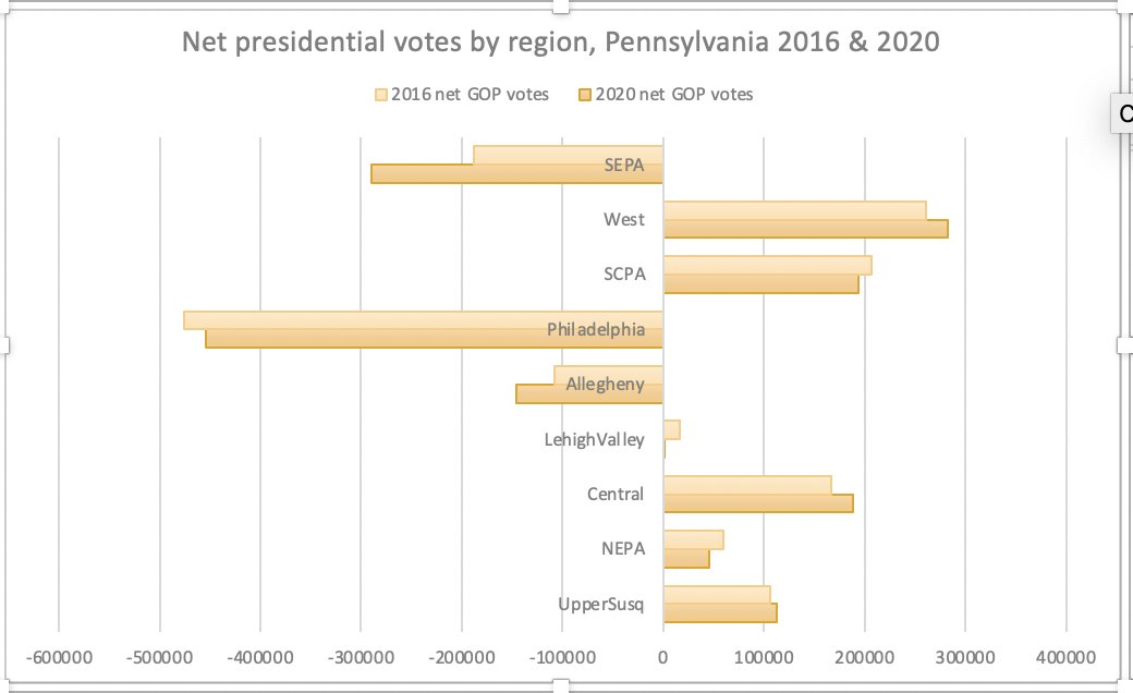
I also included this chart of net votes by PA region in 2016 & 2020, which makes clear why the headline explanations for Biden/Harris flipping the state have all focused on SEPA, Philly, and the Pittsburgh suburbs. But:
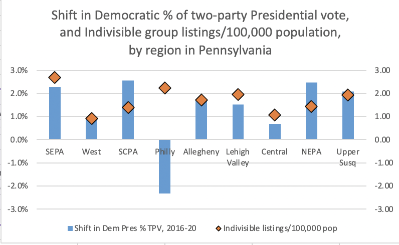
If what you want to know instead is what kinds of change are happening where, a different headline emerges. SCPA & NEPA saw the largest shifts away from Trump, with SEPA and Upper Susquehanna close behind. Allegheny in contrast shifted only slightly more than the Lehigh Valley

 Read on Twitter
 )" title="Coming soon: some thoughts on PA regions & voting trends (mumbled about this earlier with @4st8 but it& #39;s really happening now: New Regionshttps://abs.twimg.com/emoji/v2/... draggable="false" alt="👀" title="Augen" aria-label="Emoji: Augen">)" class="img-responsive" style="max-width:100%;"/>






 , showing vote swing btwn 2016 & & #39;20. Everywhere except Philly it favored Biden. Middle Suburbs & Exurbs, which had moved towards Trump& #39;16 fr Romney& #39;12, now swung towards Biden compared w Trump& #39;16. No category saw a median county swing greater than 3pts" title="Compare that w the yellowhttps://abs.twimg.com/emoji/v2/... draggable="false" alt="👇" title="Rückhand Zeigefinger nach unten" aria-label="Emoji: Rückhand Zeigefinger nach unten">, showing vote swing btwn 2016 & & #39;20. Everywhere except Philly it favored Biden. Middle Suburbs & Exurbs, which had moved towards Trump& #39;16 fr Romney& #39;12, now swung towards Biden compared w Trump& #39;16. No category saw a median county swing greater than 3pts" class="img-responsive" style="max-width:100%;"/>

 @JMilesColeman" title="IANAM (I Am Not A Mapper) so we& #39;ll have to wait for @4st8 & @MikeJohnsonPA& #39;s 2016-20 precinct-level change maps to know. But it& #39;s what we saw in 2018 vs 2014 in some of PA& #39;s Northern Tier: county seats got bluer, outskirts redder, & county totals shifted 1-2 pts Dhttps://abs.twimg.com/emoji/v2/... draggable="false" alt="👇" title="Rückhand Zeigefinger nach unten" aria-label="Emoji: Rückhand Zeigefinger nach unten"> @JMilesColeman" class="img-responsive" style="max-width:100%;"/>
 proposed breakdown of PA regions, & a discussion of why I think aggregating in this way to track political processes, & political change, makes sense" title="Speaking of that chunk of the norther tier, you may recall that this thread started (what, years ago?) by introducing this https://abs.twimg.com/emoji/v2/... draggable="false" alt="👇" title="Rückhand Zeigefinger nach unten" aria-label="Emoji: Rückhand Zeigefinger nach unten">proposed breakdown of PA regions, & a discussion of why I think aggregating in this way to track political processes, & political change, makes sense" class="img-responsive" style="max-width:100%;"/>

