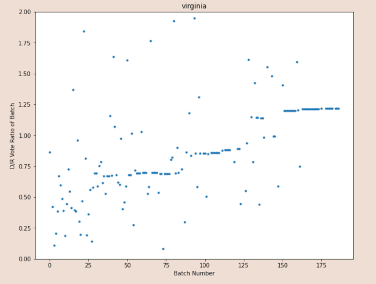
Making an attempt to explain to the layman why this chart is so consequential. What you are looking at is:
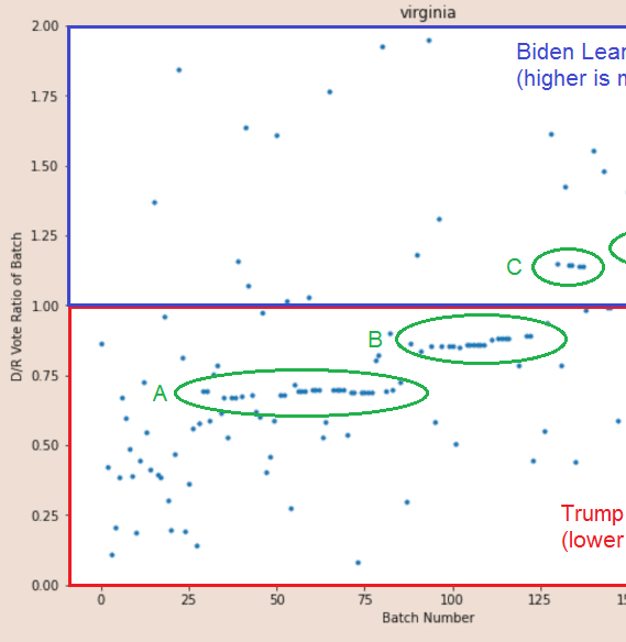
BATCHES of votes (dots)
in the order they were recorded, left to right (x-axis)
placed high or low on y-axis based on D or R lean
BATCHES of votes (dots)
in the order they were recorded, left to right (x-axis)
placed high or low on y-axis based on D or R lean
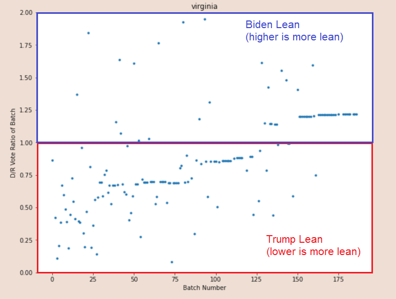
Here& #39;s the first thing to understand:
Batches in the red box went for Trump
Batches in the blue box went for Biden
Notice how few batches before the very end went for Biden!
Batches in the red box went for Trump
Batches in the blue box went for Biden
Notice how few batches before the very end went for Biden!
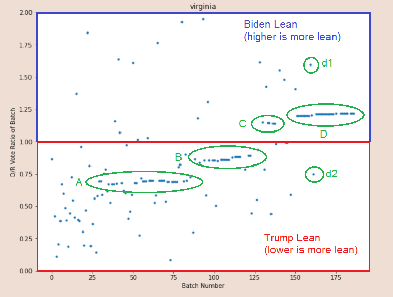
I& #39;ve marked here the characteristic line data structures of "Central Absentee Precinct" (early + mail/absentee) returns drawn out by the chart and named them.
The structures A, B, (maybe C) and D are a big problem, because it& #39;s discontinuous TWICE.
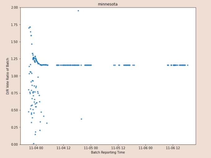
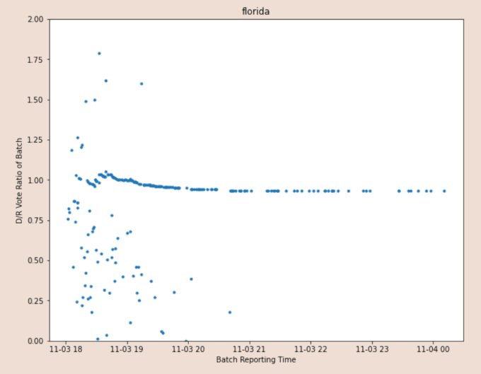
Untampered absentee returns look like Minnesota& #39;s or Florida& #39;s; they settle quickly into a straight line - mixed mail averages out single-precinct votes to produce a fairly constant value.
Untampered absentee returns look like Minnesota& #39;s or Florida& #39;s; they settle quickly into a straight line - mixed mail averages out single-precinct votes to produce a fairly constant value.
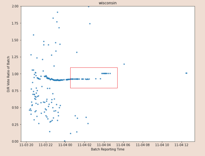
Let& #39;s return to our marked-up VA chart and compare it to Wisconsin and what happened with a known anomaly (169,000 ballots shipped in at 4AM CST). The discontinuity in WI vs the A->B transition in VA, and the amount + direction of the jump are extremely similar.
Wisconsin pre-tamper absentee line settles in at about 0.9, which would be Trump winning them with ~55% of the vote.
Post-tamper it settles in just over 1.0, slightly in favor of Biden.
Post-tamper it settles in just over 1.0, slightly in favor of Biden.
But Virginia& #39;s early+absentee returns line settles in far more pro-Trump than Wisconsin& #39;s: Trump is running at least 60% of the vote before the jump.
And even after the jump he& #39;s still winning more than half - the tamper failed. More was needed, the Trump vote was so strong.
And even after the jump he& #39;s still winning more than half - the tamper failed. More was needed, the Trump vote was so strong.
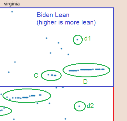
Now let& #39;s take a closer look at C/D.
C may be a coincidental grouping or it may be calibration testing for D.
Other than d1 and d2, D is nearly constant.
C may be a coincidental grouping or it may be calibration testing for D.
Other than d1 and d2, D is nearly constant.
What& #39;s up with d1 and d2? Are they noise, or something else?
They come after all other "noise" (scattered dots forming no shape). And they appear to be precisely equidistant from the position at the end of the first part of D.
They come after all other "noise" (scattered dots forming no shape). And they appear to be precisely equidistant from the position at the end of the first part of D.
Now let& #39;s examine D further.
D has a set of dots with the exact same vote ratio, then one SLIGHTLY above that to terminate the first series.
Then the second series has the same exact pattern.
The third was the finisher and no post-adjustment needed was (goal achieved).
D has a set of dots with the exact same vote ratio, then one SLIGHTLY above that to terminate the first series.
Then the second series has the same exact pattern.
The third was the finisher and no post-adjustment needed was (goal achieved).
I& #39;ve cut the chart into pre-D and post-D so you can see how dramatic and immediate the change from chaotic patterns to total order was.
The odds of structure D occurring in nature are effectively zero. That is artificially induced if anything ever was.
The odds of structure D occurring in nature are effectively zero. That is artificially induced if anything ever was.
Moreover, the vertical position of D is an extreme outlier.
Here is the entire set of batches that were more Biden-leaning than the D set. Count & #39;em: 13 of 150, less than 10% of all returns, were more Democrat than D.
Here is the entire set of batches that were more Biden-leaning than the D set. Count & #39;em: 13 of 150, less than 10% of all returns, were more Democrat than D.
The structure labeled "D" is really important to understand.
Before it shows up, Virginia& #39;s election was a crushing and overwhelming GOP victory.
And D *CANNOT* be authentic. Cannot.
Before it shows up, Virginia& #39;s election was a crushing and overwhelming GOP victory.
And D *CANNOT* be authentic. Cannot.
@threadreaderapp unroll

 Read on Twitter