Map Time!
So you’ve seen a lot of maps in the last few days. What maps work, which ones don’t, and how to think about them? Time for a thread ! /1
So you’ve seen a lot of maps in the last few days. What maps work, which ones don’t, and how to think about them? Time for a thread ! /1
To begin, let’s go through some data visualization basics. Data visualization, is the use of graphical metaphors to represent quantities. The fact that visualization are metaphors, however, is often forgotten. 2/
Think of a scatter plot showing age vs income. Age is measured in years. Income in dollars, but in a scatter plot they are both represented in inches (a spatial metaphor!). 3/
This tells us that when it comes to data visualization there are a few metaphors at our disposal. Spatial metaphors (x,y,z), chromatic metaphors (colors, transparency), size, shapes, etc. 4/
This makes maps very constrained. Geographies have a place (x,y), a shape and a size. So if u want to honor those constraints, you are stuck with color as you only degree of freedom. Still, there is a lot that we can do here. 5/
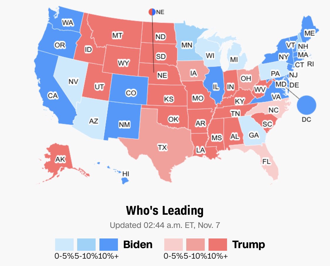
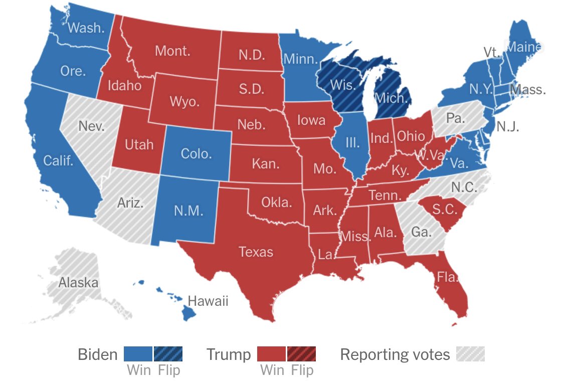
Let’s critique a straight up election map. A map like this can be misleading in two accounts. The first one is variations in population density (people vote, not land).
*Although the US is built on the idea of double majority representing people & land (eg house & senate).
*Although the US is built on the idea of double majority representing people & land (eg house & senate).
The second problem is that states & counties are not purely red or blue. Texas has quite a few Democrat voters, and New Hampshire is not a strange land for Republicans. /7
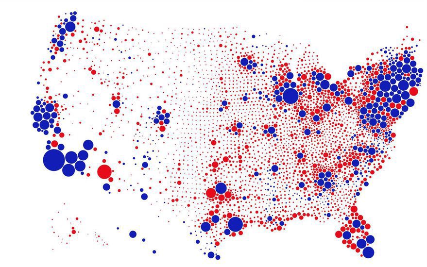
A popular map trying to correct the first problem is this one. But this map is far from perfect either. On the one hand, it still binary. In LA county nearly a million people voted Republican, but the map doesn’t show that. /8
The other problem is that by keeping the position of each county, it dilutes red dots in the mountain region of the US. Those dots added together would have a higher visual impact that diluted on the white canvas (our eyes are drawn to the dense areas of the map). /9
So these two maps are quite complementary. The state map is biased towards the red, the county map is better at showing populations, but by using a binary (all red or all blue) representation, and by diluting red dots, it biases blue. /10
One improvement would be to split each county on a map like this into two circles. One red, and one blue. Showing votes rather than winners (I have not yet seen this version). Still, this would not fix the dilution problem. For that, we need to relax the geographic constrain./11
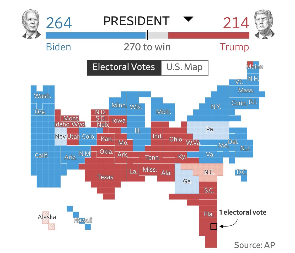
Once you relax geography you get weird looking maps. This Minecraft style map from the WSJ using one square per electoral college vote is good at condensing the less populated mountain region of the US. Still it is an all red or blue map. /12
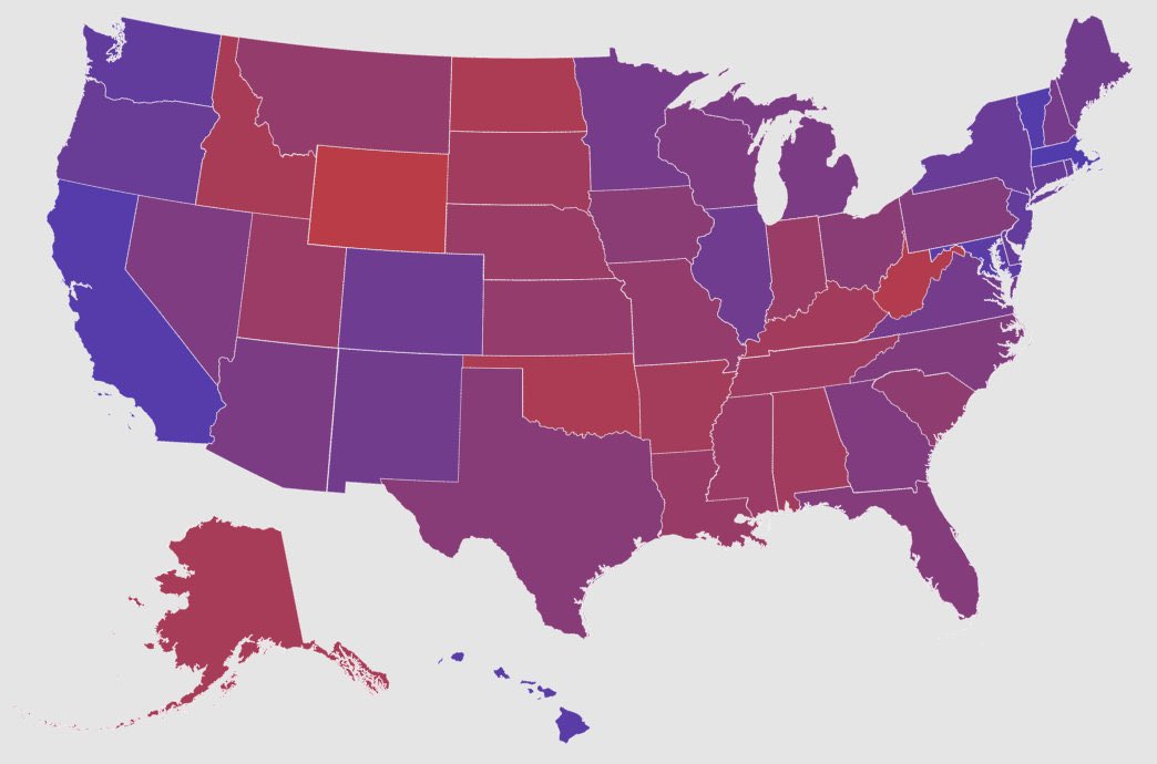
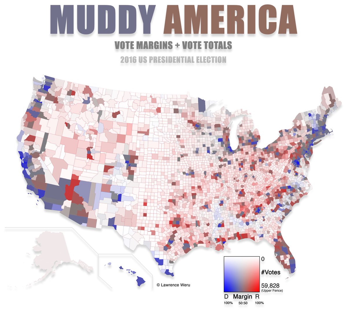
That’s why some advocate for purple, or grey maps, which use diverging color scales. Technically, in dataviz you use a diverging color scale when u are trying to show distance from a middle point (50% in this case). I would advocate here for a neutral white, black, or grey. / 13
Comparing shades of purple is nearly impossible. But a white with a hint of red or blue is more clearly distinguishable. /14
This all to show that maps can get better, but improvements are not perfection. Also, the visual representation depends on what you want to show. If you are counting the color of electoral college votes, you cannot do much better than the WSJ. /15
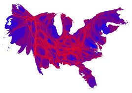
If you want to show people votes, then you need to avoid a straight up red blue divide, by either giving two separate circles to each voting population or using a diverging scale. You also want to condense the mountain region too (like in this 2016 density equalizing map) /16
Making a good map is difficult (every designer knows that you need to iterate multiple times to get a slick design). But the good news is that if you succeed in this challenge you will have something that everyone will want to see 4 years from today. /END

 Read on Twitter