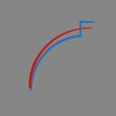
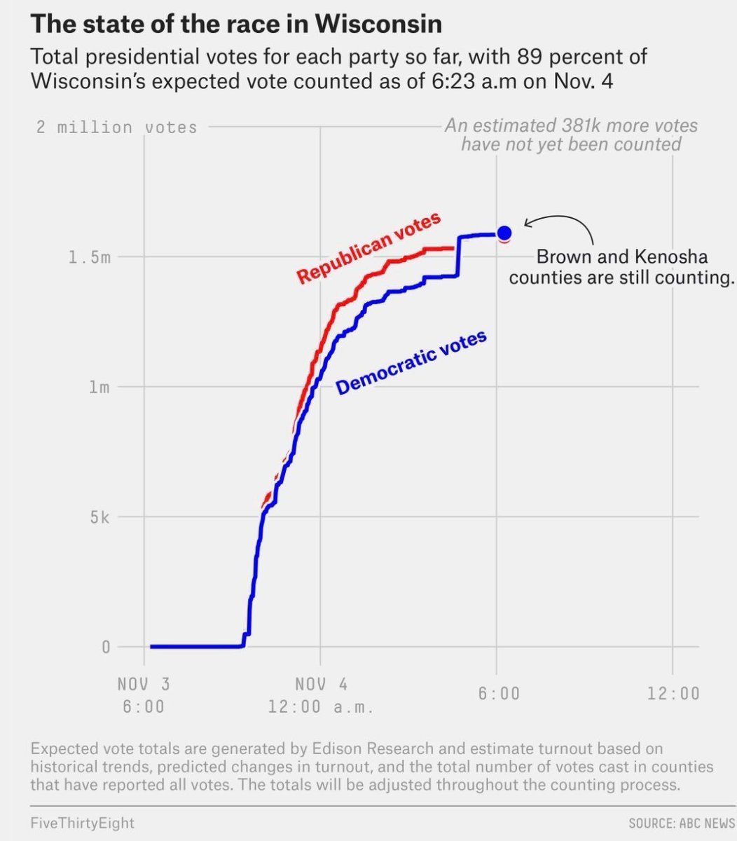
I& #39;ve started to see this image crop up in GOP circles as a shorthand for the election fraud that they claim took place in Wisconsin and other states. This is the FiveThirtyEight chart it& #39;s a play on. See if you can spot the difference!
"The only thing we did on Election Day was tell them how many votes they needed on election night," reads one viral post with 40k likes and 18k retweets. A Federalist piece that& #39;s gone even more viral describes the FiveThirtyEight chart this way:
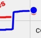
But look at the difference between the chart and the shorthand logo BASED on the chart! In the one that& #39;s a shorthand for what Republicans claim happened, the red line continues flat as the blue line jumps above it.
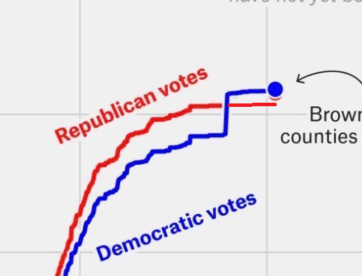
The blue line is in "front" of the red line, so that fact isn& #39;t IMMEDIATELY CLEAR--but if Trump had in fact received no votes in the ballots in question (Milwaukee absentees) the red would poke out the other side, as in this very scientific counterfactual I whipped up in MS Paint
All of which to say that this talking point, which is UBIQUITOUS in "stop the steal" circles, isn& #39;t the kind of dumb that& #39;s based on taking a graph out of context--it& #39;s the kind of dumb that& #39;s based on LOOKING AT ONE EXTREMELY SIMPLE LINE GRAPH AND BEING WRONG ABOUT WHAT IT SAYS.

 Read on Twitter


