What does the demand curve for blockspace look like?
I was able to take some baby pictures of the incipient blockspace market.
 https://abs.twimg.com/emoji/v2/... draggable="false" alt="🧵" title="Thread" aria-label="Emoji: Thread">
 https://abs.twimg.com/emoji/v2/... draggable="false" alt="👇" title="Rückhand Zeigefinger nach unten" aria-label="Emoji: Rückhand Zeigefinger nach unten">
I was able to take some baby pictures of the incipient blockspace market.
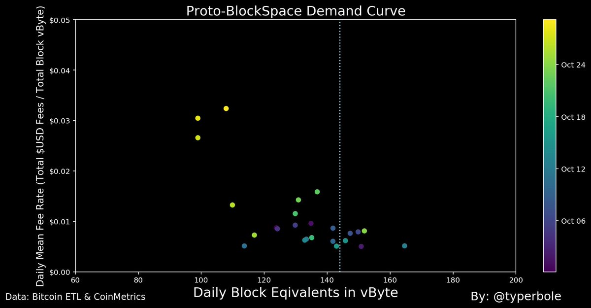
This week’s dramatic decrease in hashpower (close to -20%) has lead to something of a natural experiment occurring in the blockspace market: a bonafide negative supply shock.
A supply shock enables us to observe a the slope of the demand curve!
A supply shock enables us to observe a the slope of the demand curve!
Blockspace supply is inelastic. The protocol adjusts difficulty so that blocks arrive at a target frequency. Blocksize is capped and since miners race to produce blocks there is no incentive to withhold supply to get a better price.
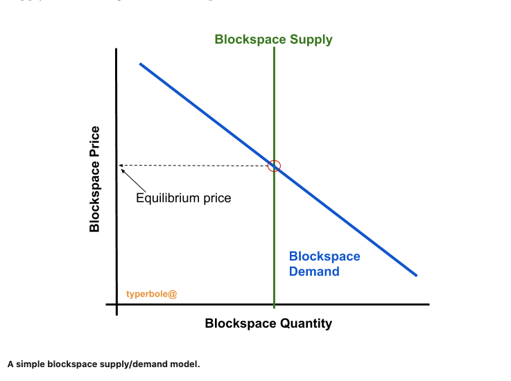
If I were to put my intro to microeconomics skills to use I might draw simple supply/demand diagram for blockspace.
The first image shows a steady state.
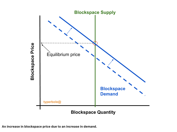
The second image shows a price increase from a shift in demand.
The first image shows a steady state.
The second image shows a price increase from a shift in demand.
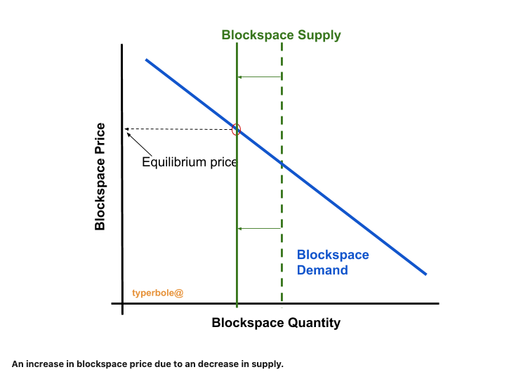
Alternatively, and as was the somewhat special case this week, the blockspace price can increase from a reduction in supply.
When supply of blockspace is reduced (and demand stays the same) we move along the blockspace demand curve to a new equilibrium.
In this case we can observe the demand curve (within the range of prices seen) and actually measure its slope!
In this case we can observe the demand curve (within the range of prices seen) and actually measure its slope!
Since such a supply shock happened this week we can actually try to plot the scatterplot of blockspace quantity vs blockspace price to see if an incipient blockspace demand curve emerges.
The first image in the thread is my attempt to do this.
The first image in the thread is my attempt to do this.
You can read more about this exercise here: https://typerbole.substack.com/p/deriving-a-bitcoin-blockspace-demand">https://typerbole.substack.com/p/derivin...

 Read on Twitter
 https://abs.twimg.com/emoji/v2/... draggable="false" alt="👇" title="Rückhand Zeigefinger nach unten" aria-label="Emoji: Rückhand Zeigefinger nach unten">" title="What does the demand curve for blockspace look like? I was able to take some baby pictures of the incipient blockspace market.https://abs.twimg.com/emoji/v2/... draggable="false" alt="🧵" title="Thread" aria-label="Emoji: Thread">https://abs.twimg.com/emoji/v2/... draggable="false" alt="👇" title="Rückhand Zeigefinger nach unten" aria-label="Emoji: Rückhand Zeigefinger nach unten">" class="img-responsive" style="max-width:100%;"/>


