1. This thread is about a statistical phenomenon called a Simpson& #39;s paradox and how it relates to the #Hydroxychloroquine research that gets so hotly debated.
A more complete version of this analysis will appear in my next book #TheChloroquineWars.
A more complete version of this analysis will appear in my next book #TheChloroquineWars.
2. If you are unfamiliar with Simpson& #39;s paradoxes, you can read up on the basics here. However, the example I present may well teach the concept. https://en.wikipedia.org/wiki/Simpson%27s_paradox">https://en.wikipedia.org/wiki/Simp...
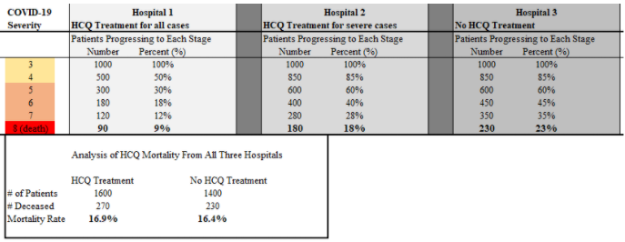
3. Consider three hospitals with different treatment policies. Perhaps the standard of care (SoC) is uniform, for the sake of simplicity, but the hydroxychloroquine (HCQ) treatment policies are different.
4. For the moment, I& #39;m going to ignore macrolides, zinc, or whatever else might be involved. The first hospital treats every patient immediately with HCQ. The second only treats patients with HCQ at an advanced state of severity (5 or higher on the standard ordinal scale).
6. It is quite clear that any patient would rather be treated at Hospital 1 and would least like to be treated in Hospital 3. However, when we collect the data, the patients treated with HCQ were more likely to die! How is this even possible?
7. This is the Simpson& #39;s paradox where a subtrend in data contradicts the primary trend in the data.
8. This situation is like comparing two hitters in baseball, where the better one faced better-than-average pitchers 67% of the time while the other hitter faced better-than-average pitchers 33% of the time. The better hitter might often have the lower batting average.
9. The results can be extreme. In our mock analysis, patients treated early with HCQ suffered a 61% lower mortality rate. However, that substantial risk mitigation gets more than washed away due to the presence of Hospital 2 in the data pool.
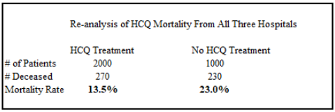
10. This is because the 400 patients there did not get counted among those receiving HCQ treatment. We might try to correct for that difference by moving those 400 patients to the other side of the ledger. After all, those patients went to a hospital with an HCQ treatment plan.
12. Now the HCQ treatment group has a 41% mortality benefit. What happened to the rest of that 61%? The second hospital is still sabotaging the results because its plan is suboptimal.
13. The correct way to view the data would be to throw the second hospital out of the analysis completely! Is this happening in practice?
14. The process of sorting the data becomes extremely hard in practice because we do not always have access to the disaggregated data.
15. Ultimately, the extreme flaws in analysis severely bias several of the retrospective research papers that muddied the waters of the HCQ efficacy debate.
16. Specifically, this seems to be the case for the Borbosa, Magagnoli (VA study), Rosenberg, Giacomelli, Komissarov, Choi, and possibly the Geleris study.
17. When you set those studies aside, most of the remaining studies that claim to be negative either show an advantage for the HCQ arm (but were underpowered in sample size to achieve statistical significance) such as Boulware, Skipper, and Discovery trials.
18. Or they used extremely high doses of HCQ or CQ that very likely poisoned many of the treated patients such as Tang, Solidarity, and Recovery trials.
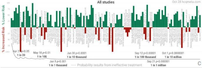
19. What remains are an almost uniformly positive set of over 100 studies on HCQ efficacy (the biased studies listed above are still included here). Last chart here by the excellent team at @CovidAnalysis
@threadreaderapp unroll
I formalized this thread into an article: https://roundingtheearth.substack.com/p/the-chloroquine-wars-part-ix">https://roundingtheearth.substack.com/p/the-chl...

 Read on Twitter


