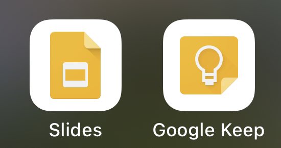
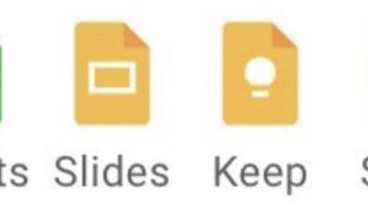
i’ve been a graphic designer my whole life, and i can’t believe i’m saying this, but
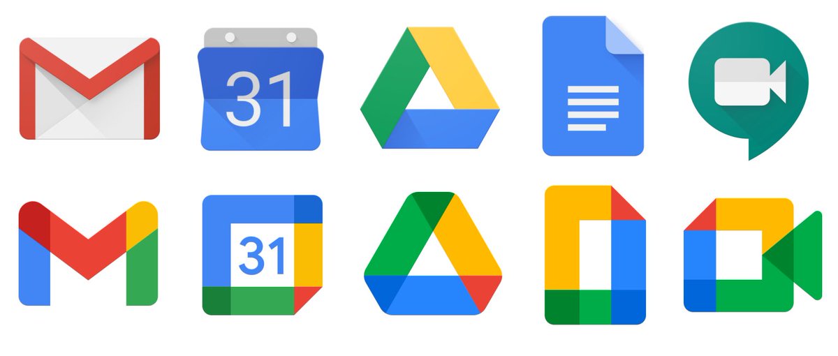
there’s too much negative space
there’s too much negative space
“but now the Google brand has cohesive visual language!!1”
yeah, and i’m gonna get a free migraine trying to squint at my screen all the time
yeah, and i’m gonna get a free migraine trying to squint at my screen all the time
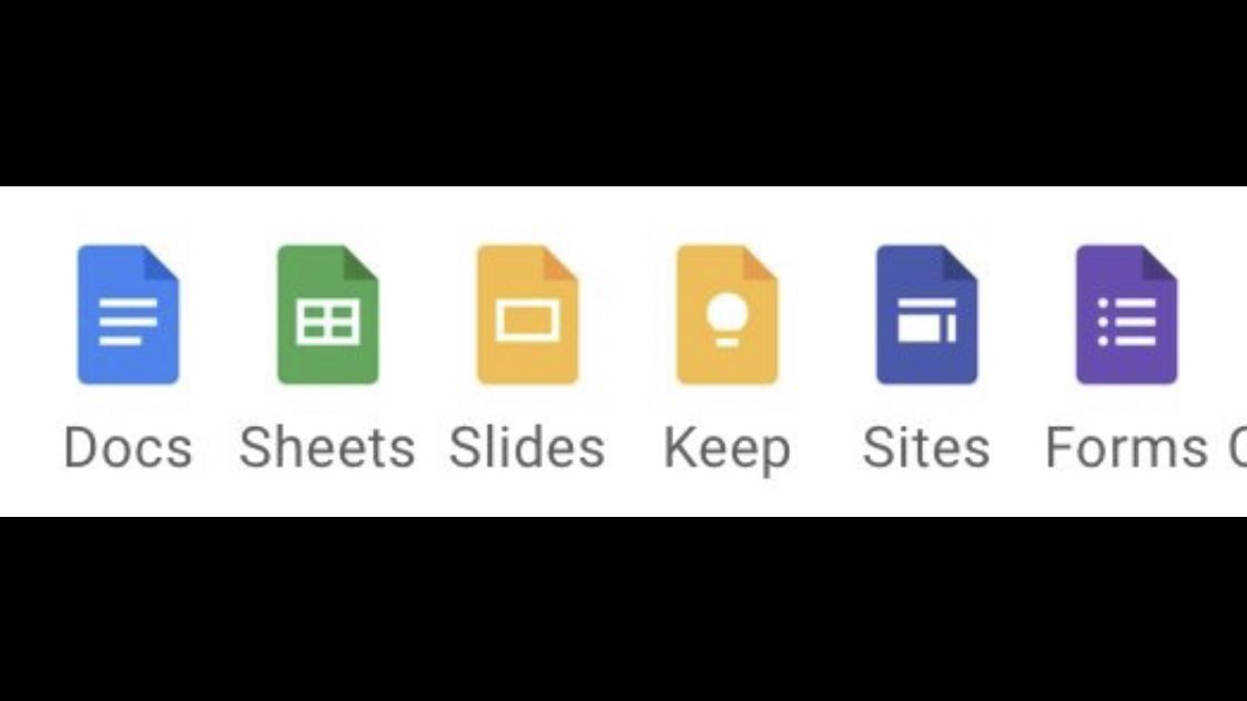
while you’re at it, can you make the documents sizes the same?
and move the folded flap part to the same corner?
and make the white line icons the same?
no? that would make them the exact same logo?
uggghhhh FINE! keep the icons.
whatever.
i don’t care.
and move the folded flap part to the same corner?
and make the white line icons the same?
no? that would make them the exact same logo?
uggghhhh FINE! keep the icons.
whatever.
i don’t care.
I gave two talks for @Adobe this year on Global Accessibility Awareness Day.
One was all about ADHD-friendly software/app product design and neurodiversity inclusion.
Tell @GoogleAccess they should hit me up! https://abs.twimg.com/emoji/v2/... draggable="false" alt="💖" title="Funkelndes Herz" aria-label="Emoji: Funkelndes Herz">
One was all about ADHD-friendly software/app product design and neurodiversity inclusion.
Tell @GoogleAccess they should hit me up!

 Read on Twitter