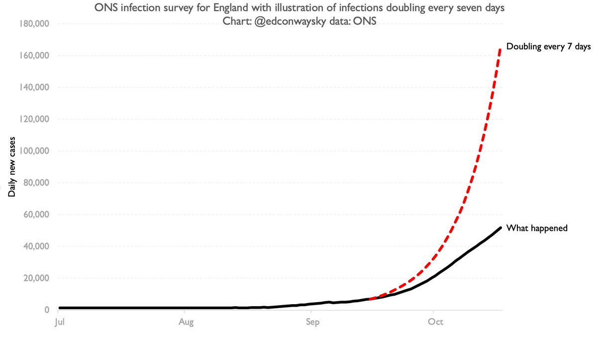
How does one reconcile this with the fact that case growth was actually SLOWER than in that "worst case scenario" (on basis of pretty much every measure inc @ONS survey)?
As @JeremyFarrar admits, communication of this stuff hasn& #39;t been great.
Lots of questions still unanswered. https://twitter.com/jeremyfarrar/status/1322247432080601090">https://twitter.com/jeremyfar...
As @JeremyFarrar admits, communication of this stuff hasn& #39;t been great.
Lots of questions still unanswered. https://twitter.com/jeremyfarrar/status/1322247432080601090">https://twitter.com/jeremyfar...
Here& #39;s that famous illustration from Sep.
The black & grey lines show you what actually transpired.
I’ve included @ONS cases growth for comparison, mapped onto the baseline @uksciencechief used.
How, on the basis of actual case data, can one claim that trajectory was surpassed?
The black & grey lines show you what actually transpired.
I’ve included @ONS cases growth for comparison, mapped onto the baseline @uksciencechief used.
How, on the basis of actual case data, can one claim that trajectory was surpassed?
The point is not to dispute the substance of @JeremyFarrar’s thread. And yes I’m being somewhat pedantic. But these details matter.
What is the point of publishing a “worst-case scenario” and then claiming it’s been surpassed when the numbers show it hasn’t?
Genuine question…
What is the point of publishing a “worst-case scenario” and then claiming it’s been surpassed when the numbers show it hasn’t?
Genuine question…
I suppose it’s poss, as some have posited, that @JeremyFarrar is referring not to the Sept illustration but the unpublished SAGE scenario laid out in July as per @spectator leak. But in that case why refer specifically to the one “outlined in sept”? V odd https://www.spectator.co.uk/article/classified-covid-in-winter-2020-a-worst-case-scenario">https://www.spectator.co.uk/article/c...
This chart is for those who say “Look: the ONS measure of daily new cases is now at 50k, so Sir Patrick Vallance’s illustration was right!”
No. If he’d based his illustration on ONS daily cases (7k on 15 Sept) we’d have hit over 160k cases by mid Oct.
No. If he’d based his illustration on ONS daily cases (7k on 15 Sept) we’d have hit over 160k cases by mid Oct.
Let& #39;s forget that @uksciencechief illustration for a moment and focus instead on the documents released by SAGE yday. There& #39;s something a wee bit fishy in them too. See if you can spot it (clue: paragraph 15): https://assets.publishing.service.gov.uk/government/uploads/system/uploads/attachment_data/file/931029/S0785_SAGE60_200930_SPI-M-O_Consensus_Statement.pdf">https://assets.publishing.service.gov.uk/governmen...
The documents state that SAGE& #39;s "reasonable worst case scenario" was 12-13k daily cases in England throughout Oct. This is strangely low for a worst case scenario. It actually implies a sharp SLOWING in case growth from mid Sep. More or less in line with the growth rate in Spain
Now, this is all ultimately pedantry. But the details matter. If SAGE had published this worst case scenario back in Sept (rather than that Vallance illustration) the accusation would be that they were being too optimistic, not too pessimistic.

 Read on Twitter


