Okay, time to analyze the Final Fantasy XVI art!
I kinda feel very bad because I& #39;m going to be a bit critical, but I really don& #39;t want to be mean.
My issues with it are purely a matter of highly idiosyncratic personal taste, and what I want out of a JRPG.
I kinda feel very bad because I& #39;m going to be a bit critical, but I really don& #39;t want to be mean.
My issues with it are purely a matter of highly idiosyncratic personal taste, and what I want out of a JRPG.
It& #39;s...very medievaly, high fantasy looking. And I am not very in to that these days.
Top get this out there, the actual skill of the artist is not the issue. This is solely about concepts and aesthetics.
It& #39;s just too...modern fantasy. It& #39;s too Game of Thrones. It& #39;s too-
Top get this out there, the actual skill of the artist is not the issue. This is solely about concepts and aesthetics.
It& #39;s just too...modern fantasy. It& #39;s too Game of Thrones. It& #39;s too-
-much like movie concept art, the kind of modern digital painting concept art that everyone does, and it makes me think of something you& #39;d see in a tabletop guidebook/sourcebook.
It& #39;s just...generic. The visual concepts, the style, all of it.
Lots of people will like this.
It& #39;s just...generic. The visual concepts, the style, all of it.
Lots of people will like this.
But it has a lot of traits I just find unappealing, especially right now that GoT, DnD, etc. really kinda have saturated "nerd" circles for so long.
So yeah, my complaint, similar to others I guess, is that it doesn& #39;t look "JRPG enough".
I like Final Fantasy mostly because-
So yeah, my complaint, similar to others I guess, is that it doesn& #39;t look "JRPG enough".
I like Final Fantasy mostly because-
-it& #39;s NOT like standard fantasy. It& #39;s anachronistic, weird, more sci-fi in many cases, etc.
This, and the trailer we& #39;ve seen, looks like more standard fantasy, western RPG aesthetics, just with a touch of certain FF aspects.
This, and the trailer we& #39;ve seen, looks like more standard fantasy, western RPG aesthetics, just with a touch of certain FF aspects.
Maybe this can be examined further if we look at the characters.
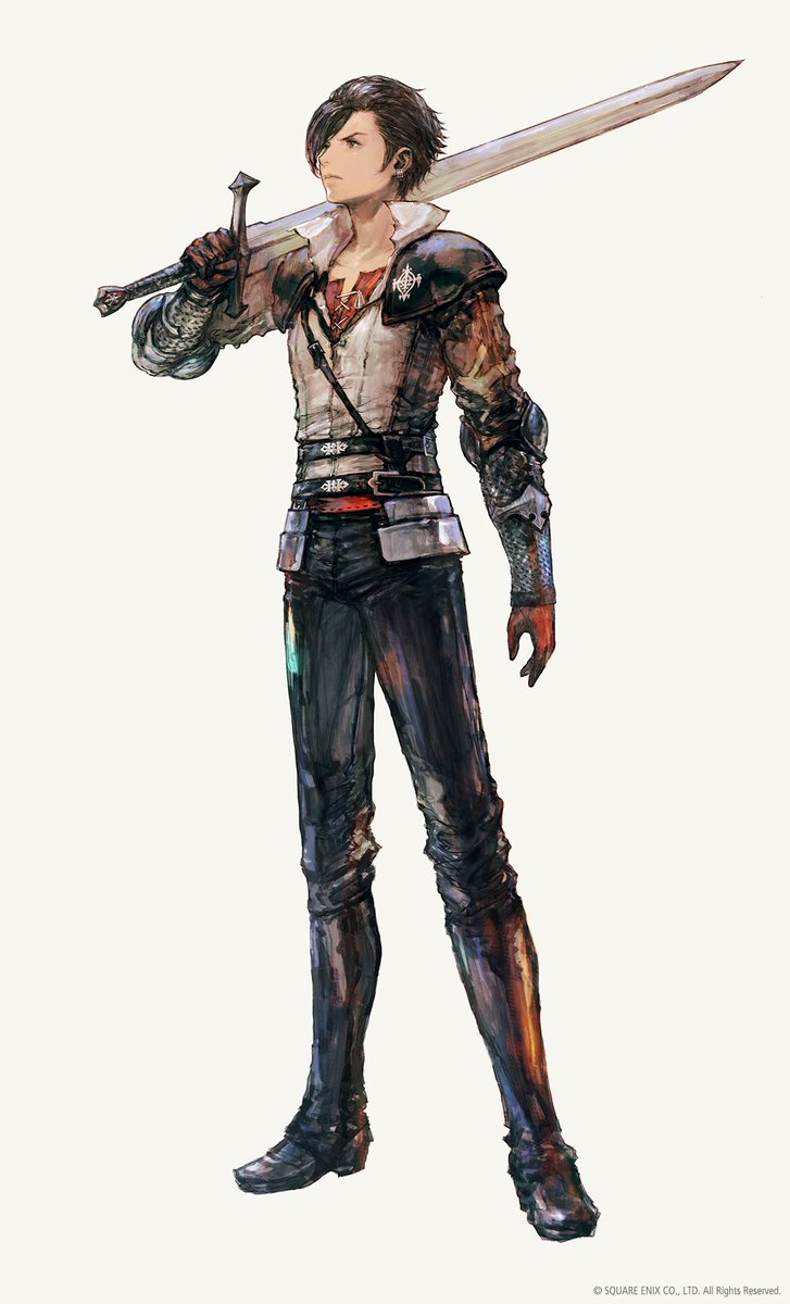
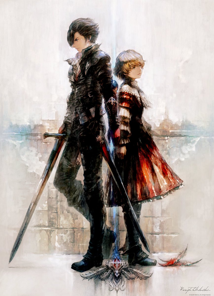
Let& #39;s start with Clive, presumably the main character.
I& #39;ve seen a few people note that this character looks like Squall, but more bland. That seems pretty accurate.
The entire look, from the pauldrons to the-
Let& #39;s start with Clive, presumably the main character.
I& #39;ve seen a few people note that this character looks like Squall, but more bland. That seems pretty accurate.
The entire look, from the pauldrons to the-
-to the collar to the sword is just...generic. It all seems very in line with how a lot of RPG& #39;s and videogame fantasy concept art look these days.
Cloud, Squall, Zidane, Tidus, Vaan, Lightning, Noctis, all looked distinct fro, most anything else in RPG& #39;s at the time.
Cloud, Squall, Zidane, Tidus, Vaan, Lightning, Noctis, all looked distinct fro, most anything else in RPG& #39;s at the time.
But Clive doesn& #39;t, not quite. And I& #39;ve seen a few people say these characters look too "Bravely Default".
That def. makes sense.
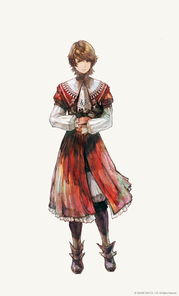
I& #39;ll get in to it more. Now for the next character, Joshua.
This looks a bit better. Probably the best of the three. There are red mage touches-
That def. makes sense.
I& #39;ll get in to it more. Now for the next character, Joshua.
This looks a bit better. Probably the best of the three. There are red mage touches-
-and maybe hints of the scholar, but my god it all looks too "old timey" for me, especially that collar.
A better, more uniquely realized design, but certainly not to my taste.
A better, more uniquely realized design, but certainly not to my taste.
I& #39;ve said it elsewhere.
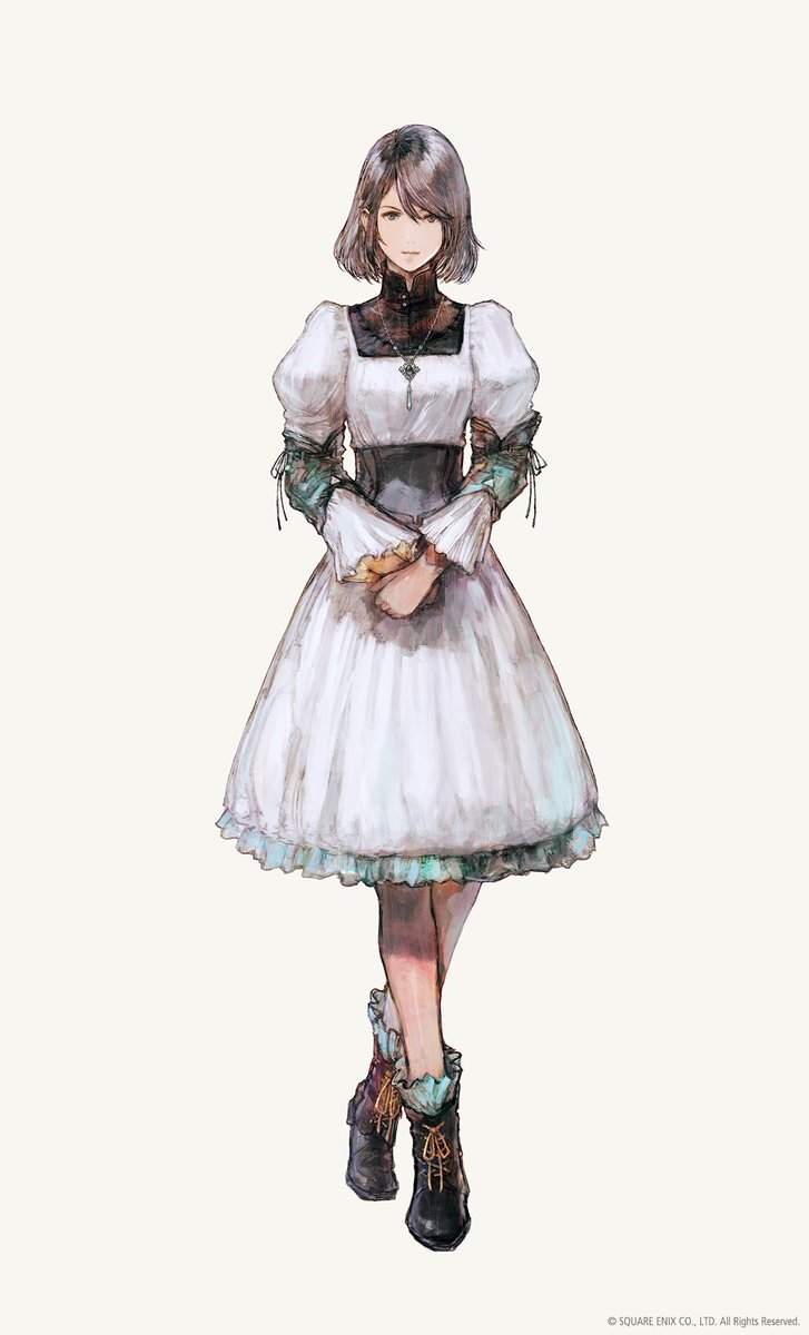
This character looks like a "tradwife".
She& #39;s like a mix between tradwife aestehtics and instagram cottage core-ish quasi-fantasy twee.
Both her and Clive are bland, but one is bland in a way that bores and one is bland in a way that angers.
This character looks like a "tradwife".
She& #39;s like a mix between tradwife aestehtics and instagram cottage core-ish quasi-fantasy twee.
Both her and Clive are bland, but one is bland in a way that bores and one is bland in a way that angers.
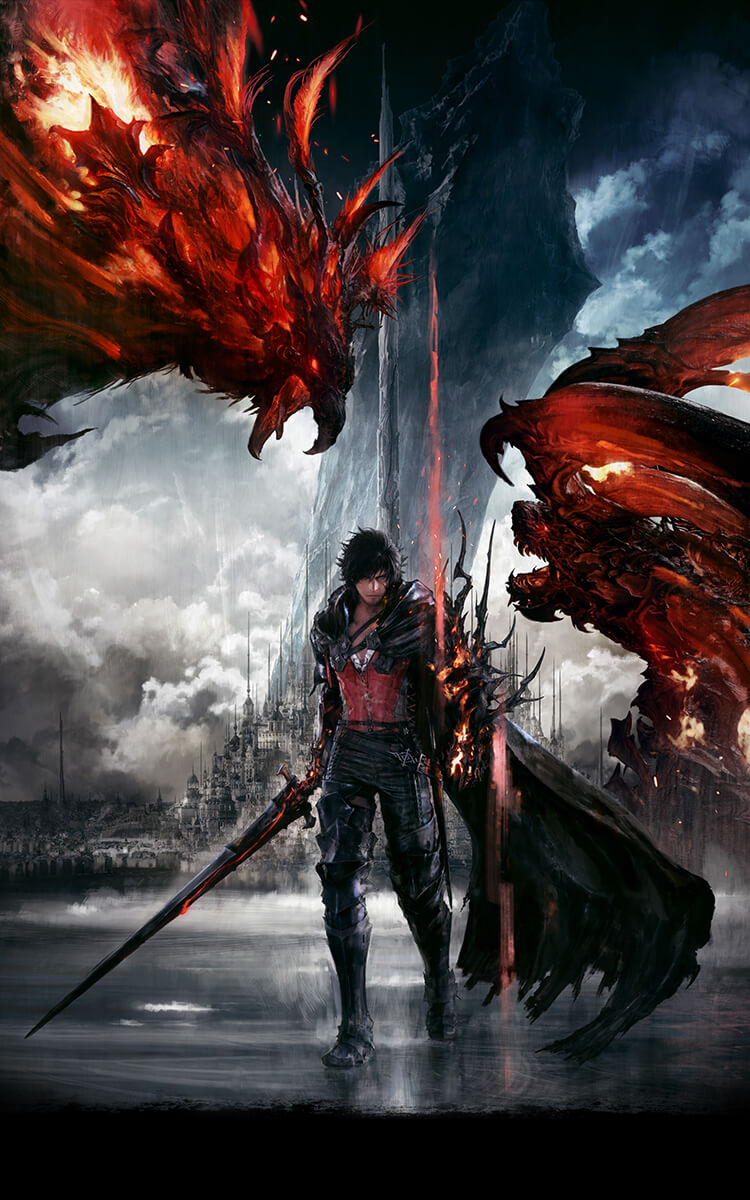
Okay, Clive looks better here solely because he looks more modern. That& #39;s the main reason I like this image better than the others.
It& #39;s a good drawing/painting, all in all.
It& #39;s a good drawing/painting, all in all.
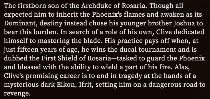
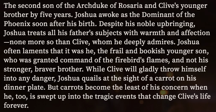
These are the bios from the site for all three; Clive, Joshua, and Jill.
My genuine inclination for not seeming mean to things people like is making it hard for me to express my thoughts on this.
My genuine inclination for not seeming mean to things people like is making it hard for me to express my thoughts on this.
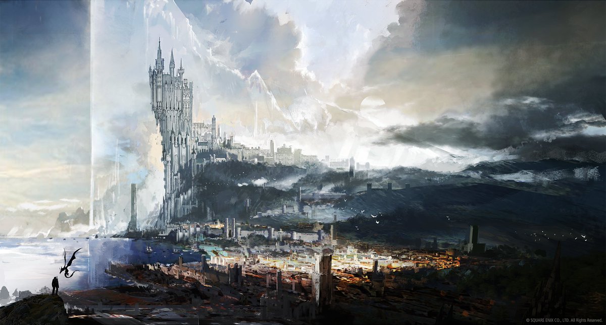
Now for the cities.
Oh boy.
Okay, the one idea I REALLY like, quite a lot, is the giant crystal mountains the cities are built around. It& #39;s a neat idea, aesthetically and conceptually.
But these designs...
Okay, this reminds me of Minas Tirith or something. Again, very-
Oh boy.
Okay, the one idea I REALLY like, quite a lot, is the giant crystal mountains the cities are built around. It& #39;s a neat idea, aesthetically and conceptually.
But these designs...
Okay, this reminds me of Minas Tirith or something. Again, very-
-standard fantasy.
It& #39;s another high fantasy cyclopean mountain city. I& #39;ve just...seen a trillion things like it.
It& #39;s another high fantasy cyclopean mountain city. I& #39;ve just...seen a trillion things like it.
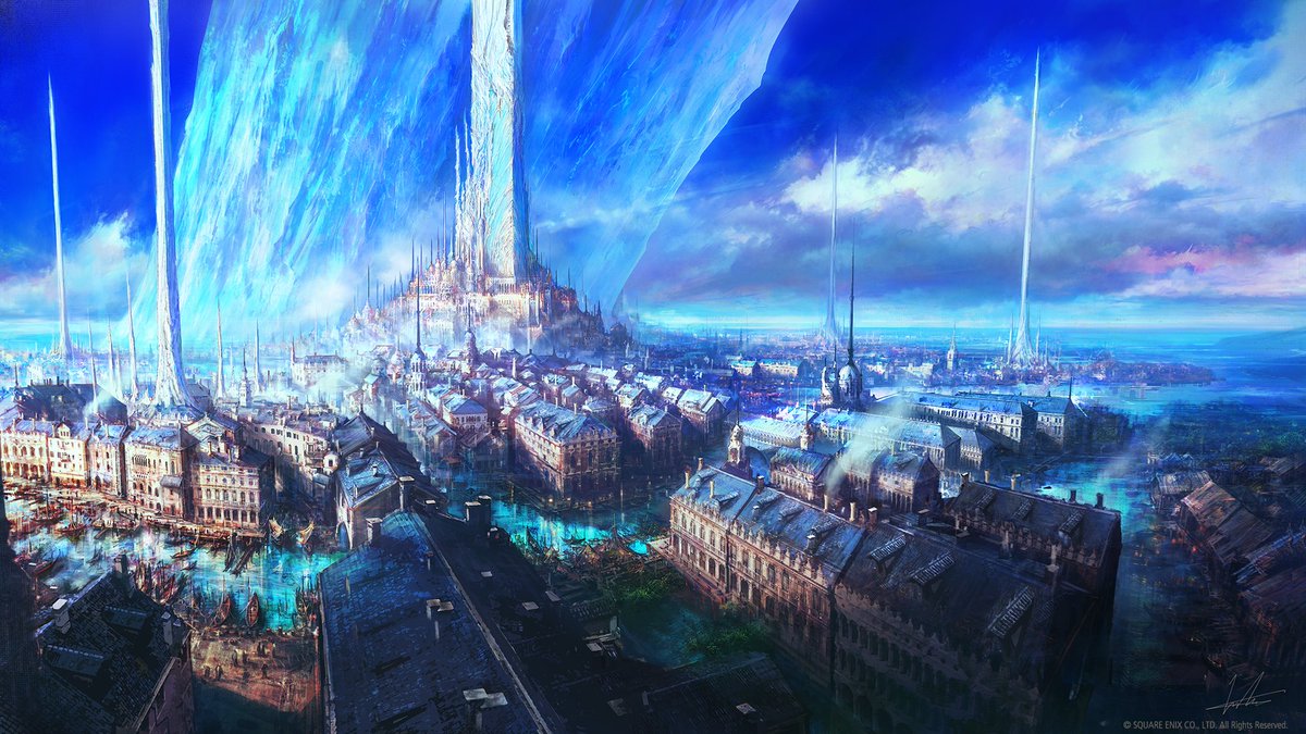
So, I find this kind of aesthetically pleasing on one level. Huge blue crystal, the spires, the colors, etc.
It has a Venice vibe, which is a BIT better than the faux Minas Tirith of the previous image.
but then I look in the background and see those clouds and am-
It has a Venice vibe, which is a BIT better than the faux Minas Tirith of the previous image.
but then I look in the background and see those clouds and am-
-kinda, I dunno, struck by the paperback genericness of it all?
This image has like a weird mix of things I final more appealing and a few things I& #39;m finding really off putting.
It also looks like a Nivbed painting you might have seen in like the aughts.
This image has like a weird mix of things I final more appealing and a few things I& #39;m finding really off putting.
It also looks like a Nivbed painting you might have seen in like the aughts.
Although, I did find this interesting, it& #39;s on the webpage.
Is it meant to be almost metatextual?
Maybe there& #39;s more to this than there seems.
However...
Is it meant to be almost metatextual?
Maybe there& #39;s more to this than there seems.
However...
...I found Square& #39;s initial trailer underwhelming, and it looked like a gritty western RPG fantasy kind of thing, which doesn& #39;t interest me much.
This looks, a BIT better. It& #39;s not "realistic grimy covered in mud" level western fantasy.
But it& #39;s very, very generic to me.
This looks, a BIT better. It& #39;s not "realistic grimy covered in mud" level western fantasy.
But it& #39;s very, very generic to me.
@Nymphomachy earlier said these character designs were not worthy of the brand. I& #39;m with her on that 100%.
A lot of it is just...a mild grab bag of generic 2010& #39;s fantasy aesthetic channeling a handful of other generic fantasy tropes.
A lot of it is just...a mild grab bag of generic 2010& #39;s fantasy aesthetic channeling a handful of other generic fantasy tropes.

 Read on Twitter