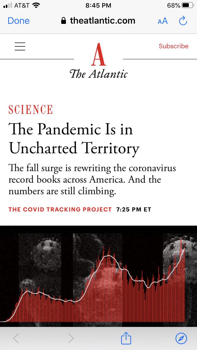
Oh @theatlantic, how I missed you. I feared your panic porn might be spent, but you’re back!
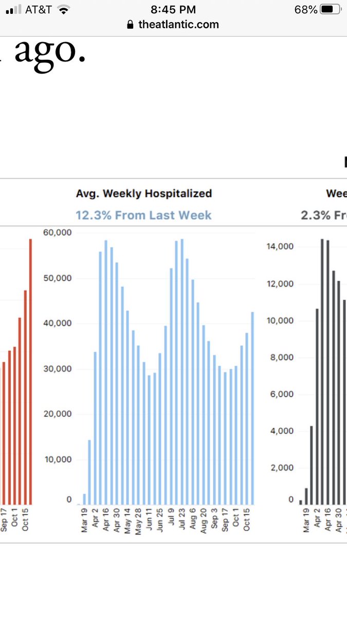
Take a close look at that blue graph. That’s hospitalizations. At first it looks scaaaary.
Look harder. Note the rate of change in each spike...
Take a close look at that blue graph. That’s hospitalizations. At first it looks scaaaary.
Look harder. Note the rate of change in each spike...
And the decline from wave 1 (March/April) to driblet 2 (summer) to mini-driblet 3 (now) is clearly visible. The spikes are getting smaller, not larger.
Remember, too, the summer spike covered a much larger section of the country but topped out with the same number of hospitalizations and far fewer deaths. The current rise covers less populated areas. It has probably already peaked in some. I haven’t looked state by state...
In part because we’ve already seen this movie and know how it goes - sequels are boring - and in part because I’m more focused on real news like schools and suicides. But maybe I’ll poke into North Dakota etc tonight...

 Read on Twitter


