A thought I& #39;ve been having a lot recently - everyone says that waves 2 & 3 of COVID-19 have been markedly different from the first
This is often used to support the idea that COVID-19 is getting less deadly
But is it true? 1/n
This is often used to support the idea that COVID-19 is getting less deadly
But is it true? 1/n
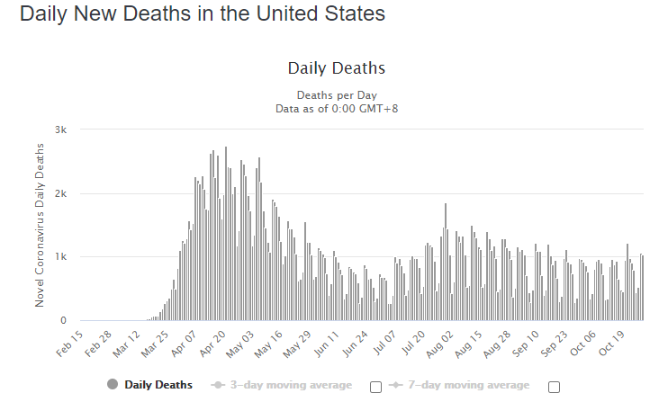
2/n If you look at the cases/deaths data from the US, it certainly seems true. Far MORE confirmed cases of COVID-19 in the second wave, but far FEWER deaths
At first glance, looks like COVID-19 is getting less lethal!
At first glance, looks like COVID-19 is getting less lethal!
3/n Problem is, we know that testing has changed enormously over the year, especially in the US
WAY more people are being tested now than in the earlier months of the year, which makes the cases/deaths equation a bit useless
WAY more people are being tested now than in the earlier months of the year, which makes the cases/deaths equation a bit useless
4/n Think about it this way - even if there had been 3 million cases/week in the US in the first wave, there& #39;s no way we& #39;d know because they weren& #39;t doing that many tests back in March/April!
5/n But something that is quite well reported and recorded at all times is deaths
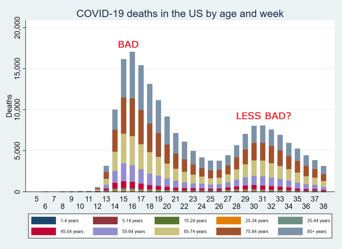
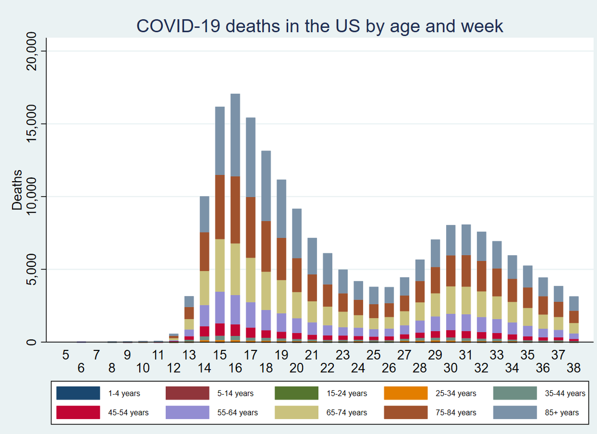
Here& #39;s the breakdown of deaths by age until mid-September in the US
Immediately, something springs out
Here& #39;s the breakdown of deaths by age until mid-September in the US
Immediately, something springs out
6/n Yes, the waves are numerically different, but the PROPORTION of deaths in each age band is...remarkably stable. Lots of deaths in older people, far fewer in the younger groups
7/n But what does that say about cases?
Well, we can actually use these death figures to (VERY crudely) back-calculate an estimate of the number of cases each week in the US by age
Well, we can actually use these death figures to (VERY crudely) back-calculate an estimate of the number of cases each week in the US by age
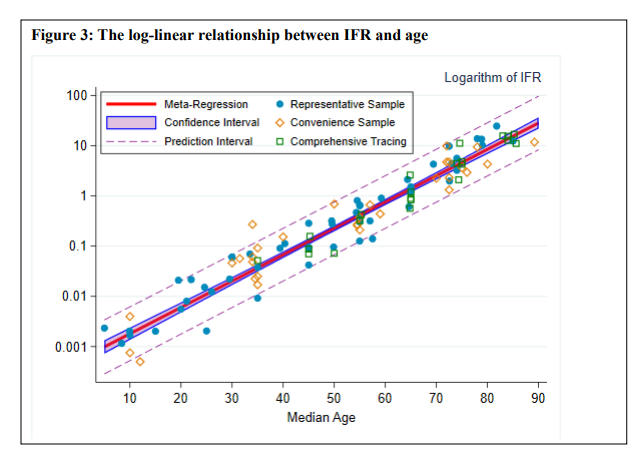
8/n Using our age-stratified IFR paper, we can (again VERY CRUDELY) estimate cases by saying:
IFR = deaths/true cases
=> true cases = deaths/IFR
https://www.medrxiv.org/content/10.1101/2020.07.23.20160895v6">https://www.medrxiv.org/content/1...
IFR = deaths/true cases
=> true cases = deaths/IFR
https://www.medrxiv.org/content/10.1101/2020.07.23.20160895v6">https://www.medrxiv.org/content/1...
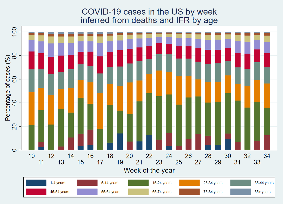
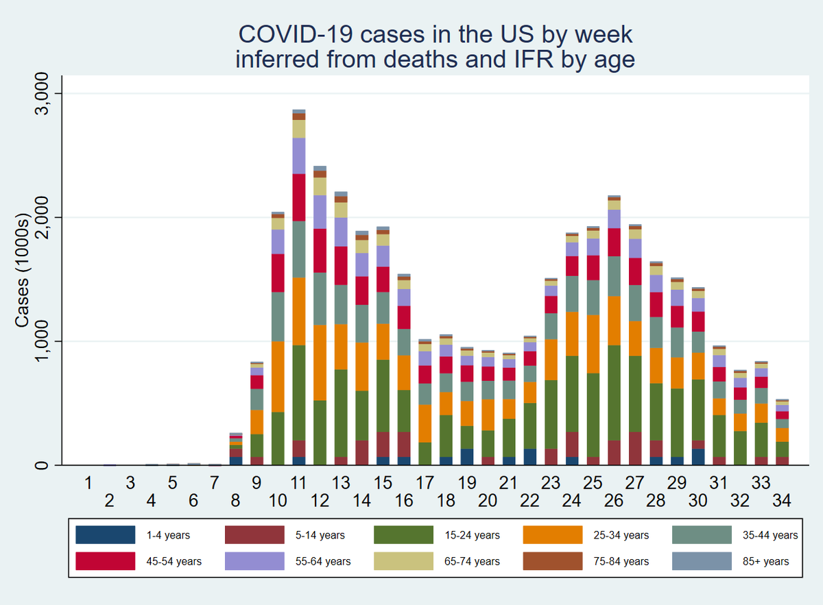
9/n If we plug these deaths and age-stratified IFRs into our equation, and assume that there is a median ~30 day lag between infection and reported death, we end up with a graph that looks like this for cases
Not as different as before!
Not as different as before!
10/n Now, as I& #39;ve repeatedly said, this is VERY CRUDE
For example, deaths are so rare in the under-5s that it& #39;s hard to estimate any realistic number of cases in this age group. It& #39;s likely that they are underrepresented to an extent
For example, deaths are so rare in the under-5s that it& #39;s hard to estimate any realistic number of cases in this age group. It& #39;s likely that they are underrepresented to an extent
11/n But we can go further even than this. What if we graphed the PROPORTION of infections in each age band, inferred from deaths?
It looks something like this
Now the waves barely look different at all
It looks something like this
Now the waves barely look different at all
12/n In particular, if I put the two graphs side-by-side, you can see how a TINY change in the proportion in older people being infected can lead to a HUGE numerical increase in deaths
13/n But broadly speaking, using this (again, VERY CRUDE) method, there appears to be little difference between waves 1 & 2 in the US
It& #39;s simply that our testing changed, not that the disease itself was different
It& #39;s simply that our testing changed, not that the disease itself was different
14/n Indeed, as you can see, the FIRST wave in the US PROBABLY HAD MORE CASES THAN THE SECOND despite having fewer confirmed cases
15/n Interestingly, this also gives us a very crude number of total cases in the US roughly in line with @youyanggu& #39;s modelled estimates, with about 12-15% of the country infected by late September

 Read on Twitter
