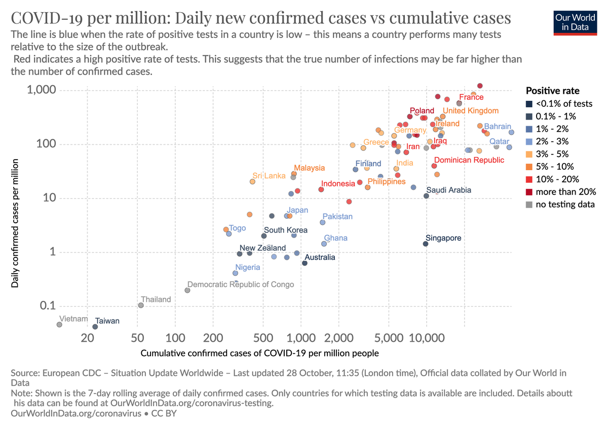
This is to me one of the saddest and most important charts on the pandemic.
Those countries that are doing bad right now (high on the y-axis) are largely the same countries that did worst overall in this pandemic (cumulative case rate until Aug 1 on x-axis).
Those countries that are doing bad right now (high on the y-axis) are largely the same countries that did worst overall in this pandemic (cumulative case rate until Aug 1 on x-axis).
This is a slightly different version of the same chart.
Here the x-axis shows the cumulative case rate up to the present (which means some of the correlation is simply due to current cases counting towards cumulative cases).
And with the color showing the postive rate.
Here the x-axis shows the cumulative case rate up to the present (which means some of the correlation is simply due to current cases counting towards cumulative cases).
And with the color showing the postive rate.
This chart would show us when a country reaches herd immunity.
A country that actually achieves herd immunity will have a high cumulative case rate and the current case rate will be low → it will end up in the bottom right corner (where no country is right now).
A country that actually achieves herd immunity will have a high cumulative case rate and the current case rate will be low → it will end up in the bottom right corner (where no country is right now).
Some responded saying that Israel, Sweden, and South Africa are not in the chart and that these countries are close to herd immunity.
They are included in the chart and they are here.
→ interactive version https://ourworldindata.org/grapher/immunity-rate-daily-new-confirmed-cases-of-covid-19-vs-cumulative-cases?tab=chart&stackMode=absolute&minPopulationFilter=1000000&country=®ion=World">https://ourworldindata.org/grapher/i...
They are included in the chart and they are here.
→ interactive version https://ourworldindata.org/grapher/immunity-rate-daily-new-confirmed-cases-of-covid-19-vs-cumulative-cases?tab=chart&stackMode=absolute&minPopulationFilter=1000000&country=®ion=World">https://ourworldindata.org/grapher/i...
Now some believe that Singapore is close to herd …
No, they are not.
Singapore had an outbreak among migrant workers in May. They now have low cases with the help of excellent testing efforts.
https://en.wikipedia.org/wiki/COVID-19_pandemic_in_Singapore">https://en.wikipedia.org/wiki/COVI...
No, they are not.
Singapore had an outbreak among migrant workers in May. They now have low cases with the help of excellent testing efforts.
https://en.wikipedia.org/wiki/COVID-19_pandemic_in_Singapore">https://en.wikipedia.org/wiki/COVI...

 Read on Twitter


