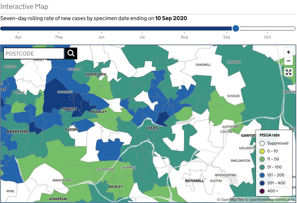
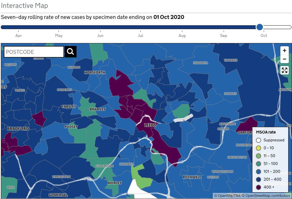
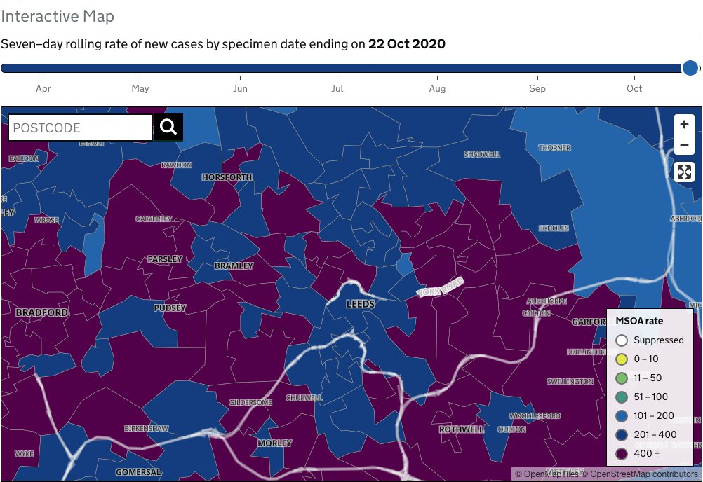
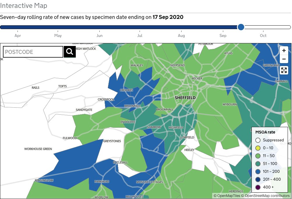
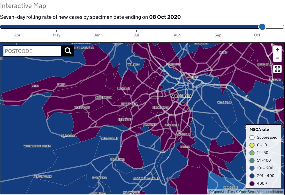
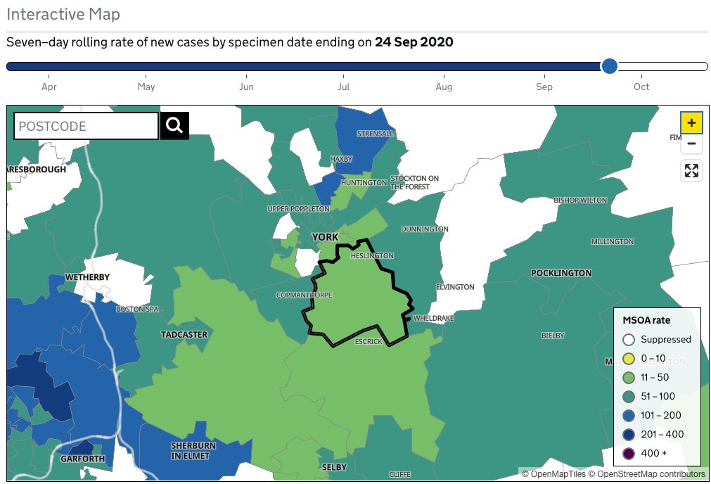
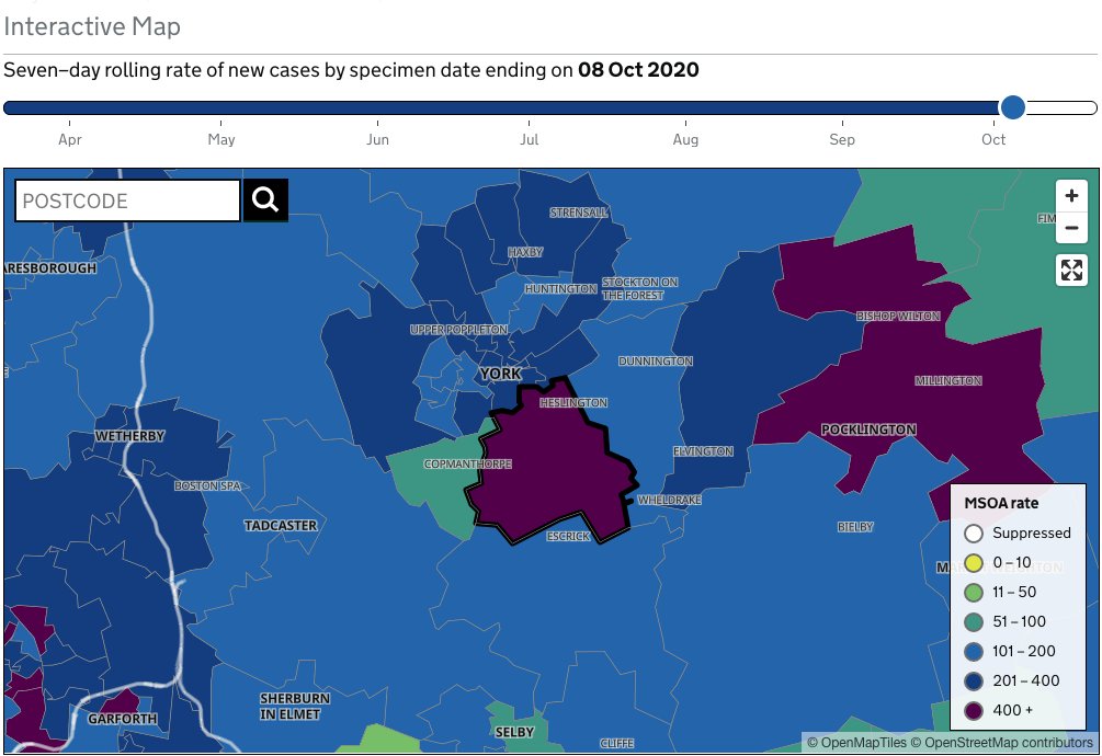
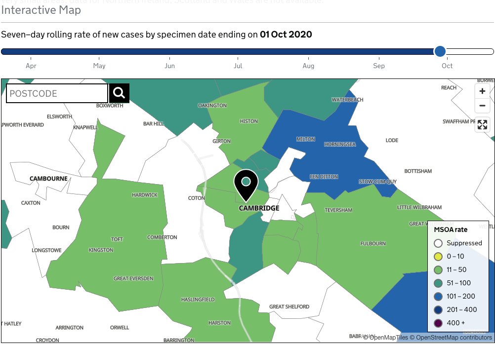
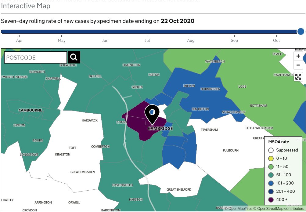
Tracking UK Covid maps ( https://coronavirus-staging.data.gov.uk/details/interactive-map)">https://coronavirus-staging.data.gov.uk/details/i... to White Rose University areas from 3 weeks prior to term offers a striking visual correlation to the renewed outbreak.
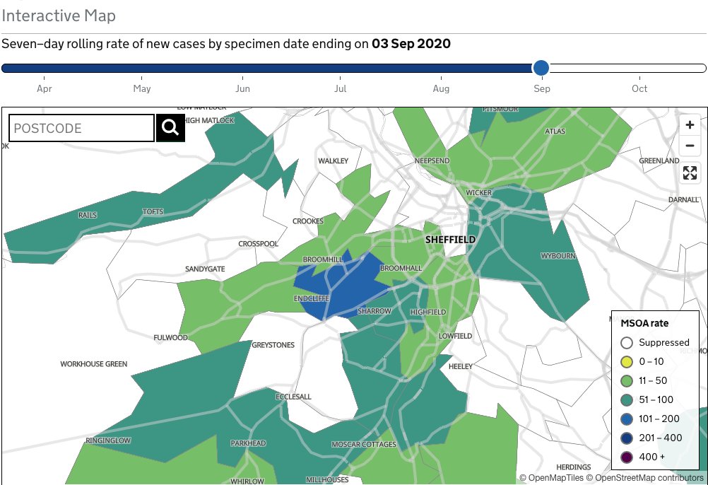
Interesting comparator (rough, obvs) below: Cambridge, where classes stayed online.
U of Leeds weeks -2 to 1:
Interesting comparator (rough, obvs) below: Cambridge, where classes stayed online.
U of Leeds weeks -2 to 1:
This thread from yesterday shows interesting data/time comparisons as well. Seems the 15-24 year-old bracket was ahead of the renewed outbreak curve in many UK university cities.
Does this suggest that universities helped aggravate regional 2nd waves? https://twitter.com/danielhowdon/status/1321167694692032514?s=20">https://twitter.com/danielhow...
Does this suggest that universities helped aggravate regional 2nd waves? https://twitter.com/danielhowdon/status/1321167694692032514?s=20">https://twitter.com/danielhow...

 Read on Twitter