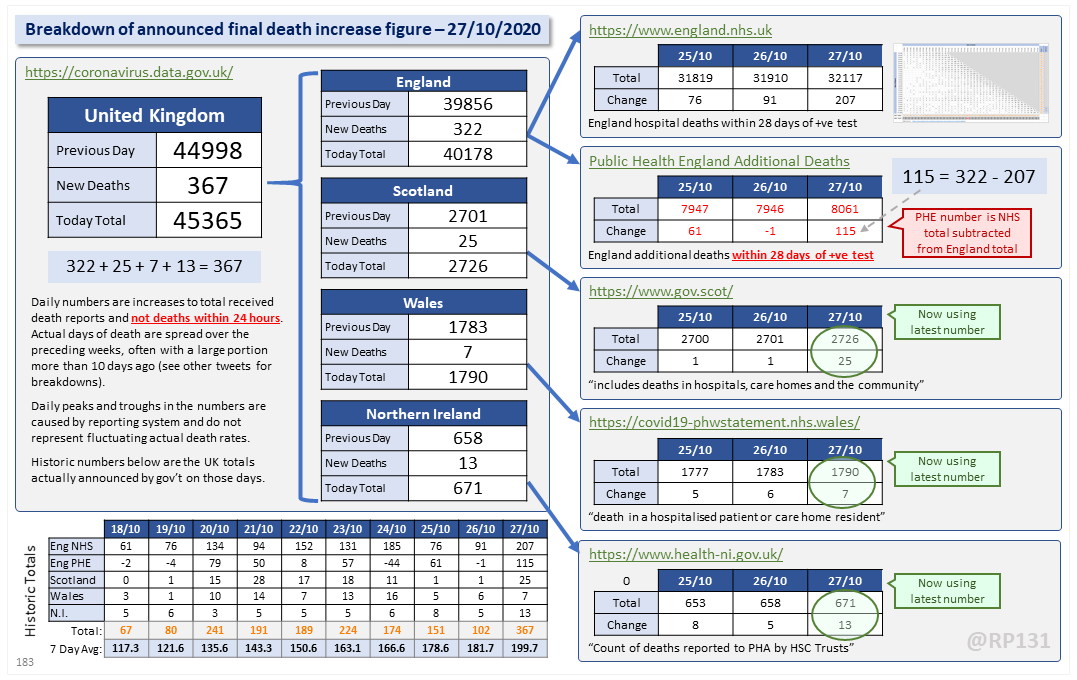
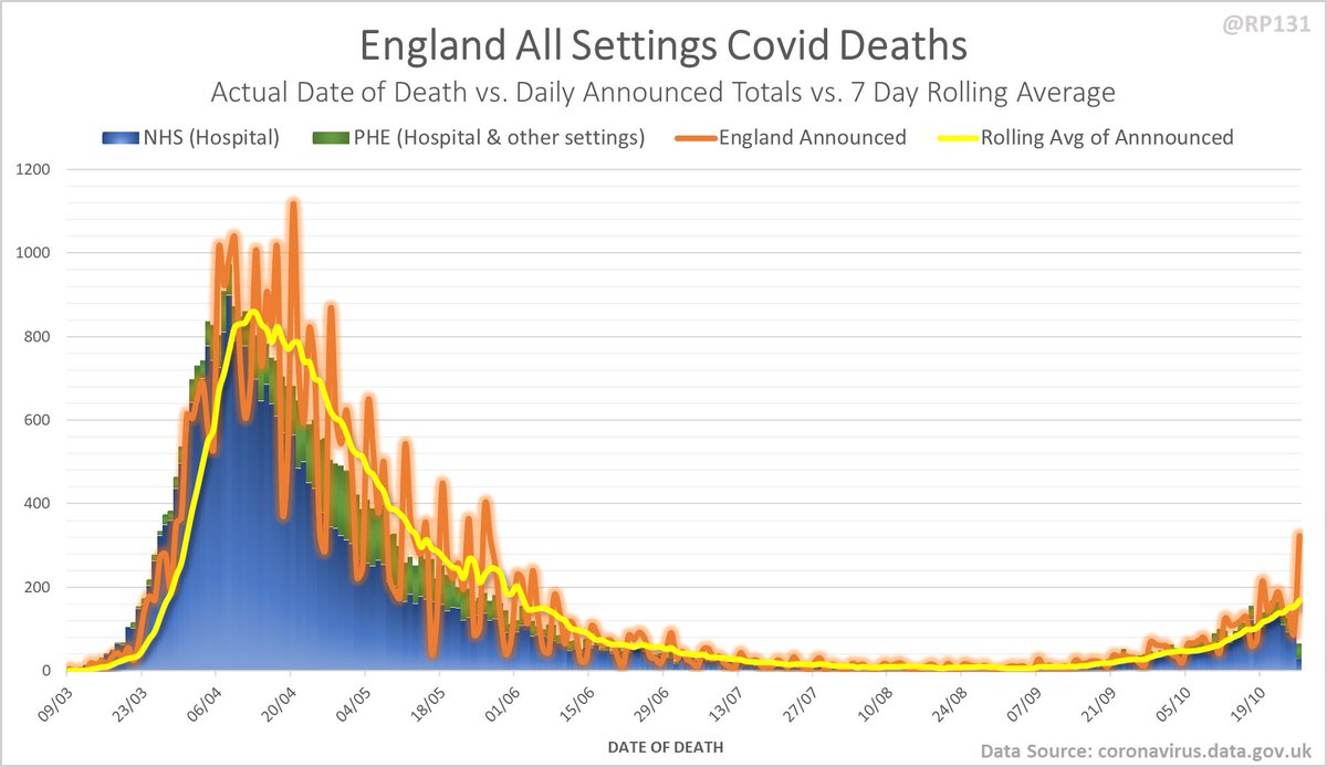
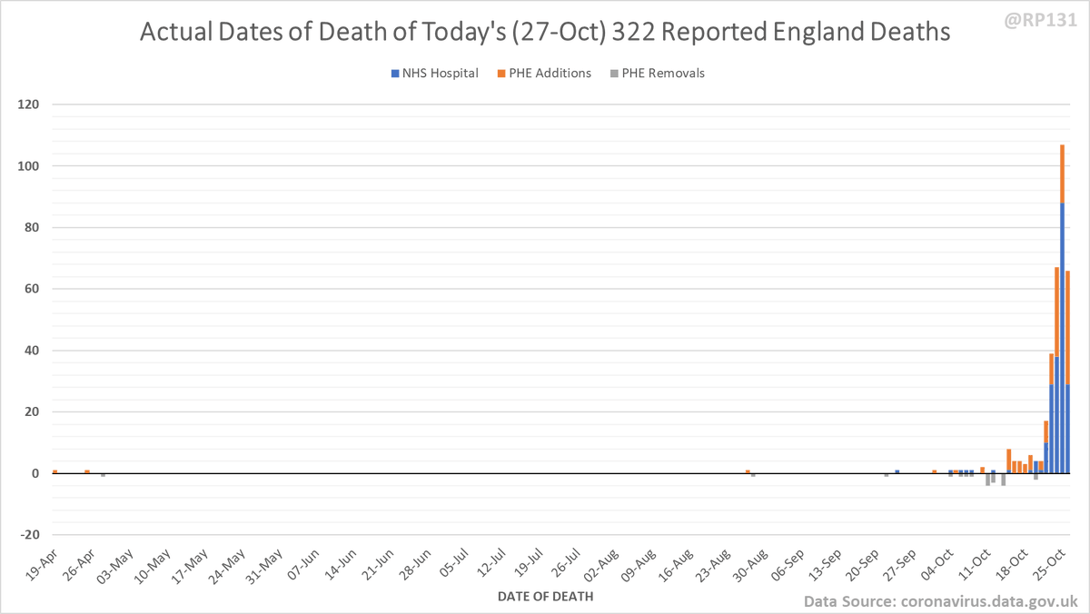
Dashboard for 27-Oct to explain where the #covid19uk total death increase figure of 367 actually comes from. The PHE dataset merge resulted in a net of 115 additional deaths today. This moves the 7 day rolling average up by 18 to 199.7.
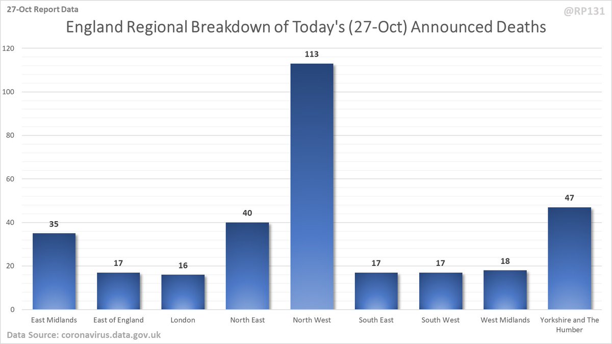
Breakdown of today& #39;s newly reported England deaths by region. Note that this data (320) doesn& #39;t always quite add up to the total England number they announce (322) possibly due to data merging issues. However I still think it& #39;s useful to see the general distribution.
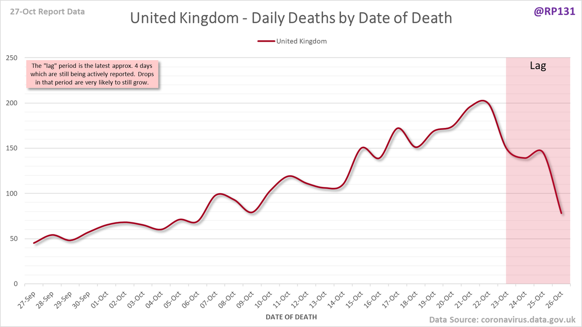
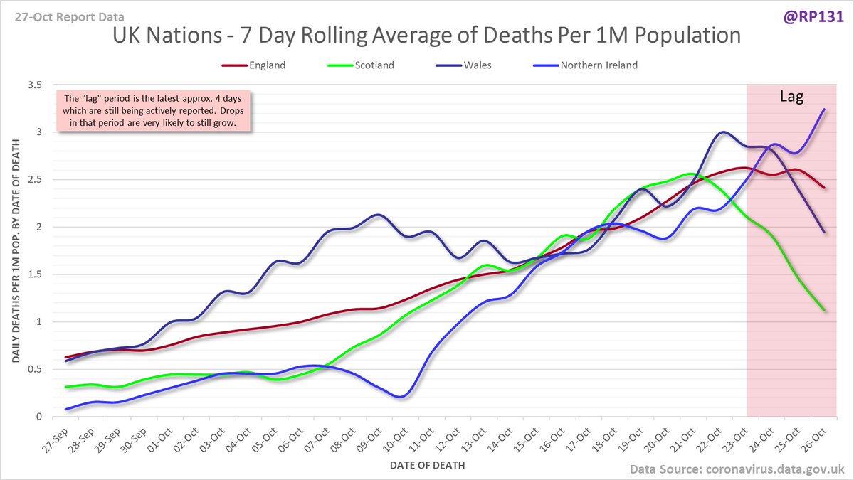
Possibly easier to interpret, date of death charts for UK nations and England regions drawn with 7 day rolling averages of deaths per 1M population.
England date-of-death vs. announcement chart. Note that the numbers drop at the end as data is still being actively reported for those dates.
Pivot for 27-Oct to show breakdown of both 207 NHS and 115 (net) PHE deaths by date of death. The negatives are a combination of date of death corrections and accounting for NHS deaths that were already known to PHE. July onward first:
Full version available here: …https://coviddatashare.s3-eu-west-1.amazonaws.com/Pivot_PHE_20201027.png">https://coviddatashare.s3-eu-west-1.amazonaws.com/Pivot_PHE...
Chart form of dates of since 15-Sept (ignoring some of the corrections noise from earlier in the year):
Full date of death chart (most of the noise earlier in the year is likely due to dataset merge errors and/or corrections).

 Read on Twitter