I have other things to do but one day I& #39;ll enlarge on the insidious effects of elevating this cursed little histogram of "Research output per year" as the single most important bit of information about academics at thousands of universities that use Elsevier Pure #AcademicChatter
Consider this mini-rant my notes for that occasion.
Most importantly, we DO NOT write per year. Our careers are too diverse and precarious to measure output that way. What we write is important, where to find it is key, but how much per calendar year is at best irrelevant.
Most importantly, we DO NOT write per year. Our careers are too diverse and precarious to measure output that way. What we write is important, where to find it is key, but how much per calendar year is at best irrelevant.
You may object that it is informative. Ah yes, informative. For whom? Primarily for bean counters who care about & #39;deliverables& #39;, & #39;outputs& #39; and other countable things. And of course for managers who care about & #39;productivity& #39; and & #39;volume& #39;.
These cursed little histograms invite inferences about productivity, gaps, and publication volume that are guaranteed to be reductive and bias-ridden. One could make the case they are actively harmful, feeding into exactly the wrong kind of feedback loops. So why do unis do it?
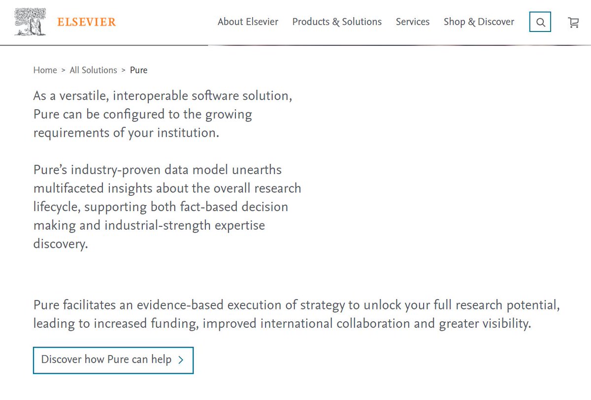
Systems like Elsevier Pure are marketed to Research Managers, and every bit of their design shows that. Universities and institutions who use its "industry-proven data model" to create automated profiles for their researchers are making a big mistake (never mind @DORAssessment)
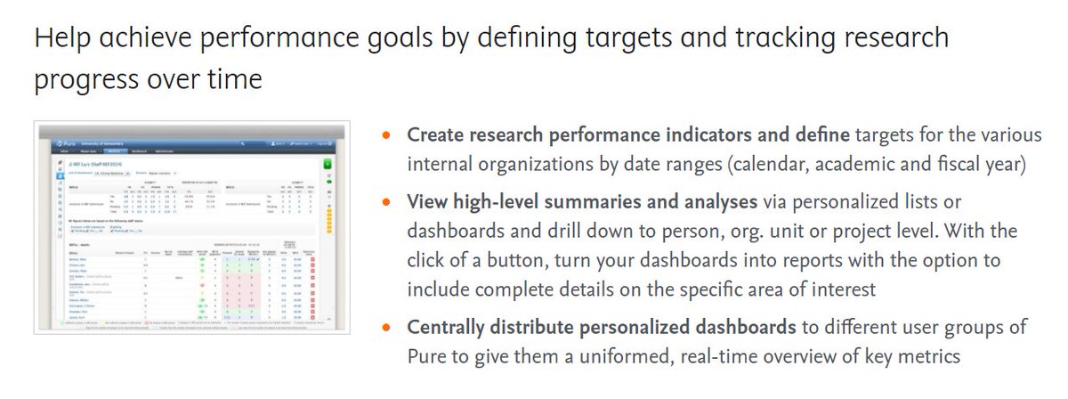
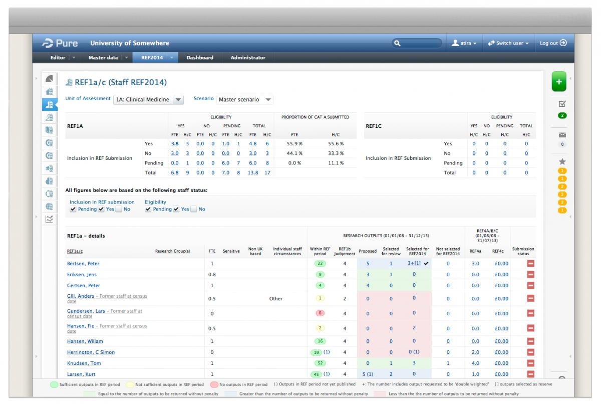
Above I wrote how these public-facing histograms invite inferences that may be harmful. Of course that& #39;s pretty much what Pure has been designed to do. Behind the scenes, there& #39;s a plethora of ways to track metrics, targets, and progress right down to individual researchers
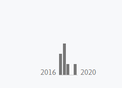
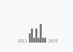
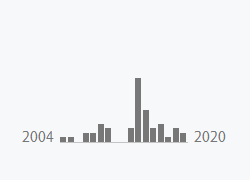
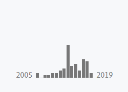
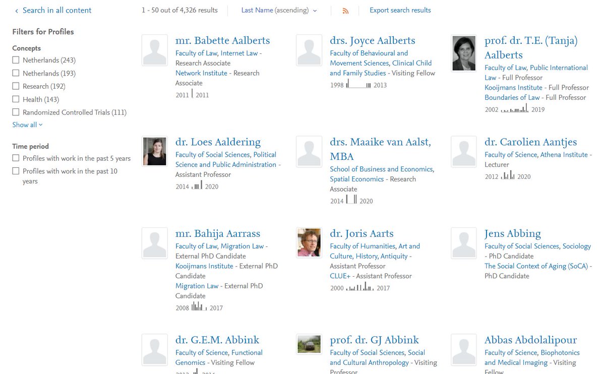
But I digress; my main beef is with the public profiles, which thoughtlessly include these little plots wherever possible — even in search results! (here, @VU_Amsterdam). Fortunately @Radboud_Uni doesn& #39;t use Pure (unless the VSNU deal with Elsevier forces it down our throat  https://abs.twimg.com/emoji/v2/... draggable="false" alt="😬" title="Grimasse schneidendes Gesicht" aria-label="Emoji: Grimasse schneidendes Gesicht">)
Elevating this useless histogram to such a prominent place on every researcher& #39;s profile is the web design equivalent of "nerdview" ( @LanguageLog ): an ill-thought-out choice that makes very little sense to end users and is telling of your own biases
Fellow academics are probably *the* key audience for institutional homepages. When we look up someone& #39;s page we do it to find a specific paper, read what they& #39;re working on, perhaps check out recent work. We don& #39;t want to see this cursed little histogram.
/end (for now) 9/9
/end (for now) 9/9
BTW, one has to admire the efficiency of this screenshot, showing that three researchers whose output was "insufficient" are "former staff", i.e. have been let go. This is straight from the MARKETING MATERIALS of Pure, in case you were wondering 10/9 https://twitter.com/DingemanseMark/status/1320728103170310149">https://twitter.com/Dingemans...

 Read on Twitter
 )" title="But I digress; my main beef is with the public profiles, which thoughtlessly include these little plots wherever possible — even in search results! (here, @VU_Amsterdam). Fortunately @Radboud_Uni doesn& #39;t use Pure (unless the VSNU deal with Elsevier forces it down our throat https://abs.twimg.com/emoji/v2/... draggable="false" alt="😬" title="Grimasse schneidendes Gesicht" aria-label="Emoji: Grimasse schneidendes Gesicht">)" class="img-responsive" style="max-width:100%;"/>


