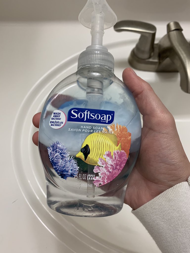
Who designed this and what was the process like? Was there critique? Disagreement? How many layers of approval were there? The designer probably started off with a few directions...
The first design actually had 2 fish, but it was immediately scrapped in review. Too busy they said, it draws the eye to too many places. One stakeholder thought it looked like the fish were fighting. It did not, but it wasn’t worth arguing over.
The second choice was quite similar to what was produced, but featured a clownfish. It was great — the crisp orange silhouette popped brightly against the pastel corals and the misty waters of the background.
The designer was proud of it. A clownfish is beautiful and interesting, but still familiar. Simultaneously bold and safe. The clownfish direction was pretty good.
The third direction doesn’t matter because they never got around to talking about it in the initial stakeholder review. Back to clownfish.
A clownfish, huh? Says someone in the meeting who no one has never seen or met before. Have you considered other fish?
Someone important suggests something slightly less flubby and more graceful, like a Moorish Idol. Another suggests a Schooling Bannerfish. Everyone nods pretending to know what these are.
The head of sales suggests a goldfish because his kid has a goldfish. Legal chimes in saying it can’t be too similar to the likeness of any specific kind of fish.
Perhaps it’s time to revisit the direction with two fish. Maybe a goldfish *and* a clownfish? The designer quietly shares that may not be the most sensible solution because one lives in freshwater and one in saltwater.
Why fish? Says marketing. Fish are cold and slimy and alienating according to their research. How about puppies? Everyone loves those.
It’s suggested that the designer come back with a range of different fish types and renderings, as well as a direction for puppies because the team “just needs to see it.”
She works all night to create a detailed presentation of fish layouts, species and graphic styles. Fish are presented by region as well as defining aesthetic features. The puppy one goes in the appendix.
“This is way too dense.” leadership says 2 minutes into the presentation. “Come back to us with 2 or 3 directions so we can move forward by Friday.”
The designer is crushed and has no idea what to do. Nobody here actually knows that much about fish. It’s a soap company.
Her mind spirals. There’s simply no way the clownfish could work at this point. How could she be so stupid to suggest a clownfish? She doesn’t feel cut out for this type of pressure. It’s a huge year for Softsoap and every detail matters.
She throws together a very safe composition of a butterfly fish. It’s really not that bad, it might even be good? There’s no way to tell anymore.
A few quick nods by a number of confident men and it’s approved for production. Just like that. The team isn’t focused on hand soap anymore. They’ve moved onto sanitizer.

 Read on Twitter


