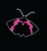
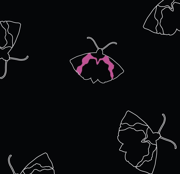
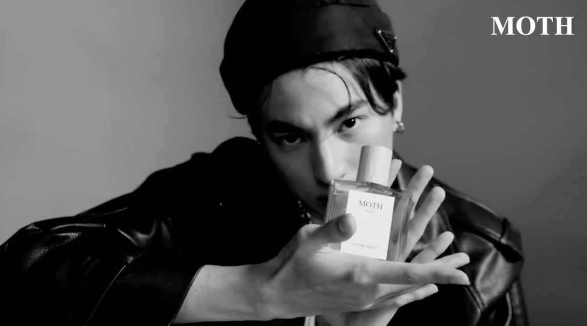
was wondering since the release of the project why MOTH was the chosen symbol for their brand, and if it really is a queer coded brand this symbolism is quite interesting; moth represents transformation. #MOTHxGULF
the tagline speaks wonders “proud to be yourself”, which is pure  https://abs.twimg.com/emoji/v2/... draggable="false" alt="🏳️🌈" title="Regenbogen-Flagge" aria-label="Emoji: Regenbogen-Flagge">moth means to transform and the pink streaks on the moth that contrasts heavily on the dark signifies that transformation? it seems as if its embracing the different sides. Its exciting from a queer perspective!
if true, then were really getting a brand thats telling you to embrace different self expression (in a still conservative environment) defying gender norms and im proud of them!! im proud that theyre the change!!
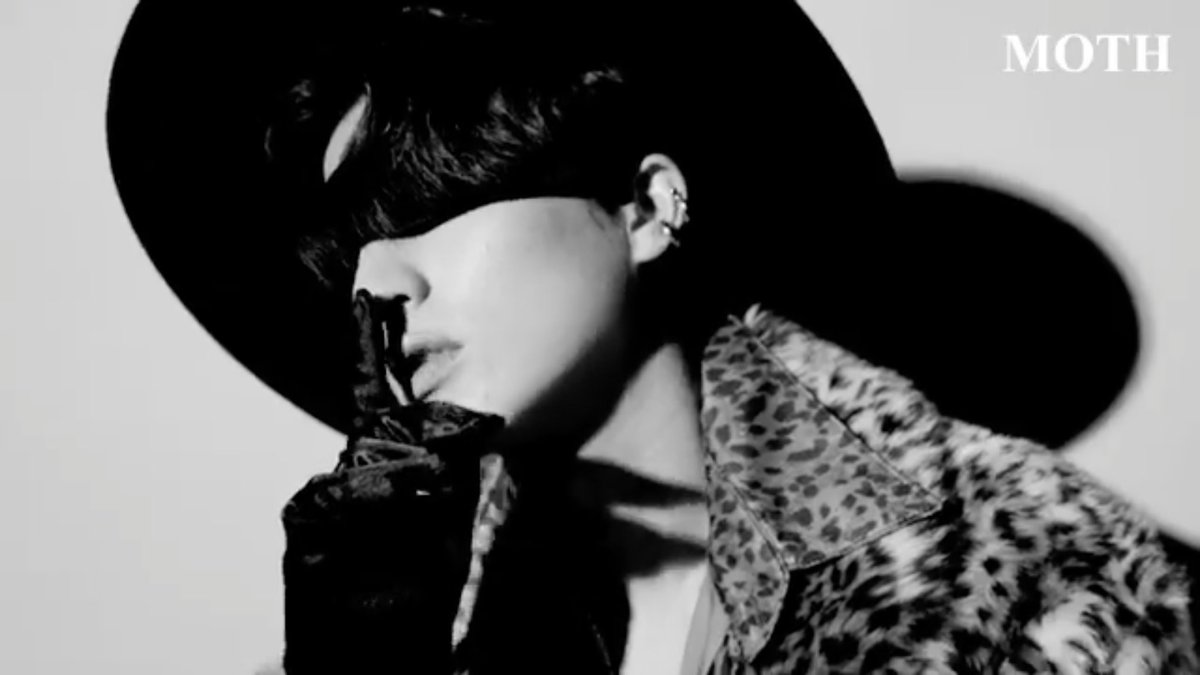
also someone asked what would be the nodes, they answered the nodes would be more feminine, which is even more of a hint to embrace self expression and defying gender norms  https://abs.twimg.com/emoji/v2/... draggable="false" alt="🥺" title="Pleading face" aria-label="Emoji: Pleading face"> i love it! i love how hes proud if himself and how he sees himself!!

 Read on Twitter
 moth means to transform and the pink streaks on the moth that contrasts heavily on the dark signifies that transformation? it seems as if its embracing the different sides. Its exciting from a queer perspective!" title="the tagline speaks wonders “proud to be yourself”, which is pure https://abs.twimg.com/emoji/v2/... draggable="false" alt="🏳️🌈" title="Regenbogen-Flagge" aria-label="Emoji: Regenbogen-Flagge">moth means to transform and the pink streaks on the moth that contrasts heavily on the dark signifies that transformation? it seems as if its embracing the different sides. Its exciting from a queer perspective!">
 moth means to transform and the pink streaks on the moth that contrasts heavily on the dark signifies that transformation? it seems as if its embracing the different sides. Its exciting from a queer perspective!" title="the tagline speaks wonders “proud to be yourself”, which is pure https://abs.twimg.com/emoji/v2/... draggable="false" alt="🏳️🌈" title="Regenbogen-Flagge" aria-label="Emoji: Regenbogen-Flagge">moth means to transform and the pink streaks on the moth that contrasts heavily on the dark signifies that transformation? it seems as if its embracing the different sides. Its exciting from a queer perspective!">
 moth means to transform and the pink streaks on the moth that contrasts heavily on the dark signifies that transformation? it seems as if its embracing the different sides. Its exciting from a queer perspective!" title="the tagline speaks wonders “proud to be yourself”, which is pure https://abs.twimg.com/emoji/v2/... draggable="false" alt="🏳️🌈" title="Regenbogen-Flagge" aria-label="Emoji: Regenbogen-Flagge">moth means to transform and the pink streaks on the moth that contrasts heavily on the dark signifies that transformation? it seems as if its embracing the different sides. Its exciting from a queer perspective!">


