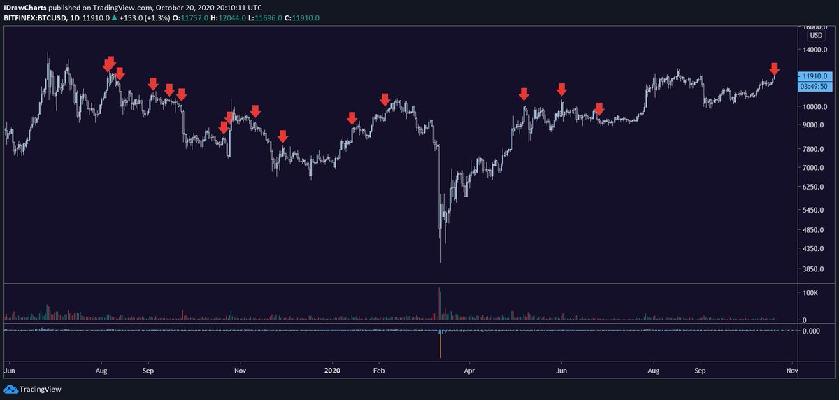
A visualization of each time @APompliano has tweeted about "entering the new bull market"
out of a sample size of 15 (excluding today& #39;s call because it was only 2 hours ago), 10 of those tweets were followed by a red day (66.6%)
The average 7 day return, measured from the close of the day the tweet was made, is -2.58%, with only 3 tweets resulting in positive 7-day results

 Read on Twitter


