A short thread about a dead salmon and implausible claims based on epidemic curves... 1/
A few years ago, some researchers famously put an Atlantic salmon in an fMRI machine and showed it some photographs. When they analysed the raw data, it looked like there was evidence of brain activity... https://www.wired.com/2009/09/fmrisalmon/">https://www.wired.com/2009/09/f... 2/
Now of course there wasn’t really any activity. It was a dead salmon. But it showed that analysing the data with simplistic methods could flag up an effect that wasn’t really there. Which leads us to COVID-19... 3/
Earlier in the year, there were widely shared claims that COVID epidemics followed a ‘natural characteristic curve’, implying they all declined because of immunity rather than NPIs. Models fitted to epidemic curves also made strong claims about level of immunity reached. 4/
Bizarrely, some of these claims suggested even COVID-19 in NZ and SARS in 2003 followed such ‘natural curves’, despite both being contained rather than spreading widely in the population. Which brings us back to the salmon... 5/
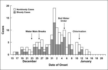
Outbreaks go up and come down for a range of reasons: seasonality, control measures, behaviour, immunity. In some cases the disease isn’t even contagious, and the shape just reflects the incubation period – below is a diarrheal outbreak ( https://www.cdc.gov/csels/dsepd/ss1978/lesson1/section11.html):">https://www.cdc.gov/csels/dse... 5/
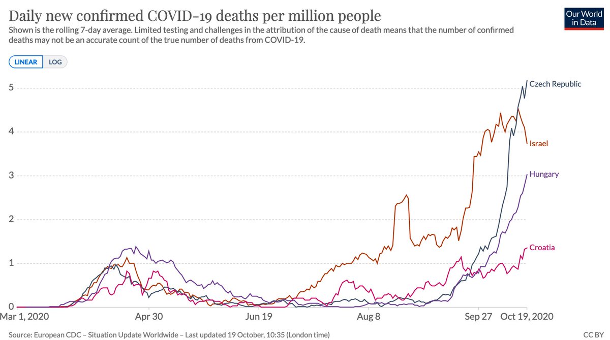
When putting forward an analysis method, it’s therefore important to test it on ‘control’ data to show if method is flagging up patterns that aren’t really there. E.g. below countries had what might at first glance look like ‘characteristic’ epidemics that ended naturally. 6/
Except they didn& #39;t end. They had follow up waves, which don’t match a simple single peak pattern. In hindsight, it’s tempting to conjure up post-hoc explanations for the multiple peaks, but the key question is whether an analysis method could have concluded this in real-time. 7/
In short: if we see someone making strong claims based on analysis of the shape of an epidemic, we should think of what ‘salmon data’ we can use to check whether the logic holds up. 8/8

 Read on Twitter


