so sedulous is out... i dont really like it that much? gonna address why that& #39;s the case as clearly as i can. be warned, long fuckin thread.
for intricate decoration style, there are generally two KEY things to look out for for levels to look good - CONTRAST, and DENSITY. (1/13)
for intricate decoration style, there are generally two KEY things to look out for for levels to look good - CONTRAST, and DENSITY. (1/13)
CONTRAST refers to the difference in value (AKA brightness) between the brightest and darkest object on screen.
DENSITY on the other hand refers to the spacing of objects on-screen RELATIVE TO SPEED.
see images below for pertinent examples of both. (2/13)
DENSITY on the other hand refers to the spacing of objects on-screen RELATIVE TO SPEED.
see images below for pertinent examples of both. (2/13)
RELATIVE TO SPEED is of particular importance here. a build may look perfectly fine on slow speed or in a screenshot, but cluttered and messy in 4x speed SIMPLY BECAUSE the eye doesn& #39;t have enough time to catch all the details in a single screen before they NYOOM by. (3/13)
this is the first problem i have with sedulous - it has serious decoration density issues. in screenshots, sedulous looks so crisp and clean because nothing is moving at all. but at 4x speed, all the deco just NYOOMS past the player and all the detail is just. GONE (4/13)
this isn& #39;t helped by problem #2: the copious amounts of glow.
i know @hiavl_ and @pocke27 made screenshots of sedulous with no glow to prove point. they are dumb stupid. without glow ENTIRELY, it looks like shit.
however, there really is WAY too much glow in the level. (5/13)
i know @hiavl_ and @pocke27 made screenshots of sedulous with no glow to prove point. they are dumb stupid. without glow ENTIRELY, it looks like shit.
however, there really is WAY too much glow in the level. (5/13)
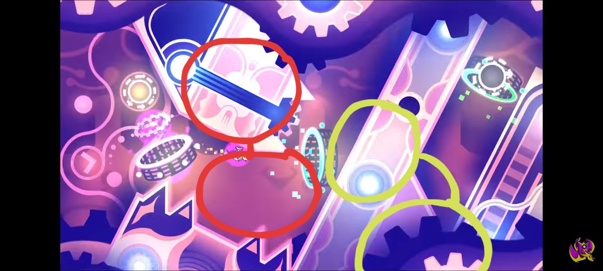
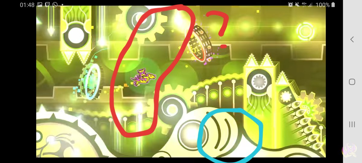
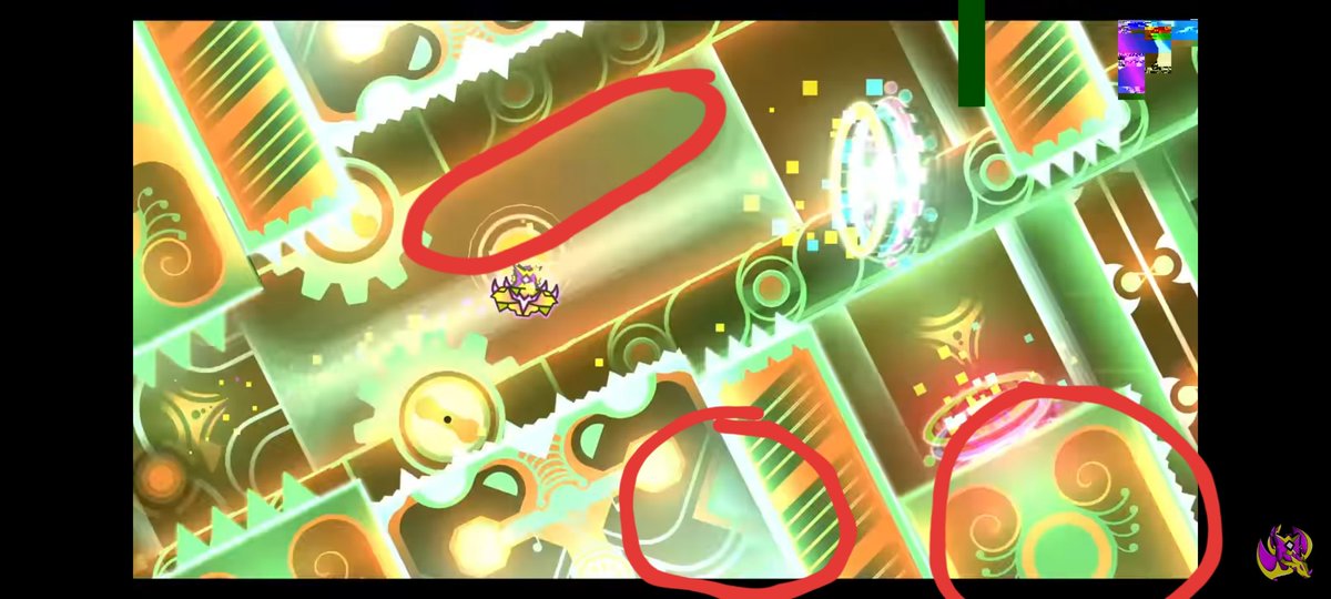
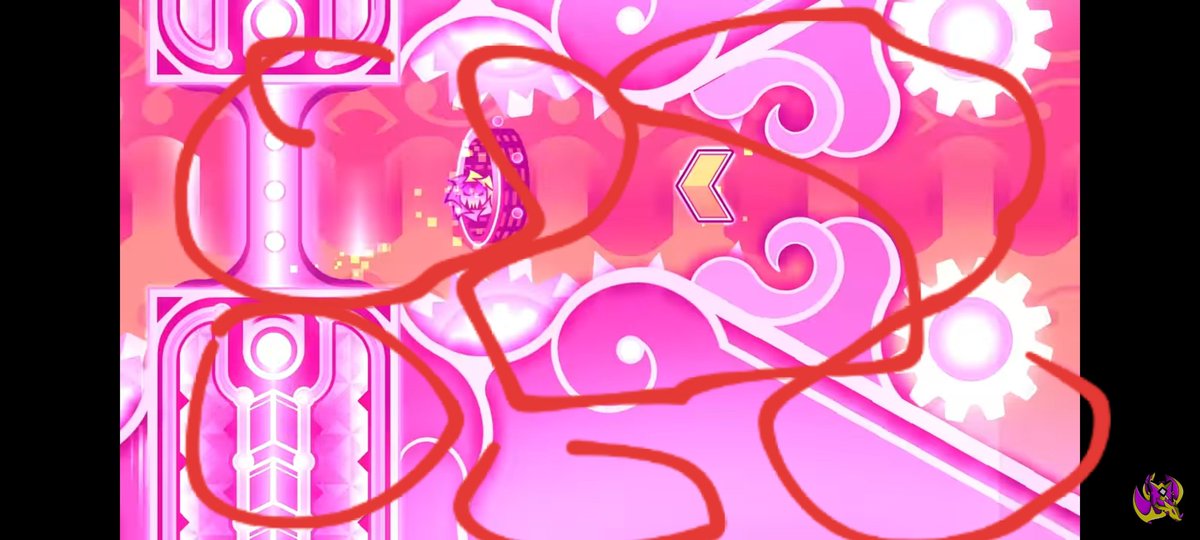
WHY is the glow is bad here? because it obscures contrast. glow should be used to HEIGHTEN differences in value between decoration and background. what it SHOULDN& #39;T do is obscure or completely fuckin& #39; eradicate that distinction. i took several screenshots to make my point. (6/13)
(green and blue circles highlight areas with GOOD contrast - where there is a significant difference in value between details (i.e. black ground / block design, image 1) so you can distinguish which is which.) (6/13)
((or the curvy spike decoration areas in image 2, where detail POPS because of the contrast between black(ish) and white(ish) values.)) (7/13)
(however, with the red circles in all these images, you can see areas where the darkest / "darker" parts really isnt THAT much darker than the brightest part. This is the erasure of contrast that is Sedulous& #39; pitfall.)
(particularly the pink screenshot, because jesus lol) (8/13)
(particularly the pink screenshot, because jesus lol) (8/13)
(the object colour (white) being super close to the pastel, bright hues of the block design dont help with contrast either. just saying. the excessive glow is what pushes it a bit too far imo.) (9/13)
i know some people are gonna argue "bro!!! it was just a pulse!!!".
i understand that. fair.
but if i can capture ~20 screenshots worth of pulses by just randomly clicking the screenshot function on my phone, PERHAPS there MAYYY be too many bright pulses.
just saying.
(10/13)
i understand that. fair.
but if i can capture ~20 screenshots worth of pulses by just randomly clicking the screenshot function on my phone, PERHAPS there MAYYY be too many bright pulses.
just saying.
(10/13)
so thats my complaints with sedulous.
NOTE, however: im not saying that samifying is a bad creator for it though! i do think the level is ehhhh at BEST, but samifying is clearly VERY talented at shapes and detail. his structures and colours are great too. (11/13)
NOTE, however: im not saying that samifying is a bad creator for it though! i do think the level is ehhhh at BEST, but samifying is clearly VERY talented at shapes and detail. his structures and colours are great too. (11/13)
and it& #39;s great to see a creator push themselves / try to reach the very limits of their ability! unfortunately since contrast and density arent present for most of the drop, the level falls flat when presented in a moving format instead of a series of progress screenshots (12/13)
my only hope is that the next level he does rectifies this because i would love to see him have another go. till then sedulous gets a weak 4/10 from me. eeeeeeeee (13/13)

 Read on Twitter


