you all made a huge deal about fancy text in the DN/bio so here’s something I’m also gonna need yall to care about!!
LET’S TALK ABOUT CARRDS AND DISABILITY. a thread
LET’S TALK ABOUT CARRDS AND DISABILITY. a thread
now that we’ve started convos about accessibility, pointing out how difficult some text and webpages can be for disabled ppl, i wanted to address my experiences with inaccessible carrds.
as a disabled user with ASD, dyslexia, dyscalculia, and ADHD, its a daily occurrence for me.
as a disabled user with ASD, dyslexia, dyscalculia, and ADHD, its a daily occurrence for me.
the problem w carrds is the range of customization giving ppl the ability to make their sites crazy complicated. this is a problem for people with sensory processing issues, dyslexia, ADHD, and those who use screen readers. we literally can’t get the info that u made ur card for.
anyways, I made note of some things to (pls) AVOID in ur carrd:
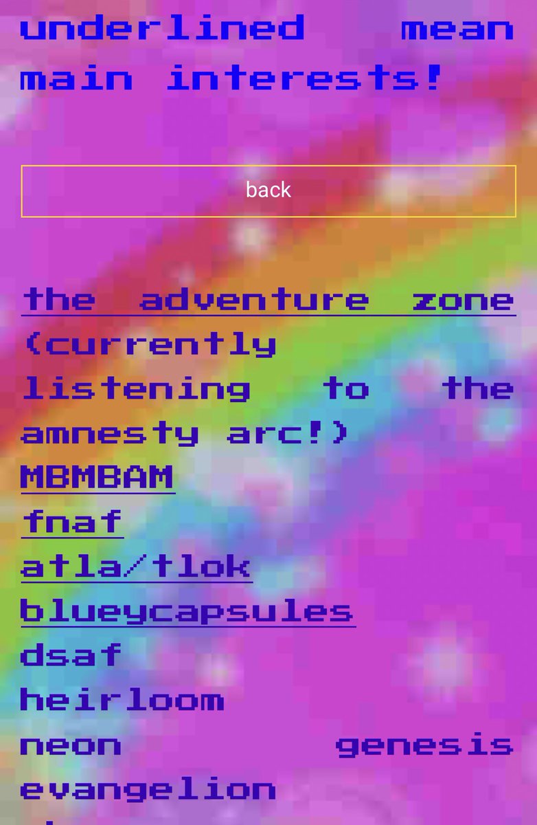
- weird, curly, or glitchy fonts
- bright, eye-straining neon colors
- teeny tiny buttons
- buttons that are ONLY images w no description of where they lead
- many gifs on one page / FLASHY GIFS. PLEASE DON’T.
- weird, curly, or glitchy fonts
- bright, eye-straining neon colors
- teeny tiny buttons
- buttons that are ONLY images w no description of where they lead
- many gifs on one page / FLASHY GIFS. PLEASE DON’T.
good things to include in ur carrd to make it easier for disabled folks to navigat:
- easily readable, normal sized buttons
- a few small gifs per page
- easy directions/navigation
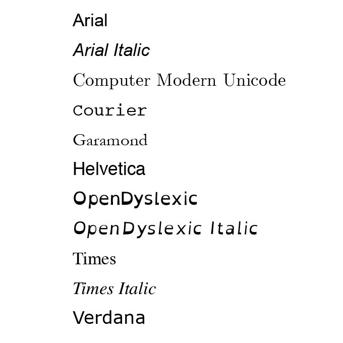
- dyslexia and screen-reader friendly fonts!
here’s some examples of good fonts to use
- easily readable, normal sized buttons
- a few small gifs per page
- easy directions/navigation
- dyslexia and screen-reader friendly fonts!
here’s some examples of good fonts to use
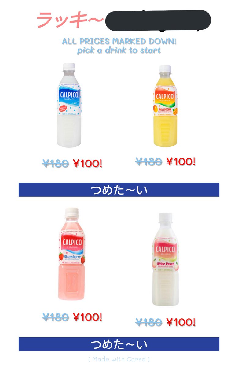
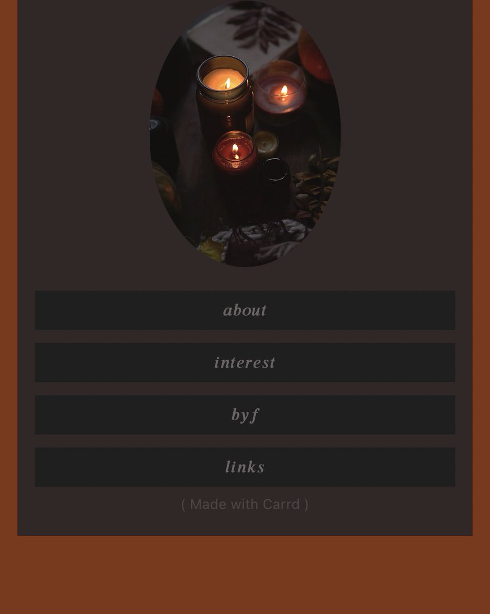
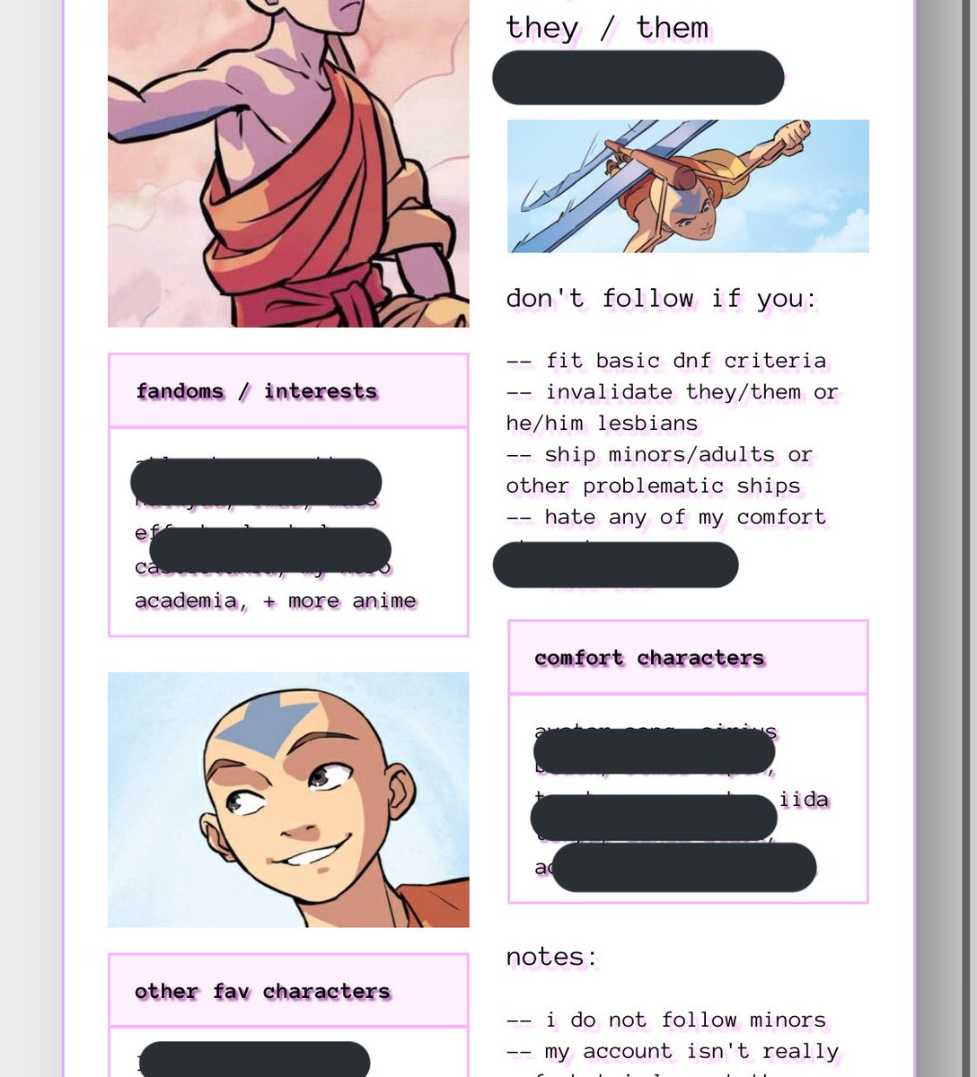
examples of some pages ive found that are inaccessible for ppl with disabilities to navigate/read (no names or links ofc) not calling them out in any way, i don’t know them, don’t send them hate. these are just visuals.
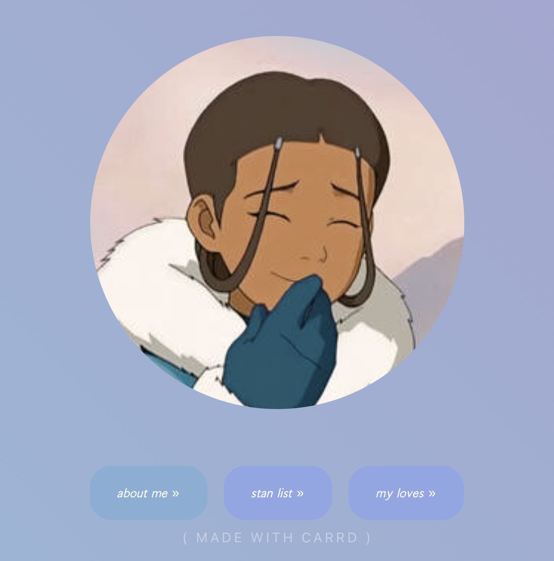
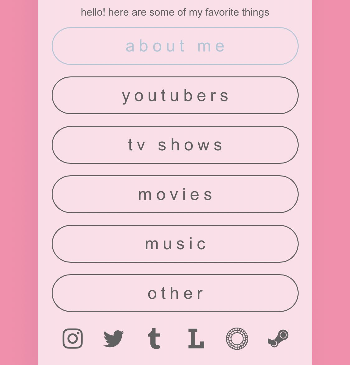
examples of pages that are easy for disabled people to read and navigate (from my experience). again, no names/links here, don’t send them hate, they’re simply good examples
in conclusion, if you want to be a good ally to disabled folks this is one way to do it. please keep us in mind when designing things like carrds. we use the internet too, and there’s a lot more of us than you think. thank you!

 Read on Twitter
