My (super late) Ateez Ticket Design Entry + explanation thread https://abs.twimg.com/emoji/v2/... draggable="false" alt="⚓️" title="Anker" aria-label="Emoji: Anker">
 https://abs.twimg.com/emoji/v2/... draggable="false" alt="✨" title="Funken" aria-label="Emoji: Funken">
#ATEEZ https://abs.twimg.com/hashflags... draggable="false" alt=""> #design #art #Contest
#ATEEZ
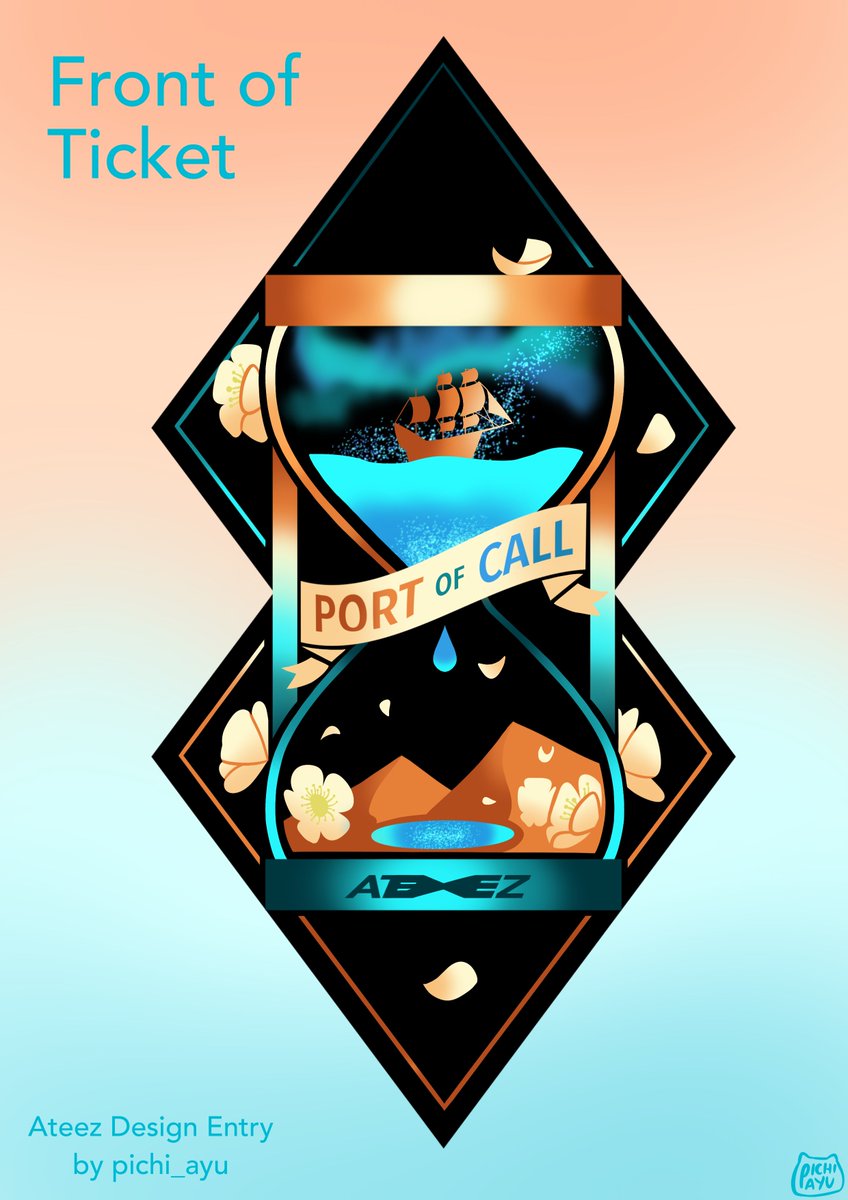
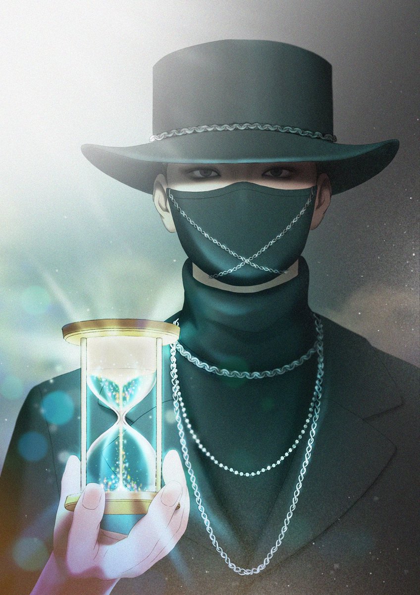
The hourglass is a reoccurring and important object in the Ateez storyline. Because of this, I chose the hourglass for the centrepiece of the design. I chose this specific design of an hourglass as it is like the one owned by the black fedora man.
The colour palette for the design is orange and teal/blue because those are the main colours from the Port of Call teaser poster. The teal and blue can also represent the ocean, and the orange can represent the desert.
Inside the hourglass are an ocean, desert and aurora borealis. These two environments were chosen because the desert and ocean tie into the storyline. Ateez started out in the desert (Treasure and Pirate King), and in the third album it shows them near the ocean (Wave).
(continuation from the last tweet) The aurora borealis was inspired by the song Aurora https://abs.twimg.com/emoji/v2/... draggable="false" alt="✨" title="Funken" aria-label="Emoji: Funken"> The oasis in the desert was inspired by San, as he mentioned the idea of an oasis being the concept idea in the Port of Call video.
The pirate ship is inspired by Ateez’s concept being..well..pirates https://abs.twimg.com/emoji/v2/... draggable="false" alt="🤠" title="Cowboy hat face" aria-label="Emoji: Cowboy hat face"> The flowers are cherry blossoms. I chose them because I think they are the flowers in the glass ball in the Port of Call poster. If I am incorrect, woops
  https://abs.twimg.com/emoji/v2/... draggable="false" alt="😗" title="Kussgesicht" aria-label="Emoji: Kussgesicht">
The shape of the ticket is kind of odd. This is because it was inspired by the shape inside the lightiny (the compass-looking thing.) Sorry if this makes it hard to print and cut out https://abs.twimg.com/emoji/v2/... draggable="false" alt="🙁" title="Leicht stirnrunzelndes Gesicht" aria-label="Emoji: Leicht stirnrunzelndes Gesicht">
The ribbon that the words “Port of Call” are on were inspired by treasure maps and scrolls. I don’t know I just thought the paper was a nice detail https://abs.twimg.com/emoji/v2/... draggable="false" alt="🙂" title="Leicht lächelndes Gesicht" aria-label="Emoji: Leicht lächelndes Gesicht"> The sparkles were added in because it is similar to sand, and they can be seen in the concert poster and fedora man’s hourglass
The metallic shine throughout the design was added because the hourglass has metal, and because if it were to be printed onto those fancy kinds of cardboard, the design would look shiny. However, you don’t have to imagine it as shiny. The design could just be the base colours.
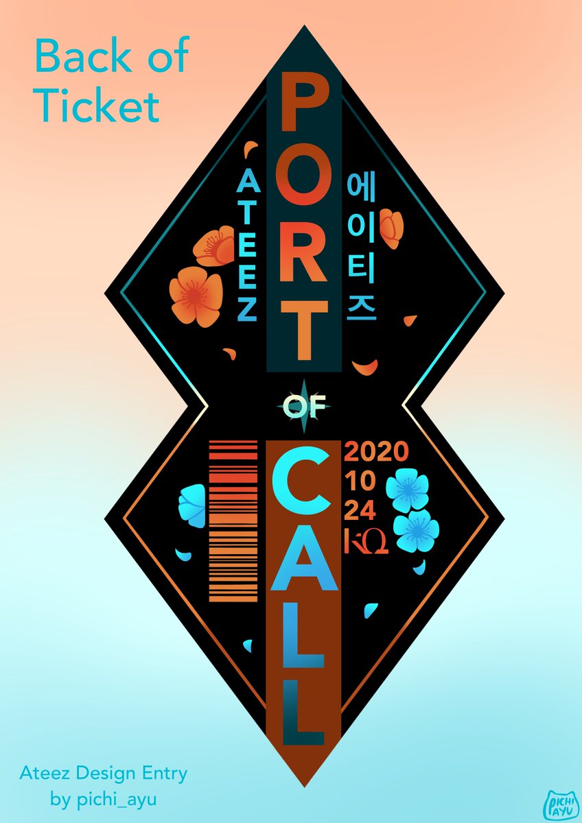
A lot of the designs on the back of the ticket are explained from the front design. The barcode is for your ticket barcode thing? I don’t know if it’s needed, since it is an online concert. But oh well. It does fill in the space https://abs.twimg.com/emoji/v2/... draggable="false" alt="🤠" title="Cowboy hat face" aria-label="Emoji: Cowboy hat face">
The lower-half of the shape could be torn off, but I wasn’t sure if we still had to keep that, so I left it as it is. Sorry if that had to be included.
- Ateez’s name in English and in hangul because that’s the group (^w^)
- Added the date of the online concert
- Ateez’s name in English and in hangul because that’s the group (^w^)
- Added the date of the online concert
- Added KQ Entertainment’s logo
- Sorry if I missed out on any details.
- Any resemblance to others& #39; designs is completely coincidental. Throughout the whole design process I didn& #39;t see much of others& #39; designs. I& #39;m sorry if it looks like someone else& #39;s.
- Sorry if I missed out on any details.
- Any resemblance to others& #39; designs is completely coincidental. Throughout the whole design process I didn& #39;t see much of others& #39; designs. I& #39;m sorry if it looks like someone else& #39;s.
If you& #39;ve reached the end of this thread, thank you so much for reading it! Idk if I went overboard with this whole design thing, I just really like art and ateez ^-^; Please do not steal my design. I know I didn& #39;t put much watermarks, but please don& #39;t steal. Thank you again! https://abs.twimg.com/emoji/v2/... draggable="false" alt="✨" title="Funken" aria-label="Emoji: Funken">

 Read on Twitter
 https://abs.twimg.com/emoji/v2/... draggable="false" alt="✨" title="Funken" aria-label="Emoji: Funken"> #ATEEZ https://abs.twimg.com/hashflags... draggable="false" alt=""> #design #art #Contest" title="My (super late) Ateez Ticket Design Entry + explanation threadhttps://abs.twimg.com/emoji/v2/... draggable="false" alt="⚓️" title="Anker" aria-label="Emoji: Anker">https://abs.twimg.com/emoji/v2/... draggable="false" alt="✨" title="Funken" aria-label="Emoji: Funken"> #ATEEZ https://abs.twimg.com/hashflags... draggable="false" alt=""> #design #art #Contest">
 https://abs.twimg.com/emoji/v2/... draggable="false" alt="✨" title="Funken" aria-label="Emoji: Funken"> #ATEEZ https://abs.twimg.com/hashflags... draggable="false" alt=""> #design #art #Contest" title="My (super late) Ateez Ticket Design Entry + explanation threadhttps://abs.twimg.com/emoji/v2/... draggable="false" alt="⚓️" title="Anker" aria-label="Emoji: Anker">https://abs.twimg.com/emoji/v2/... draggable="false" alt="✨" title="Funken" aria-label="Emoji: Funken"> #ATEEZ https://abs.twimg.com/hashflags... draggable="false" alt=""> #design #art #Contest">

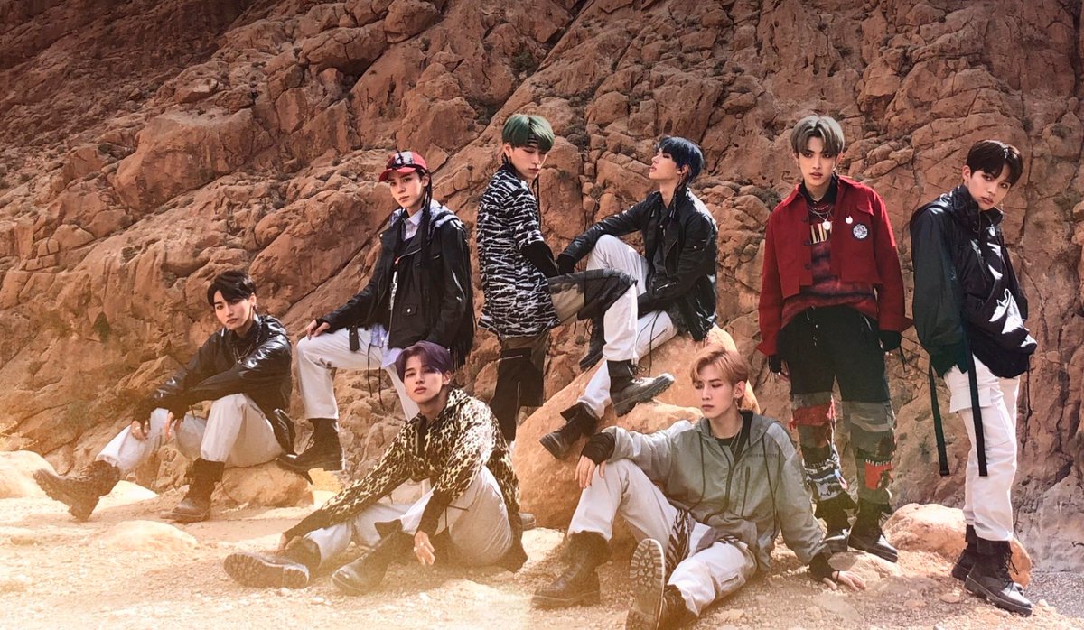
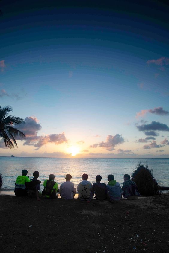
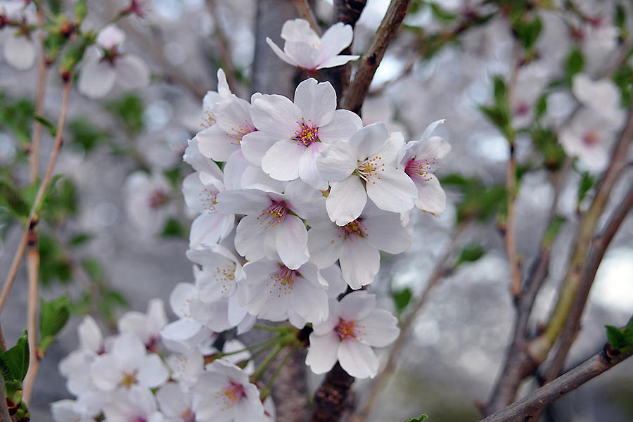 The flowers are cherry blossoms. I chose them because I think they are the flowers in the glass ball in the Port of Call poster. If I am incorrect, woops https://abs.twimg.com/emoji/v2/... draggable="false" alt="😗" title="Kussgesicht" aria-label="Emoji: Kussgesicht">" title="The pirate ship is inspired by Ateez’s concept being..well..pirateshttps://abs.twimg.com/emoji/v2/... draggable="false" alt="🤠" title="Cowboy hat face" aria-label="Emoji: Cowboy hat face"> The flowers are cherry blossoms. I chose them because I think they are the flowers in the glass ball in the Port of Call poster. If I am incorrect, woops https://abs.twimg.com/emoji/v2/... draggable="false" alt="😗" title="Kussgesicht" aria-label="Emoji: Kussgesicht">" class="img-responsive" style="max-width:100%;"/>
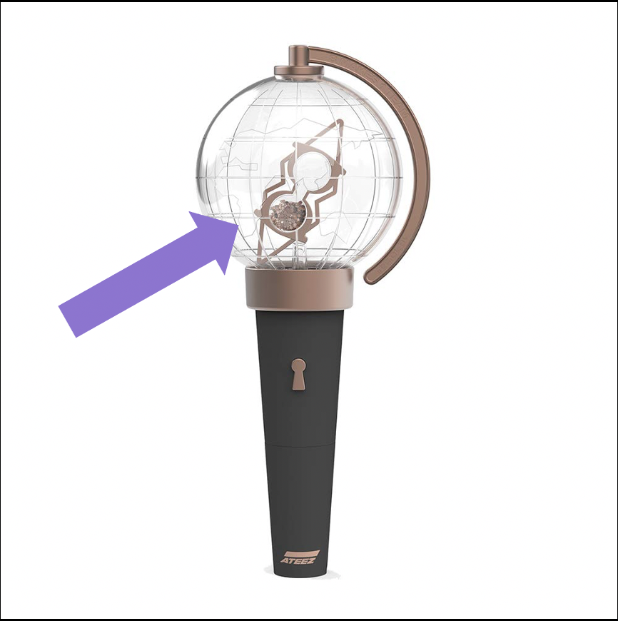 " title="The shape of the ticket is kind of odd. This is because it was inspired by the shape inside the lightiny (the compass-looking thing.) Sorry if this makes it hard to print and cut outhttps://abs.twimg.com/emoji/v2/... draggable="false" alt="🙁" title="Leicht stirnrunzelndes Gesicht" aria-label="Emoji: Leicht stirnrunzelndes Gesicht">" class="img-responsive" style="max-width:100%;"/>


