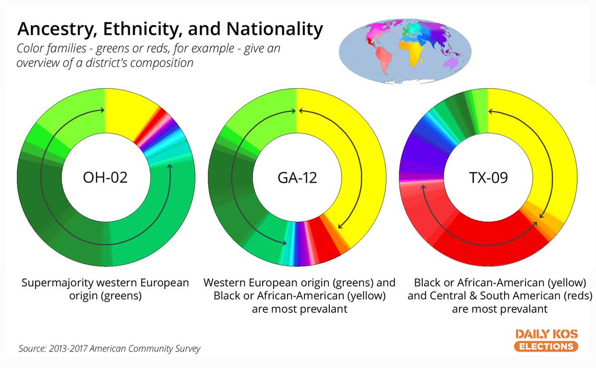
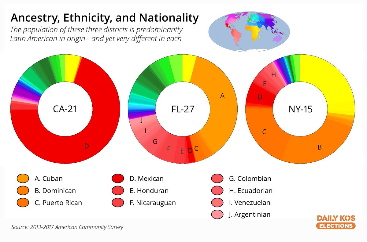
We’re preparing to add a new section to our Atlas ( http://dkel.ec/atlas ),">https://dkel.ec/atlas&quo... and one of the new parts requires a bit of explanation. It’s a… donut. 1/ #comment_78944633">https://www.dailykos.com/stories/2020/10/16/1975098/-All-the-world-s-a-donut-Introducing-a-new-way-to-visualize-our-ancestries-and-origins #comment_78944633">https://www.dailykos.com/stories/2...
Last year, @DavidLJarman created a database of ancestries and origins responses from various American Community Survey questions for each congressional district. But with hundreds of categories, it can be a bit hard to parse. 2/ https://www.dailykos.com/stories/2019/7/28/1873750/-The-Daily-Kos-Elections-guide-to-the-nation-s-ancestries-and-origins-by-congressional-district">https://www.dailykos.com/stories/2...
So we assigned each category its own color, arranged by geography. Color families roughly align with major census racial categories. 3/

 Read on Twitter


