Q: How do you make your #COVID19 situation look less scary, without actually combating the disease?
A: Fiddle with the data.
That& #39;s what& #39;s just happened here in England. Test & Trace have quietly changed their data, suddenly changing our picture of the severity of the disease https://abs.twimg.com/emoji/v2/... draggable="false" alt="🧵" title="Thread" aria-label="Emoji: Thread">
A: Fiddle with the data.
That& #39;s what& #39;s just happened here in England. Test & Trace have quietly changed their data, suddenly changing our picture of the severity of the disease
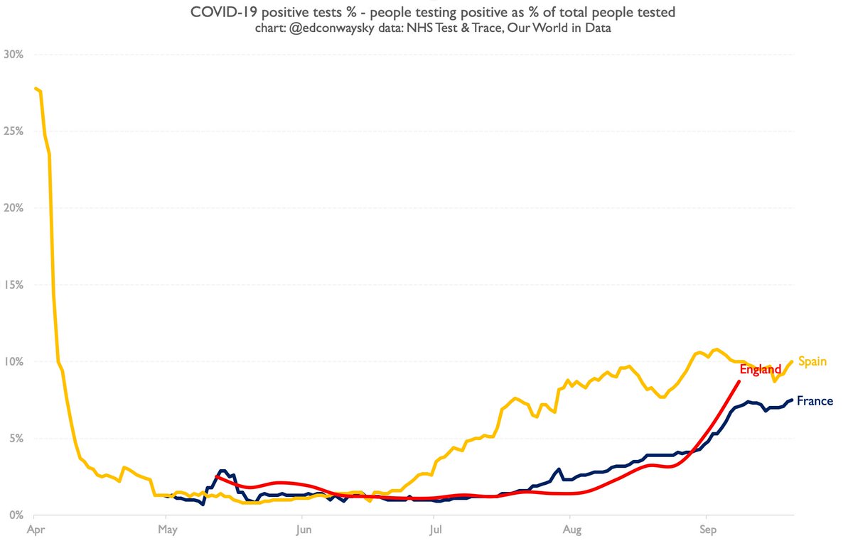
The starting point is to note that perhaps the best measure (admittedly of a bad bunch) when it comes to overall case data, is to work out the number of positive cases as a percentage of tests taken. Here is how that chart looked for England as of last week. Scary, right?
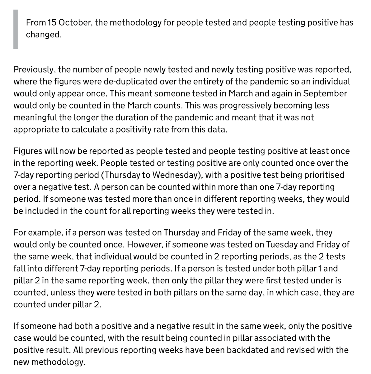
Given cases are rising pretty quickly, it looked v much as if by this week England& #39;s positivity rate would have been above France/Spain. So here& #39;s what the statisticians have done: changed their definition for the total number of tests. Footnote here: https://www.gov.uk/government/publications/nhs-test-and-trace-statistics-england-methodology/nhs-test-and-trace-statistics-england-methodology">https://www.gov.uk/governmen...
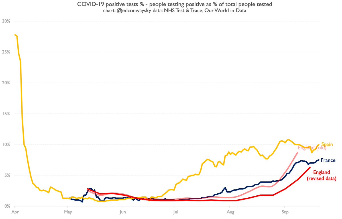
Now this might be a better way to count overall tests. Which is good. But first off, this is an obscure footnote, not even included in the Test & Trace report itself, but in a link. Why be so surreptitious? Second, it has major implications and completely changes the picture:
As a result of an obscure statistical switch no-one was supposed to notice, the #COVID19 positivity rate in England has gone from looking like it& #39;s worse than France and Spain to looking better. Look at the red lines here. Which are we supposed to believe?
As I say, this is plausibly a better way of measuring it. So why do it so surreptitiously and with precious little context/framing? Data is central to understanding #COVID19. Quietly messing with the data further undermines confidence in it - and the handling of the pandemic.

 Read on Twitter


