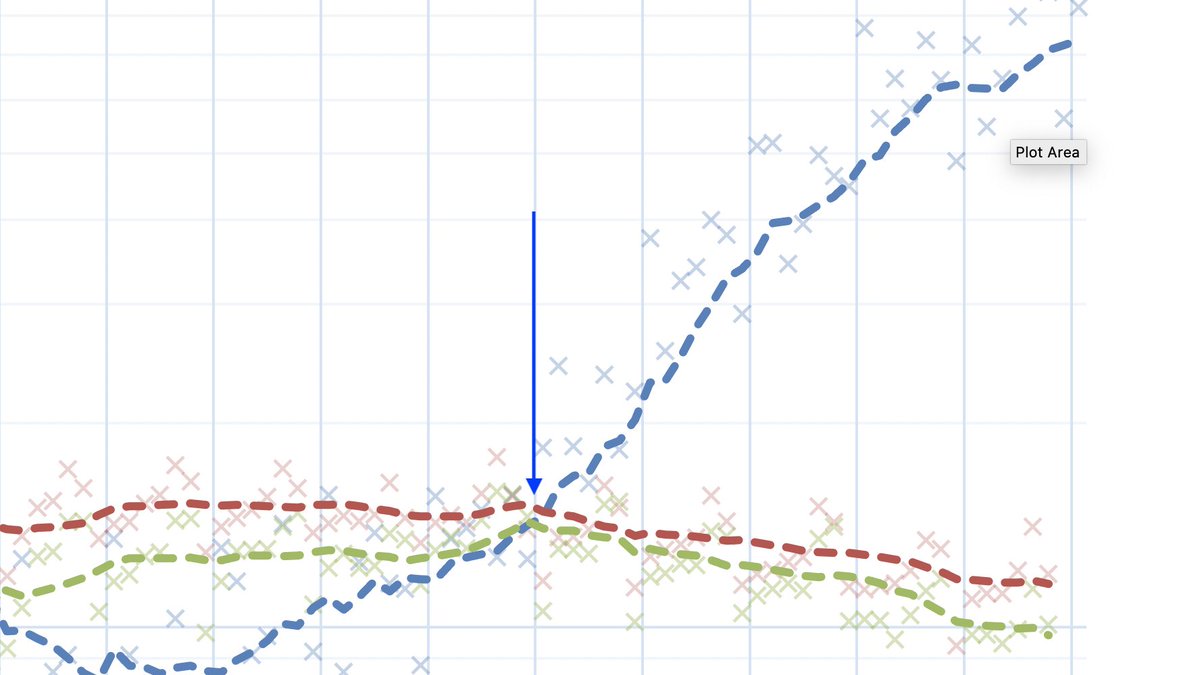
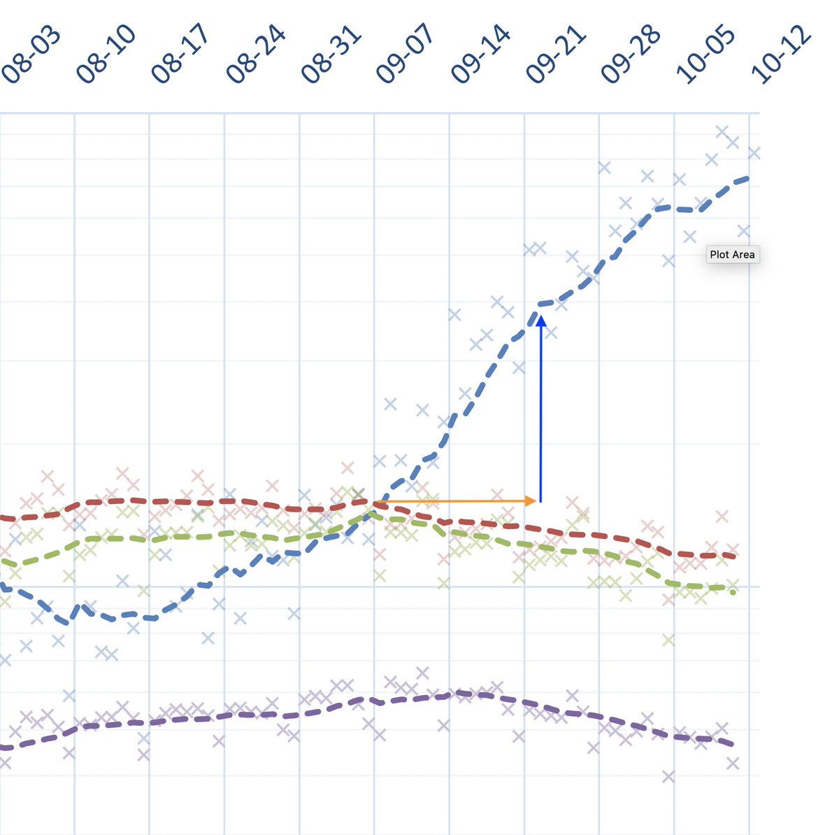
Thankful for being wrong. My previous mobility graphs had an axis error (time on the mobility axis was misaligned - shame on me for doing these in a spreadsheet): mobility has been slowly bending down for the last 5 weeks. Is that good? Yes. Am I super excited? No. Here is why:
I was quite worried cases kept growing while mobility did not seem to have budged. What was good from that perspective was that it suggested there was a lot of room for improvement. The problem is mobility has been slowly decreasing, while cases keep going up. Is that bad?
Hard to tell. While it& #39;s really good that the population changes behaviour in response to rising case counts (before the government acts), cases continued rising. But, maybe not as fast as before; see slight bend in the trajectory of cases ~2 weeks after decline started.

 Read on Twitter


