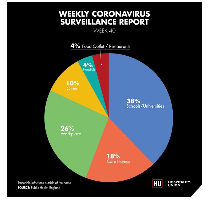
Classic case of misleading graphics without source.
Title: "Traceable infections outside the home".
Let& #39;s see where it comes from.
Title: "Traceable infections outside the home".
Let& #39;s see where it comes from.
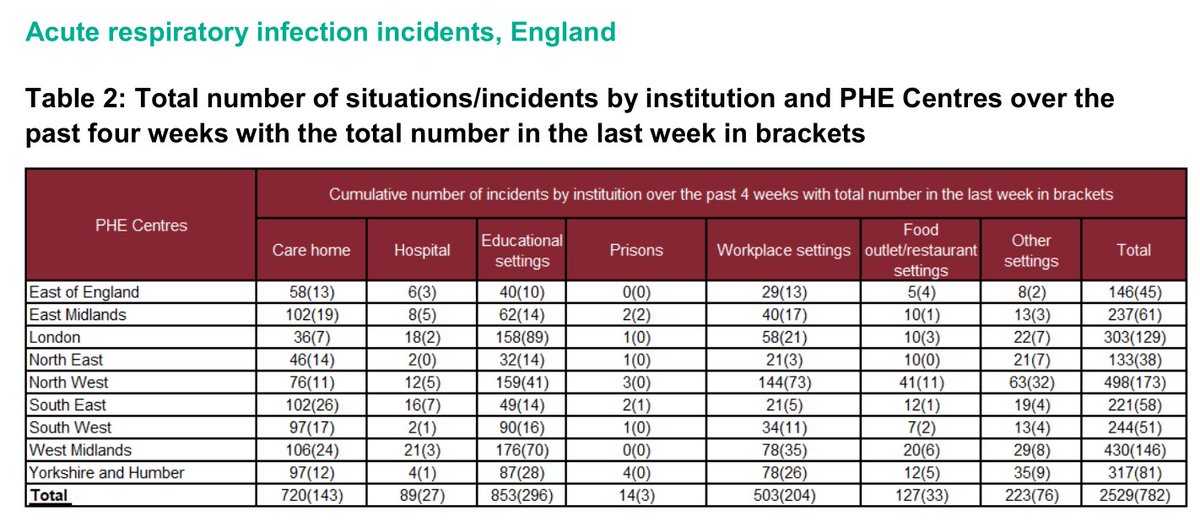
https://assets.publishing.service.gov.uk/government/uploads/system/uploads/attachment_data/file/923668/Weekly_COVID19_Surveillance_Report_week_40.pdf
This">https://assets.publishing.service.gov.uk/governmen... is the report.
This">https://assets.publishing.service.gov.uk/governmen... is the report.
They are essentially outbreaks or suspected outbreaks - two people linked to somewhere test positive.
So not "Traceable infections outside the home" at all.
So not "Traceable infections outside the home" at all.
It& #39;s likely that the data for ARIs is hugely skewed to schools, care homes and workplaces because people go to the same school, same care home and same worksplace.

 Read on Twitter


