You probably have heard me talk about how great muted colors are over the past year.
But, knowing me, I probably didn& #39;t expand on that point.
So let& #39;s talk about muted colors.
And why they are such a HUGE Graphic Design Trend in 2021.
THREAD https://abs.twimg.com/emoji/v2/... draggable="false" alt="👇" title="Rückhand Zeigefinger nach unten" aria-label="Emoji: Rückhand Zeigefinger nach unten">
But, knowing me, I probably didn& #39;t expand on that point.
So let& #39;s talk about muted colors.
And why they are such a HUGE Graphic Design Trend in 2021.
THREAD
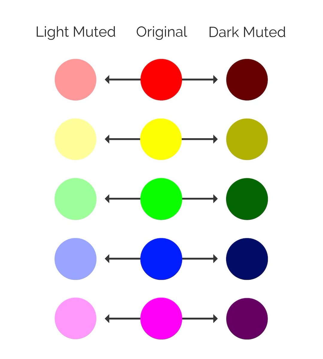
First, let& #39;s define muted colors before we get too far into this thread.
They are basically vivid colors that have had their edge taken off with an infusion of black, white, or a complementary color.
Because of how they are created, there are a TON of muted colors you can use.
They are basically vivid colors that have had their edge taken off with an infusion of black, white, or a complementary color.
Because of how they are created, there are a TON of muted colors you can use.
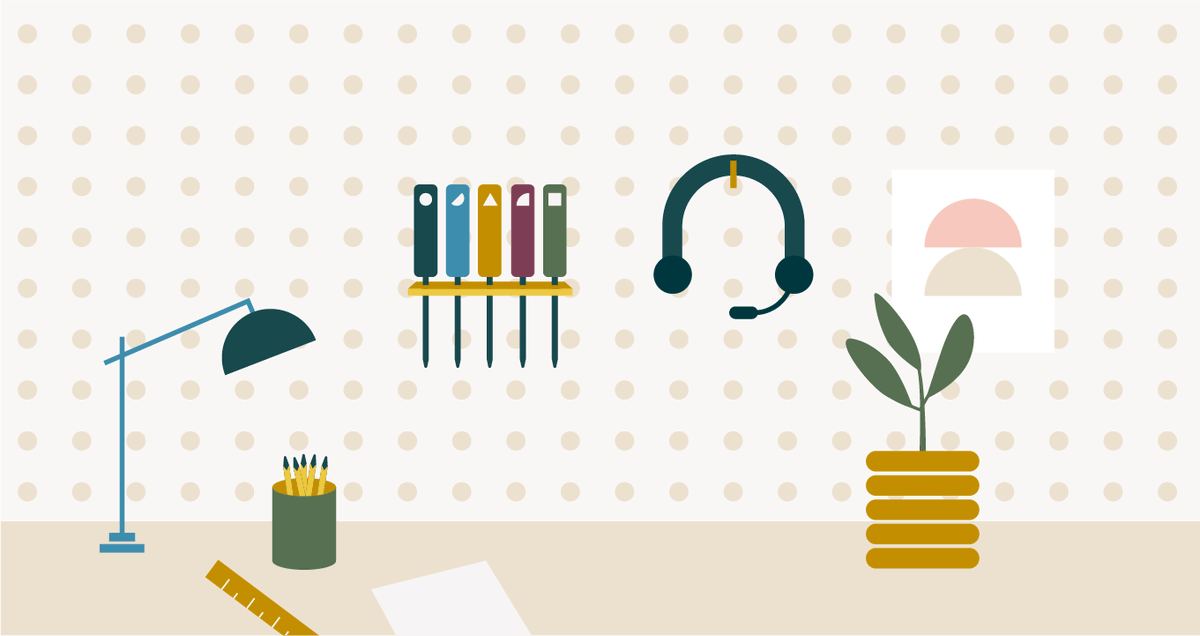
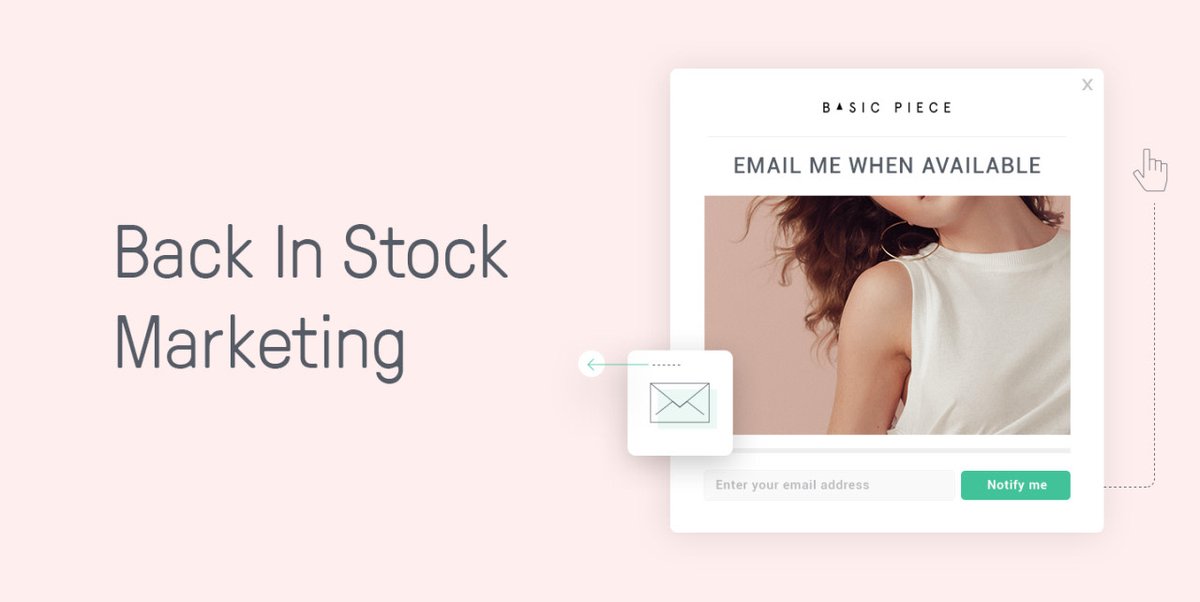
Muted color palettes really took over the graphic design world last year, and show no sign of stopping anytime soon.
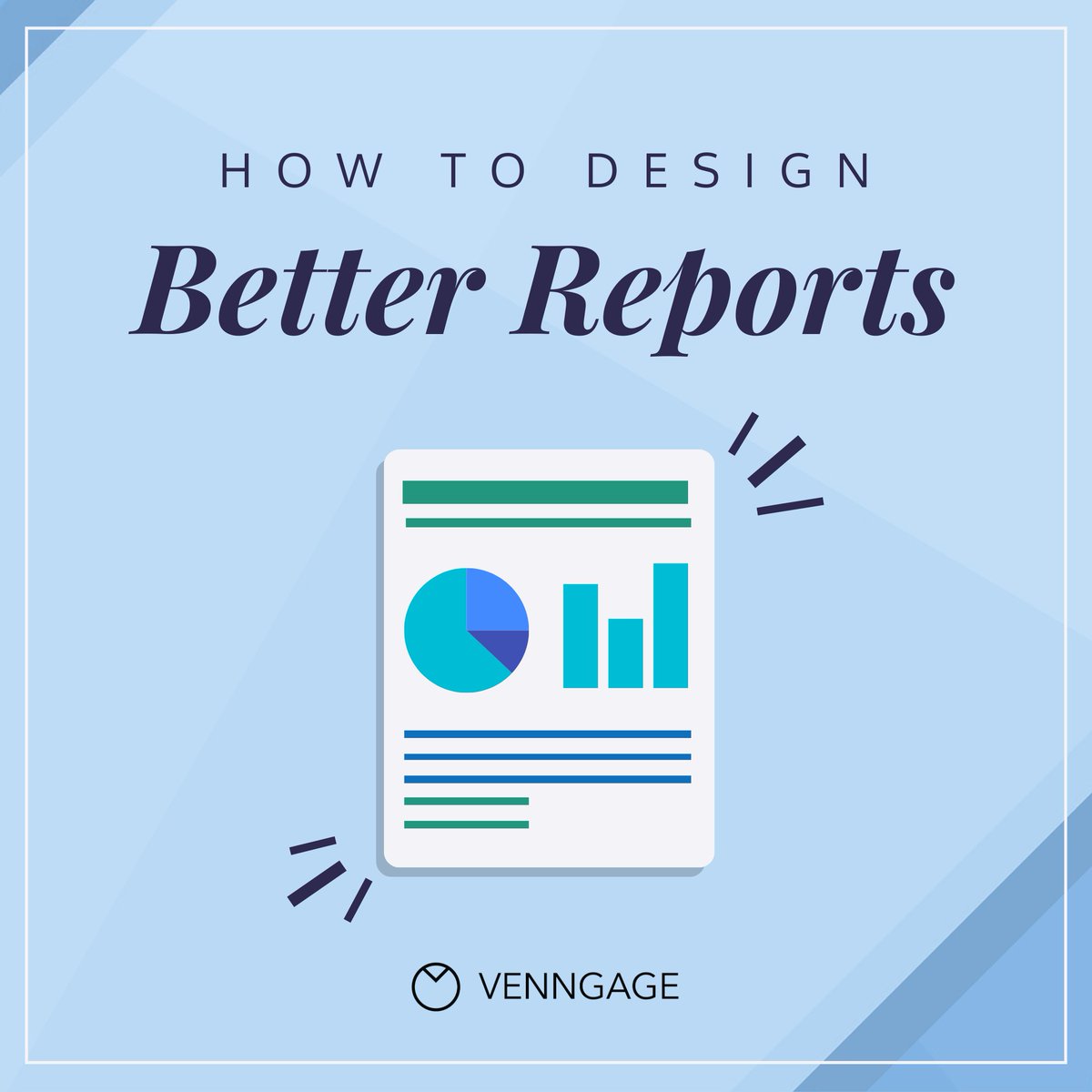
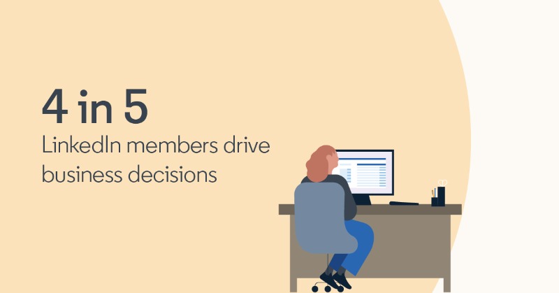
With huge brands like @Mailchimp, @LinkedIn, @Hubspot & @Zendesk using them lately.
I predict they will be very relevant for the next few years as well.
With huge brands like @Mailchimp, @LinkedIn, @Hubspot & @Zendesk using them lately.
I predict they will be very relevant for the next few years as well.
Muted colors feel safe & secure, even nostalgic or genuine to a large part of the population.
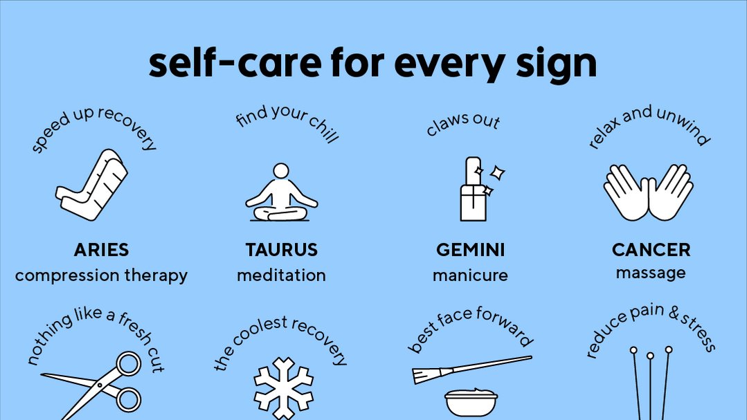
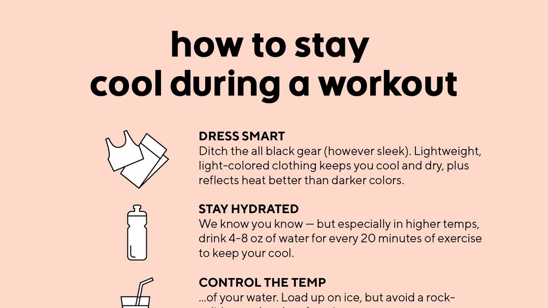
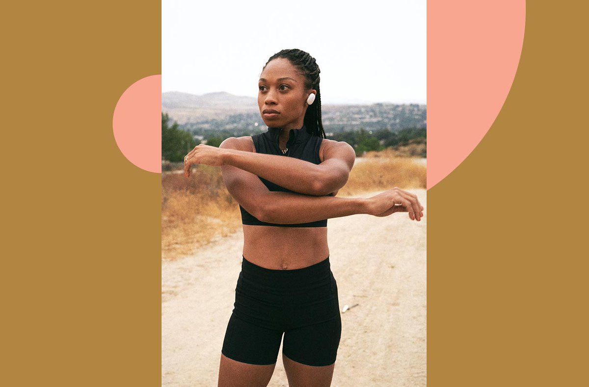
But some brands can also use muted colors to make a graphic feel very natural & organic.
Lifestyle brands @Classpass & @iamwellandgood use muted colors in this way.
But some brands can also use muted colors to make a graphic feel very natural & organic.
Lifestyle brands @Classpass & @iamwellandgood use muted colors in this way.
Personally, I REALLY like using muted color palettes because they play nice well with text.
It doesn& #39;t matter if you use a light or dark font, your text will stand out against the muted backgrounds & other elements.
It doesn& #39;t matter if you use a light or dark font, your text will stand out against the muted backgrounds & other elements.
Now if you& #39;re not ready to complete rethink your brand color palette this year, I have a compromise.
Use your brand colors as a jumping off point & create a few secondary color palettes that you can use.
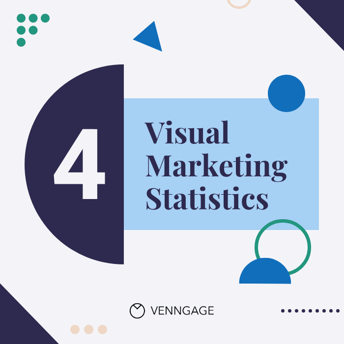
That& #39;s what we have done at @Venngage for a lot of our new social content!
Use your brand colors as a jumping off point & create a few secondary color palettes that you can use.
That& #39;s what we have done at @Venngage for a lot of our new social content!
If you want to see all of the examples & learn a little more about using muted colors, check out the full article: https://venngage.com/blog/graphic-design-trends/">https://venngage.com/blog/grap...

 Read on Twitter
 " title="You probably have heard me talk about how great muted colors are over the past year. But, knowing me, I probably didn& #39;t expand on that point.So let& #39;s talk about muted colors. And why they are such a HUGE Graphic Design Trend in 2021.THREAD https://abs.twimg.com/emoji/v2/... draggable="false" alt="👇" title="Rückhand Zeigefinger nach unten" aria-label="Emoji: Rückhand Zeigefinger nach unten">">
 " title="You probably have heard me talk about how great muted colors are over the past year. But, knowing me, I probably didn& #39;t expand on that point.So let& #39;s talk about muted colors. And why they are such a HUGE Graphic Design Trend in 2021.THREAD https://abs.twimg.com/emoji/v2/... draggable="false" alt="👇" title="Rückhand Zeigefinger nach unten" aria-label="Emoji: Rückhand Zeigefinger nach unten">">
 " title="You probably have heard me talk about how great muted colors are over the past year. But, knowing me, I probably didn& #39;t expand on that point.So let& #39;s talk about muted colors. And why they are such a HUGE Graphic Design Trend in 2021.THREAD https://abs.twimg.com/emoji/v2/... draggable="false" alt="👇" title="Rückhand Zeigefinger nach unten" aria-label="Emoji: Rückhand Zeigefinger nach unten">">
 " title="You probably have heard me talk about how great muted colors are over the past year. But, knowing me, I probably didn& #39;t expand on that point.So let& #39;s talk about muted colors. And why they are such a HUGE Graphic Design Trend in 2021.THREAD https://abs.twimg.com/emoji/v2/... draggable="false" alt="👇" title="Rückhand Zeigefinger nach unten" aria-label="Emoji: Rückhand Zeigefinger nach unten">">
