Oh look @jneill @_johnbye
They’ve done their old trick again
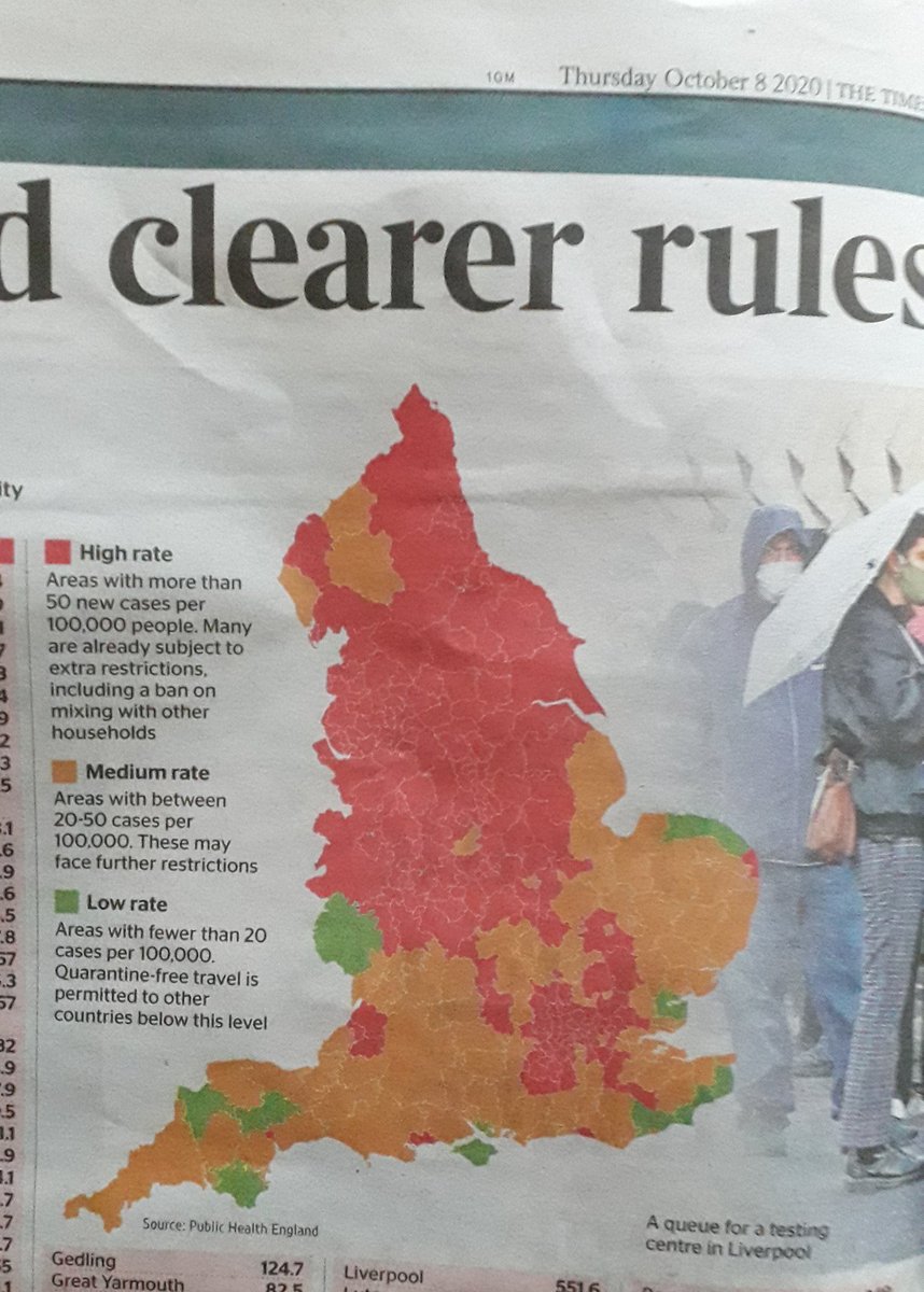
When the map was looking “too red” they just changed the scale so it looked nice and calm again
Instead of looking red nearly everywhere.
And changed the way positivity is calculated.
Either method has downside https://twitter.com/dr_d_robertson/status/1314243939633786881">https://twitter.com/dr_d_robe...
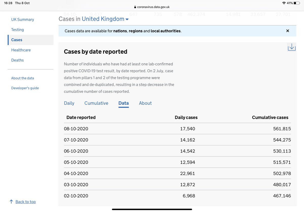
You would never think this week is markedly worse than last week would you...with cases nearly tripling this week (although the PHE report spans last week )
The PHE report goes up to 4th October (the date the second tranche of the backlog of missing cases were reported.)
The problem with reporting positivity by applying ONLY new people tested as the denominator is that it deflates the numbers of people being tested.
The problem with using tests processed as the denominator is that includes testing that includes A LOT OF routine screening of people with no symptoms and not even a close contact of the symptomatic.
Possibly as much as half of the tests processed.
That dilutes positivity.
Possibly as much as half of the tests processed.
That dilutes positivity.
Given capacity cannot meet demand of the symptomatic and close contacts of the symptomatic this certainly means the new method artificially dilutes positivity rates and likely by quite a bit.
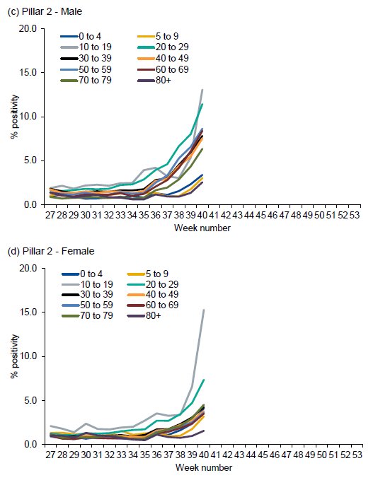
Now look at positivity by age group...and sex.
Girls in the 10-19 age group hit c 15%! Boys c 12.5%
But that reverses in the 20-29 age group with males at just over 10% and females at about 7%.
Indeed makes in all other age groups https://abs.twimg.com/emoji/v2/... draggable="false" alt="⬆️" title="Pfeil nach oben" aria-label="Emoji: Pfeil nach oben"> on females except in 5-9 yr olds.
Girls in the 10-19 age group hit c 15%! Boys c 12.5%
But that reverses in the 20-29 age group with males at just over 10% and females at about 7%.
Indeed makes in all other age groups
BUT when you look at the oldest age groups, esp 80%, remember this is the age group most likely to be subject to routine repeat testing of people without symptoms and not in contact with known positives..so not really comparing like cohorts with like across age groups.
That SHOULD be 80 YEARS old +
Just to remind of what the gradual progression was from week to week here is @jneill ‘s progressive maps.
Have a good look because you would never guess from today’s that the week to 4/10/20 was so much worse.
Which week do you think it NOW looks closest to? https://twitter.com/jneill/status/1313144529986424832">https://twitter.com/jneill/st...
Have a good look because you would never guess from today’s that the week to 4/10/20 was so much worse.
Which week do you think it NOW looks closest to? https://twitter.com/jneill/status/1313144529986424832">https://twitter.com/jneill/st...
But look. @carlbaker has come to the rescue so we can see comparable scales mapped side by side 3 weeks apart.  https://abs.twimg.com/emoji/v2/... draggable="false" alt="🧵" title="Thread" aria-label="Emoji: Thread"> x2 https://twitter.com/fascinatorfun/status/1314556651513536513">https://twitter.com/fascinato...
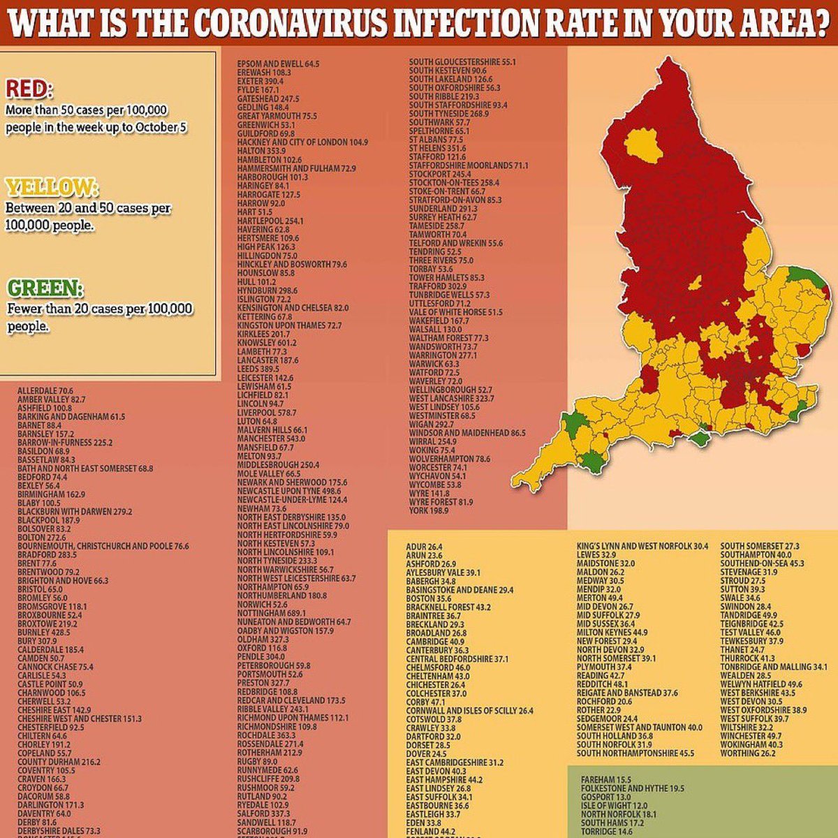
And another via @jneill from the Daily Mail that also provides a helpful index.

 Read on Twitter


 on females except in 5-9 yr olds." title="Now look at positivity by age group...and sex.Girls in the 10-19 age group hit c 15%! Boys c 12.5%But that reverses in the 20-29 age group with males at just over 10% and females at about 7%.Indeed makes in all other age groups https://abs.twimg.com/emoji/v2/... draggable="false" alt="⬆️" title="Pfeil nach oben" aria-label="Emoji: Pfeil nach oben"> on females except in 5-9 yr olds." class="img-responsive" style="max-width:100%;"/>


