Public Health England have published their latest (week 41) COVID surveillance report. However, this is in a new format called the & #39;influenza and COVID-19 surveillance report& #39;. It is not clear whether a separate COVID report will be published
https://assets.publishing.service.gov.uk/government/uploads/system/uploads/attachment_data/file/925324/Weekly_Flu_and_COVID-19_report_W41_FINAL.pdf">https://assets.publishing.service.gov.uk/governmen...
https://assets.publishing.service.gov.uk/government/uploads/system/uploads/attachment_data/file/925324/Weekly_Flu_and_COVID-19_report_W41_FINAL.pdf">https://assets.publishing.service.gov.uk/governmen...
This report does not appear to contain a watchlist of local authorities. Previous weeks have contained a watchlist of local authorities published jointly by PHE / Joint Biosecurity Centre / NHS Test and Trace.
See this for last week& #39;s https://twitter.com/Dr_D_Robertson/status/1311998656174788608">https://twitter.com/Dr_D_Robe...
See this for last week& #39;s https://twitter.com/Dr_D_Robertson/status/1311998656174788608">https://twitter.com/Dr_D_Robe...
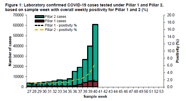
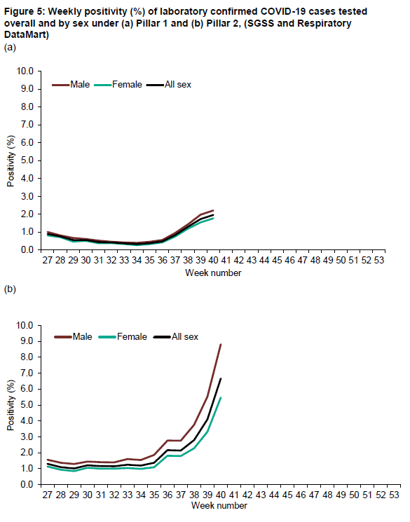
This is the chart for positivity. Increasing. Change of methodology this week - a good thing as a more conventional calculation.
& #39;Positivity is calculated as the number of individuals testing positive during the week divided by the number of individuals tested during the week.& #39;
& #39;Positivity is calculated as the number of individuals testing positive during the week divided by the number of individuals tested during the week.& #39;
Pillar 2 (community testing) positivity increasing significantly. Greater than 5% in Pillar 2 (indicating not enough testing being performed) (WHO guidance)
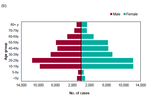
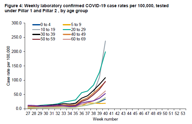
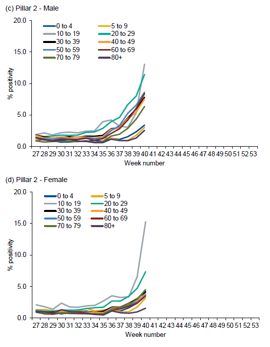
Pillar 2 (community testing) positivity broken down by age cohorts. Positivity of >10% for 10-19 year olds and 20-29 year olds. This indicates that not enough testing is being performed particularly in these age groups. Cases in these age groups particularly under-reported.
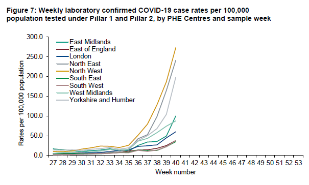
Covid case rates broken down by region. North East, North West, Yorkshire & Humber high.
East Midlands rising fast too (dark green line)
East Midlands rising fast too (dark green line)
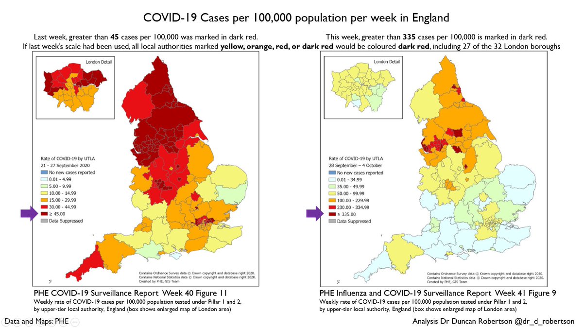
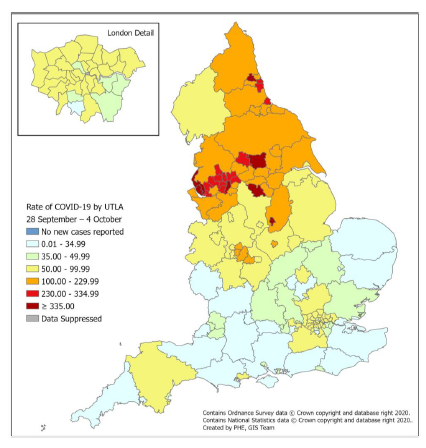
Covid cases map for the UK. Doesn& #39;t look as scary as last week - last week darkest red was for greater than 45 cases per 100,000.
It& #39;s now greater than 335 cases per 100,000.
If this was using the same colour scheme as last week, *everything yellow or above would be dark red*.
It& #39;s now greater than 335 cases per 100,000.
If this was using the same colour scheme as last week, *everything yellow or above would be dark red*.
So, this week, the *whole of London* would be dark red if using the same scale as last week.
Here& #39;s last week& #39;s map for comparison. Things have got worse since then. https://twitter.com/Dr_D_Robertson/status/1311984858785296384">https://twitter.com/Dr_D_Robe...
Here& #39;s last week& #39;s map for comparison. Things have got worse since then. https://twitter.com/Dr_D_Robertson/status/1311984858785296384">https://twitter.com/Dr_D_Robe...
It is not clear whether the (only) Covid surveillance report will be published tomorrow. If so, I will produce another thread, which I expect will include hospitalisation location data and maps of cases in local authorities.
A couple of clarifications/corrections
- This is a map not of the UK, but of England https://abs.twimg.com/emoji/v2/... draggable="false" alt="🙂" title="Leicht lächelndes Gesicht" aria-label="Emoji: Leicht lächelndes Gesicht"> (data from Public Health England)
- The areas that would formerly be dark red are 27 of the 32 London boroughs: all London boroughs except for: Bexley, Bromley, Greenwich, Merton, and Sutton
- This is a map not of the UK, but of England
- The areas that would formerly be dark red are 27 of the 32 London boroughs: all London boroughs except for: Bexley, Bromley, Greenwich, Merton, and Sutton
And thank you to @rob_aldridge and @junipertwo for pointing me in the right direction: the Covid-specific report will no longer be published.
The watchlist and local authority maps have been published on Fridays, and I will look out for them tomorrow. https://twitter.com/Junipertwo/status/1314307728244903936">https://twitter.com/Junipertw...
The watchlist and local authority maps have been published on Fridays, and I will look out for them tomorrow. https://twitter.com/Junipertwo/status/1314307728244903936">https://twitter.com/Junipertw...
Although the watchlist of local authorities has not yet been published, you can make a rough estimate - here are the upper tier local authorities (these are the equivalent of county councils) and include unitary authorities such as Leicester.
105 out of 149, or over two-thirds
105 out of 149, or over two-thirds
Only *three* of these 149 upper tier local authorities are below a threshold of 20 cases per 100,000
"above 20 per 100,000 are of particular concern when [the Government] decides whether to update the [self-isolation for travellers to the UK] list." https://news.sky.com/story/coronavirus-which-are-the-next-countries-to-be-added-to-the-uks-quarantine-list-12058367">https://news.sky.com/story/cor...
"above 20 per 100,000 are of particular concern when [the Government] decides whether to update the [self-isolation for travellers to the UK] list." https://news.sky.com/story/coronavirus-which-are-the-next-countries-to-be-added-to-the-uks-quarantine-list-12058367">https://news.sky.com/story/cor...
Here& #39;s a slide summarizing the colour scheme change

 Read on Twitter

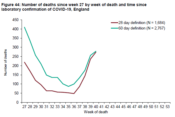
 (data from Public Health England) - The areas that would formerly be dark red are 27 of the 32 London boroughs: all London boroughs except for: Bexley, Bromley, Greenwich, Merton, and Sutton" title="A couple of clarifications/corrections- This is a map not of the UK, but of England https://abs.twimg.com/emoji/v2/... draggable="false" alt="🙂" title="Leicht lächelndes Gesicht" aria-label="Emoji: Leicht lächelndes Gesicht"> (data from Public Health England) - The areas that would formerly be dark red are 27 of the 32 London boroughs: all London boroughs except for: Bexley, Bromley, Greenwich, Merton, and Sutton" class="img-responsive" style="max-width:100%;"/>

