Using the daily MA State COVID reports, I& #39;ve made a graph comparing the daily "Total Molecular Tests", by date to their previous released day, to get a sense of "What dates are tests being returned to the state by?" This is an approximation of testing delays. 1/
Overall, this graph shows the curve of seriously delayed results increasing in late July, matching anecdotal reports of lack of testing capacity, increasing from early July to around the 24th, recovering by early August. 2/
However, it also shows intermittent spikes in testing delays, with some of the worst dates actually happening in mid-September. 3/
This alternative view focuses only on "new" tests--the state& #39;s category for people being tested for the first time. (This excludes the routine surveillence testing from universities that now dominates our statewide testing.) Overall, similar shapes, but key differences: 4/
1. The delay around mid-September is not present, so this was likely a delay in one of the big universities returning tests; unlikely to have much impact on symptomatic tests.
2. The first-day return rate is much lower; surveillance testing is quicker on average. 5/
2. The first-day return rate is much lower; surveillance testing is quicker on average. 5/
Overall, this suggests our testing return times at the moment are about as timely as they ever have been; that mid July was *really* bad; and that there& #39;s still a fair number (~20%) of people who are not getting tests back for 4 days or more. 6/
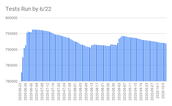
There is also some noise in this data which may be confounding: overall, if you go back more than two weeks, the tests completed by any given date just... constantly shift. For example, here is a graph of "tests run by 6/22" as reported over time. 7/
(The fact that on *October 5th* we are reporting that a different number of tests was performed on June 22nd than we reported on October 1st is really concerning to me!)
So, these graphs aren& #39;t perfect; the data is noisy and problematic, and may not tell the full story. 8/
So, these graphs aren& #39;t perfect; the data is noisy and problematic, and may not tell the full story. 8/
Overall, this data gives me the sense that testing delays right now are about on-par with how they& #39;ve always been. This isn& #39;t a defense, and it isn& #39;t *good*, but at least it& #39;s not new or the sign of a currently worrying trend. 9/
cc @garrett_wollman; you probably already have an intuitive sense of the graphs in this thread, but since I put together the work, figured I& #39;d share :)

 Read on Twitter


