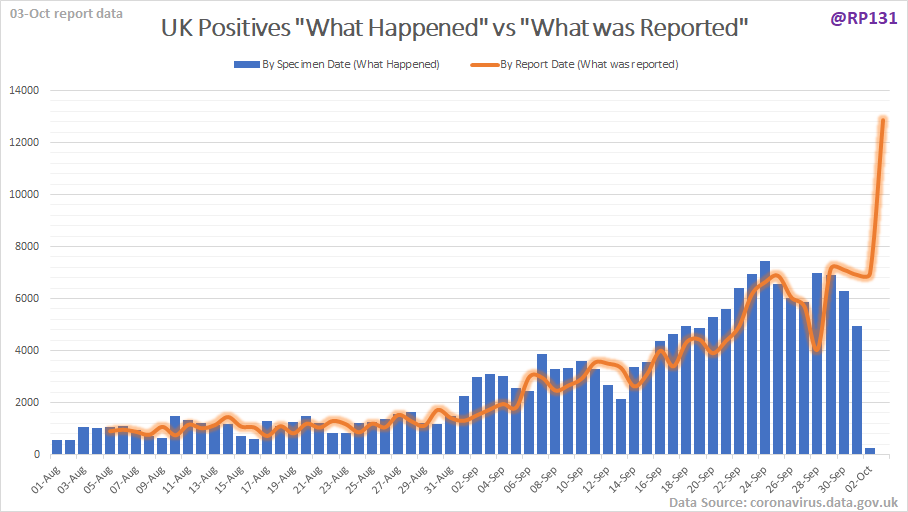
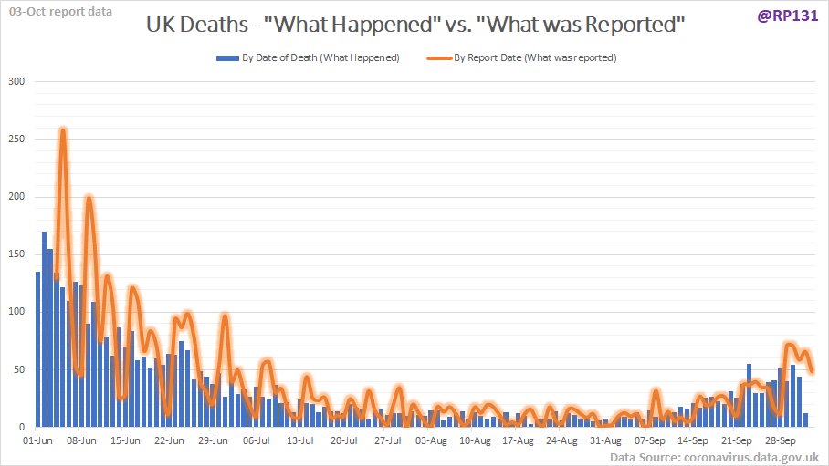
Yesterday was another in a long line of examples of how an unhealthy addiction to "the very latest data" has spread considerable amounts of misunderstanding during this whole event. The series on this chart essentially represent the same numbers.
It does the same with deaths too. I really don& #39;t know if the problem is that @PHE_uk / @DHSCgovuk are over-keen with offering their data, or whether they& #39;re pushed too hard by the government/media to provide some kind of real-time view in this modern digital age.
Ultimately, the message is not being properly managed that nationwide reporting systems take time to collate/process the data and sometimes there will be issues that need to be analysed and resolved. I think @ONS gets this as their reports are generally a week in arrears.
I do sympathise because they can& #39;t just change their reporting process overnight, both for technical and political reasons. I believe Spain did it a few months ago and everyone accused them of trying to hide their death numbers.
So with the obvious benefit of hindsight, I would suggest that a reporting process based more around "latest movements of trends" might have been more appropriate. Possibly where they provide real-time trends but only release the raw data a week or so behind.
In the meantime though, I do think their media relations departments could do a better job at managing the message. Events like yesterday deserved better reporting than they have so far received.

 Read on Twitter


