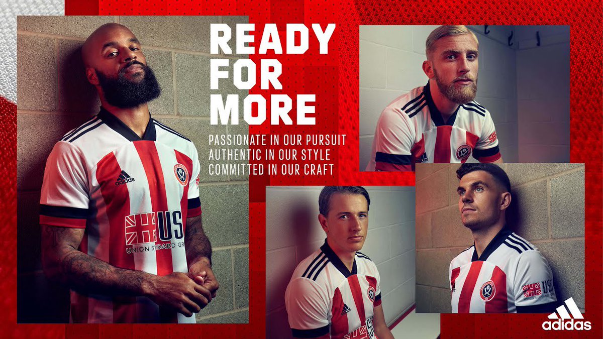
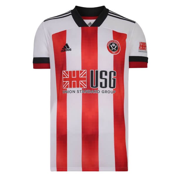
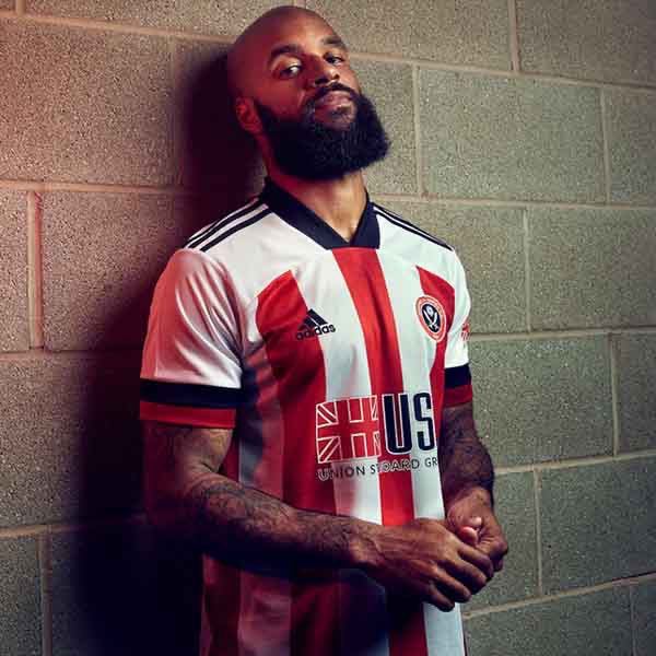
Right, I keep seeing rankings of this seasons Premier League shirts (and the fantastic #PremierKitLeague that @kitfanatic is currently running) and there’s one shirt that isn’t receiving enough love I feel- Sheffield United’s home shirt. Why? (Thread)
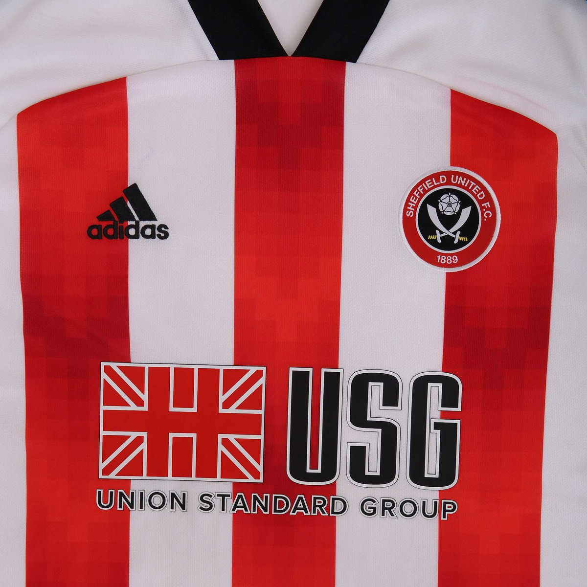
The shirts design is very clean, and Sheffield United are blessed with a great colourway to show it off. Look how crisp the white looks against the red. The black collar and accents are just the icing on the cake

 Read on Twitter