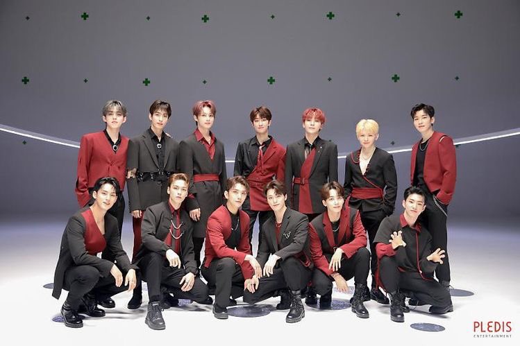
Dissecting Seventeen’s 24H concept
⁽ the art of harmony ⁾
— a thread
@pledis_17 @pledis_17jp #SEVENTEEN
⁽ the art of harmony ⁾
— a thread
@pledis_17 @pledis_17jp #SEVENTEEN
disclaimer: I am in no way an expert but I do love fashion and read up on fashion essays and keep up with collections and have taken online courses on fashion theory so I guess this is just how I PERSONALLY would interpret/dissect their outfits based on my knowledge.
PSA: this isn’t my typical fashion thread where I discuss and dissect the concept in relation to clothes but this thread is more of me pointing out and furthering the concept as a whole and inserting little tidbits abt the clothes :D
I’ll start off with the concept as a whole then I’ll move on to the details then lastly, I’ll discuss their concepts in relation to the MV or the red string of fate.
The unpredictable passing of time; One main theme that 24H presents. It’s this sort of feeling and notion that how time passes is out of your hands that drives a lot of the visuals in the choreography and MV.
The choreography and visuals showing us that how time moves is in your perspective. It slows, speeds up and sometimes it stops.
According to the legend of the red string of fate, two people are connected and are bound by fate itself. The strings can sometimes stretch and become tangled, which could postpone the fateful meeting.
But those ties will never be broken. It’s this sort of philosophy that enforces that our world has its share of obstacles but nothing in it happens by accident.
It’s also interesting to note that there were a lot of shots with water and presenting the fluidity of water. These images are aesthetically appealing but alternately water in art is usually a metaphor for rebirth, change and self discovery.
It’s this sort of idea and philosophy stated above that connects the MV with the concept of the red string of fate.
Red, a color that usually signifies healing and power but in this context it is mostly used to signify an intensity. Intensity of longing and assurance found in the lyrics.
One important theme is also contrast (which is quite a recurring concept in seventeen if you’ve read my other threads). The contrast between the sharp suiting in the MV to the soft drapes in the album pictures.
Most importantly though it’s also this contrast from white and red to red and black that really helped to focus and juxtapose the meaning and intensity of the color red as stated above.
The asymmetry in their suiting with the one sided cinched waists, side cuts, etc that is then contrasted with the symmetrical sets and framing in the MV helps to reinforce the visual idea of contrast in the MV also.
It is also interesting to note the extra strings lining and then dangling thru their suits looks almost as if it’s an extension of their clothes.
This could be another reference to the red string of fate as the legend says the red strings are connected from the heart that then leads and extends outward to the pinky finger.
24h is a fine example of what harmony in art is. The album concept, lyrics, MV visuals and clothing coming together in a unified way to create something beautiful and meaningful.
Anyways I hope you had fun reading this! I focused less on the clothes this time and changed the way I write a little bit as I wanted to highlight all the elements at play that unified the whole concept of 24H but still I hope you enjoyed it!
and lastly! don’t forget to stream 24H or i will haunt u <33 and please do dm me if you want any of the references i used to make this thread! https://youtu.be/MmI-vsaOoUE ">https://youtu.be/MmI-vsaOo...
mmm you’ve reached the end of this thread anyways so cmon read my other threads don’t be shy  https://abs.twimg.com/emoji/v2/... draggable="false" alt="😼" title="Katzengesicht mit ironischem Lächeln" aria-label="Emoji: Katzengesicht mit ironischem Lächeln"> https://twitter.com/messmingyu/status/1285965511512268805">https://twitter.com/messmingy...

 Read on Twitter


