I& #39;m having a data day, to counter the Graphs of Mass Destruction. Let& #39;s have some balance.  https://abs.twimg.com/emoji/v2/... draggable="false" alt="🤓" title="Nerd-Gesicht" aria-label="Emoji: Nerd-Gesicht">
 https://abs.twimg.com/emoji/v2/... draggable="false" alt="📊" title="Balkendiagramm" aria-label="Emoji: Balkendiagramm">
 https://abs.twimg.com/emoji/v2/... draggable="false" alt="📉" title="Tabelle mit Abwärtstrend" aria-label="Emoji: Tabelle mit Abwärtstrend">
 https://abs.twimg.com/emoji/v2/... draggable="false" alt="👍" title="Thumbs up" aria-label="Emoji: Thumbs up">
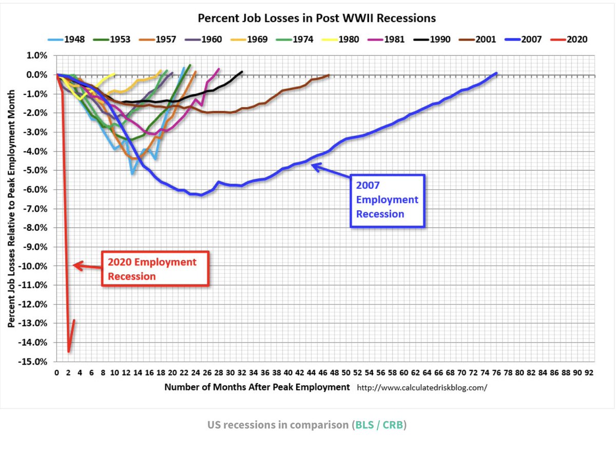
This is a useful collection of charts that offer a wider perspective. https://swprs.org/covid-the-big-picture-in-7-charts/">https://swprs.org/covid-the...
This is a useful collection of charts that offer a wider perspective. https://swprs.org/covid-the-big-picture-in-7-charts/">https://swprs.org/covid-the...
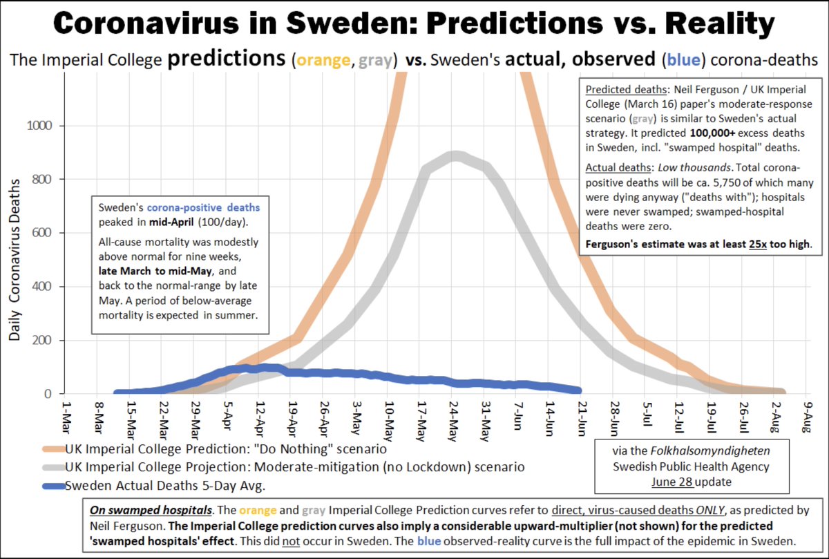
Talking of Graphs of Mass Destruction... Lockdown followed the widely debunked doom and gloom models of Imperial College. Let& #39;s see what they had to say about Sweden and what actually happened....They were wrong! And the UK government is still using Imperial models now *groan*
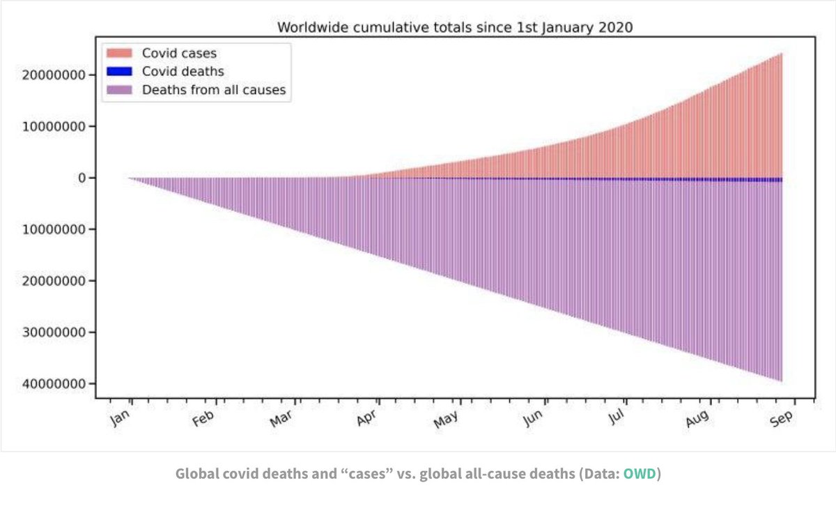
And this graph really gets Covid & #39;cases& #39; (positive results NOT necessarily symptoms) with Covid deaths and & #39;all cause& #39; deaths. Covid has taken a lot of lives, but it is not the worldwide killer that was feared.

 Read on Twitter


