UPDATE: 6,914 more #COVID19 UK cases in past 24 hrs.
So.
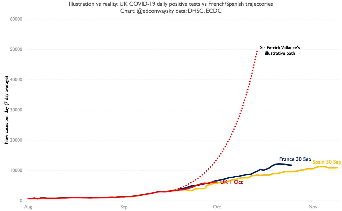
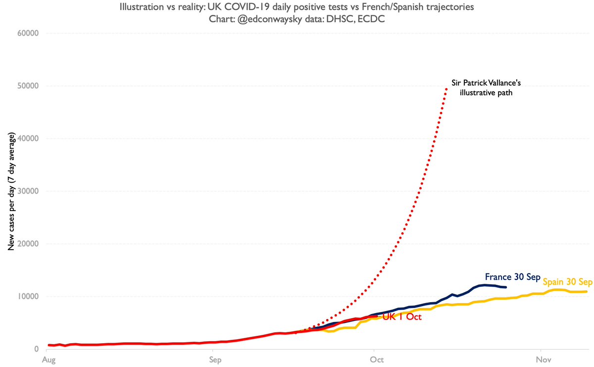
Is the UK case trajectory in line with the illustration from @uksciencechief 10 days ago or is it still in line with the Spanish/French trajectories - as it has been for ages?
Have a look at the chart and judge for yourself
So.
Is the UK case trajectory in line with the illustration from @uksciencechief 10 days ago or is it still in line with the Spanish/French trajectories - as it has been for ages?
Have a look at the chart and judge for yourself
The point is not that @uksciencechief was wrong to give an illustration.
Illustrations are helpful.
But by choosing the path he did - a single path, a scary number, designed to grab headlines - he made the far likelier path look less serious than it really is.
This stuff matters
Illustrations are helpful.
But by choosing the path he did - a single path, a scary number, designed to grab headlines - he made the far likelier path look less serious than it really is.
This stuff matters
This pains me because I greatly value experts and institutions.
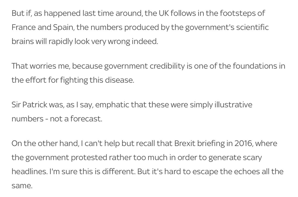
But as I wrote last Mon, that illustration was always likely to become a hostage to fortune.
Today’s daily cases were less than half what they would have been had we followed that path! https://news.sky.com/story/coronavirus-the-disease-is-clearly-spreading-but-can-we-trust-the-figures-12078232">https://news.sky.com/story/cor...

 Read on Twitter


