covid panics have become as regular & predictable as moon phases or cicadas
as we& #39;re coming back into the "mistaking more testing for more cases" part of the cycle, let& #39;s see if we can get ahead of the fear here:
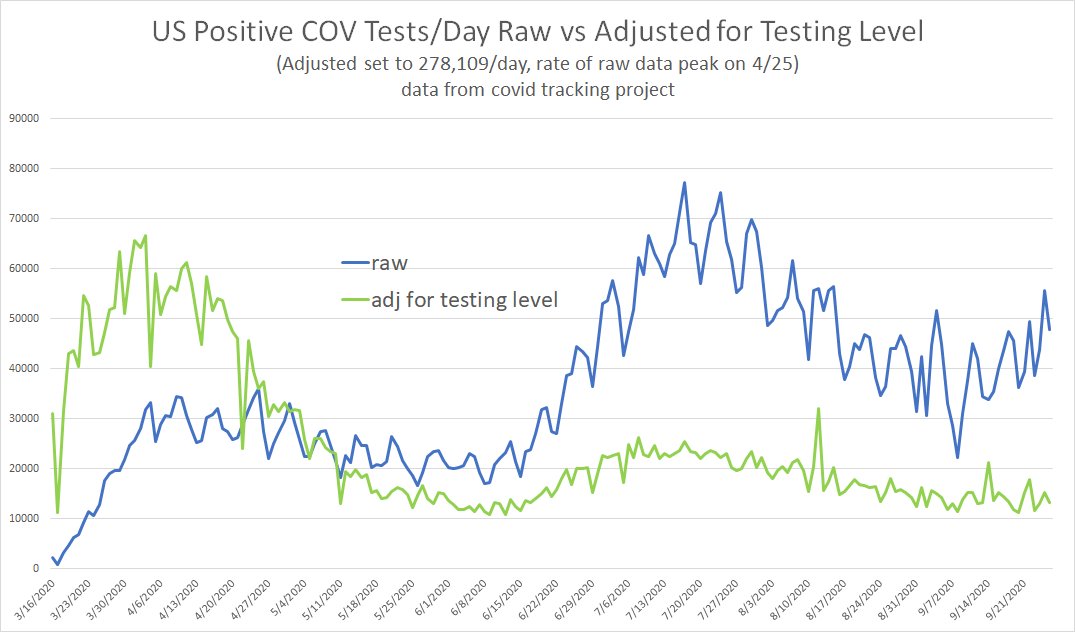
the blue line is reported cases, green adjusts for more testing
as we& #39;re coming back into the "mistaking more testing for more cases" part of the cycle, let& #39;s see if we can get ahead of the fear here:
the blue line is reported cases, green adjusts for more testing
as can be readily seen, the two tell very different stories.
the second peak from southern seasonality was actually much smaller than the first, not larger.
it topped out at 35% of prior peak, not 214% as the raw data misleadingly implies.
the second peak from southern seasonality was actually much smaller than the first, not larger.
it topped out at 35% of prior peak, not 214% as the raw data misleadingly implies.
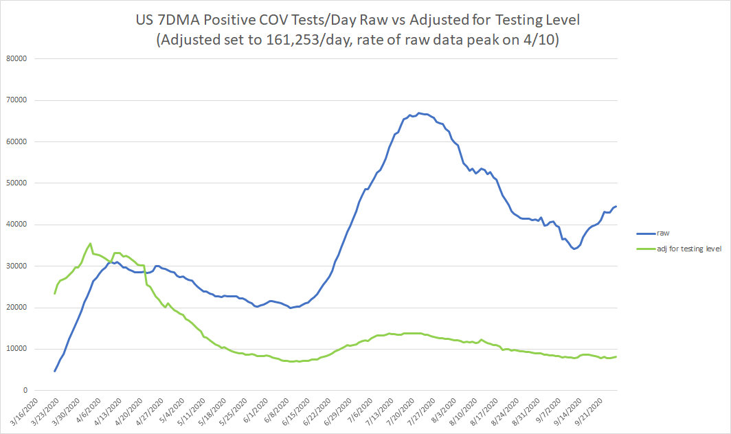
this is data from CTP, so it& #39;s not real day of case but rather day of report, so it has some significant data artifacts. we can mitigate this somewhat by smoothing to a 7 day moving average.
blue is "reported"
green is the real epidemiological trend.
blue is "reported"
green is the real epidemiological trend.
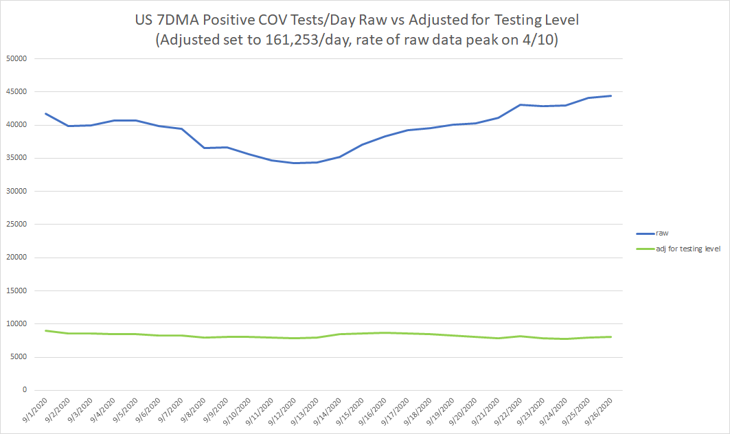
as can readily be seen, they are once more diverging meaningfully.
this is precisely the time that the casedemic cicadas emerge from their slumber and begin chirping loudly.
but, just like last time, they are mistaking a data artifact for data and sample rate for disease vector
this is precisely the time that the casedemic cicadas emerge from their slumber and begin chirping loudly.
but, just like last time, they are mistaking a data artifact for data and sample rate for disease vector
we can do a rough check on this using % positive rates on tests.
when prevalence rises, so, ceteris paribus, should % positive. it tracks death rates pretty well, so we get some intuition that this is roughly correct.
it is not rising.
when prevalence rises, so, ceteris paribus, should % positive. it tracks death rates pretty well, so we get some intuition that this is roughly correct.
it is not rising.
there is a tantalizing wrinkle to this data in the way it flatlines.
% positive seems to hit a wall at 4.5% and hold in the 4.5-5.5% range.
that looks like a probabilistic phenomenon, not an epidemiological one.
could this be the false positive rate on tests?
% positive seems to hit a wall at 4.5% and hold in the 4.5-5.5% range.
that looks like a probabilistic phenomenon, not an epidemiological one.
could this be the false positive rate on tests?
is this the number of PCR tests that will read positive when run at very high Ct either as a false positive or because they are picking up tiny levels of non-clinically relevant virus from people who are neither sick nor contagious?
this is going to bear watching.
this is going to bear watching.
are we even tracking disease anymore or just tracking the error rates from oversensitive testing being performed at a rate never before seen in all of human history.
we& #39;re doing more covid tests per day in the US than we do flu tests in a year.
we& #39;re doing more covid tests per day in the US than we do flu tests in a year.
for some reason, media and politicos alike still seem to struggle with this basic idea of "sample rate"
this is not some complex statistical fine point. you could easily explain it to a third grader.
this is not some complex statistical fine point. you could easily explain it to a third grader.
imagine you& #39;re watching cars on the highway. you want to know how many red ones there are.
you cannot look at them all, there are too many.
but if you see 100,000 cars go by and assess every 100th car, you can get good data.
of the 1000 you look at 90 are red. 9% prevalence.
you cannot look at them all, there are too many.
but if you see 100,000 cars go by and assess every 100th car, you can get good data.
of the 1000 you look at 90 are red. 9% prevalence.
for the sake of this discussion, let& #39;s assume that that& #39;s correct. 9% of cars really are red.
now let& #39;s say you count the next 100k cars but at a rate of 2 per 100.
you get 180 red cars. 9% prevalence.
reporting this as "the number of red cars doubled!" would be absurd.
now let& #39;s say you count the next 100k cars but at a rate of 2 per 100.
you get 180 red cars. 9% prevalence.
reporting this as "the number of red cars doubled!" would be absurd.
and yet somehow this is precisely what we& #39;re falling for, over and over.
this is what the media keeps doing despite this issue having been raised 1000 times by scientists, statisticians and internet cats alike.
and as we have seen, this is not a difficult concept.
this is what the media keeps doing despite this issue having been raised 1000 times by scientists, statisticians and internet cats alike.
and as we have seen, this is not a difficult concept.
at a certain point, one must presume that this is willful.
i& #39;m simply finding it impossible to believe that this issue is too complex for reporters, pundits, and leaders
they have chosen their paths and seem unwilling to diverge from them
they will seek to mislead and frighten
i& #39;m simply finding it impossible to believe that this issue is too complex for reporters, pundits, and leaders
they have chosen their paths and seem unwilling to diverge from them
they will seek to mislead and frighten
but they can only do so with your permission.
this is just the same old campfire ghost story they have told you 20 times before.
it loses its potency once you start laughing at them for taking it seriously.
so take laughing at them seriously and discredit this manipulation.
this is just the same old campfire ghost story they have told you 20 times before.
it loses its potency once you start laughing at them for taking it seriously.
so take laughing at them seriously and discredit this manipulation.

 Read on Twitter


