The @cityoftoronto and @TOPublicHealth are burying data on Covid-19 deaths and hospitalizations.
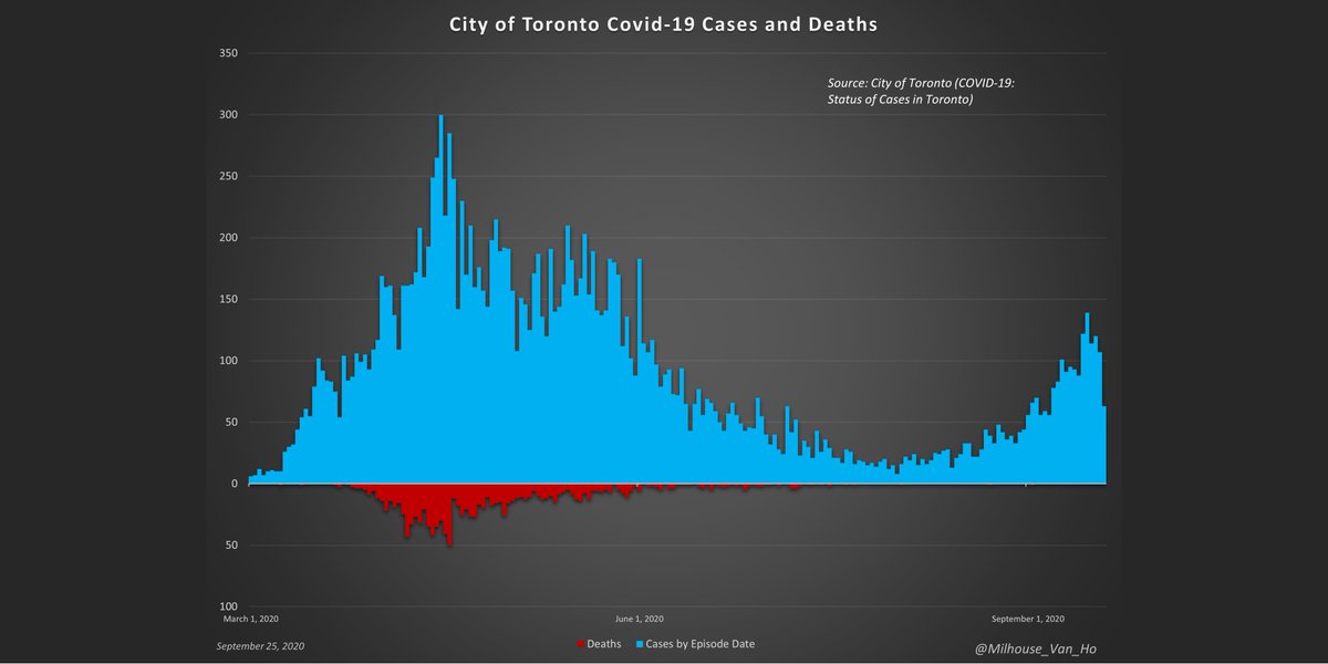
It is now nearly impossible for someone to account for the dates of the 1,178 deaths in Toronto as done below.
Is it because there have only been 3 deaths since August 1st?
It is now nearly impossible for someone to account for the dates of the 1,178 deaths in Toronto as done below.
Is it because there have only been 3 deaths since August 1st?
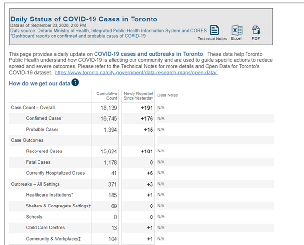
There used to be a graph of cases and deaths by date, but that has been removed and replaced with this daily status that only explains the current status and change from the day before.
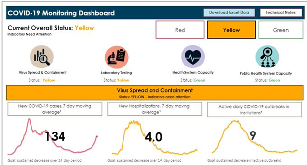
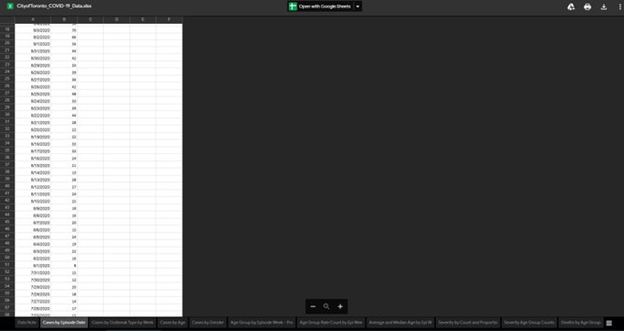
The Monitoring Dashboard offers an Excel download option, but deaths are not included.
Hospitalization data is limited to a 7-day moving average.
Hospitalization data is limited to a 7-day moving average.
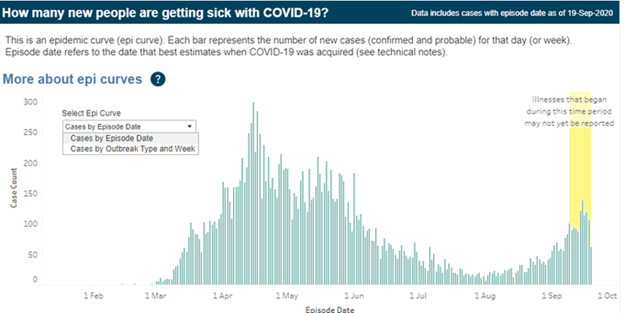
One must find that data buried deep within, where it is organized by week rather than by date. Up until last week, this data was available by date, even with a reporting lag.
On the plus side, the hospital system capacity data is helpful.
It is misleading, however, in that there is no mention of the % capacity occupied by covid-19 patients. With only 25 patients in the ICU in all of Ontario, that % is likely minuscule.
It is misleading, however, in that there is no mention of the % capacity occupied by covid-19 patients. With only 25 patients in the ICU in all of Ontario, that % is likely minuscule.
https://www.toronto.ca/home/covid-19/covid-19-latest-city-of-toronto-news/covid-19-status-of-cases-in-toronto/">https://www.toronto.ca/home/covi...

 Read on Twitter