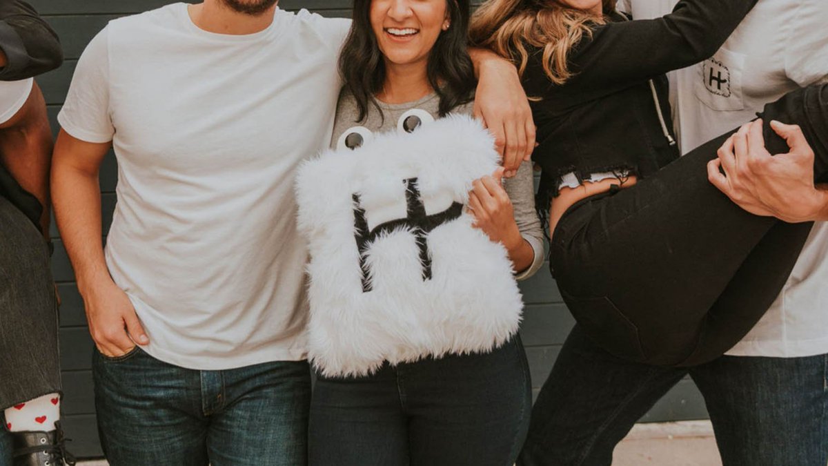
Building genuine trust with your audience is incredibly hard.
Especially if you niche - online dating - already has a complicated reputation .
But @Hinge seems to have figured it out & are growing like crazy.
Wonder how do they do it?
Check out this thread to learn more!
Especially if you niche - online dating - already has a complicated reputation .
But @Hinge seems to have figured it out & are growing like crazy.
Wonder how do they do it?
Check out this thread to learn more!
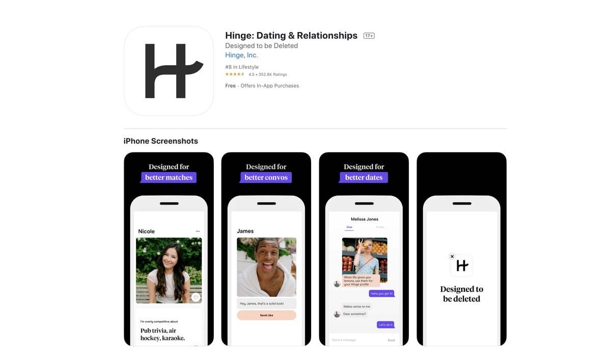
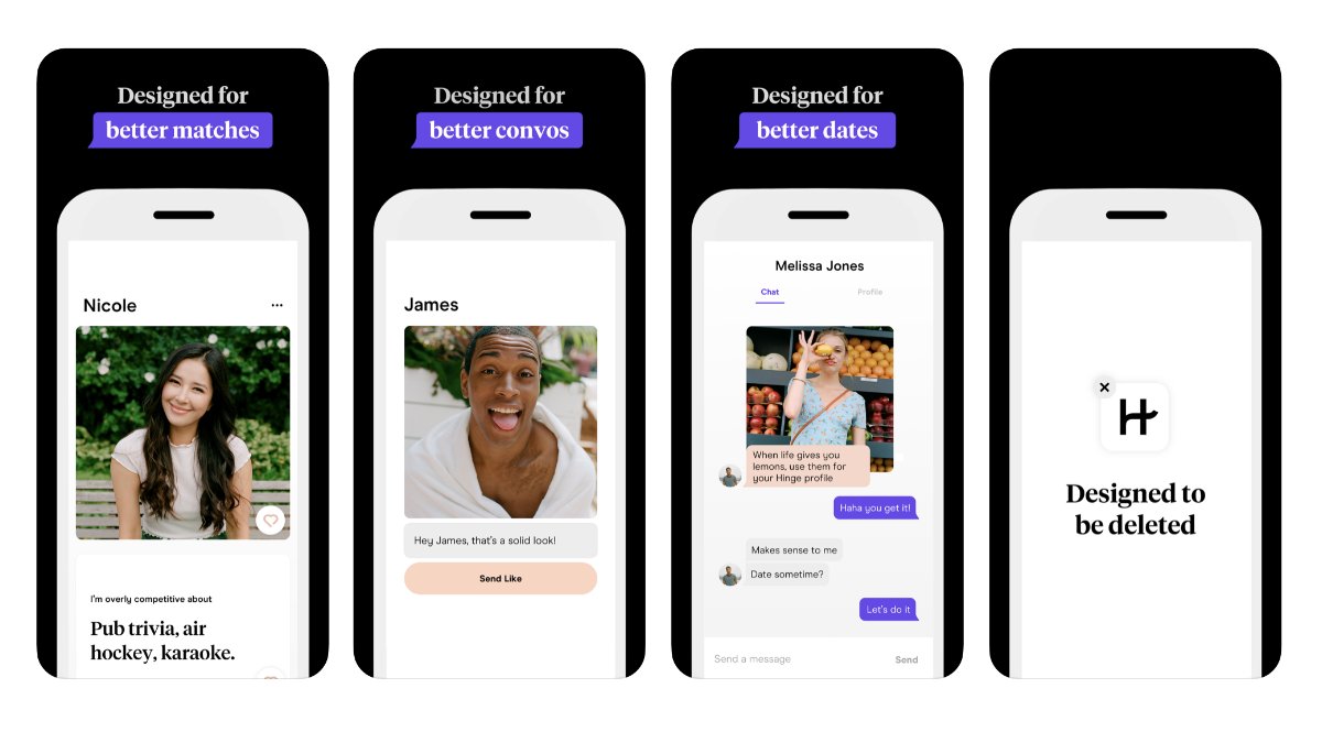
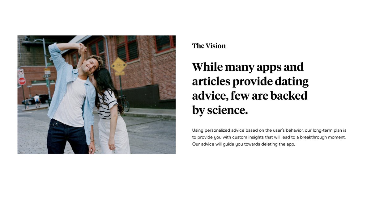
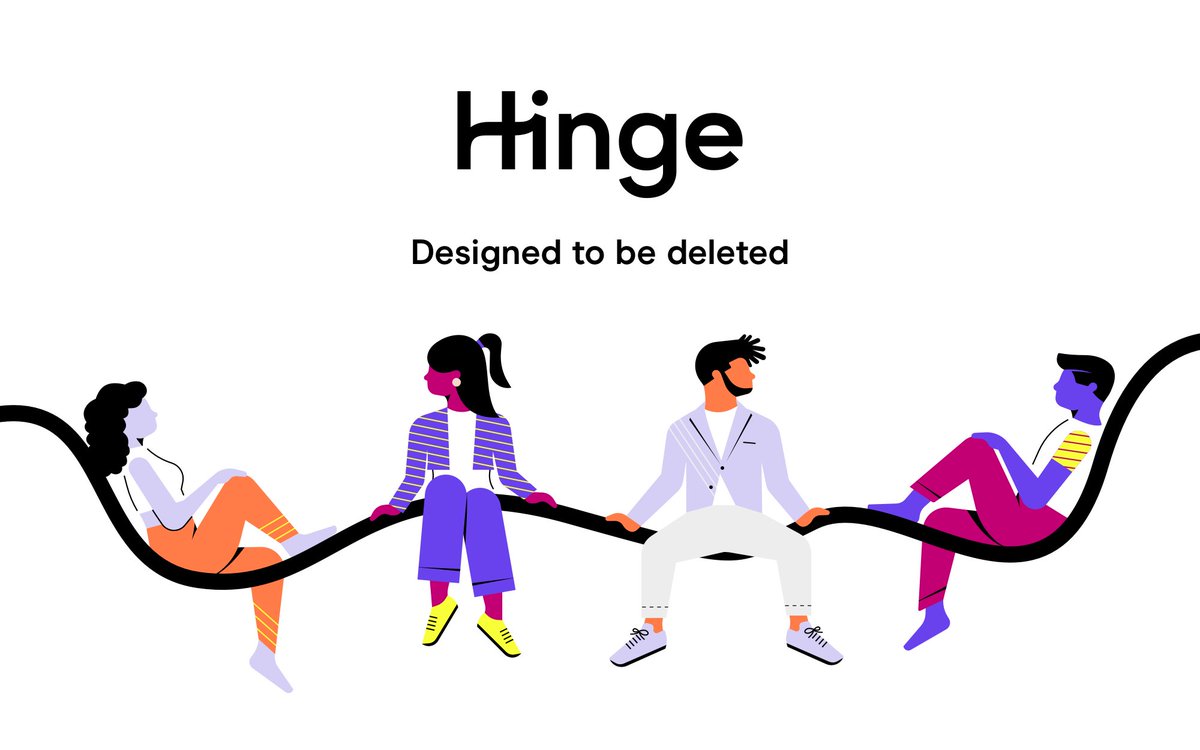
If you& #39;re not aware of @Hinge, it’s a dating app that WANTS to be deleted.
Their core mission is to help you find that special someone.
Sounds pretty simple, right?
But dating isn& #39;t simple.
It& #39;s messy, frustrating & vulnerable.
So how do they convince user& #39;s it& #39;s worth it?
Their core mission is to help you find that special someone.
Sounds pretty simple, right?
But dating isn& #39;t simple.
It& #39;s messy, frustrating & vulnerable.
So how do they convince user& #39;s it& #39;s worth it?
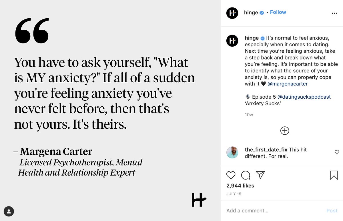
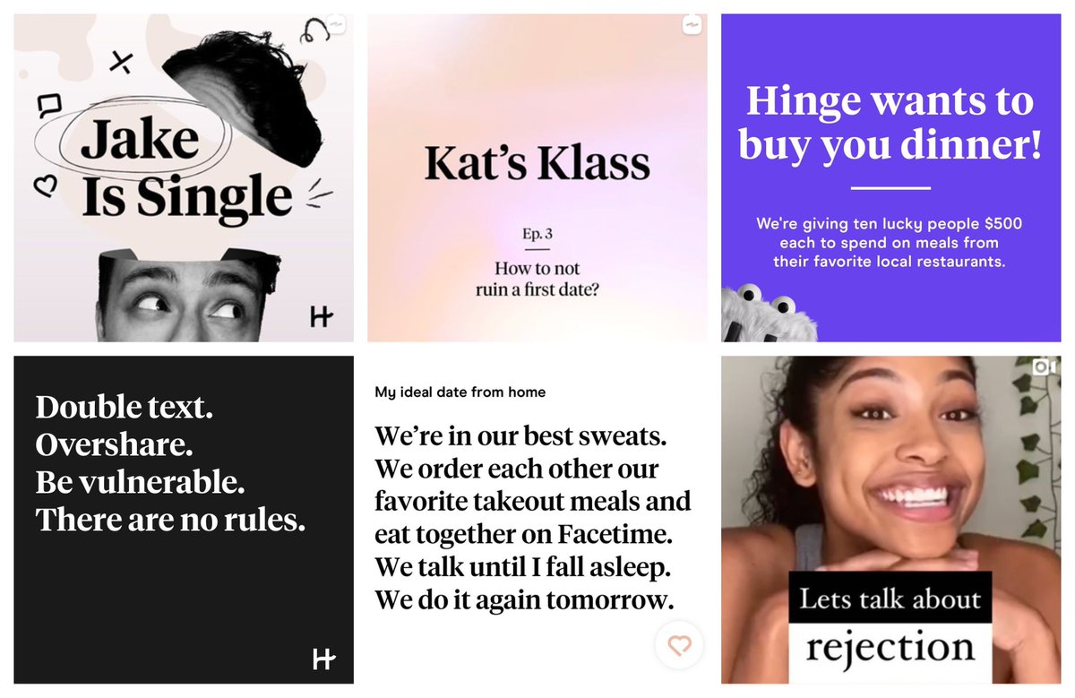
First, their marketing & branding decisions are extremely consistent across every channel.
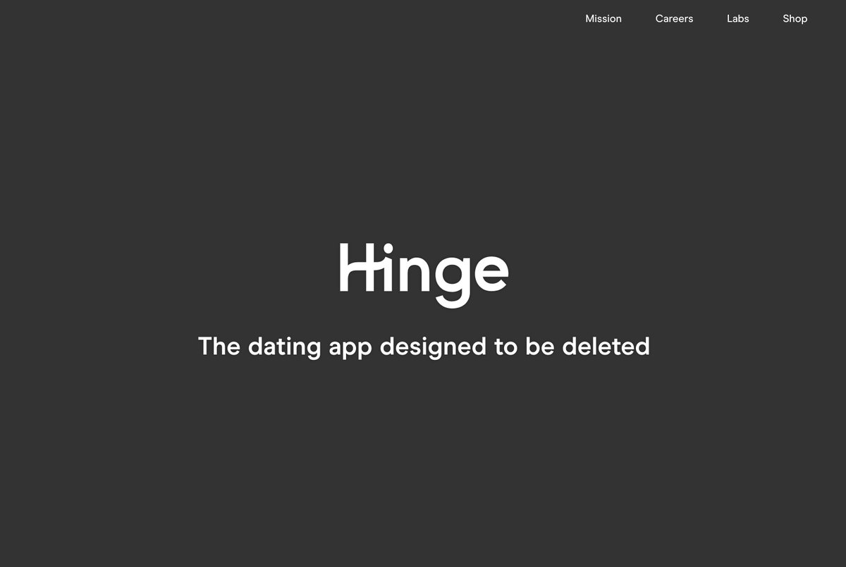
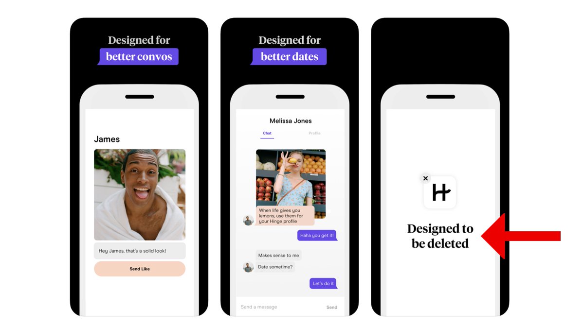
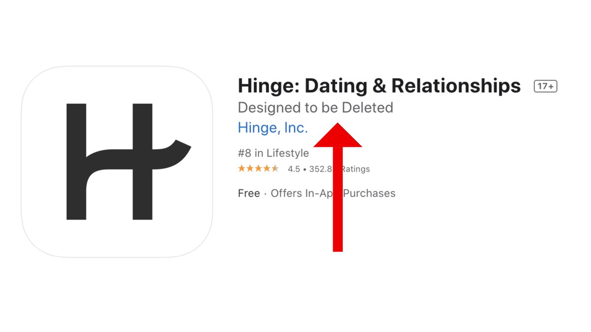
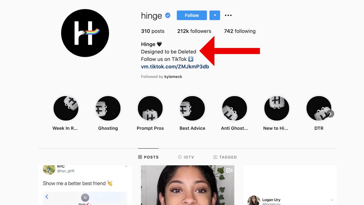
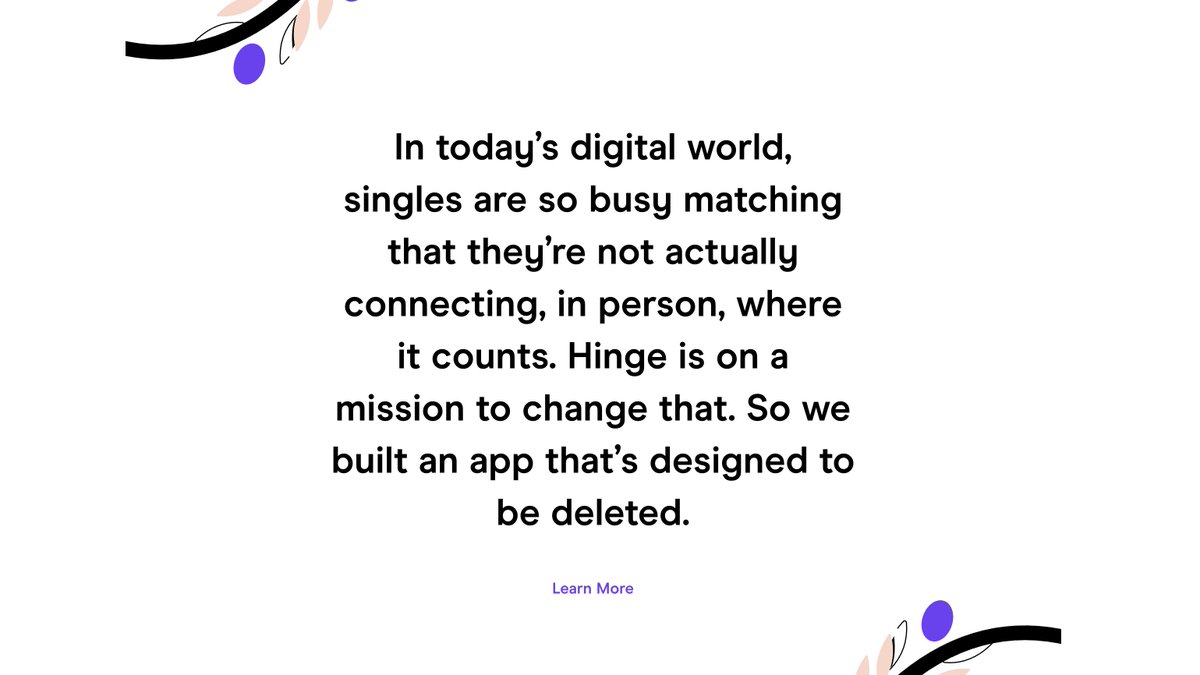
"Designed to be Deleted." is everywhere.
It& #39;s on their website.
Their Instagram account.
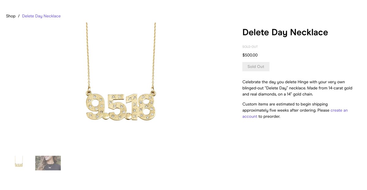
They even created a NECKLACE to celebrate the day you delete Hinge, which is out of stock.
"Designed to be Deleted." is everywhere.
It& #39;s on their website.
Their Instagram account.
They even created a NECKLACE to celebrate the day you delete Hinge, which is out of stock.
That commitment to their underlying mission makes the app feel a lot more genuine & trustworthy.
It feels like they truly want to help you find one amazing partner, not just a lot of matches.
They also use some design elements exceptionally well to continue to build trust.
It feels like they truly want to help you find one amazing partner, not just a lot of matches.
They also use some design elements exceptionally well to continue to build trust.
On the whole, their branding is very minimalist & embraces white space.
Instead of using a lot of distracting elements, like other brands, this makes their messaging very clear & concise.
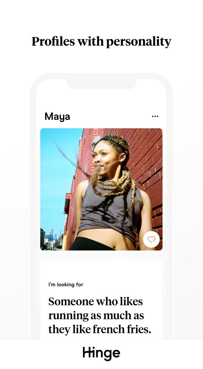
Plus in the app, this combo helps make your potential match the main focal point.
Instead of using a lot of distracting elements, like other brands, this makes their messaging very clear & concise.
Plus in the app, this combo helps make your potential match the main focal point.
As you probably have noticed, they use a single serif font across their visual content & app too.
Serif fonts are usually used because they feel classic, positive or trustworthy.
If they would have used a bold font, like @Tinder does, I don& #39;t think it would fit their mission.
Serif fonts are usually used because they feel classic, positive or trustworthy.
If they would have used a bold font, like @Tinder does, I don& #39;t think it would fit their mission.
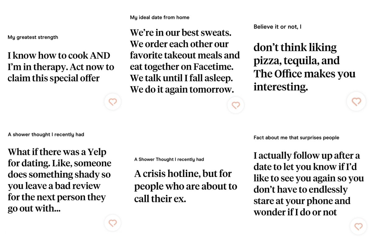
These serif fonts also make the info/answers on the app feel like they came from a real person, not a bot.
If you have ever dated online, you know how annoying & discouraging bots are.
With a simple brand font they are able to address a common pain point of other dating apps.
If you have ever dated online, you know how annoying & discouraging bots are.
With a simple brand font they are able to address a common pain point of other dating apps.
Another common pain point is that they are set up so "only looks matter."
But on @Hinge, they give the answers about the same amount of screen space as the photos.
Even @Bumble doesn& #39;t do this.
This gives someone an opportunity to start a convo, instead of just saying ""Hey."
But on @Hinge, they give the answers about the same amount of screen space as the photos.
Even @Bumble doesn& #39;t do this.
This gives someone an opportunity to start a convo, instead of just saying ""Hey."
It& #39;s almost like @Hinge saw all the ugly parts of online dating & did the opposite.
 https://abs.twimg.com/emoji/v2/... draggable="false" alt="⭐️" title="Mittelgroßer Stern" aria-label="Emoji: Mittelgroßer Stern">Instead of using bold branding, they use minimalism.
 https://abs.twimg.com/emoji/v2/... draggable="false" alt="⭐️" title="Mittelgroßer Stern" aria-label="Emoji: Mittelgroßer Stern">Instead of finding a ton of matches, they want to find you the one.
 https://abs.twimg.com/emoji/v2/... draggable="false" alt="⭐️" title="Mittelgroßer Stern" aria-label="Emoji: Mittelgroßer Stern">Instead of locking you into an app, they want you to delete it.
For someone who is making the decision to be vulnerable, & put themselves out there, these small things can go a long way.
@Hinge knows this & their branding reflects it.
That& #39;s why they have been adding A TON of users lately.
Plus, they have an amazing mascot named Hingie.
@Hinge knows this & their branding reflects it.
That& #39;s why they have been adding A TON of users lately.
Plus, they have an amazing mascot named Hingie.
Ok, now some final questions:
What are YOU looking for in a dating app?
What do you hate about dating or dating apps?
Did I miss anything that you love about Hinge?
Was my brand assessment correct, especially compared to @Tinder & @Bumble?
What are YOU looking for in a dating app?
What do you hate about dating or dating apps?
Did I miss anything that you love about Hinge?
Was my brand assessment correct, especially compared to @Tinder & @Bumble?
Want to learn more about creating better visual content in 2020?
Check out our newest edition of Graphic Design Trends: https://venngage.com/blog/graphic-design-trends/?latest">https://venngage.com/blog/grap...
Check out our newest edition of Graphic Design Trends: https://venngage.com/blog/graphic-design-trends/?latest">https://venngage.com/blog/grap...

 Read on Twitter

 Instead of using bold branding, they use minimalism.https://abs.twimg.com/emoji/v2/... draggable="false" alt="⭐️" title="Mittelgroßer Stern" aria-label="Emoji: Mittelgroßer Stern">Instead of finding a ton of matches, they want to find you the one.https://abs.twimg.com/emoji/v2/... draggable="false" alt="⭐️" title="Mittelgroßer Stern" aria-label="Emoji: Mittelgroßer Stern">Instead of locking you into an app, they want you to delete it." title="It& #39;s almost like @Hinge saw all the ugly parts of online dating & did the opposite.https://abs.twimg.com/emoji/v2/... draggable="false" alt="⭐️" title="Mittelgroßer Stern" aria-label="Emoji: Mittelgroßer Stern">Instead of using bold branding, they use minimalism.https://abs.twimg.com/emoji/v2/... draggable="false" alt="⭐️" title="Mittelgroßer Stern" aria-label="Emoji: Mittelgroßer Stern">Instead of finding a ton of matches, they want to find you the one.https://abs.twimg.com/emoji/v2/... draggable="false" alt="⭐️" title="Mittelgroßer Stern" aria-label="Emoji: Mittelgroßer Stern">Instead of locking you into an app, they want you to delete it." class="img-responsive" style="max-width:100%;"/>
