23 September 2020 #BetweenTheLinesDotVote Analysis
Dornsife& #39;s TWO COMPLETELY DIFFERENT DATA SETS
Part 1 of 2
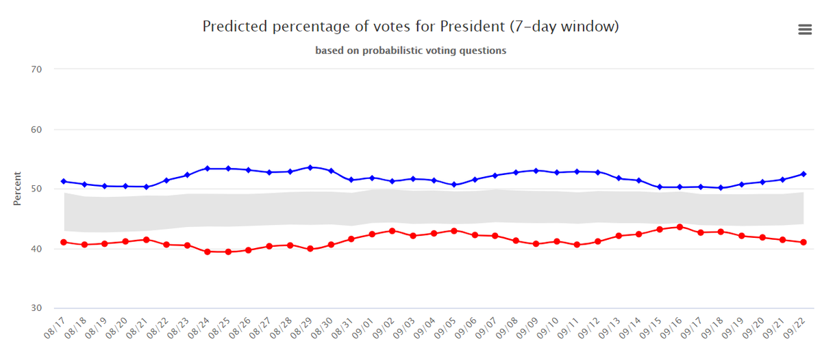
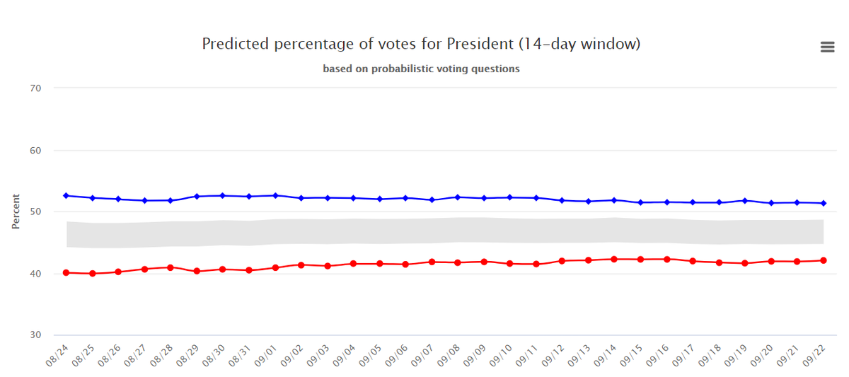
I& #39;ll offer some short thoughts below. Here, I charge you, just look at these two charts and let me know what you see, will you?
Dornsife& #39;s TWO COMPLETELY DIFFERENT DATA SETS
Part 1 of 2
I& #39;ll offer some short thoughts below. Here, I charge you, just look at these two charts and let me know what you see, will you?
2) In case you& #39;re not accustomed to polling data chart analysis, I& #39;ll give you a few tips on what to look at. First, note that it is the people being polled, but that the first is a 7-day window, and the second a 14-day. In fact, looks a little bit more closely.
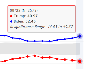
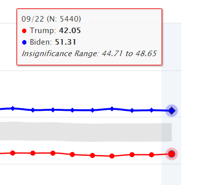
3) Here are the two different data sets for today. Note, the data employs the date 22 Sep. This is completely correct. You cannot look at all of yesterday& #39;s data until today. As you look, note especially these two points: (N: 2575) on the 7-day, and (N: 5440) on the 14-day.
4) As an untested innovation this year, Dornsife increased its sample size from roughly 3,100 in 2016, to roughly 6,000 here in 2020. Thus, their 7-day data - what they& #39;ve been publishing until yesterday - has about half the number of participants, at 2,575. The 14-day has 5,440.
5) Let& #39;s pause, and let go of data for a moment. I never expect anyone else to be as obsessive about details as I am. I always imagine you, my dear readers, as suffering under the yeah-alright-so-what problem when you attempt to follow my impassioned data ravings.
6) If possible, later today, I& #39;ll be posting my second attack on this 2-data sets problem. If not, then I surely will tomorrow. I hope to show you with charts how significant these changes really are, and offer substantive reasons that may be motivating this change.
7) But, if you simply look at the images I& #39;ve posted above you can see, obviously, that not only are we dealing now with TWO DATA sets, they are each absolutely different. Please take a moment to consider the far-reaching implications of that.
8) Two data sets. Hmm. Let& #39;s turn positive first. Okay, we can slice and dice the data and openly present our onion layers to the world, and let the world decide which makes more sense of the two for itself. Or, more likely, the world will just see the general trend and not care.
9) Here& #39;s the counter-case to that. Dornsife now posts on its face, the 14-day Window. Before it was the 7-day. Why switch? To me, the answer is obvious. I& #39;ll show you the simple math below.
10) Here is the simple math for their Insignificance Range.
7- day: 49.37 - 44.05 = 5.32
14-day: 48.65 - 44.71 = 3.94
Play with the math and you& #39;ll see, they have reduced their Insignificance range by about 27%. Wow!
7- day: 49.37 - 44.05 = 5.32
14-day: 48.65 - 44.71 = 3.94
Play with the math and you& #39;ll see, they have reduced their Insignificance range by about 27%. Wow!
11) If you can, stay with me. In 2016, all of Dornsife& #39;s data was represented as inside or outside a 95% Confidence Range. They employed the same method in 2012, when they rightly predicted Obama over Romney, when most other polls leaned toward Romney.
12) How significant is the flip? Before, they used a Confidence ratio. Now, they use an Insignificance ratio.
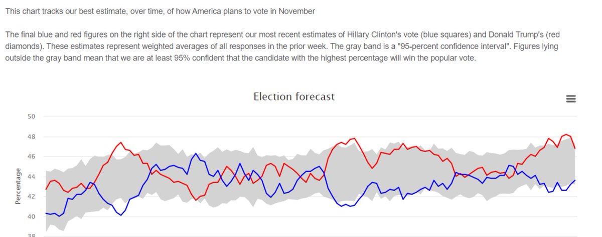
In case you can& #39;t quite visualize the difference, here again is their 2016 presentation of the data.
In case you can& #39;t quite visualize the difference, here again is their 2016 presentation of the data.

 Read on Twitter