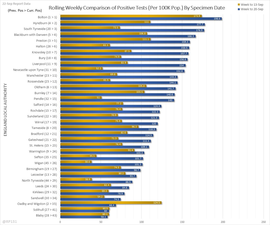
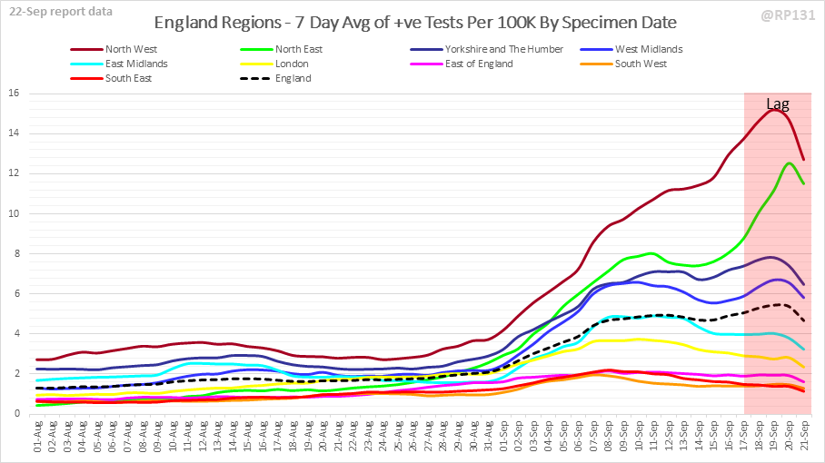
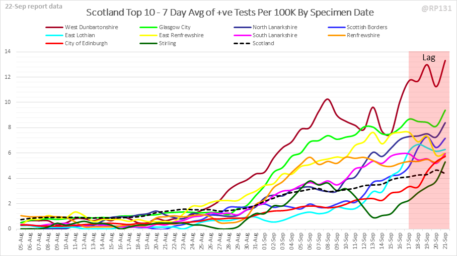
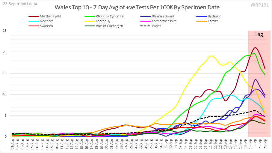
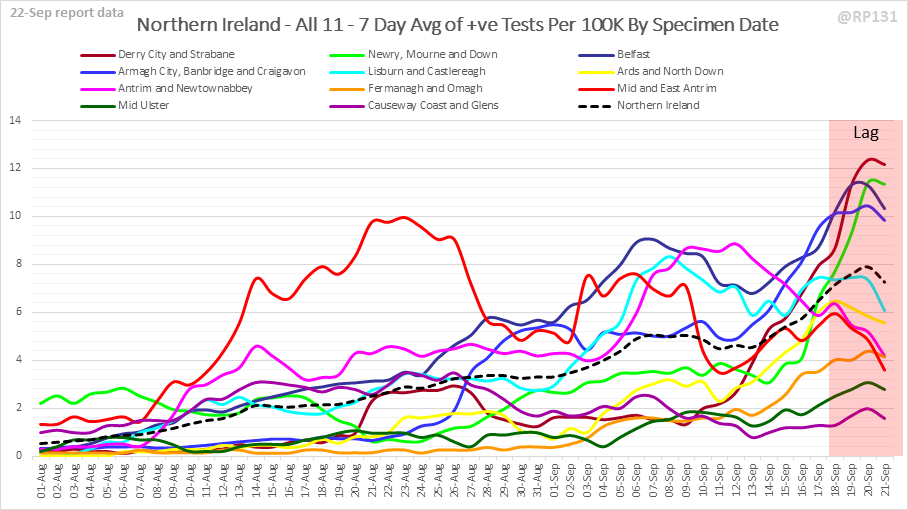
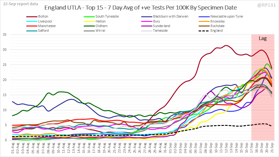
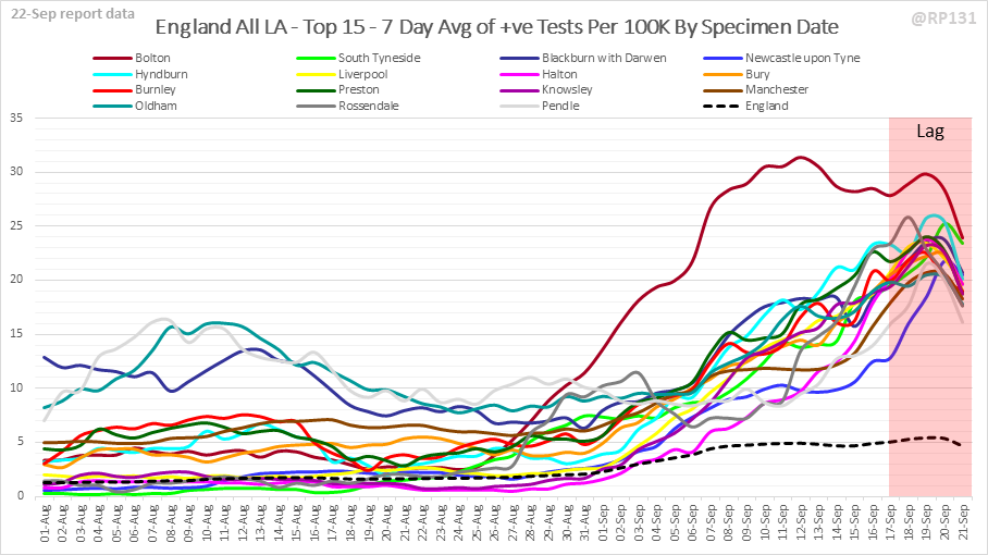
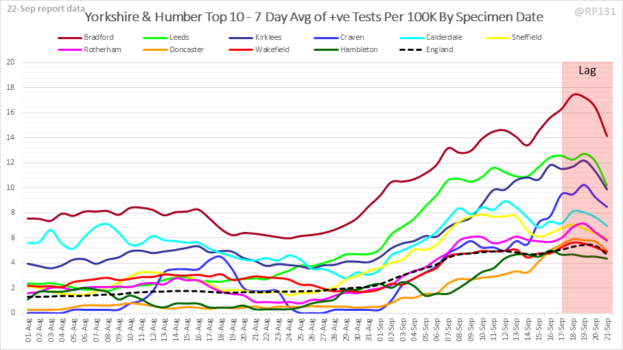
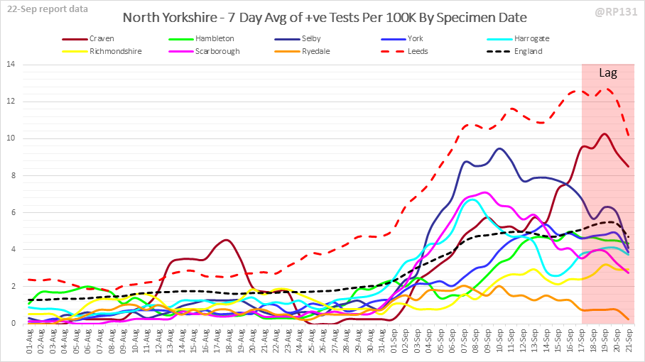
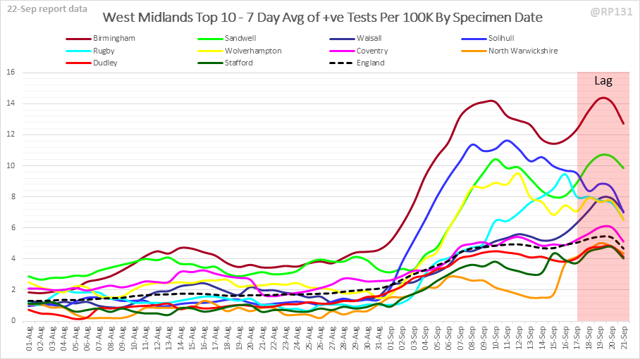
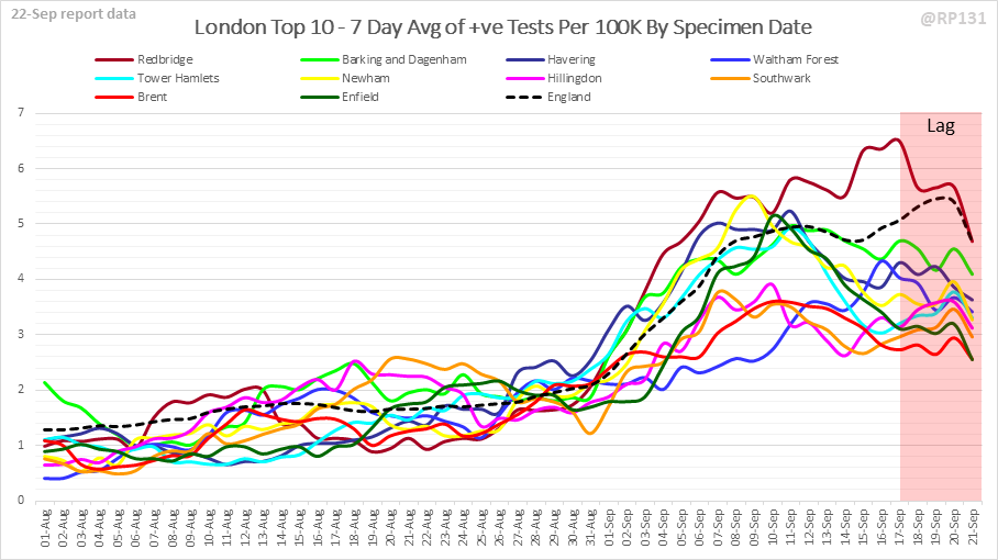
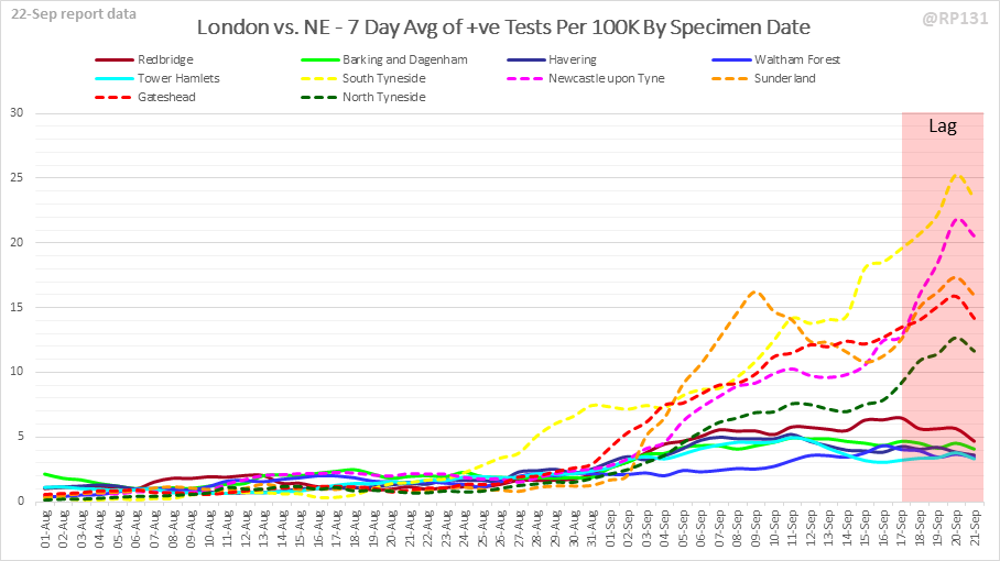
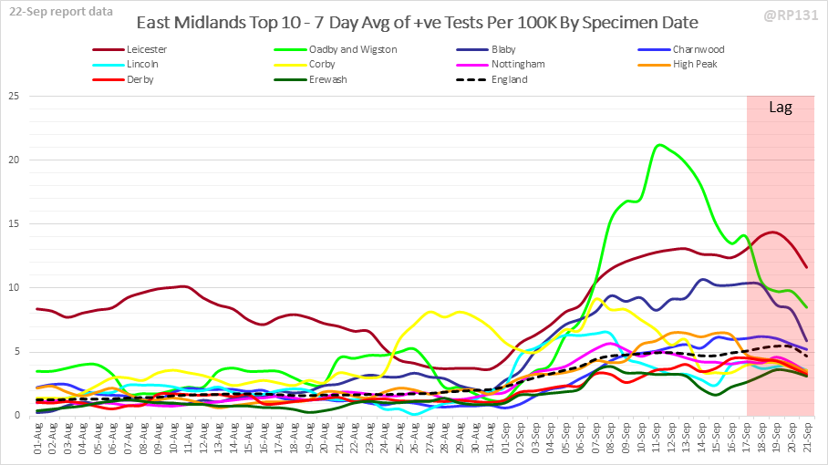
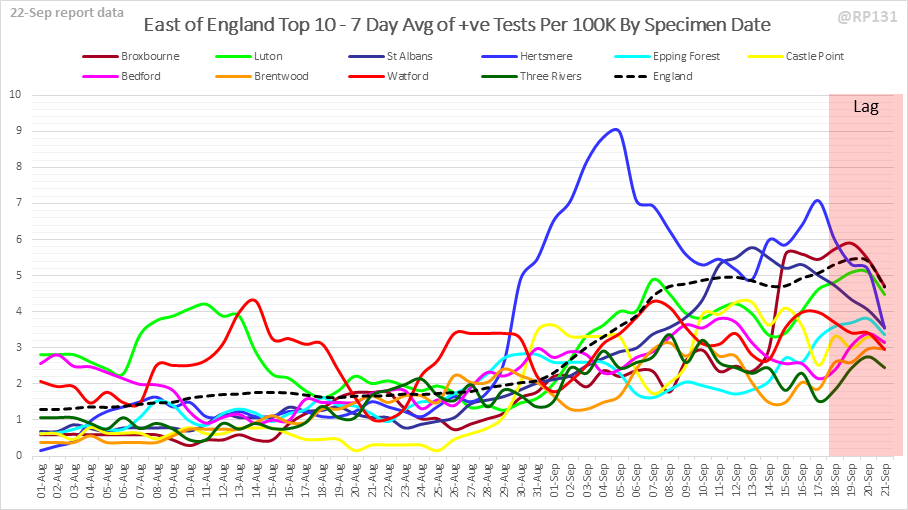
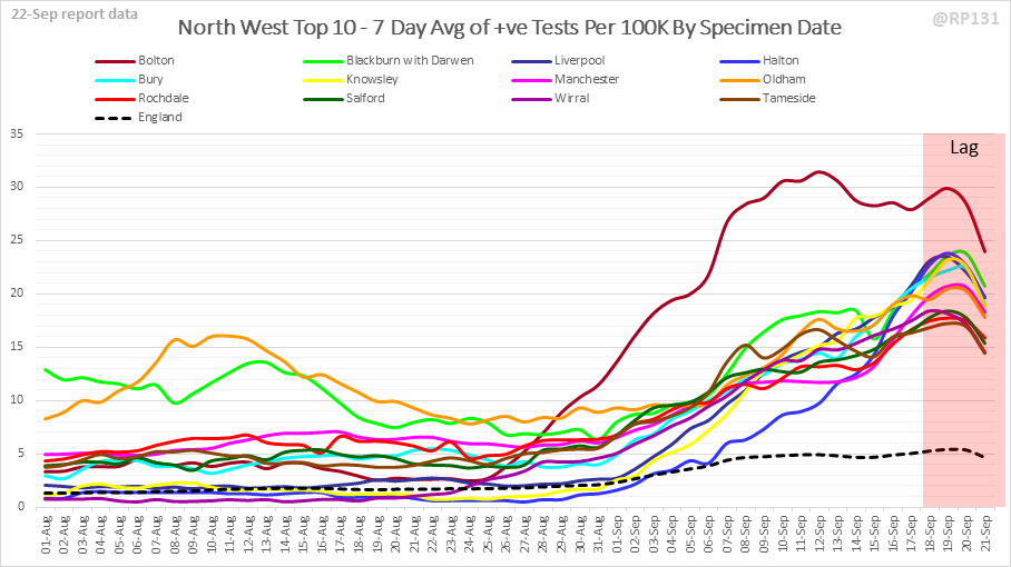
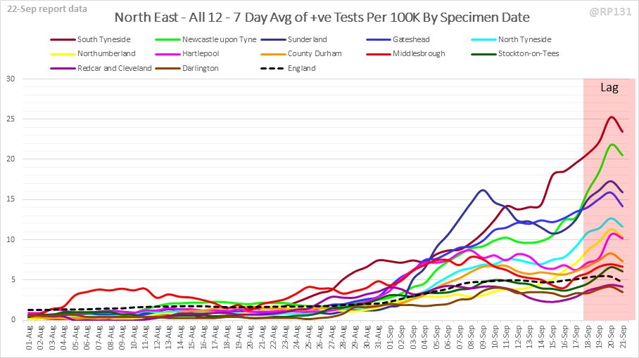
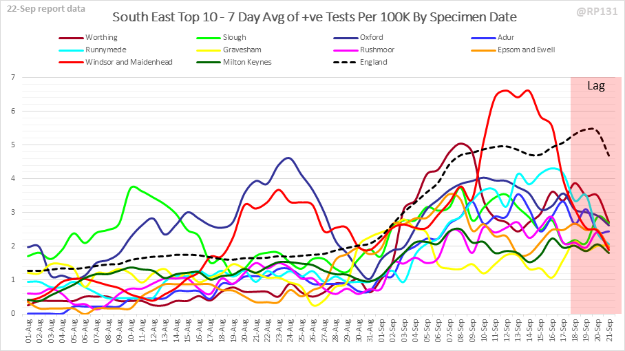
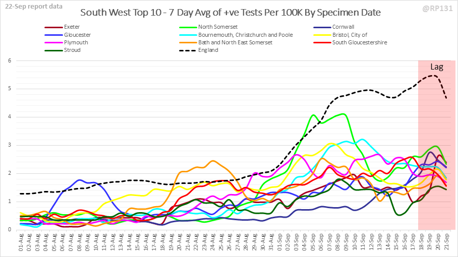
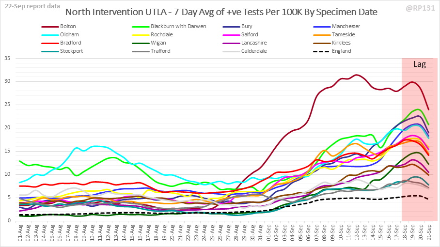
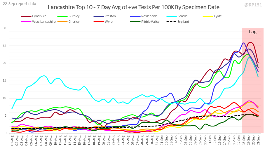
Detailed positive tests thread. Rolling weekly comparison of totals up to 2 days ago. This is like the charts drawn from the weekly surveillance report, but updated daily in a rolling fashion and also including lower tier authorities instead of grouped counties.
Full version of above chart available here: …https://coviddatashare.s3-eu-west-1.amazonaws.com/Week_20200922.png">https://coviddatashare.s3-eu-west-1.amazonaws.com/Week_2020...
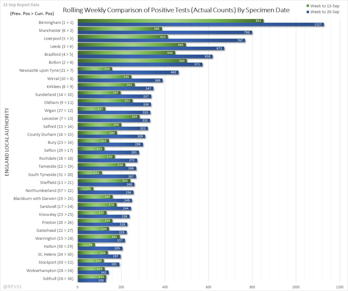
Same as above but with actual counts intead of per 100K population numbers. Both can be useful depending on whether your focus is on "relative numbers" or "understanding spread of daily report numbers".
Full version of above chart available here: …https://coviddatashare.s3-eu-west-1.amazonaws.com/WeekActual_20200922.png">https://coviddatashare.s3-eu-west-1.amazonaws.com/WeekActua...
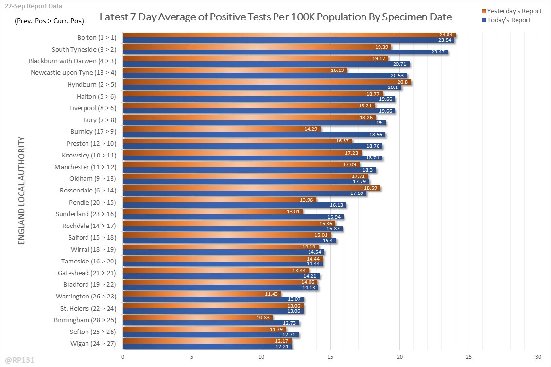
Comparison of yesterday& #39;s and today& #39;s top 25 rolling averages per 100K population by specimen date (including lag period). This is intended to give a rough indication of the impact of today& #39;s report, to be interpreted along with the charts further down the thread.
Full version of above chart available here: …https://coviddatashare.s3-eu-west-1.amazonaws.com/Day_20200922.png">https://coviddatashare.s3-eu-west-1.amazonaws.com/Day_20200...
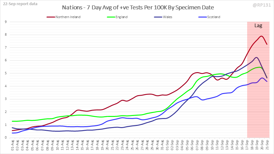
The rest of this thread is a set of charts showing different views of rolling 7 day average positives per 100K by specimen date. Starting with all 4 nations:

 Read on Twitter