I haven& #39;t posted any charts or similar about Covid19 in a while... mainly because others were doing better stuff, but here is something that I think is worthwhile interrogating.
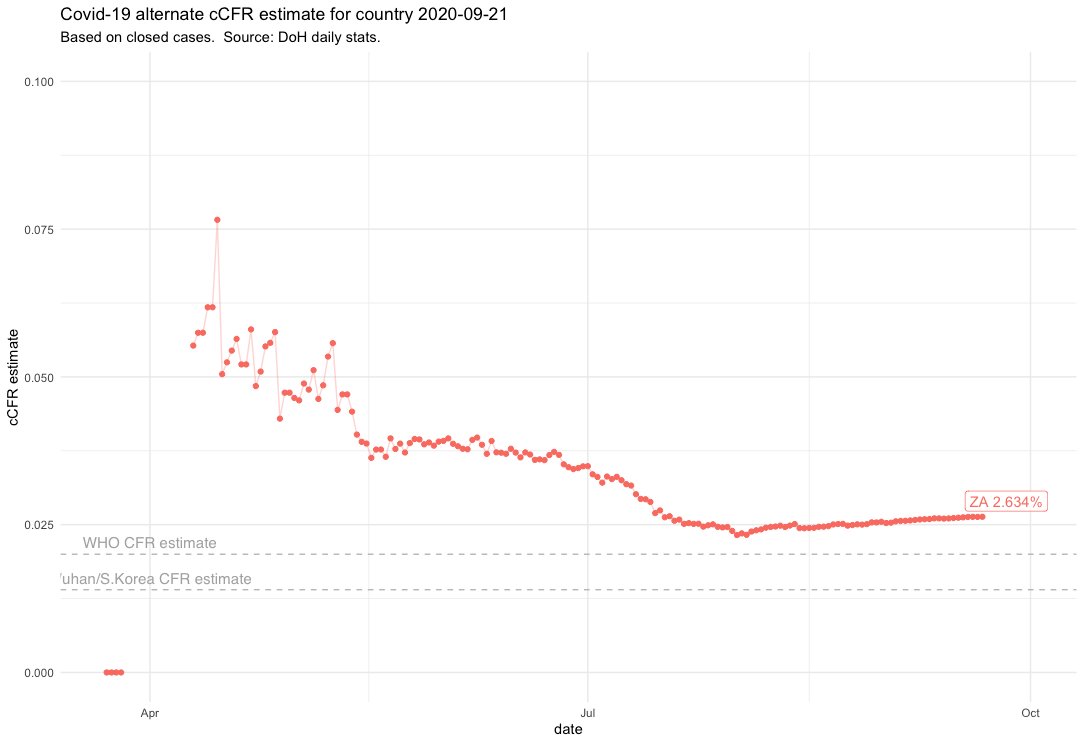
This chart is a representation of the *confirmed* Case Fatality Rate, calculated by dividing the number of reported fatalities by the confirmed closed cases (closed = recovered/deceased). As you& #39;d expect it is a bit messy when the cases numbers are low...
but as the numbers of cases and deaths grow, you can see a definite trend, and currently (on a national basis) this is around 2.65%.
It& #39;s higher than the WHO guesstimate and higher than the rate recorded in South Korea and Wuhan, but that is to be expected.../
It& #39;s higher than the WHO guesstimate and higher than the rate recorded in South Korea and Wuhan, but that is to be expected.../
... because we have been under-counting cases. The under-count is due to a huge number of reasons (pressure on labs, access to tests, access to healthcare, policy decisions etc.)
However, we& #39;d expect that undercount to be fairly consistent throughout the country.../
However, we& #39;d expect that undercount to be fairly consistent throughout the country.../
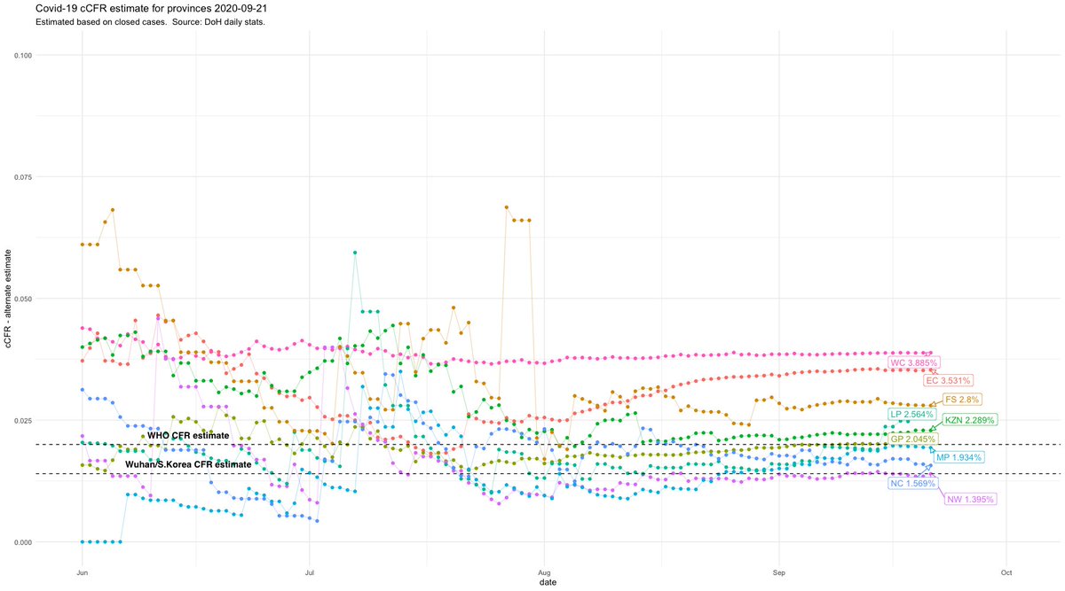
.../ and if the undercount of cases was consistent, we& #39;d expect that the cCFR to be similar in the various provinces. But it isn& #39;t.
Some of the provinces have had a relatively low disease and deaths burden (NC, LP, NW, MP) so a small change in either would impact their cCFR quite dramatically and since they don& #39;t make a major impact to the national numbers, let& #39;s exclude them.
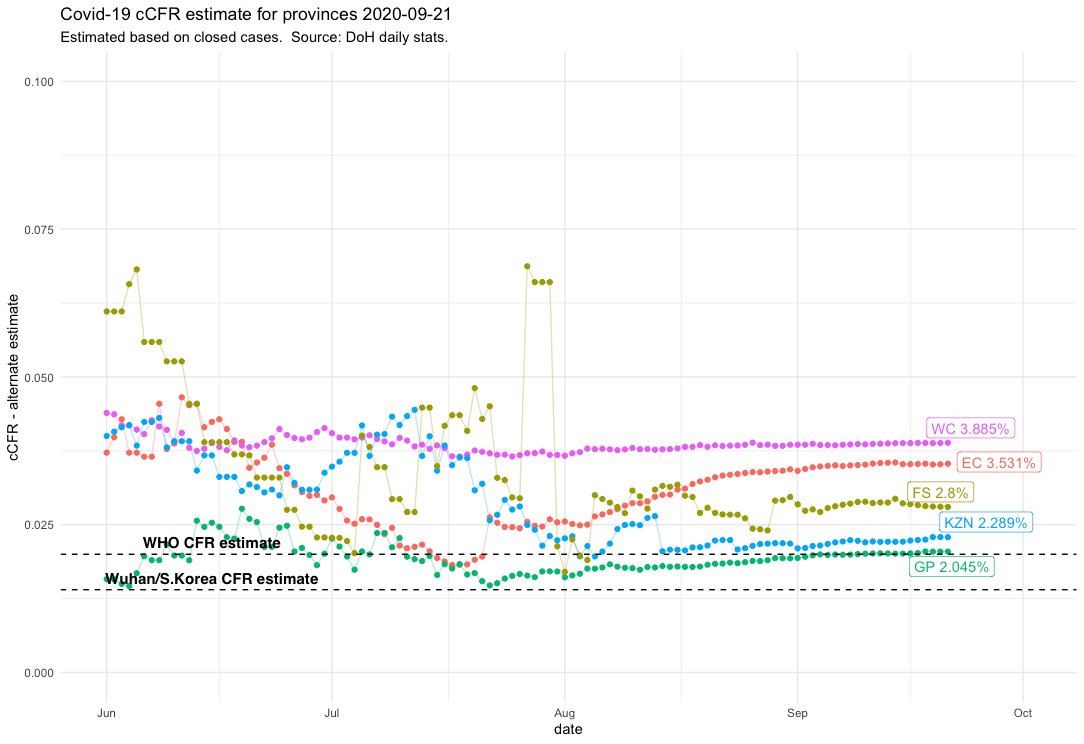
There is a huge difference in the rate between Gauteng and the Western Cape. It bears investigation, why such a disparity? These two provinces arguably have the best healthcare infrastructure in the country. What could cause the disparity?
Is it possible that WC case undercount is significantly worse than that of Gauteng (i.e. a 90% difference in undercount)? It seems unlikely. So, it is more likely that it comes from the numerator rather than the denominator i.e. the number of deaths reported.
The options in that case are the following:
1. The medical outcomes in some provinces were worse than in others (i.e. more people succumbed to the disease)
2. There is an issue with data. i.e Covid deaths are not categorised correctly (or the reverse) in some provinces.
1. The medical outcomes in some provinces were worse than in others (i.e. more people succumbed to the disease)
2. There is an issue with data. i.e Covid deaths are not categorised correctly (or the reverse) in some provinces.
3. A combination of the two.
I don& #39;t have the expertise to even attempt to argue option one. I& #39;m sure some clever people are analysing the outcomes of admitted patients, but I wouldn& #39;t know where to start.
However, there is some data to test option 2...
I don& #39;t have the expertise to even attempt to argue option one. I& #39;m sure some clever people are analysing the outcomes of admitted patients, but I wouldn& #39;t know where to start.
However, there is some data to test option 2...
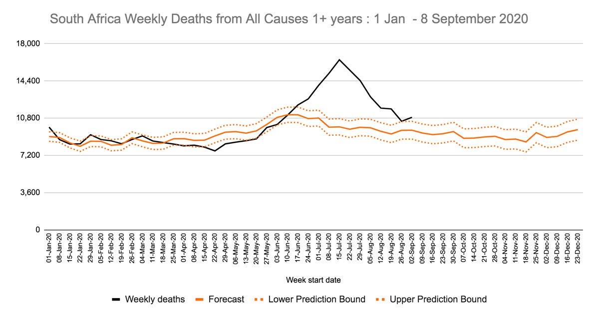
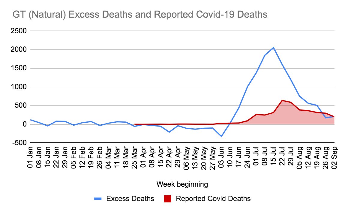
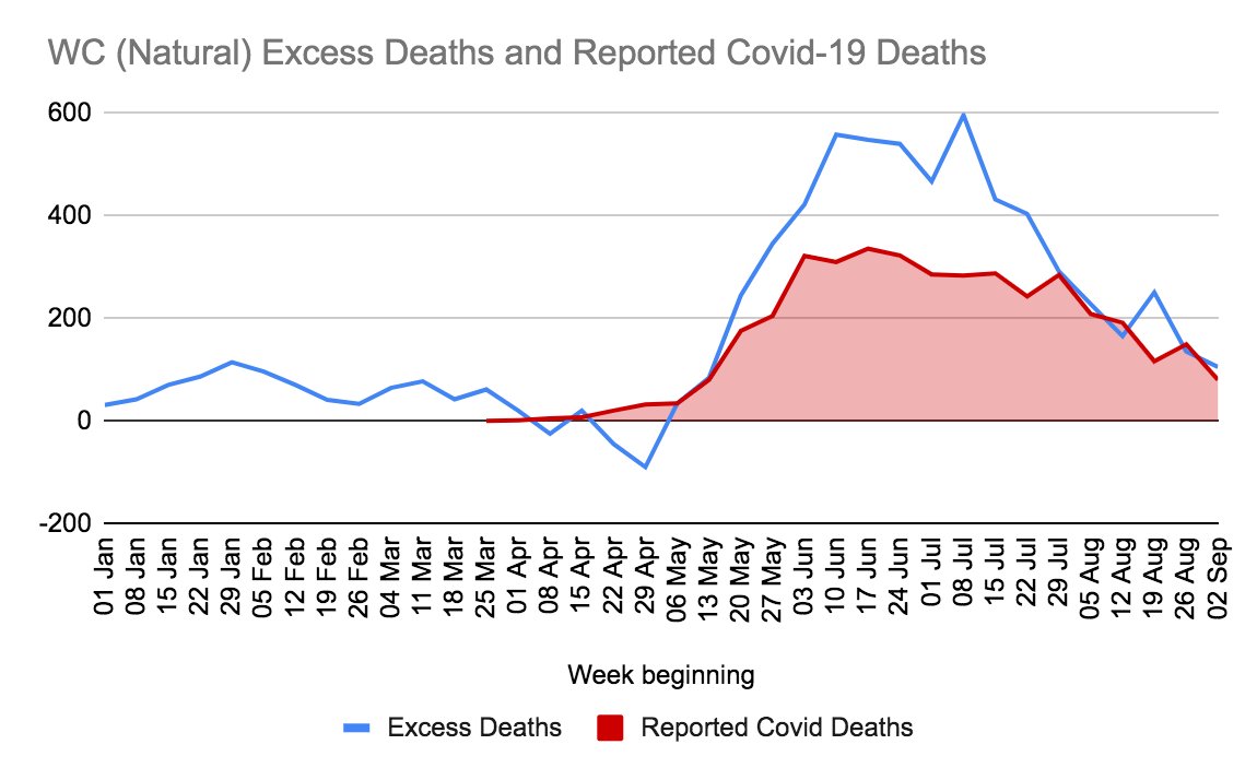
The SAMRC releases data on what they term "excess natural deaths", i.e. deaths are higher than would normally be forecast. So we can look at these numbers to see if there are big differences between provinces.
And, if we look at the Western Cape and Gauteng, there are indeed differences between provinces. Gauteng shows significantly more "excess" deaths than Western Cape.
Not all of those deaths are necessarily COVID19 related, but it is likely that a significant portion are. If we are to assume that 70% of "excess deaths" are COVID-related (a thumbsuck but will allow comparisons)...
we get a cCFR for WC of 3.9%... which is pretty consistent with the reported data. If we do the same for Gauteng, we get a cCFR of 4%. More or less identical.
EC: 7.7%
KZN: 4.5%
FS: 7.5%
While there is still a massive disparity between provinces, ...
EC: 7.7%
KZN: 4.5%
FS: 7.5%
While there is still a massive disparity between provinces, ...

 Read on Twitter
