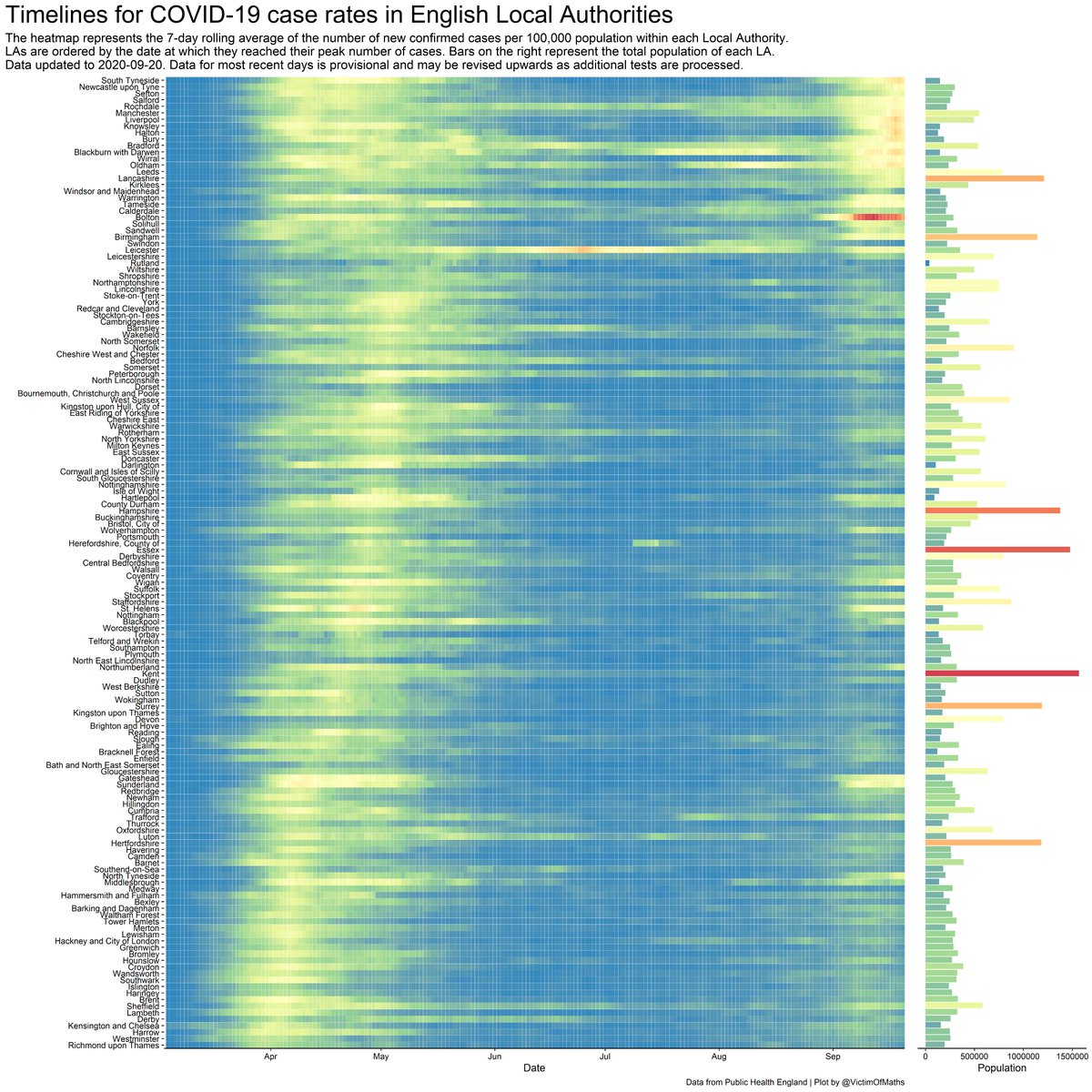
I& #39;ve tweaked this plot a bit, so this version now shows the evolution of confirmed COVID-19 case rates in English Local Authorities over time. The bars on the right show the population size for each area.
Striking how recent rise in cases happened almost everywhere at once.
Striking how recent rise in cases happened almost everywhere at once.
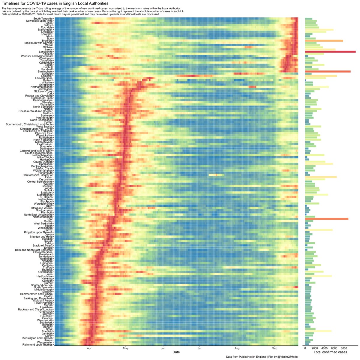
Here& #39;s the version normalised within each Local Authority. You can see the shared pattern in the last month even more clearly here. Almost every LA with red/orange days in the last month is in the Midlands or North of the country.
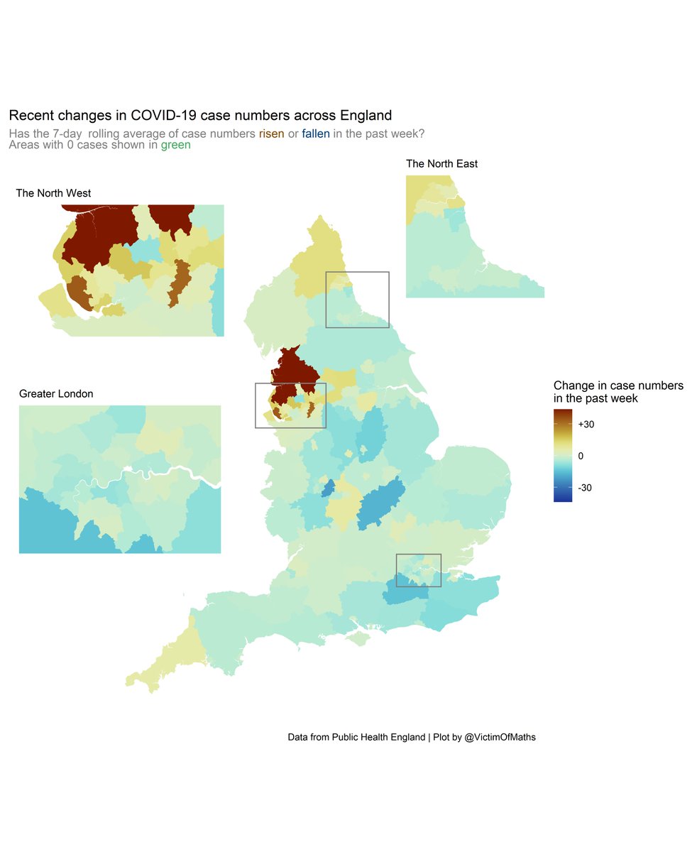
This is a bit sketchy, because the increasing lag in the testing data makes it hard to know what day to cut the time series off at, but this shows that case numbers might actually be tailing off in a fair bit of the country. Not the North West though.
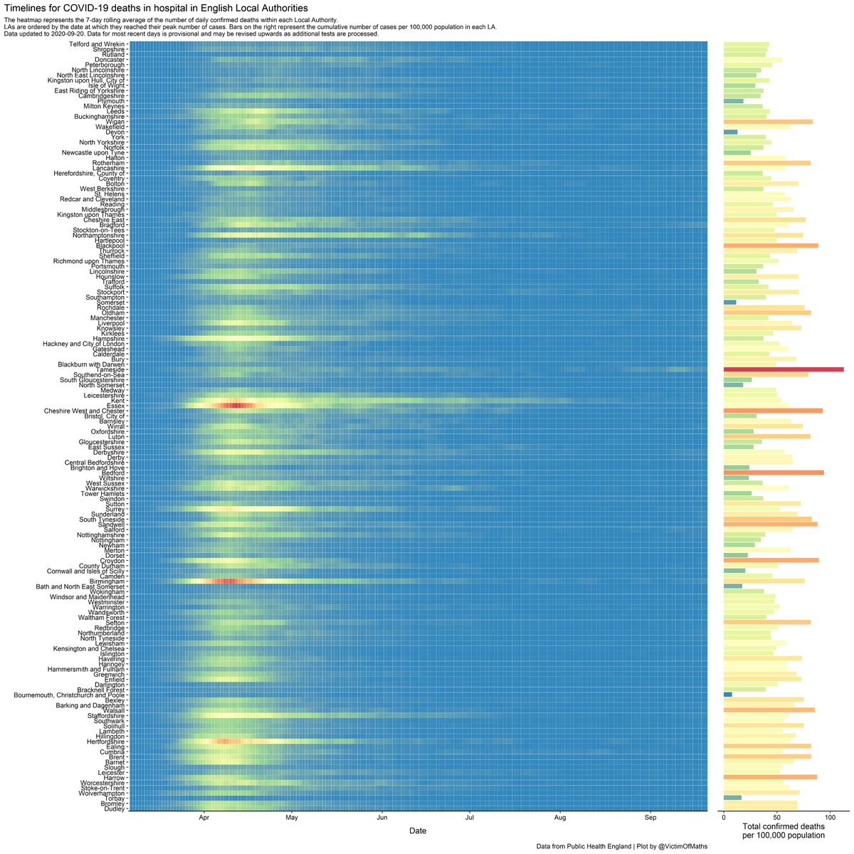
Still absolutely no discernible rises in confirmed COVID-19 deaths (in hospitals at least), except for the recent issues in Tameside.
I& #39;d like to produce a heatmap like these for hospital admissions, but the data isn& #39;t available on a useful timescale.
I& #39;d like to produce a heatmap like these for hospital admissions, but the data isn& #39;t available on a useful timescale.
Is this a new crisis?
Are the government& #39;s proposed measures overkill or not enough?
I genuinely have no idea.
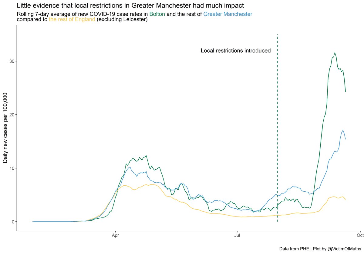
It doesn& #39;t seem like the various local restrictions have had a significant positive impact in Manchester though.
Are the government& #39;s proposed measures overkill or not enough?
I genuinely have no idea.
It doesn& #39;t seem like the various local restrictions have had a significant positive impact in Manchester though.
Code for these plots is here: https://github.com/VictimOfMaths/COVID-19/blob/master/Heatmaps/English%20LA%20Heatmaps.R">https://github.com/VictimOfM...

 Read on Twitter