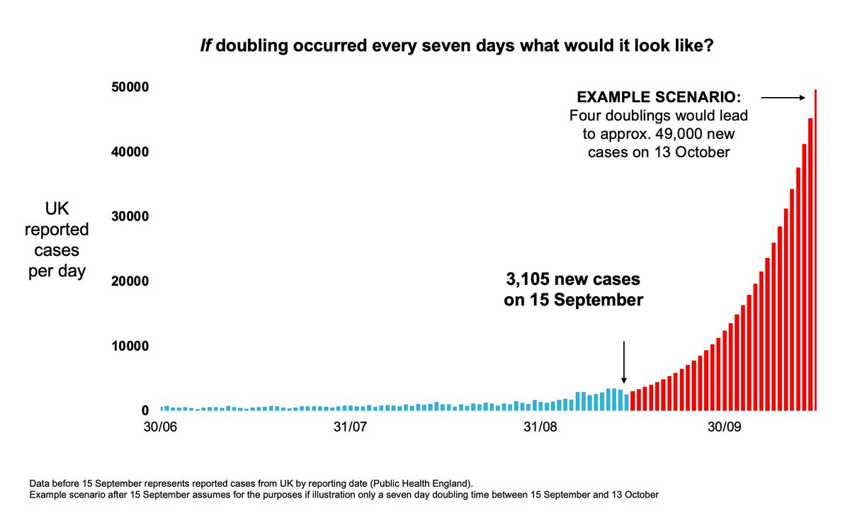
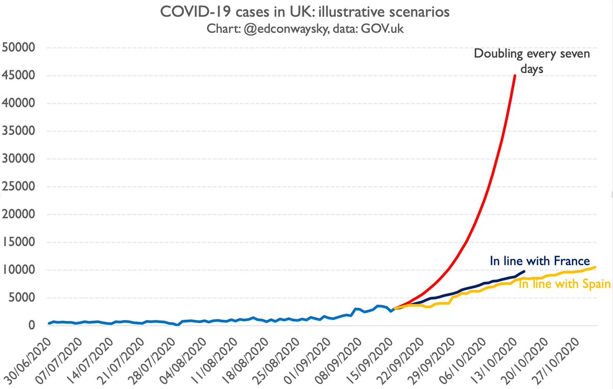
You’ll probably see this chart a lot today. It’s the one @uksciencechief just showed at the @10DowningStreet briefing today. It’s v v scary & implies if the current growth rate of #COVID19 continues we& #39;ll face 49k cases a day by mid October. So. Is this really plausible...?
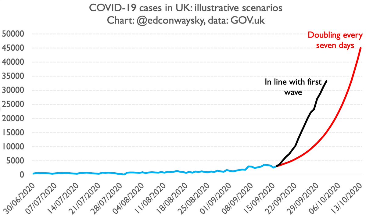
Well in strict mathematical terms, yes it is. Exponential growth rates are scary. This is precisely the problem with diseases like #COVID19. In the first wave deaths were for a time doubling every 3/4 days. Here& #39;s what that chart might look like if we followed last wave. Scarier!
But here& #39;s the big problem with @uksciencechief& #39;s scary illustrative chart: it& #39;s predicated on two presumptions. 1) that we are indeed seeing the disease double every 7 days. 2) it presumes that growth rate will continue. There are quite important challenges to both assumptions.
Let& #39;s take 1. first.
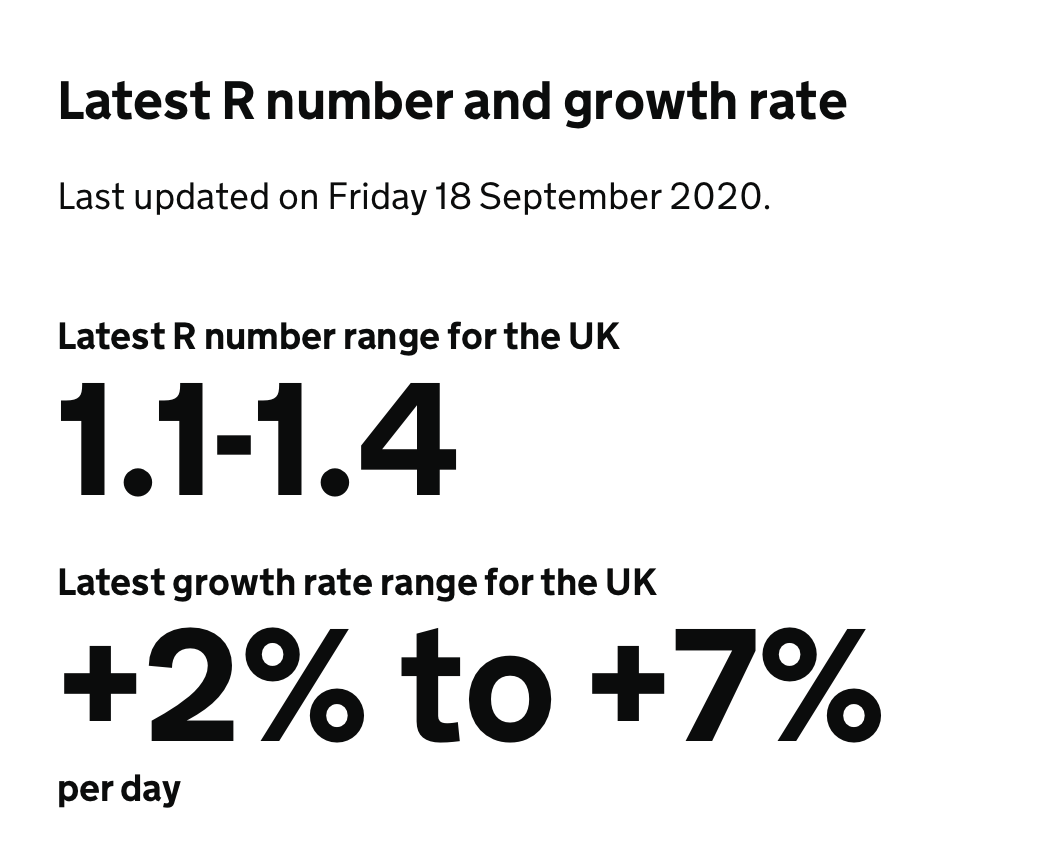
Doubling every 7 days works out at about 10.4% daily growth on average. Yet the govt& #39;s own estimate of the disease& #39;s growth rate, as per the latest R number release on fri, is 2-7%. Odd. Do they have data they& #39;re not telling us about? #latest-r-number-and-growth-rate">https://www.gov.uk/guidance/the-r-number-in-the-uk #latest-r-number-and-growth-rate">https://www.gov.uk/guidance/...
Doubling every 7 days works out at about 10.4% daily growth on average. Yet the govt& #39;s own estimate of the disease& #39;s growth rate, as per the latest R number release on fri, is 2-7%. Odd. Do they have data they& #39;re not telling us about? #latest-r-number-and-growth-rate">https://www.gov.uk/guidance/the-r-number-in-the-uk #latest-r-number-and-growth-rate">https://www.gov.uk/guidance/...
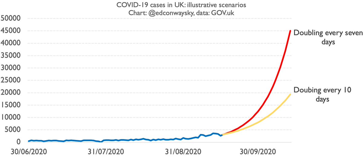
In an exponential world, smallish differences between % growth rates can make a big difference. Here& #39;s doubling every 10 days (yellow) vs doubling every 7 days, as per @uksciencechief& #39;s line (red).
Still grim. Up to 20k cases a day by mid Oct. But that& #39;s barely HALF the level.
Still grim. Up to 20k cases a day by mid Oct. But that& #39;s barely HALF the level.
But just as important as q1 (the growth rate) is q2: the assumption the rate will not change over time. As @uksciencechief mentioned in his presentation, the UK is not the only country in Europe facing a rise in #COVID19 cases. There& #39;s also France and Spain...
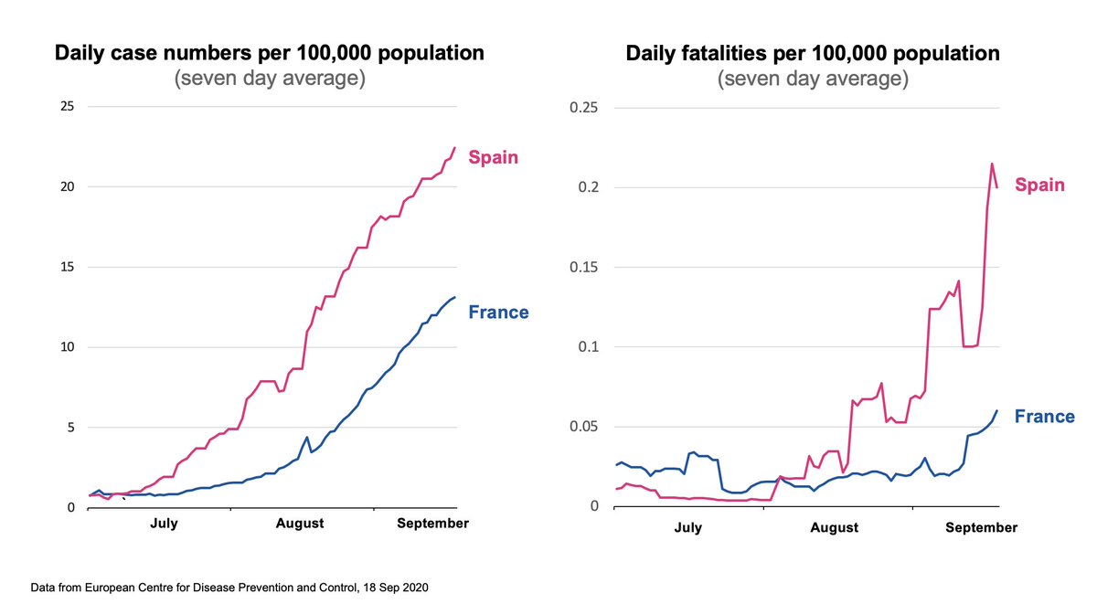
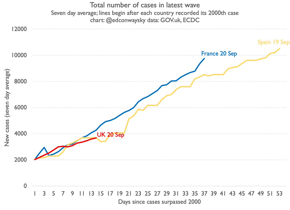
In fact, as I& #39;ve pointed out a fair few times now, Britain& #39;s #COVID19 trajectory this time around is eerily similar so far to what we& #39;ve seen in both France and Spain. Here& #39;s where we are now: about 2/3 weeks behind France/Spain. What happens if that continued?
If our #COVID19 growth followed France or Spain (as it has been so far) we& #39;d be at around 10k cases a day by mid October. Not 45k or so.
This is an enormous difference.
10k cases is scary enough. It implies many more deaths & hospitalisations. But 45k cases is way, way worse.
This is an enormous difference.
10k cases is scary enough. It implies many more deaths & hospitalisations. But 45k cases is way, way worse.
Clearly it& #39;s not impossible our case trajectory suddenly leaps as per @uksciencechief& #39;s chart. Perhaps he has data we don& #39;t have. Though so far there& #39;s no sign our trajectory is dramatically different from the ones in France and Spain. If that changes I will of course  https://abs.twimg.com/emoji/v2/... draggable="false" alt="🚨" title="Polizeiautos mit drehendem Licht" aria-label="Emoji: Polizeiautos mit drehendem Licht">

 Read on Twitter