Hello friends  https://abs.twimg.com/emoji/v2/... draggable="false" alt="👋" title="Waving hand" aria-label="Emoji: Waving hand">
Today I want to talk about something in software design I like to call https://abs.twimg.com/emoji/v2/... draggable="false" alt="✨" title="Funken" aria-label="Emoji: Funken"> hidden complexity
  https://abs.twimg.com/emoji/v2/... draggable="false" alt="✨" title="Funken" aria-label="Emoji: Funken"> or "Why Simple Things are Rarely as Simple as They Seem" from the perspective of someone both designing and implementing.
Thread https://abs.twimg.com/emoji/v2/... draggable="false" alt="👇" title="Rückhand Zeigefinger nach unten" aria-label="Emoji: Rückhand Zeigefinger nach unten">
Today I want to talk about something in software design I like to call
Thread
Here& #39;s the stitch. I& #39;m implementing this screen taken from an upcoming redesign of my app, @HyphenReader:
There& #39;s a number of "simple" things here that have interesting design and implementation details, but for now, I want to focus on the three buttons in the top right:
Simple, right? Two buttons, a visual divider, and another button. If we break this up into layout constructs, in, say, Figma, you could do this by wrapping three labels and a rectangle in Auto Layout-group. So far so good.
I can implement them very similarly in code with Apple& #39;s UIStackView and a couple of UIButtons (the button part is _not_ as straightforward as I am making it sound and I& #39;m not actually using UIButton, but I haven& #39;t yet processed that trauma so let& #39;s pretend).
me: I& #39;m done! Time to move on to the next thing.
brain: *drags cigarette* ...you forgetting anything?
me: What? No. Go away.
brain: Heh. OK, kid. Sure.
me: Good. Let& #39;s see, what& #39;s next? I gotta—
brain: *whispers* ...touch targets
me:
brain: *drags cigarette* ...you forgetting anything?
me: What? No. Go away.
brain: Heh. OK, kid. Sure.
me: Good. Let& #39;s see, what& #39;s next? I gotta—
brain: *whispers* ...touch targets
me:
It& #39;s very common to need to improve or compensate for insufficient touch targets, especially in mobile design. In the screen above, the touch target of the & #39;More& #39; button is 20x40. That& #39;s pretty small — for example, Apple recommends touch targets *at least* 44pts large.
I know all this from experience, but since it& #39;s been awhile since I had to meddle with touch targets, this means a 10 minute trip to Apple& #39;s HIG to confirm what I know then 20 minutes spent making sure that I override the methods to modify the touch target correctly and...
...40 minutes later my brain has started to melt out of my ears, but hey, success! Now the button& #39;s touch target is automatically padded, which raises the tappable area to >44pts and makes it much easier to hit without having to mess with the button& #39;s actual layout.
Finally! I can move on from these three dumb butto—
brain: Hi.
me: NO. I& #39;m not doing this with you again.
brain: Y& #39;know, I wonder...is fingers the only way people are going to use this?
me: *covers ears* I just want to move o~
brain: *leans in* YOU FORGOT ABOUT POINTERS, DUMBASS
brain: Hi.
me: NO. I& #39;m not doing this with you again.
brain: Y& #39;know, I wonder...is fingers the only way people are going to use this?
me: *covers ears* I just want to move o~
brain: *leans in* YOU FORGOT ABOUT POINTERS, DUMBASS
iOS 13.4 introduced the ability to use mouses and touchpads directly with iPads in a more intuitive way. If you& #39;ve used it, you know Apple& #39;s visual pointer design is somewhat unique. Here& #39;s what it looks like when you mouse over one of the buttons by default:
(promise I tried to upload a higher-quality video than that, but twitter has decided I don& #39;t deserve to be able to upload videos today, so... you get a gif)
As you get closer to interactive areas, these areas & #39;attract& #39; the cursor while morphing into the area& #39;s shape. This isn& #39;t just for aesthetics& #39; sake, but so you don& #39;t need to be as precise when hitting buttons and the like (see: Fitts& #39;s Law).
Pointers are something mobile apps have never really had to consider before — when designing web or desktop software, the practice of reacting visually to mouse hover to help indicate interactivity is common. On mobile? Not so much.
By designing mouse support this way, Apple gives users more intuitive (hopefully), easy-to-use mouse support, designers and developers less work (you don& #39;t need to roll your own hover states) and ensures older apps get decent pointer support for free. Not bad.
Now I *could* just take advantage of the default pointer interaction stuff and go home (sike! We& #39;re all home! I can& #39;t LEEAAVE) but something is bothering me, so once again, I take a trip not just to the HIG, but WWDC vids as well.
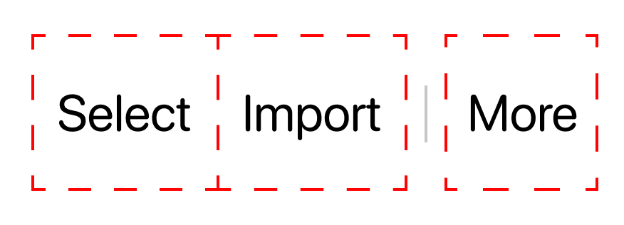
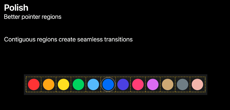
Fast forward, and I& #39;ve learned at least one key thing I wasn& #39;t aware of before: for groups of adjacent buttons like this, Apple has a neat UX trick of ensuring that buttons have "contiguous regions." (Regions are the same conceptually as touch/hit targets, but for pointers.)
Why does this matter? Well, by making it so that there& #39;s no gaps between these buttons& #39; regions, the pointer will be & #39;pulled& #39; and glide smoothly from button to button, requiring less precision. It makes sense to do for semantically grouped and visually adjacent stuff like this.
I& #39;ll spare you some of the details on implementing this (s/o to @steipete and co. for their articles on this). Here& #39;s how interacting with these buttons with a pointer looks before contiguous regions, before and after:
( @TwitterEng I had to send this video to my phone, screen cap it, then upload it from the twitter app before it sent. Absolutely refused to upload from desktop with zero feedback. :/ )
(You might& #39;ve have missed it, but there& #39;s an additional detail in the video above. As the user mouses over a button adjacent to the divider, the divider itself disappears. This is just a minor tweak to make the move from the & #39;Select& #39; to & #39;More& #39; button less visually noisy.)
We done? NOPE. (design is never done, bucko  https://abs.twimg.com/emoji/v2/... draggable="false" alt="😎" title="Lächelndes Gesicht mit Sonnenbrille" aria-label="Emoji: Lächelndes Gesicht mit Sonnenbrille">. (wow. very designer. much thought lead)) There& #39;s more to consider, like:
- Dynamic Type!
- Accessibility! (Voice Over, High Contrast)
- Dark Mode!
- The futility of life!
- and more!
and that& #39;s just for 3 buttons!
- Dynamic Type!
- Accessibility! (Voice Over, High Contrast)
- Dark Mode!
- The futility of life!
- and more!
and that& #39;s just for 3 buttons!
So what& #39;s the moral of this story? The moral of the story is that sometimes when you can& #39;t figure out how to fix a bug it& #39;s a decent distraction and *definitely not* a waste of time to go on twitter and write entirely too long threads about something completely unrelated
OK, fine, so the real moral is... shoot, I didn& #39;t think this through. My point is, making things is always harder in practice than it is conceptually, and that reality doesn& #39;t care how simple or easy you (as consumer or producer) assumes or thinks something will be.
In other words: time, complexity, and struggle are almost always the costs paid for producing anything of quality, or that& #39;s worth doing to begin with. This thread is really more of a reminder for me, since despite doing this for quite some time now, I still manage to forget  https://abs.twimg.com/emoji/v2/... draggable="false" alt="🤷♀️" title="Achselzuckende Frau" aria-label="Emoji: Achselzuckende Frau">
also this thread is a really long reminder that maybe I should get a blog
btw this thread is, in spirit, a continuation of this other thread which you might find interesting if me musing about design philosophy and other stuff(?) sounds like your thing: https://twitter.com/mattxcurtis/status/1196937009551462400">https://twitter.com/mattxcurt...

 Read on Twitter


