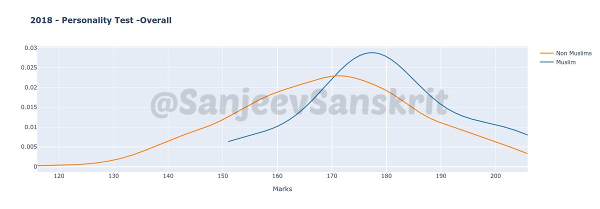
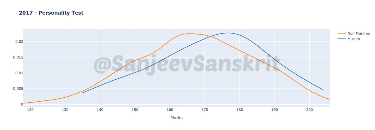
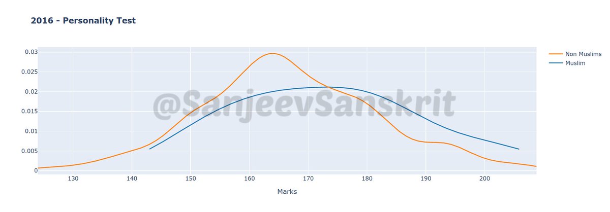
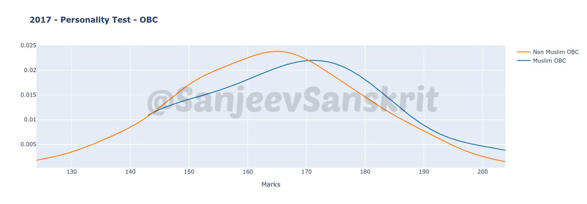
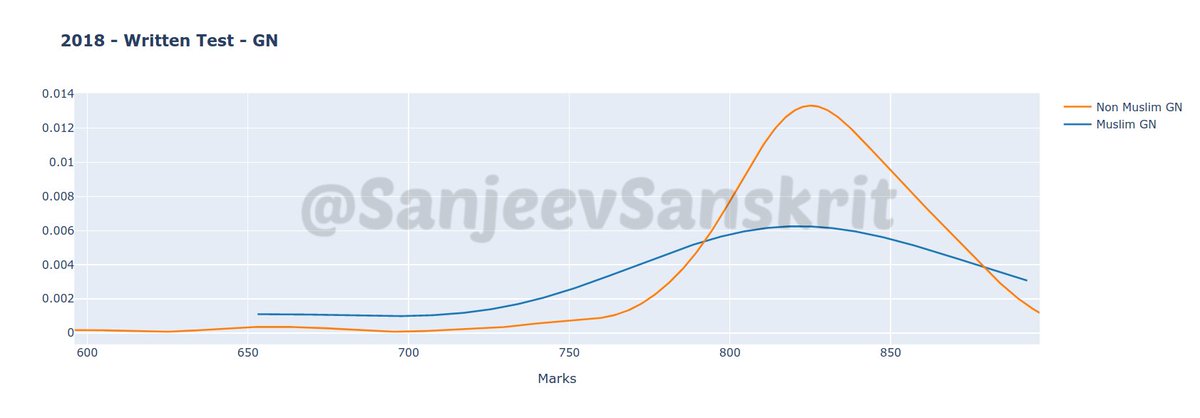
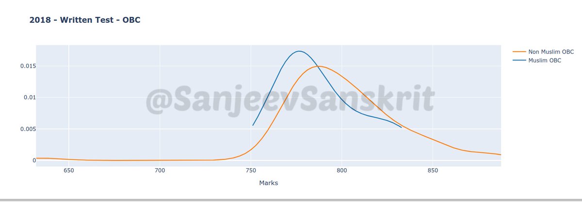
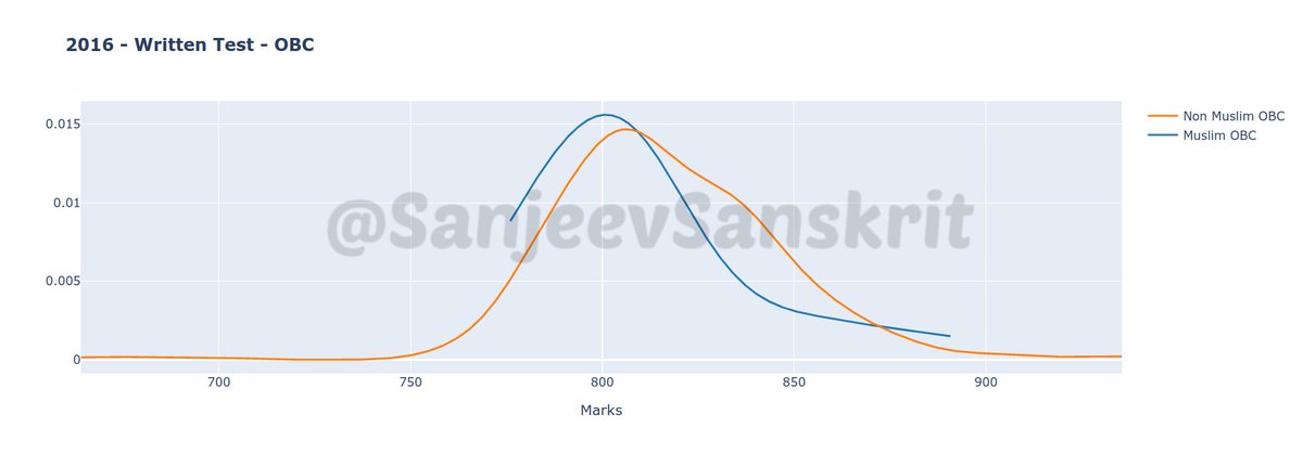
After huge demand, giving you distribution plots of interview (personality) & written marks in UPSC. First image is for interview marks in 2018. As clearly seen, marks of M (blue) are clearly shifted by around 10 marks higher from non-M (orange) candidates. Isn& #39;t it interesting?+
The written marks of 2018 have more interesting pattern. M marks (blue) show perfect bell curve (actually too perfect for small sample). But non-M marks (orange) seem as if half of candidates& #39; have marks pulled towards lower to balance for higher marks of top half of candidates.+
In 2017, interview marks show same trend but margin of difference between M and non-M is lesser. 2016 has a bit uneven marks pattern for non-M but a smooth curve for M. Interesting!+
If we compare written marks for 2017 and 2016, they are close. I won& #39;t infer much given the sample size difference in M and non-M candidates. So instead of being too finicky, I would say they are broadly same.+
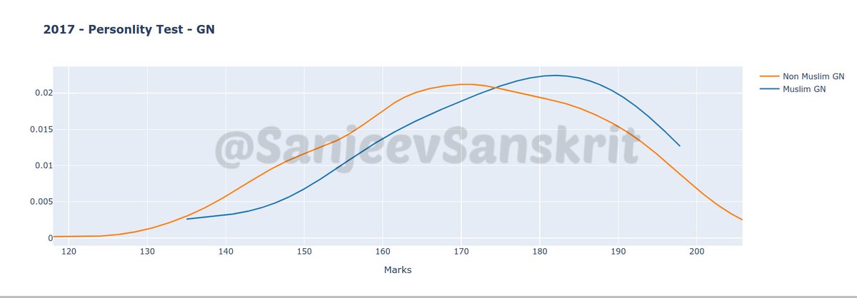
Note that this is what data shows. Why this is happening is not something data can suggest with this info. However I did plot category wise interview marks to see if story is different. But what I found was that for each of OBC and General, M still outperformed non-M every year+
I would also provide charts for written performance over years. I leave it to people to bring out inferences. What is important though is that on average OBC non-M seem to be having biggest shortfall compared to OBC M in interviews. It was 10.07 in 2018 and 9 in 2016.
Here is the thread of my earlier tweets on this issue. Some data has been revised as news agencies had published wrong list of selected Muslims earlier. https://twitter.com/SanjeevSanskrit/status/1120481554785026050?s=20">https://twitter.com/SanjeevSa...
Since some are confused about what these graphs mean, here it is. These are distribution plots. X axis represents marks. Higher marks are on right side as in most graphs. Y axis is proportion of candidates who got particular marks. Put simply, these are histograms+
When you reduce the interval of each bar in histogram and represent proportion of candidates in y axis it becomes this distribution plot. You can interpret it just like any line graph for most purposes.

 Read on Twitter