Let& #39;s build a React app for a job application..
Using create-react-app (CRA):
$ npx create-react-app my-app # create app scaffold
$ npm run build # production build
$ ls -l build/static/js/*.js # take a look at generated js files
SPOILER: 3files, 2reqs, 128.01 KB
Using create-react-app (CRA):
$ npx create-react-app my-app # create app scaffold
$ npm run build # production build
$ ls -l build/static/js/*.js # take a look at generated js files
SPOILER: 3files, 2reqs, 128.01 KB
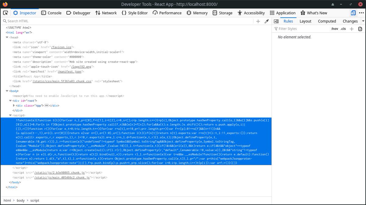
2.b3e90865.chunk.js
- 126.4 KB
- exquisite chunk name
- contains main dependencies (react, react-dom, scheduler)
- 126.4 KB
- exquisite chunk name
- contains main dependencies (react, react-dom, scheduler)
main.405466c2.chunk.js
- 1.2 KB
- logical chunk name
- contains the apps& #39; code (screens, components, and all)
- 1.2 KB
- logical chunk name
- contains the apps& #39; code (screens, components, and all)
runtime-main.76ce5e6f.js
- 1.53 KB
- somewhat obscure name if you don& #39;t already know what it is
- contains the webpack runtime, necessary glue for all the chunks to work together
- inlined in the HTML document by default
- 1.53 KB
- somewhat obscure name if you don& #39;t already know what it is
- contains the webpack runtime, necessary glue for all the chunks to work together
- inlined in the HTML document by default
The scripts are loaded using the classic method of <script> tags at the end of the document.
It& #39;s simple & effective - in the case of static CSR - though relies on preload scanner for best loading experience (scripts are downloaded asap with a ~high priority, executed on DOM rdy)
It& #39;s simple & effective - in the case of static CSR - though relies on preload scanner for best loading experience (scripts are downloaded asap with a ~high priority, executed on DOM rdy)
A simple example where this doesn& #39;t work very well is if our app& #39;s document is dynamic and streamed to the client (case of SSR / Redux store serialization / React hydration), our <script> tags may be discovered & downloaded unnecessarily late.
BTW, obligatory mention of the excellent reference on JavaScript Loading Priorities in Chrome by Addy Osmani: https://addyosmani.com/blog/script-priorities/">https://addyosmani.com/blog/scri...
Now back to our app..
While I& #39;m not perfectly happy with the defaults of CRA so far, I can& #39;t spend the time setting up a new development environment for this ephemeral project.
Let& #39;s code our way through it, and take a look back at ejecting CRA and tuning the setup later.
While I& #39;m not perfectly happy with the defaults of CRA so far, I can& #39;t spend the time setting up a new development environment for this ephemeral project.
Let& #39;s code our way through it, and take a look back at ejecting CRA and tuning the setup later.
The expected layout is a simple full-width header + two half-width vertically scroll-able panes, I could flex my way into it though it kind-of screams opportunity to finally learn CSS grid..
CRA& #39;s webpack configuration allows for old-fashioned CSS files, import-able from components so that& #39;s what we& #39;ll use.
Just set a few colors & spacing values (in relative units) as CSS (variables) custom properties and we& #39;re good to go.
Just set a few colors & spacing values (in relative units) as CSS (variables) custom properties and we& #39;re good to go.
Though the instructions state that the styling isn& #39;t important, the identity of our app is mainly conveyed by the header, so let& #39;s try and get something decent there:
- new Header.js component
- h1 title w/ link to home + logo, app name
- a CTA
- using flex + our CSS variables
- new Header.js component
- h1 title w/ link to home + logo, app name
- a CTA
- using flex + our CSS variables
We& #39;ll be using both keyboard and mouse navigation throughout the development, and we should assume the "customer" will too, so let& #39;s quickly add hover/focus styles:
- filter: contrast(...) for hover
- outline solid blue/white for focus
- filter: contrast(...) for hover
- outline solid blue/white for focus
We now have an idea where we& #39;re going, having set base building blocks of the “look & feel” of the app, thanks to our Header.js component, we can now focus on the next step.
The header includes a call to action button, inviting the user to create a "thing".
The header includes a call to action button, inviting the user to create a "thing".
Clicking this button should update the main UI (which we haven& #39;t even started yet) to display some kind of form fields.
Because we& #39;re building for the web, believe that our users understand and may take advantage of well constructed URLs , we want to use good old <a> links.
Because we& #39;re building for the web, believe that our users understand and may take advantage of well constructed URLs , we want to use good old <a> links.
To do so, we will need some kind of a router:
- subscribing to navigation changes so we react to
- extract route parameters
- navigating to a specific path
- leveraging the History API (pushState / replaceState) for reload-less navigation (still building an SPA after all...)
- subscribing to navigation changes so we react to
- extract route parameters
- navigating to a specific path
- leveraging the History API (pushState / replaceState) for reload-less navigation (still building an SPA after all...)
Now, one would probably go for the popular routing packages for React without hesitation, but I kinda want to take the opportunity to explore the alternatives here - though this is most probably out of scope of the job application exercise.
So, here& #39;s my (kind of crazy, don& #39;t do this at home) idea:
create a React wrapper around a lighter, smaller, lower level JavaScript routing library.
It doesn& #39;t need to handle all the super fancy use-cases, just the simplest ones.
create a React wrapper around a lighter, smaller, lower level JavaScript routing library.
It doesn& #39;t need to handle all the super fancy use-cases, just the simplest ones.
We& #39;ll be using the tiny, < 200 loc `a-route` routing library from @WebReflection, go check it out! https://github.com/WebReflection/a-route">https://github.com/WebReflec...
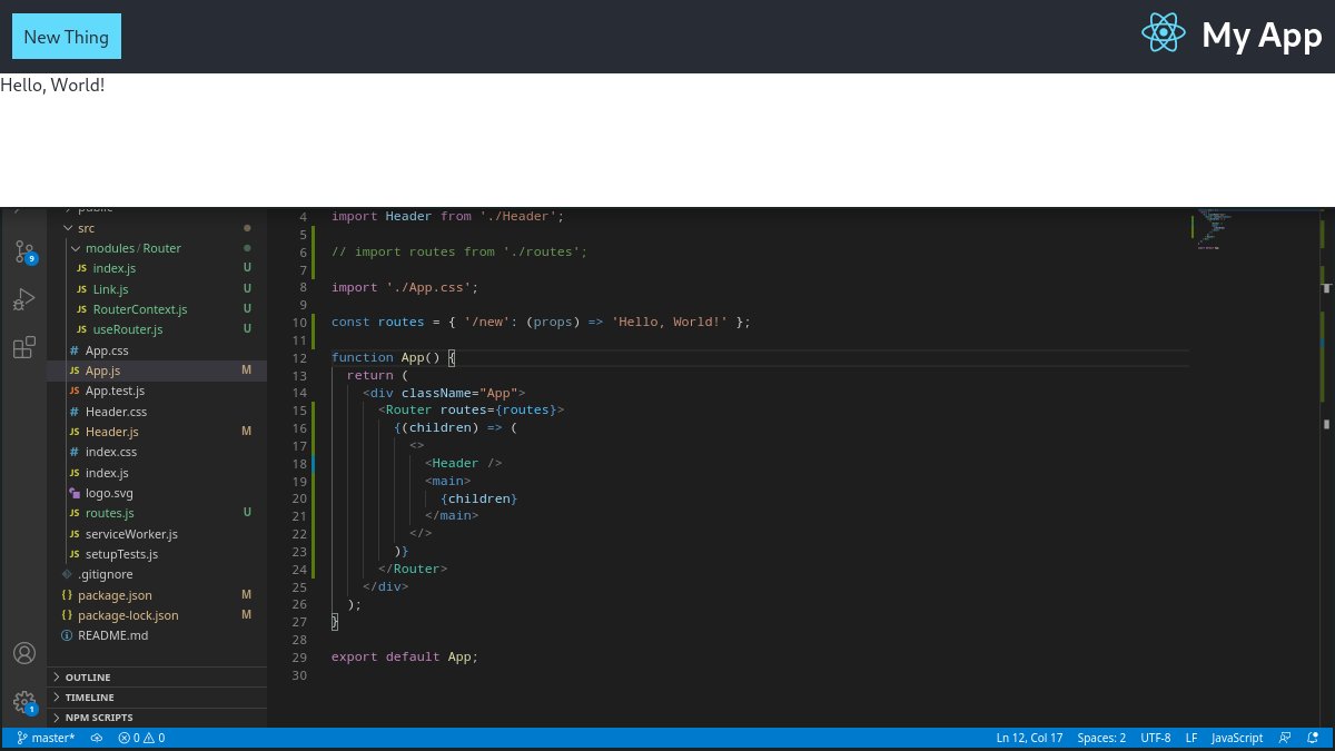
Annnd it works!  https://abs.twimg.com/emoji/v2/... draggable="false" alt="✨" title="Funken" aria-label="Emoji: Funken">
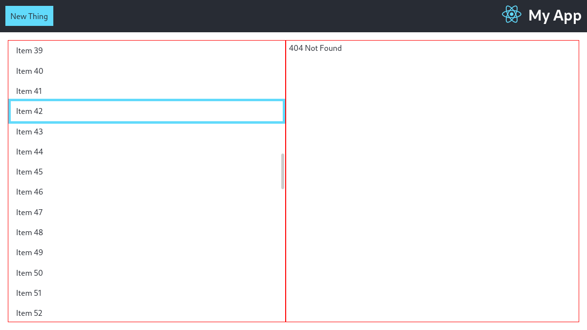
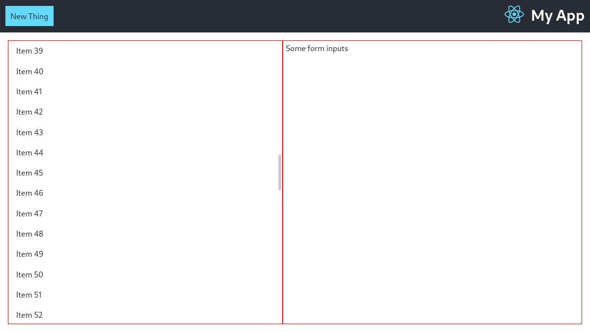
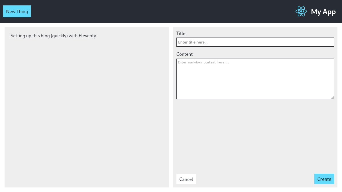
Here& #39;s a screenshot of a main content route component being rendered in our app, using our React a-route wrapper.
It is rendered by navigating to the /new URL either via:
- initial navigation
- browser history
- link click
- router.navigate() from useRouter()
Here& #39;s a screenshot of a main content route component being rendered in our app, using our React a-route wrapper.
It is rendered by navigating to the /new URL either via:
- initial navigation
- browser history
- link click
- router.navigate() from useRouter()
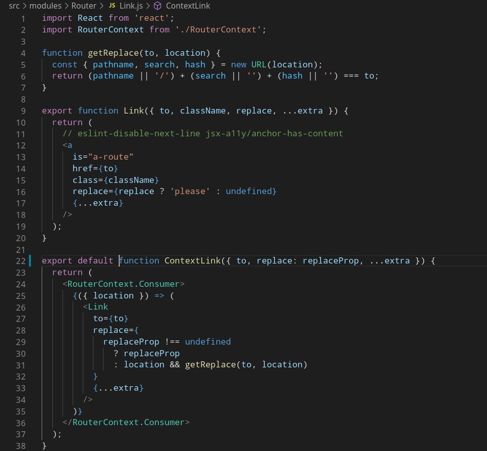
As you may have noticed, the <Router> component acts as a React Context Provider. While not strictly necessary, it& #39;s encouraged that all components dealing with navigation in any way be placed as children of <Router> for optimal (opinionated) results.
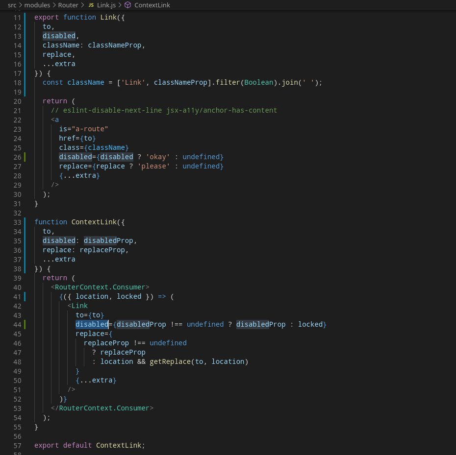
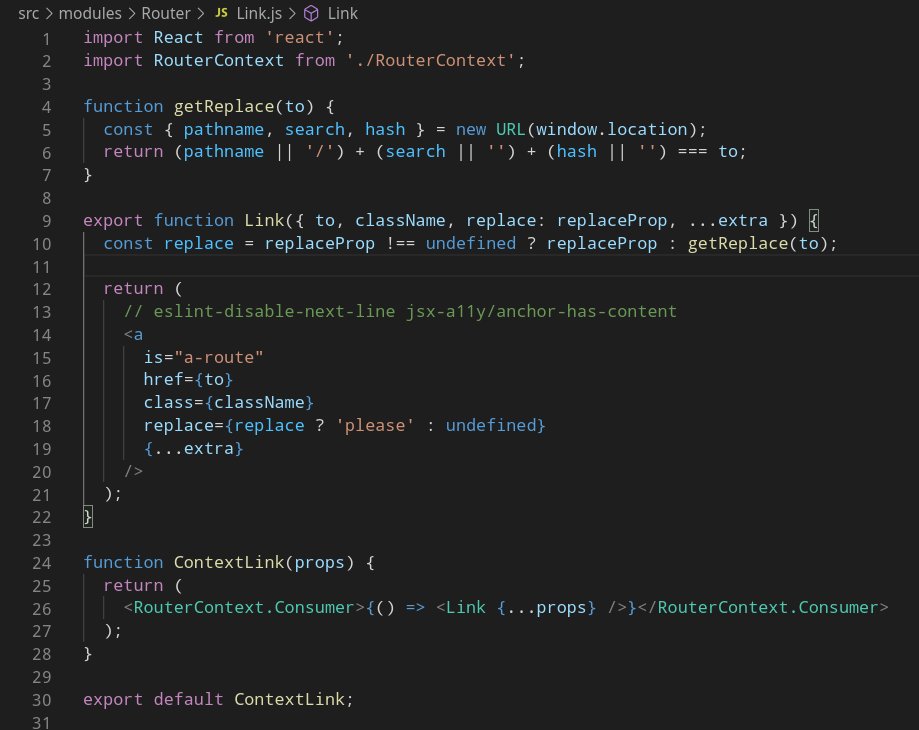
Here& #39;s our <Link> component implementation, which illustrates that point:
- every <Link /> in the tree is re-rendered on every navigation
- this allows us to update whether or not we consider a link click should use replaceState or pushState methods of the History API.
- every <Link /> in the tree is re-rendered on every navigation
- this allows us to update whether or not we consider a link click should use replaceState or pushState methods of the History API.
Note: there are a few things here I wouldn& #39;t encourage in a real world environment:
- using the Context API only to trigger re-renders of child components when a new random value (Symbol) is set upon navigation
- using DOM APIs directly in components rendering instead of props
- using the Context API only to trigger re-renders of child components when a new random value (Symbol) is set upon navigation
- using DOM APIs directly in components rendering instead of props
So we& #39;ve had our fun with our little router React wrapper experiment, probably won& #39;t keep it in the final version of the app, or maybe we& #39;ll publish it as a package someday, we& #39;ll see.
In any case, we now have everything we need to start building our actual app, let& #39;s get to it!
In any case, we now have everything we need to start building our actual app, let& #39;s get to it!
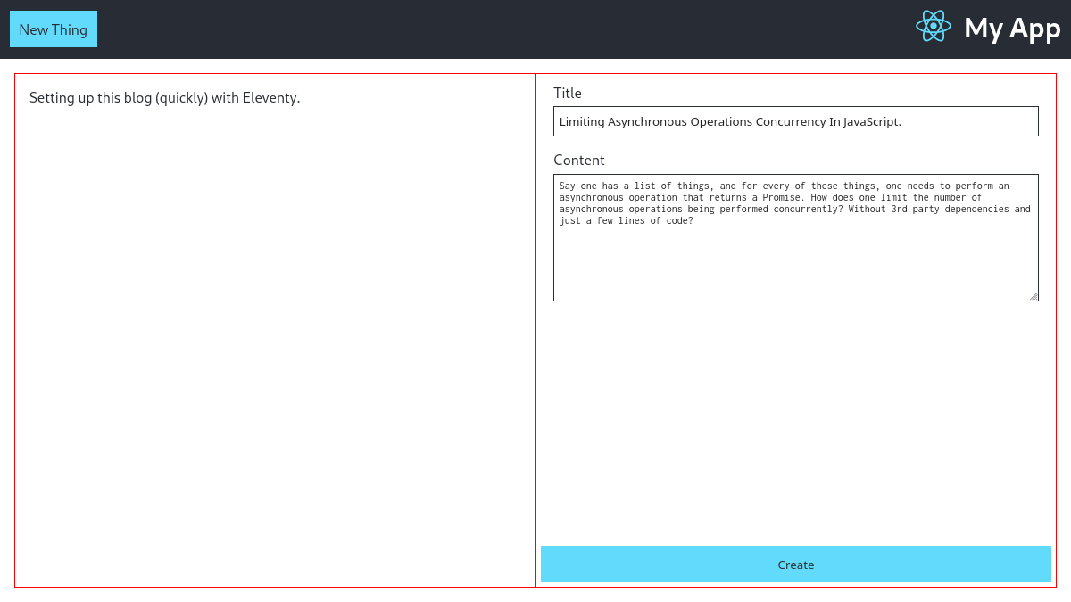
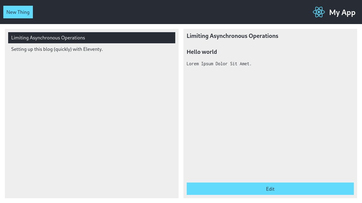
The app& #39;s main content is supposed to be divided in up to two full-height, vertically scroll-able panes: list of items on the left, and on the right, either an item viewer or editor if any selected, a creation form, or nothing.
Plot twist: I did go with flexbox.
Plot twist: I did go with flexbox.
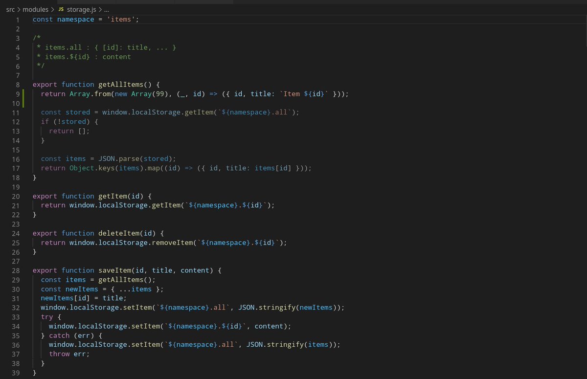
The instructions didn& #39;t say if the items should be fetched & stored remotely, so I went with local storage.
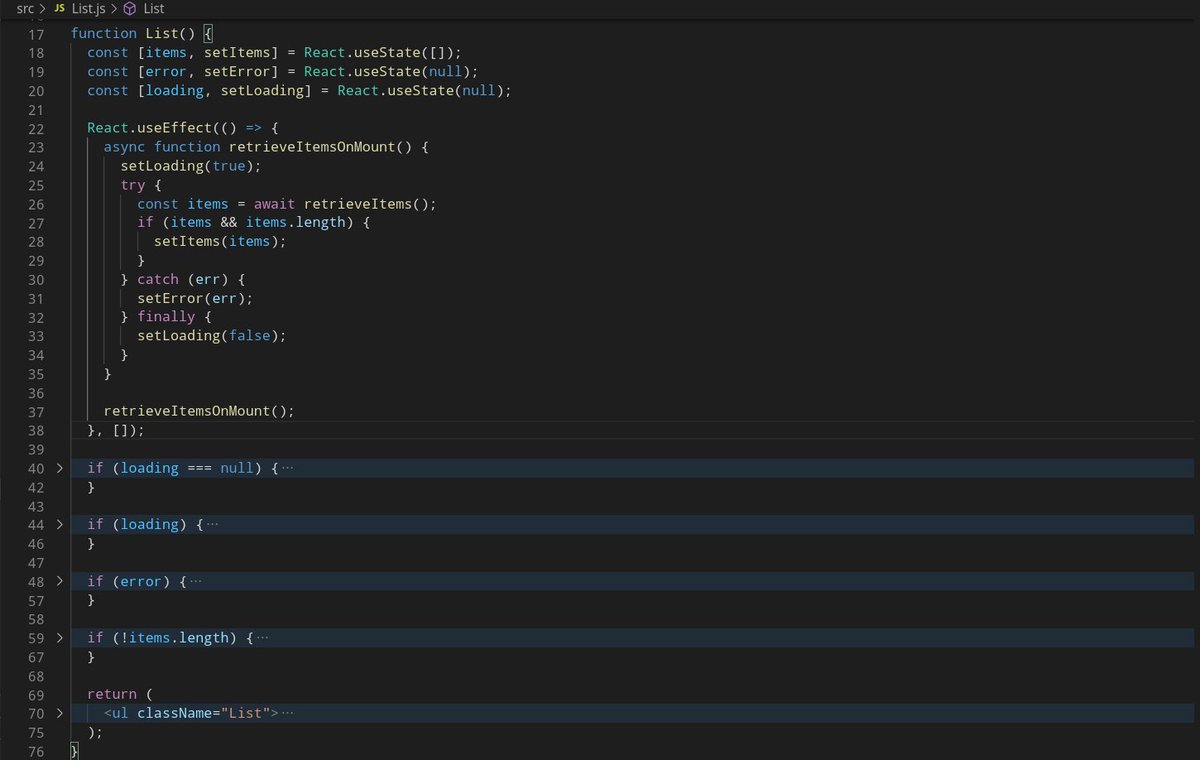
The List component itself is pretty standard stuff, at the moment only retrieving the items on mount & handling all possible states: mounting/loading/error/empty/items.
The List component itself is pretty standard stuff, at the moment only retrieving the items on mount & handling all possible states: mounting/loading/error/empty/items.
Next step should probably be the item creation form, for which we already have a sweet `/new` route.
Handling item creation - and saving to local storage - is likely going to force us to move a few things around in the List component, shouldn& #39;t be a too much of a big deal though.
Handling item creation - and saving to local storage - is likely going to force us to move a few things around in the List component, shouldn& #39;t be a too much of a big deal though.
Item creation form coming up nicely.
A few things left for us to there, most importantly updating the list view (left pane) once a new item is created.
There are a couple of ways we can do that, the simplest probably being to lift the React state holding the items, up.
A few things left for us to there, most importantly updating the list view (left pane) once a new item is created.
There are a couple of ways we can do that, the simplest probably being to lift the React state holding the items, up.
Here are a few other options we might want to consider:
- using the React Context API
- using a state management library such as Redux
- triggering the refresh through a side effect, e.g. on every navigation event
- using the React Context API
- using a state management library such as Redux
- triggering the refresh through a side effect, e.g. on every navigation event
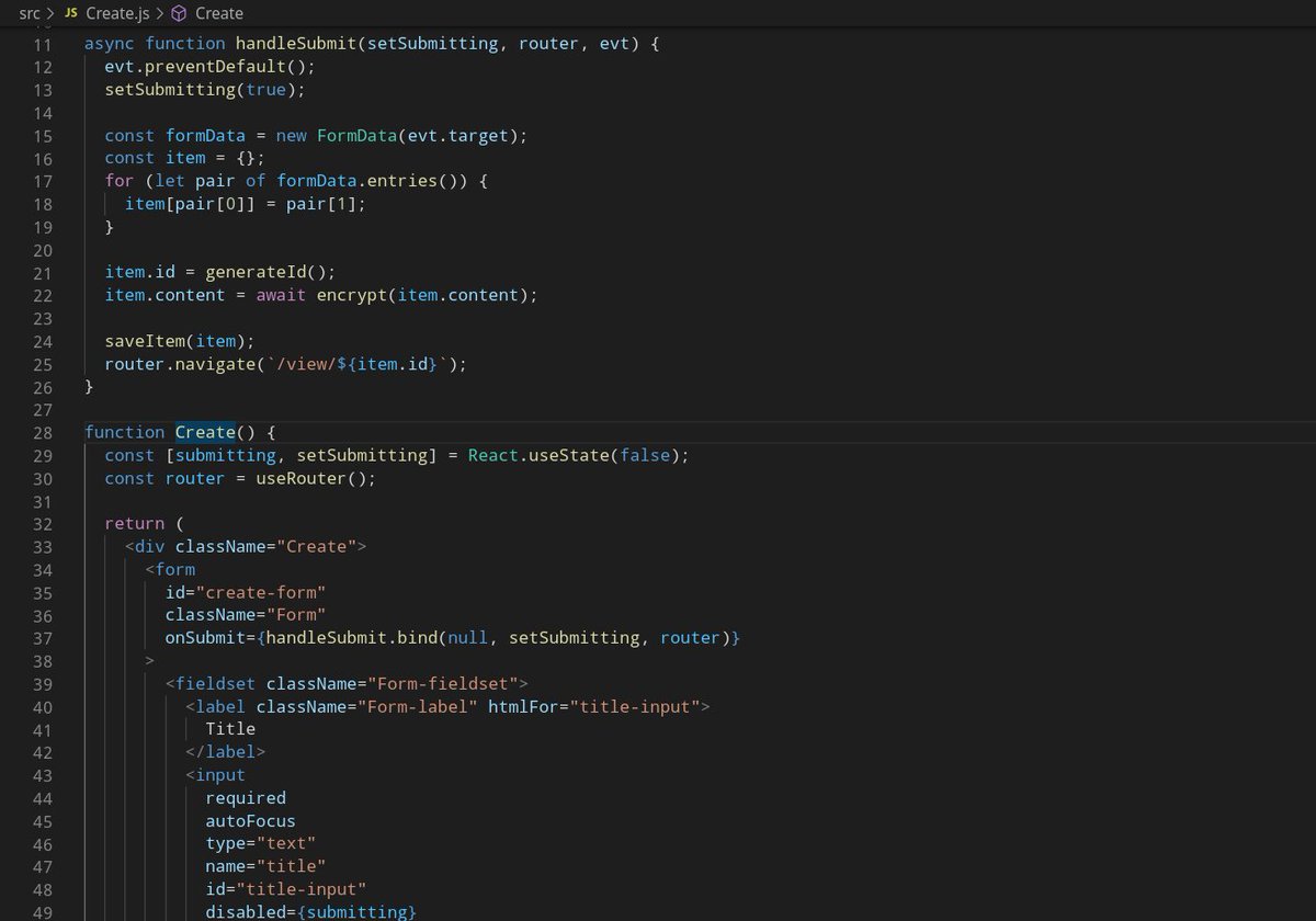
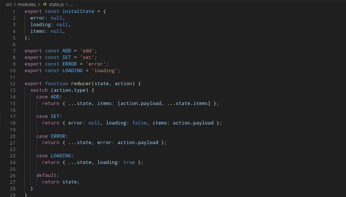
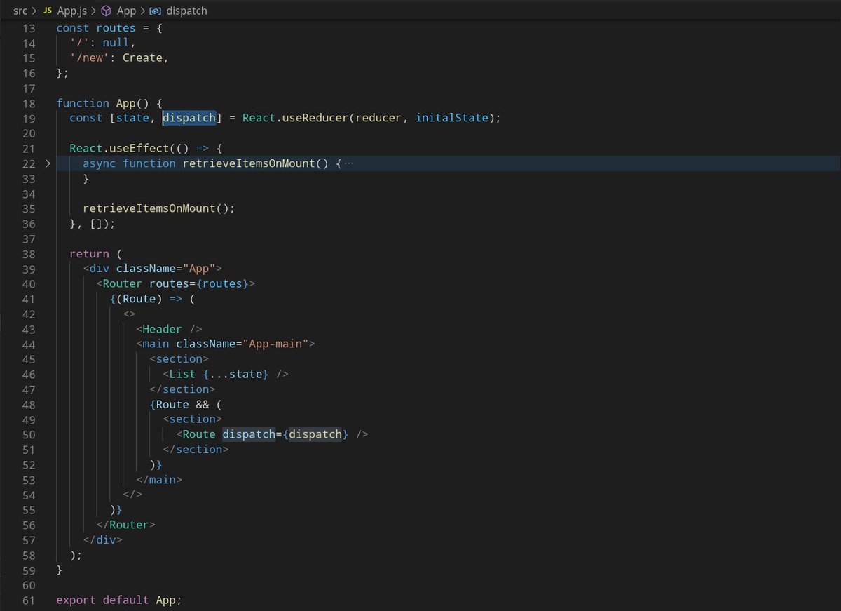
Went for a redux-like “lift the state up” approach:
- App component now holds the items state
- items state is now managed w/ useReducer instead of useState
- Create component now simply calls dispatch({ type: ADD, payload: item }) once item is successfully saved to local storage
- App component now holds the items state
- items state is now managed w/ useReducer instead of useState
- Create component now simply calls dispatch({ type: ADD, payload: item }) once item is successfully saved to local storage
Let& #39;s move on to the next piece of functionality: viewing an item.
Our viewer component should be rendered for the `/view/:id` route, to which we already link in a few places.
On mount, we must retrieve and perform an async transformation on the item, before we can display it.
Our viewer component should be rendered for the `/view/:id` route, to which we already link in a few places.
On mount, we must retrieve and perform an async transformation on the item, before we can display it.
Did I just say "on mount"?
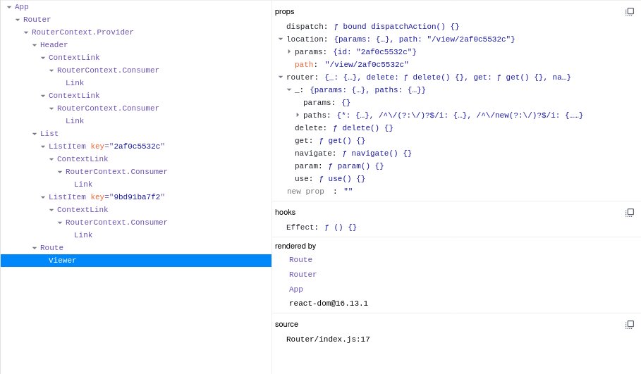
Well, there& #39;s one thing we might want to consider before jumping in: the user can switch from viewing a given note, to viewing another one in a single interaction: a click on another list element link.
Well, there& #39;s one thing we might want to consider before jumping in: the user can switch from viewing a given note, to viewing another one in a single interaction: a click on another list element link.
In other words, between 2commits, our React tree might contain exactly the same leaves... *but* with different props.
So, in this scenario, retrieving the item& #39;s info based on its id when the View component is mounted is not good enough: we might display the previous item& #39;s info if the id we& #39;re interested in changes.
Let& #39;s take a quick look at the 2 solutions I have in mind for this problem.
Let& #39;s take a quick look at the 2 solutions I have in mind for this problem.
First solution:
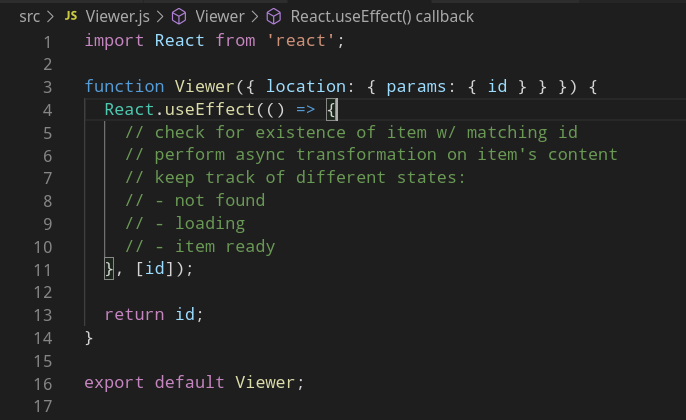
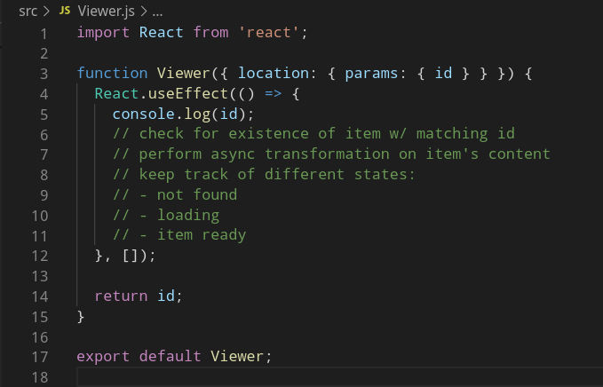
Perform the necessary checks, transformation, etc..., not just on component mount, but also whenever the item& #39;s `id` (from the props) change.
Perform the necessary checks, transformation, etc..., not just on component mount, but also whenever the item& #39;s `id` (from the props) change.
Problem with this first solution:
We& #39;d have to either index secondary states (loading, error, not found, transformed content) every-time the effect runs, at risk of missing one out and end up with a state desync that will be hard to debug :(
We& #39;d have to either index secondary states (loading, error, not found, transformed content) every-time the effect runs, at risk of missing one out and end up with a state desync that will be hard to debug :(
Second solution:
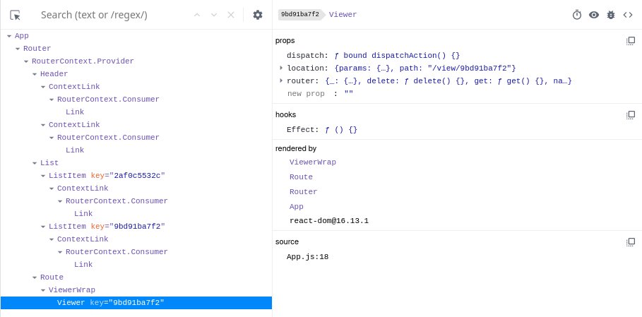
Actually unmount then remount the Viewer component whenever the current item& #39;s id changes.
This way we can run our Viewer initialization logic only once on mount, without having to worry about cleaning up secondary state.
Actually unmount then remount the Viewer component whenever the current item& #39;s id changes.
This way we can run our Viewer initialization logic only once on mount, without having to worry about cleaning up secondary state.
To do so, we first add a wrapper component around Viewer, let& #39;s call it ViewerWrap.
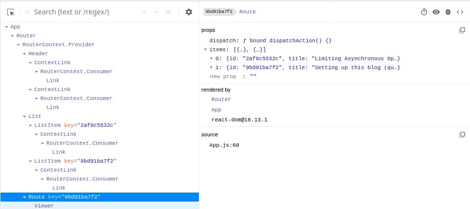
ViewerWrap renders Viewer component, forwards all incoming props *and* sets a `key={id}` prop.
Whenever the `key` prop value changes, React will unmount and then remount this component.
ViewerWrap renders Viewer component, forwards all incoming props *and* sets a `key={id}` prop.
Whenever the `key` prop value changes, React will unmount and then remount this component.
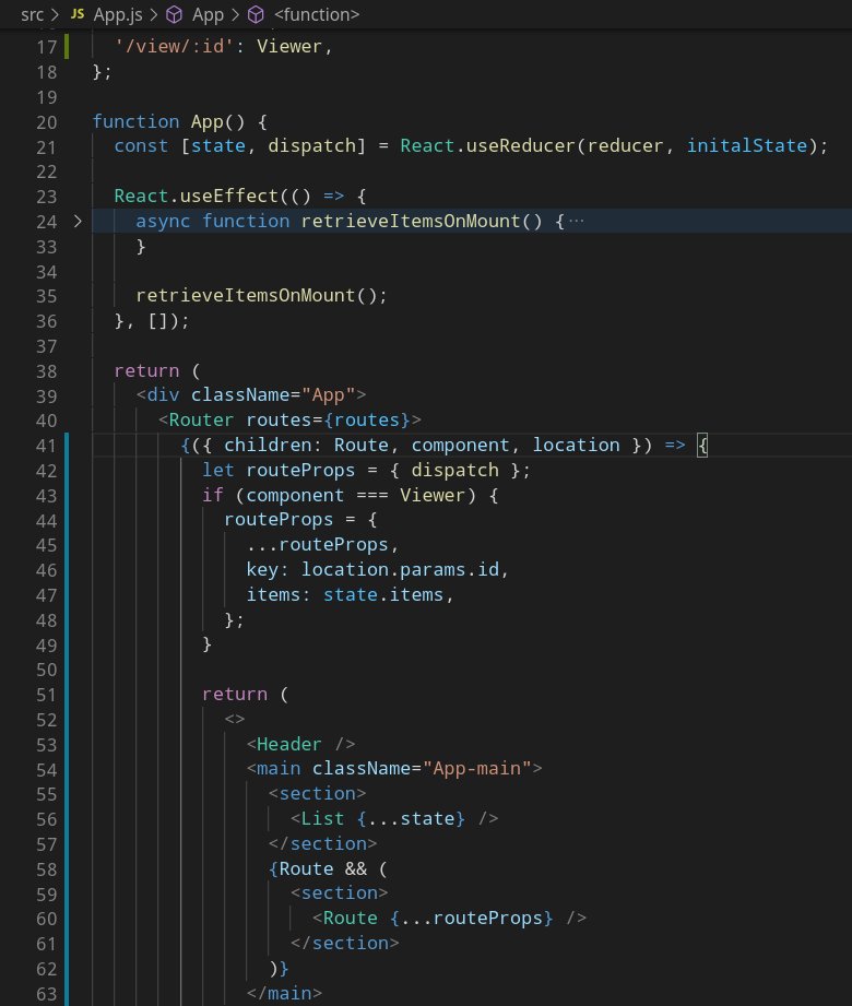
However, our Router already provides an intermediary `Route` component we could set a `key` on, and we might want to keep a cleaner definition of our routes.
So we make a few tiny changes to our Router to enable custom route props, such as `key` and `items`.
So we make a few tiny changes to our Router to enable custom route props, such as `key` and `items`.
The definition of the routeProps does not feel very clean though, we might have to come back to it and shape the API a little better, we& #39;ll see.
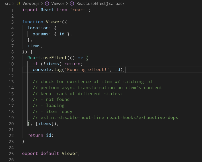
Now that we have our `items` passed in props of `Viewer`, we can start our initialization logic, but since we& #39;ll be retrieving the current item from its id, we need to make sure this logic doesn& #39;t run until the items are available (in case of initial navigation).
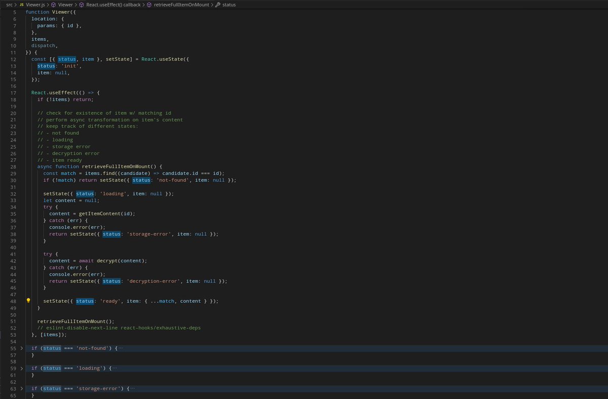
A few lines of code later, we have the first working version of our Viewer component, with minimal handling of all the possible states.
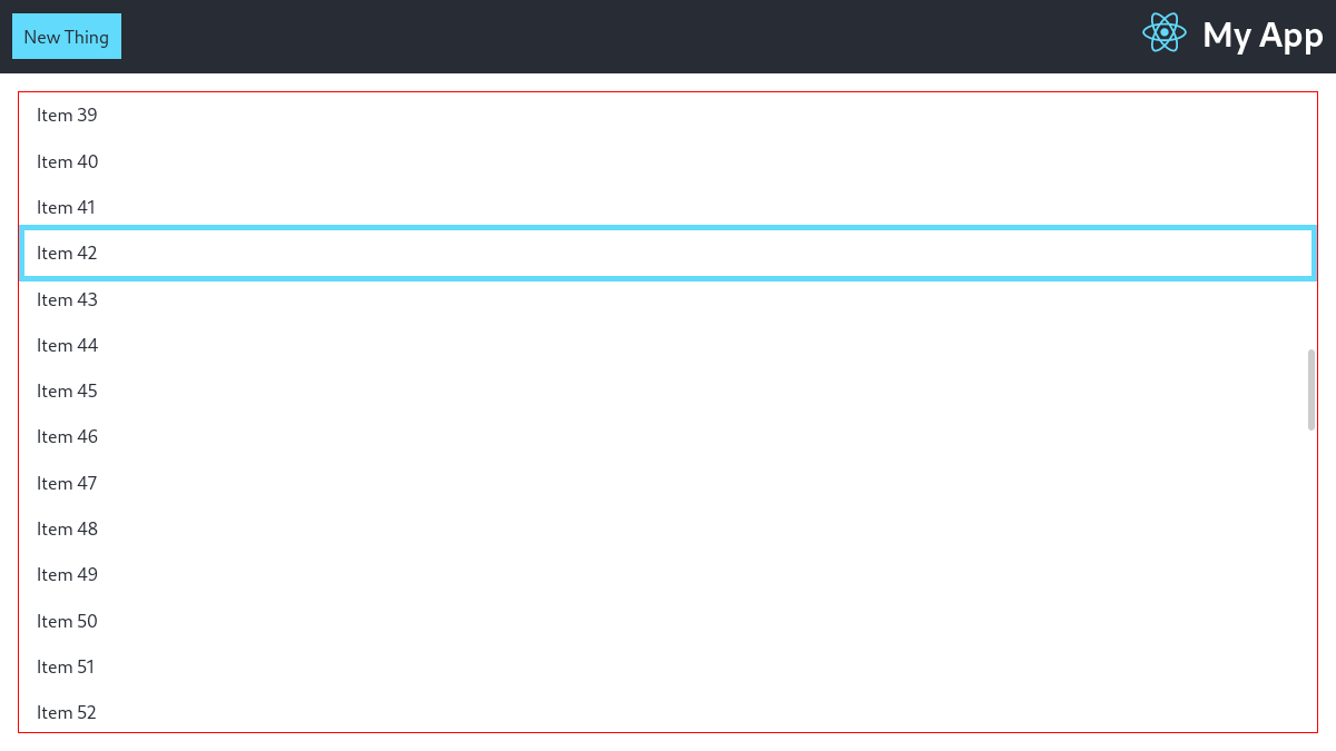
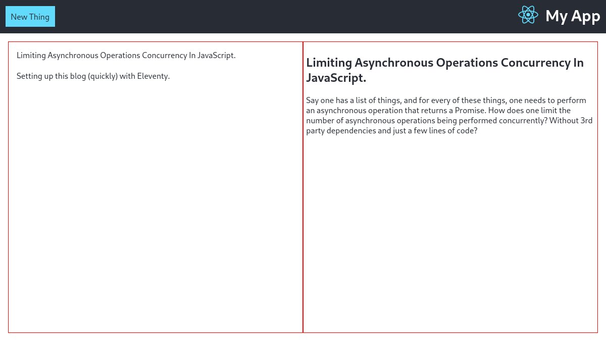
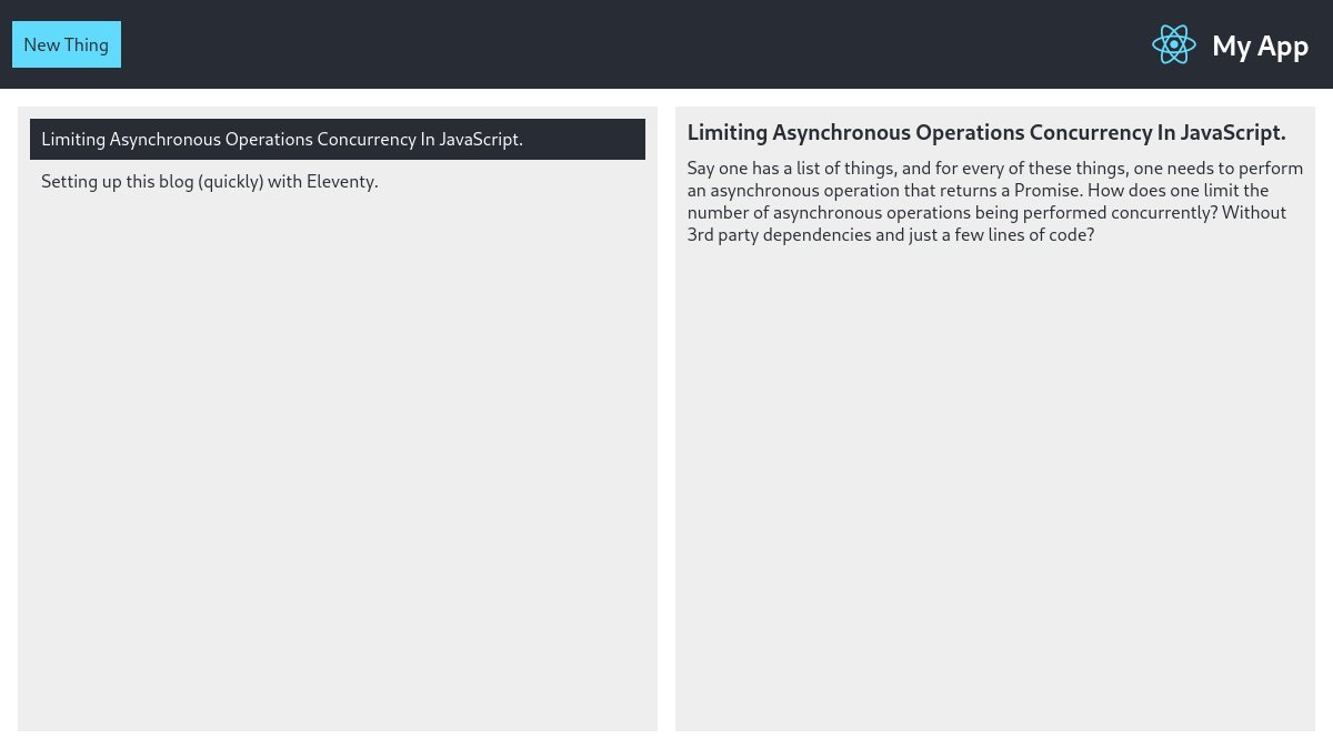
I couldn& #39;t stand the red borders among other things, so I had to spend a little time improving the styling to the bare minimum acceptable.
Next step is an actual requirement of the job application exercise: writing the content of an item as Markdown, and see it properly rendered when viewing, for which we& #39;ll need to pick an external dependency.
We& #39;ll want something both lightweight (even a basic React app is already big enough, more on that later) and fast (the content must be parsed on the fly, in Viewer initialization).
The good news are, we probably won& #39;t need to:
- sanitize the output (self-xss yourself all you want)
- handle complex stuff such as tables (who uses that syntax anyway)
- sanitize the output (self-xss yourself all you want)
- handle complex stuff such as tables (who uses that syntax anyway)
I& #39;ve used `marked` with React apps in the past, so my first thought is to check again for the package& #39;s size.
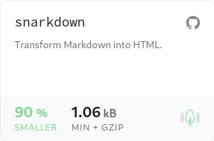
As always, BundlePhobia did not disappoint: there& #39;s a package named `snarkdown` by @_developit that& #39;s apparently ~90% smaller, about 2kB before gzip, let& #39;s give it a shot
As always, BundlePhobia did not disappoint: there& #39;s a package named `snarkdown` by @_developit that& #39;s apparently ~90% smaller, about 2kB before gzip, let& #39;s give it a shot
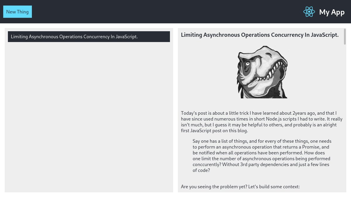
Works like a charm, just added the call to snarkdown in the initialization step in the Viewer component, then some good old dangerouslySetInnerHTML and voila!
Now the viewer should allow to edit an item - re-using logic from the creation form, so that& #39;s what we& #39;ll be up to next.
Now the viewer should allow to edit an item - re-using logic from the creation form, so that& #39;s what we& #39;ll be up to next.
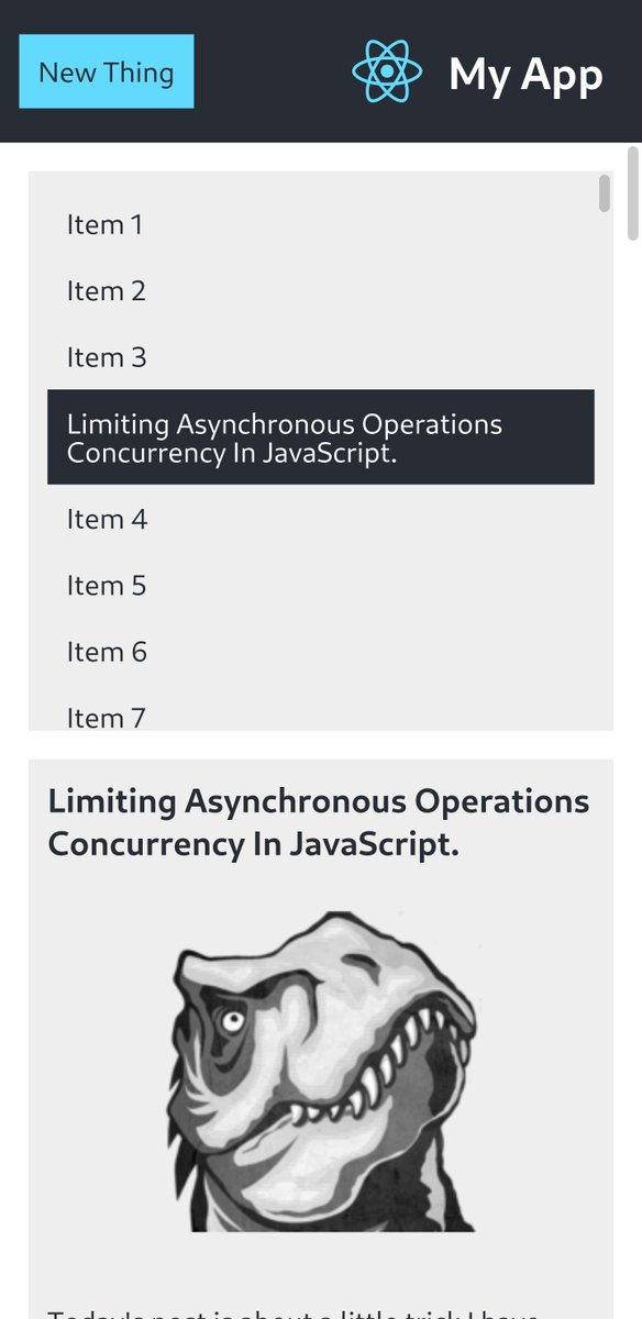
But just before we do that, let& #39;s treat ourselves with making this app somewhat usable on smaller screens as well.
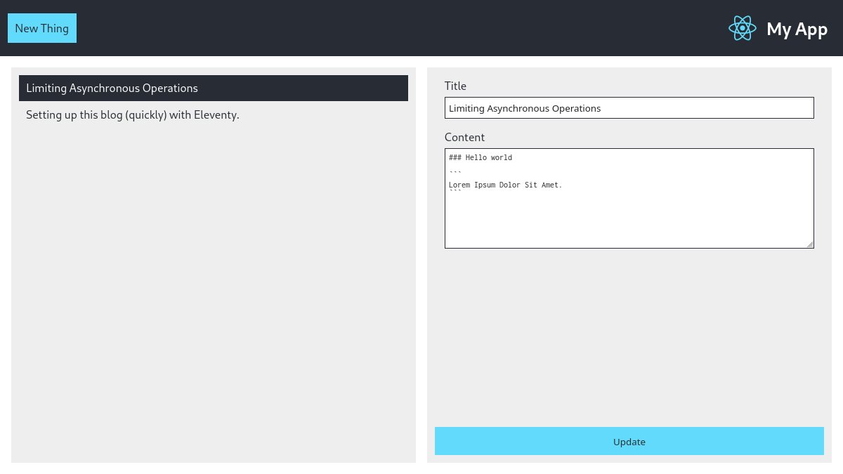
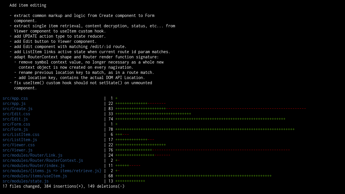
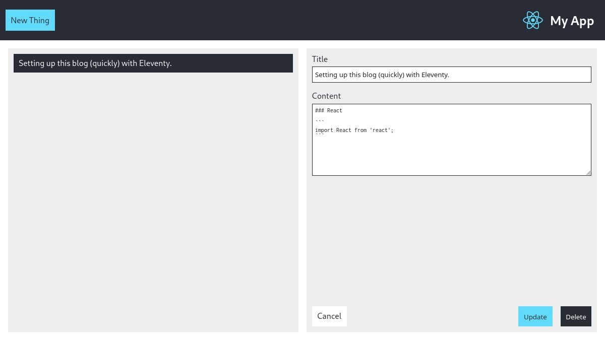
Back at it, we& #39;ve just finished adding the editing feature.
That required quite a bit of work to get where I wanted, mainly:
- extract markup/logic from Create component to a more generic Form component.
- extract Viewer& #39;s state/effect into a re-usable hook.
- fun with the Router
That required quite a bit of work to get where I wanted, mainly:
- extract markup/logic from Create component to a more generic Form component.
- extract Viewer& #39;s state/effect into a re-usable hook.
- fun with the Router
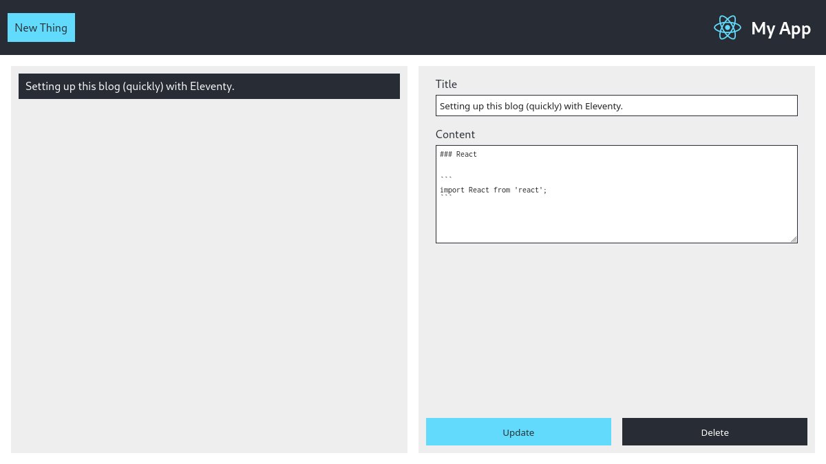
Correction: the exercise instructions state an item can only be deleted while in "edit mode".
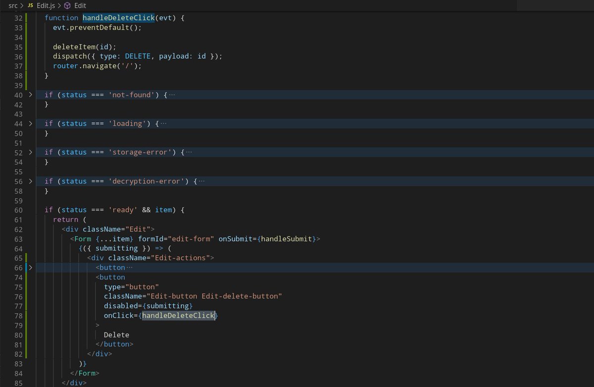
Item deletion is pretty straightforward, on button click:
- remove the item from localstorage
- remove the item from the app& #39;s state
- navigate back to the homepage
- remove the item from localstorage
- remove the item from the app& #39;s state
- navigate back to the homepage
Arguably, this should all be wrapped in a try/catch and an error message be displayed to the user if needed.
We& #39;ll come back to it later if we have time.
We& #39;ll come back to it later if we have time.
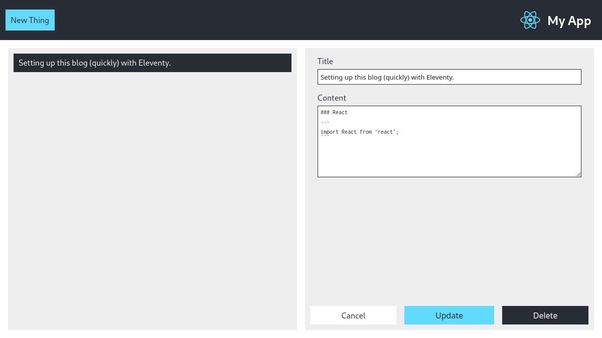
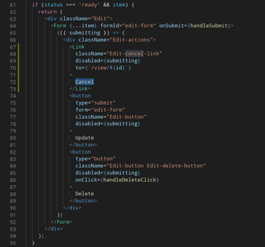
Up next: a cancel button in the Edit component, which simply takes the user back to the Viewer component, without saving any modifications that may have occurred.
Thanks to our Link component, this is both straightforward and optimal in just a few lines.
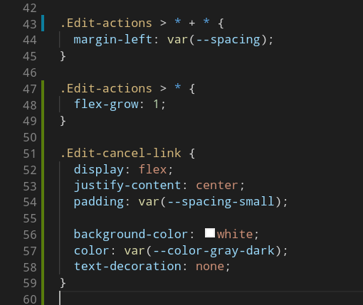
Lobotomized owl selector FTW BTW * + *
Lobotomized owl selector FTW BTW * + *
The next (and last) exercise requirement is that the "edition mode" (Create or Edit form) should prevent all navigation for the user, effectively "locking" them up in the authoring process (to avoid losing unsaved modifications I guess), except for the Cancel button.
That& #39;s probably questionable from a UX standpoint, but we aren& #39;t here to ask questions are we. Or at least, not yet.
First things first, let& #39;s move back our Cancel button from just Edit component, one level lower, to our Form component so that it& #39;s present in both Edit & Create components.
Now, for the “locked navigation” part:
For a set of given routes (/edit/:id & /new), we wish to effectively disable all links by default, except for the Cancel button when one of these routes is active.
For a set of given routes (/edit/:id & /new), we wish to effectively disable all links by default, except for the Cancel button when one of these routes is active.
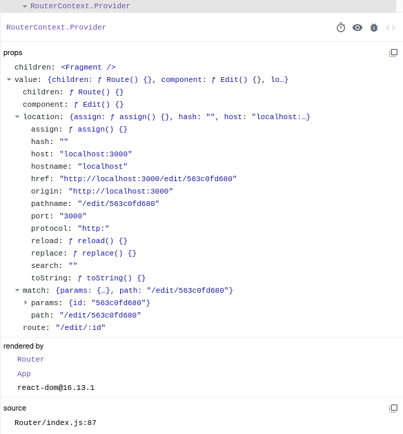
Good thing we have a custom Router, which stores various information regarding the current navigation through the React Context API, as well as a Link component which is a consumer of said React Context.
Do you see where I& #39;m getting at?
In other words, we could simply change our routes definition to include whether or not a given route should enable this “locked navigation” behavior, store it in the context, and have all context-connected link components behave accordingly.
In other words, we could simply change our routes definition to include whether or not a given route should enable this “locked navigation” behavior, store it in the context, and have all context-connected link components behave accordingly.
Here& #39;s what our routes definition might look like.
type Definition = null
| Component
| {| component: Component, locked: boolean |};
type Routes = {
[path: string]: Definition,
}
type Definition = null
| Component
| {| component: Component, locked: boolean |};
type Routes = {
[path: string]: Definition,
}
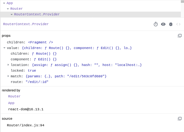
Adapting our Router component allows us to handle the new definition type, and store the corresponding `locked` value for the current navigation context.
Which in turn, allows us to obtain the expected behavior, by applying pointer-events: none, from the disabled attribute set on the link element, depending on the value of the locked key from the router context.
Behavior that can be overridden, either by:
- using the named Link export, which is not a consumer of the router context, instead of the default one
- passing a boolean disabled prop to the Link component
- using the named Link export, which is not a consumer of the router context, instead of the default one
- passing a boolean disabled prop to the Link component
Because the Cancel button/link in our Form component, doesn& #39;t make use of the additional behavior (locked / replace navigation) of the router context connected Link component (default export), we can use the raw component directly (named export).
And so we’re done with the original exercise requirements  https://abs.twimg.com/emoji/v2/... draggable="false" alt="🎉" title="Partyknaller" aria-label="Emoji: Partyknaller">
But.. we’re not done just yet, there a few things we need to do before sending our project back.
But.. we’re not done just yet, there a few things we need to do before sending our project back.
- review the files structure
- factorize some redundant UI components & styling
- simplify a few things here and there
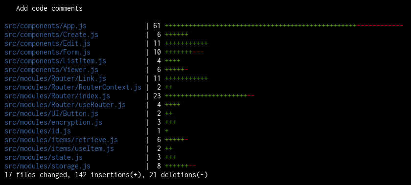
- add comments
- write tests
- write documentation
- publish code
- deploy app
- factorize some redundant UI components & styling
- simplify a few things here and there
- add comments
- write tests
- write documentation
- publish code
- deploy app
Add components tests using jest + react-testing-library
14 files changed, 418 insertions(+), 12 deletions(-)
14 files changed, 418 insertions(+), 12 deletions(-)
It& #39;s done! https://github.com/ziir/react-notes-app">https://github.com/ziir/reac...
And it& #39;s live, too.
https://react-notes-app.timtech.blog/ ">https://react-notes-app.timtech.blog/">...
https://react-notes-app.timtech.blog/ ">https://react-notes-app.timtech.blog/">...
The exercise being completed, I’m ending this thread here, thanks for reading this far.
I will share some additional thoughts and ideas in this new thread. https://abs.twimg.com/emoji/v2/... draggable="false" alt="👇" title="Rückhand Zeigefinger nach unten" aria-label="Emoji: Rückhand Zeigefinger nach unten"> https://twitter.com/tpillard/status/1307998240625823747">https://twitter.com/tpillard/...
I will share some additional thoughts and ideas in this new thread.

 Read on Twitter


 Here& #39;s a screenshot of a main content route component being rendered in our app, using our React a-route wrapper.It is rendered by navigating to the /new URL either via:- initial navigation- browser history- link click- router.navigate() from useRouter()" title="Annnd it works! https://abs.twimg.com/emoji/v2/... draggable="false" alt="✨" title="Funken" aria-label="Emoji: Funken">Here& #39;s a screenshot of a main content route component being rendered in our app, using our React a-route wrapper.It is rendered by navigating to the /new URL either via:- initial navigation- browser history- link click- router.navigate() from useRouter()" class="img-responsive" style="max-width:100%;"/>




![Here& #39;s what our routes definition might look like.type Definition = null | Component | {| component: Component, locked: boolean |};type Routes = { [path: string]: Definition,} Here& #39;s what our routes definition might look like.type Definition = null | Component | {| component: Component, locked: boolean |};type Routes = { [path: string]: Definition,}](https://pbs.twimg.com/media/EiZaOPDWoAI5HkG.png)
